
Web page templates optimized for macOS
Explore Similar TemplatesAbout template
Manage web page templates optimized for macOS and provide the best user experience on the market. Try the best solution today!
Recommended templates


Easy to build without coding
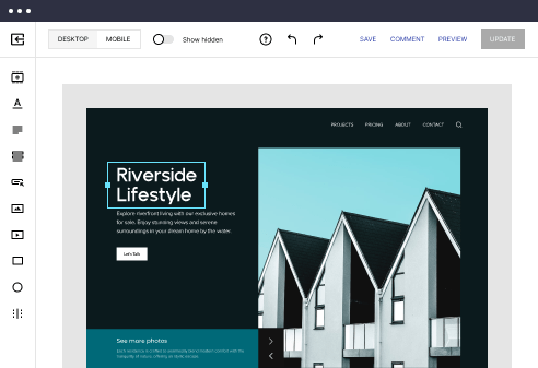
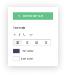
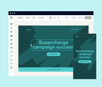
With the intuitive drag-and-drop builder, anyone on your team can create high-converting pages without any knowledge of code or design. Make enhancements to your landing page with custom widgets using Javascript, HTML/CSS, or third-party scripts.
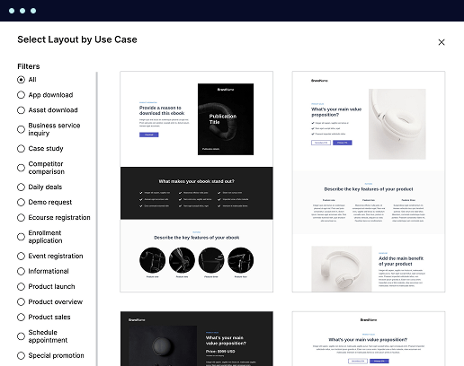
Multiple layouts for any industry and goal
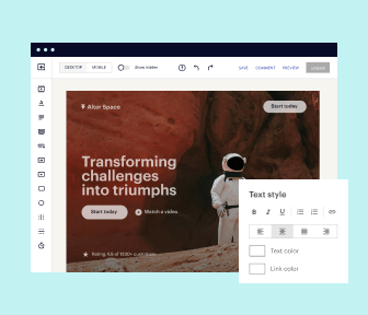
Select from 500+ landing page layouts built to boost conversions across industry-specific scenarios. Customize them by adjusting fonts, adding images, and generating on-brand content with the AI assistant. Quickly scale with Instablocks® and Global Blocks that you can save, reuse, and update globally.
Loads fast and looks polished on any device
Every template is responsive, which means they present professionally on any device and load blazingly fast with our Thor Render Engine. You can also power them up with Google AMP technology to deliver an unparalleled mobile experience and drive higher conversions.
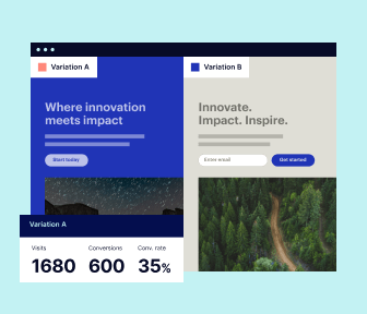
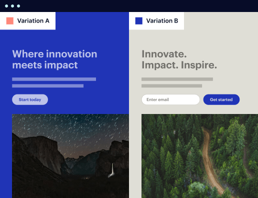
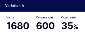
Robust analytics & experimentation
Get real-time updates and reporting across all your devices, showing the number of visitors, conversions, cost-per-visitor, and cost-per-lead. Launch AI-powered experiments, run A/B tests, and use heatmaps to analyze user behavior, then optimize your landing page to maximize conversions.
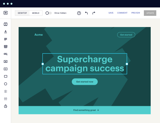

Easy to build without coding
With the intuitive drag-and-drop builder, anyone on your team can create high-converting pages without any knowledge of code or design. Make enhancements to your landing page with custom widgets using Javascript, HTML/CSS, or third-party scripts.
Multiple layouts for any industry and goal
Select from 500+ landing page layouts built to boost conversions across industry-specific scenarios. Customize them by adjusting fonts, adding images, and generating on-brand content with the AI assistant. Quickly scale with Instablocks® and Global Blocks that you can save, reuse, and update globally.
Loads fast and looks polished on any device
Every template is responsive, which means they present professionally on any device and load blazingly fast with our Thor Render Engine.
Robust analytics & experimentation
Get real-time updates and reporting across all your devices, showing the number of visitors, conversions, cost-per-visitor, and cost-per-lead. Launch AI-powered experiments, run A/B tests, and use heatmaps to analyze user behavior, then optimize your landing page to maximize conversions.
All the features you need to build lead-generating landing pages

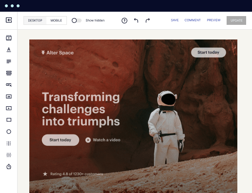
Landing page builder
Easily create landing pages with the intuitive drag-and-drop page builder that features contextual element editing, over 500 page layouts, and 33 million images.

Visual on-page collaboration
Invite teammates and clients to collaborate on page design in real time to get your pages created, reviewed, and launched faster.

AI content generation
Instantly generate audience-focused content with AI-crafted headlines, paragraphs, and CTAs directly within the Instapage builder.

500+ customizable layouts
Choose from a range of professionally tailored page layouts, specifically designed to enhance conversion rates across numerous industry-specific scenarios.
Instablocks
Quickly build personalized landing pages using individual page blocks that you can customize, save, and reuse.
Thor Render Engine
Our back-end technology ensures that your landing pages load quickly to increase conversions, SEO rankings, and enhance the overall user experience.
Analytics
Seamlessly connect to Google Analytics to get real-time updates on cost-per-visitor and cost-per-lead metrics directly in the Instapage platform.
Learn how to build top-performing landing pages for any goal
FAQs
“Instapage gives us the ability to tailor our landing page content and layout to tell a unique story for each geographical target. The platform also enables us to create different variations with content that performs well for each unique channel. Every marketing team needs this!”

"Instapage has truly maximized our digital advertising performance by enabling us to offer matching, personalized experiences for every ad and audience. Now we can scale our landing page experiences as efficiently and effectively as we scale the ads themselves."

"If we have to wait on a developer, our creative velocity plummets. But Instapage has made it possible for us to exponentially grow our advertising programs and convert more customers"

Leading the way in building high-performing landing pages


A comprehensive guide to optimizing landing page performance with Instapage
When aiming to maximize the effectiveness of your digital marketing efforts, utilizing a robust landing page template is essential. Instapage, renowned for its powerful landing page and conversion rate optimization (CRO) platform, equips marketers with the tools necessary to accelerate campaign performance and enhance return on investment (ROI). This guide details how to effectively leverage landing page templates tailored for your needs, ensuring higher conversions and targeted audience engagement.
Understanding the importance of landing pages
Landing pages serve as the focal point for your digital marketing campaigns, converting visitors into leads and customers. Here’s why they are crucial:
- Focus on specific goals: Landing pages are designed with clear objectives such as lead generation, product sales, or event registrations.
- Enhanced user experience: Well-structured templates provide intuitive navigation for users, facilitating a smooth journey towards conversion.
- Targeted messaging: By honing in on specific audience segments, landing pages deliver personalized content, increasing engagement rates.
Step 1: Choose the right template
Selecting a high-converting template is fundamental to your success. Consider these factors while making your selection:
- Relevance to your campaign: Ensure the chosen template aligns with the campaign’s goals and target audience.
- Aesthetic appeal: A visually appealing design can attract users and reduce bounce rates.
- Adaptability: Opt for templates that allow for easy customization to tailor messaging to different segments.
Step 2: Implement personalization techniques
Utilizing personalization can significantly enhance user engagement. Here’s how you can do it:
- Dynamic text replacement: Adjust messaging on the fly based on the visitor’s needs and past interactions.
- AdMaps: Align your specific advertising campaigns with corresponding landing pages to create a cohesive flow.
- Audience tracking: Use analytics to monitor visitor behavior and adjust content accordingly for maximum impact.
Step 3: Optimize and test your pages
Constant optimization through testing is key to sustained success. Consider the following tactics:
- A/B testing: Experiment with different headlines, layouts, and CTAs to find the most effective combinations.
- Heatmaps: Utilize tools to analyze user behavior, identifying which elements attract the most attention.
- Analytics: Leverage the analytics dashboard to gain insights into performance metrics and adjust strategies as necessary.
In conclusion, utilizing Instapage's powerful landing page templates can dramatically boost your marketing campaigns' effectiveness. By strategically choosing templates, implementing personalization, and engaging in ongoing optimization, you can create high-converting landing pages that resonate with your target audience.
Start transforming your marketing efforts today! Explore Instapage’s selection of high-converting landing page templates and see the difference for yourself.
People also ask about Web page template optimized for macOS
Web page template optimized for macOS
Understanding the significance of macOS optimization in web design
When considering web design, macOS optimization is not just a nice-to-have—it is a necessity. Mac users have distinct characteristics that impact their browsing habits and overall experience. These users often appreciate aesthetics and functionality, which are crucial components in web design. Understanding their predispositions can therefore inform how web pages are optimized specifically for them.
A significant segment of macOS users tends to be professionals and creatives who value high-quality visuals and streamlined interfaces. They favor minimalistic design, which reduces clutter and enhances usability. Catering to these user demographics can lead to increased engagement and satisfaction. Additionally, compatibility across the Apple ecosystem is essential; seamless function between devices ensures that users feel at home, regardless of whether they are on a MacBook, iPad, or iPhone.
User demographics often include tech-savvy professionals and creatives.
Design sensibilities lean toward minimalism and functionality.
Technical compatibility is an overarching requirement when creating a considerable experience for macOS users. The integration of web standards and adherence to superior coding practices ensures that the website performs impeccably on macOS devices. A prudent optimization strategy enhances user experience, translating directly into improved conversion rates and brand loyalty—two key priorities for marketers.
Features of a web page template optimized for macOS
A web page template optimized for macOS should manifest design features that align intrinsically with the macOS aesthetic. Desdeighing its interface must prioritize sleekness and minimalism, embracing clean lines and whitespace to create a user-friendly experience. Elements that echo macOS design guidelines, such as soft rounded corners and a subtle color palette, will likely resonate with users who appreciate Apple's aesthetic.
Additionally, a drag-and-drop interface significantly simplifies web creation for non-technical users. This innovative solution empowers marketers and content creators to build and modify their websites without requiring deep technical knowledge. By reducing the barriers to entry, users can quickly prototype and experiment with different layouts, making modifications as their project evolves.
Sleek design and minimalistic layouts that mirror macOS aesthetics.
Innovative drag-and-drop interfaces that facilitate ease of use.
Fonts specifically chosen for macOS compatibility to enhance readability.
When it comes to typography, selecting mac-compatible typefaces is critical. Opt for styles that maintain fluidity and clarity on retina displays, ensuring that text is not only aesthetically pleasing but also readable. This focus on visual quality gives an edge to brands looking to enhance their overall user experience.
Speed and performance: the cornerstone of optimal web design
The performance of a web page is vital in retaining users; thus, accelerated load times should be the foundation of any macOS-optimized template. Research consistently shows that high page speeds correlate with lower bounce rates and improved user engagement. Implementing effective strategies such as lazy loading images and optimizing code can drastically enhance loading times, making a significant difference in user experience.
Responsiveness is another key component. Users frequently move between different devices, and thus, creating templates that adjust effortlessly from macOS to mobile formats is non-negotiable. Comprehensive testing across various platforms ensures that users enjoy a consistent experience that behaves predictably no matter the device they’re using.
Accelerated load times enhance user engagement and retention.
Utilize techniques like image optimization and lazy loading for better performance.
Ensure responsiveness across devices targeted to macOS users.
SEO best practices in macOS-optimized web templates
Effective SEO strategies are paramount in enhancing the visibility of web pages. One key aspect is the utilization of clean, semantic HTML, which facilitates better indexing by search engines. This also involves implementing proper metadata and ensuring that every image used on the site has accurate alt text, including macOS-specific tags when relevant to optimize for search engines more effectively.
Content tailored to the macOS user experience is crucial for engagement. By understanding macOS user behavior and preferences, brands can identify and craft relevant keywords that resonate with their target audience. Incorporating local SEO strategies can amplify efforts, particularly for tech-centric businesses aiming to reach specific demographics effectively.
Use clean and semantic HTML for effective search indexing.
Implement alt text for images and incorporate specific tags.
Tailor content and keywords based on macOS user behavior.
Visual elements: utilizing images and icons effectively
High-resolution images are imperative when optimizing web pages for macOS. Because macOS devices feature Retina displays, the images used must be of superior quality. Best practices dictate that image compression techniques be employed to reduce loading times without sacrificing visual fidelity. This attention to detail can elevate the perceived quality of the overall site.
Additionally, thoughtful iconography can significantly enhance user experience. Carefully designed icons not only assist in navigation but also align closely with branding efforts. Icons should be intuitive and easy to understand, informing users about their functions at a glance. A successful implementation of visual elements ensures that the end-user effectively interacts with the content provided.
Select high-resolution images optimized for Retina displays.
Utilize image compression techniques to maintain quality and performance.
Focus on intuitive icons that enhance user navigability.
The role of creative space and layout in user experience
Utilizing white space effectively can create a more visually pleasing experience for users. Negative space plays a critical role in balancing content, minimizing visual clutter, and improving readability. When done well, it guides user attention towards important elements on the page, enhancing both comprehension and engagement.
Customizable grids and layouts also add to the overall user experience. By employing flexible design systems, marketers can experiment with various layouts, enhancing creativity without sacrificing structure. This flexibility allows brands to adjust designs based on specific marketing campaigns or brand aesthetics, ensuring a unique user experience tailored to their audience.
Incorporate effective white space to balance content and improve clarity.
Utilize flexible grid systems for dynamic design opportunities.
Real-world applications of macOS-optimized web templates
Examining successful brands utilizing macOS-optimized templates reveals invaluable insights about design choices and user engagement. Companies that prioritize macOS-specific elements often see an increase in conversions and user satisfaction. These case studies can serve as blueprints for adopting best practices and understanding trends in tech-centric web design.
Furthermore, community feedback complements these findings. Testimonials from users who benefited from tailored macOS features provide authentic perspectives and can guide future design decisions. Fostering a supportive ecosystem by leveraging shared experiences also encourages continuous improvement and innovation within the web design community.
Analyze successful brands using mac-optimized templates for insights.
Collect community feedback to inform design practices.
The future of web design on macOS: trends and innovations
With the rapid advancement of technology, future web design on macOS is set to evolve significantly. Emerging tools aim to streamline design processes, catering to the specifics of the macOS ecosystem. Innovations like AI-based design tools promise to enhance interactivity and user engagement, creating a more tailored viewing experience.
As user expectations shift, designers must adapt accordingly. Future macOS users may lean towards more integrated solutions that focus on not just functionality but also seamless transitions across devices. Understanding these predicted changes will be crucial for designers seeking to remain relevant and effective in meeting the dynamic needs of their audiences.
Explore emerging technologies that streamline design for macOS users.
Prepare for a shift in user preferences towards more integrated solutions.
Enhancing creativity through template customization options
Creative freedom is paramount for marketers aimed at unique branding. The customization features of a macOS-optimized template should allow for tailored branding elements such as color schemes and logos. Facilitating the integration of essential marketing tools within the design interface further amplifies this personalization, making it easier for brands to connect with their audience.
Encouraging user innovation is another critical aspect. User-generated templates and community-sharing initiatives foster collaboration and inspiration within the macOS community, enabling marketers to innovate and learn from one another. This cultivates an ecosystem wherein shared knowledge drives collective growth and creativity.
Allow for tailored branding elements like color and logos.
Integrate marketing tools within the design process for seamless workflow.
Encourage user-generated templates and peer-sharing initiatives.
Practical tips for implementing macOS-optimized page templates
For marketers new to the world of macOS-optimized templates, a step-by-step guide can ease the initial hurdles. Begin by identifying the right template that aligns with your objectives; focus on usability, aesthetic appeal, and high conversion potential. Essential tools and software that complement template use—ranging from graphic design applications to web analytics services—should also be considered for a comprehensive setup.
Continual maintenance and updates are equally important. Keeping templates fresh and aligned with contemporary web standards is necessary for maintaining user engagement. Employing analytics can inform ongoing design tweaks and optimizations, ensuring the website continues to meet the evolving expectations of users over time.
Choose the right template based on marketing objectives.
Utilize relevant tools and software to enhance the template experience.
Maintain and update the template based on user feedback and analytics.
Ready to skyrocket conversions?
Supercharge your ad campaigns with high-performing landing pages
Get started