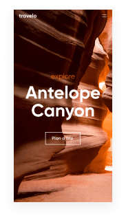
Create retina ready blog website from scratch using our lead-focused templates
Drive more leads with Instapage retina ready blog website template built to maximize conversions. Easy customization - no designer or coding skills needed.
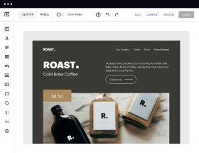
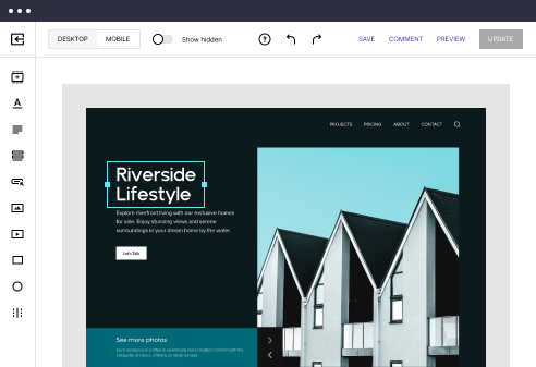
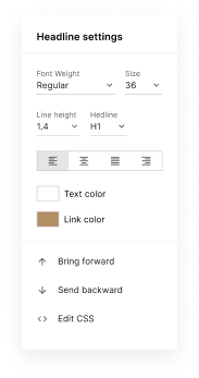
Easy to build without coding
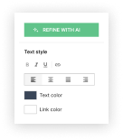
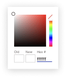
With the intuitive drag-and-drop builder, anyone on your team can create high-converting pages without any knowledge of code or design. Make enhancements to your landing page with custom widgets using Javascript, HTML/CSS, or third-party scripts.
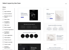
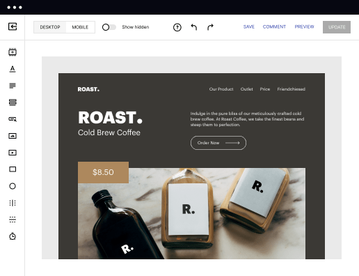
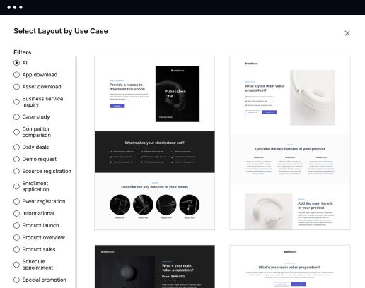
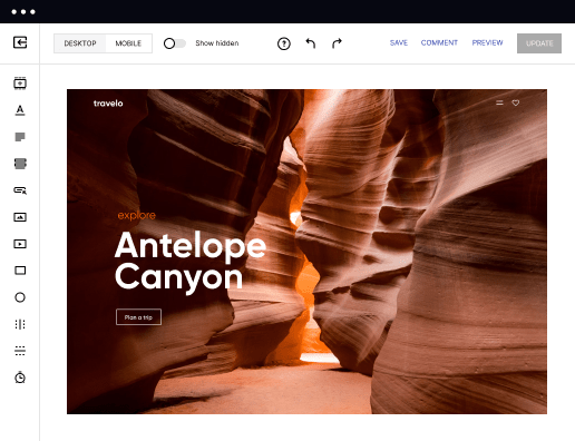
Multiple layouts for any industry and goal
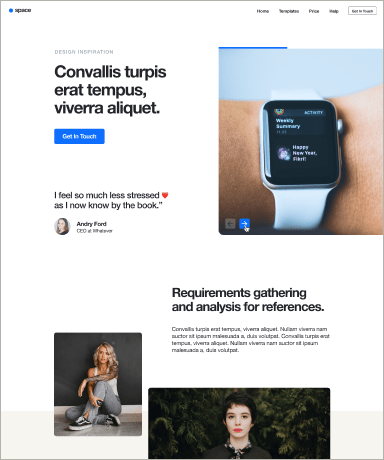
Select from 500+ landing page layouts built to boost conversions across industry-specific scenarios. Customize them by adjusting fonts, adding images, and generating on-brand content with the AI assistant. Quickly scale with Instablocks® and Global Blocks that you can save, reuse, and update globally.
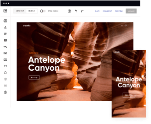
Loads fast and looks polished on any device
Every template is responsive, which means they present professionally on any device and load blazingly fast with our Thor Render Engine. You can also power them up with Google AMP technology to deliver an unparalleled mobile experience and drive higher conversions.
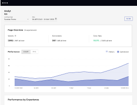
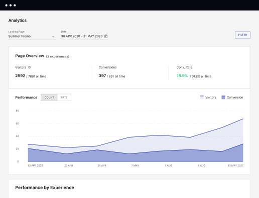
Robust analytics & experimentation
Get real-time updates and reporting across all your devices, showing the number of visitors, conversions, cost-per-visitor, and cost-per-lead. Launch AI-powered experiments, run A/B tests, and use heatmaps to analyze user behavior, then optimize your landing page to maximize conversions.
Easy to build without coding
With the intuitive drag-and-drop builder, anyone on your team can create high-converting pages without any knowledge of code or design. Make enhancements to your landing page with custom widgets using Javascript, HTML/CSS, or third-party scripts.
Multiple layouts for any industry and goal
Select from 500+ landing page layouts built to boost conversions across industry-specific scenarios. Customize them by adjusting fonts, adding images, and generating on-brand content with the AI assistant. Quickly scale with Instablocks® and Global Blocks that you can save, reuse, and update globally.
Loads fast and looks polished on any device
Every template is responsive, which means they present professionally on any device and load blazingly fast with our Thor Render Engine. You can also power them up with Google AMP technology to deliver an unparalleled mobile experience and drive higher conversions.
Robust analytics & experimentation
Get real-time updates and reporting across all your devices, showing the number of visitors, conversions, cost-per-visitor, and cost-per-lead. Launch AI-powered experiments, run A/B tests, and use heatmaps to analyze user behavior, then optimize your landing page to maximize conversions.
All the features you need to build lead-generating landing pages

Landing page builder
Easily create landing pages with the intuitive drag-and-drop page builder that features contextual element editing, over 500 page layouts, and 33 million images.

Visual on-page collaboration
Invite teammates and clients to collaborate on page design in real time to get your pages created, reviewed, and launched faster.

AI content generation
Instantly generate audience-focused content with AI-crafted headlines, paragraphs, and CTAs directly within the Instapage builder.

500+ customizable layouts
Choose from a range of professionally tailored page layouts, specifically designed to enhance conversion rates across numerous industry-specific scenarios.
Instablocks
Quickly build personalized landing pages using individual page blocks that you can customize, save, and reuse.
Thor Render Engine
Our back-end technology ensures that your landing pages load quickly to increase conversions, SEO rankings, and enhance the overall user experience.
AMP
Use Google AMP framework to build and A/B test mobile-responsive pages that load fast and drive more conversions.
Analytics
Seamlessly connect to Google Analytics to get real-time updates on cost-per-visitor and cost-per-lead metrics directly in the Instapage platform.
Learn how to build top-performing landing pages for any goal
FAQs
“Instapage gives us the ability to tailor our landing page content and layout to tell a unique story for each geographical target. The platform also enables us to create different variations with content that performs well for each unique channel. Every marketing team needs this!”

"Instapage has truly maximized our digital advertising performance by enabling us to offer matching, personalized experiences for every ad and audience. Now we can scale our landing page experiences as efficiently and effectively as we scale the ads themselves."

"If we have to wait on a developer, our creative velocity plummets. But Instapage has made it possible for us to exponentially grow our advertising programs and convert more customers"

Leading the way in building high-performing landing pages


A comprehensive guide to using Instapage for effective landing pages and conversion rate optimization
Instapage stands out as the premier landing page and conversion rate optimization (CRO) platform in the USA. Its capabilities enable marketers across various sectors—including business services, tech, education, and financial services—to enhance their digital marketing strategies. By using Instapage's intuitive features, you can transform your campaigns, maximize your return on investment, and drive tangible results.
Understanding the importance of landing pages
Landing pages are critical for digital marketing success, acting as the first point of contact between your target audience and your offerings. With Instapage, marketers can easily create landing pages that not only capture leads but also convert them into loyal customers. Key aspects include:
- Clarity: A well-defined call to action ensures users know exactly what to do.
- Relevance: Align your landing pages with targeted ads for heightened engagement.
- Optimization: Regularly update and optimize landing pages using A/B testing and analytics.
Step 1: Choosing the right template
Begin your journey by selecting one of Instapage's stunning, high-converting templates designed for various industries. The platform offers over 100 pre-built templates that save time and effort. Key factors to consider include:
- Industry relevance: Choose a template that resonates with your vertical.
- Conversion elements: Look for templates with built-in lead generation forms.
- Customization options: Ensure the template is easy to personalize according to your brand.
Step 2: Designing your landing page
With the right template in hand, utilize Instapage’s drag-and-drop functionality for seamless design. This stage involves integrating your brand elements, compelling visuals, and user-friendly navigation. Focus on these elements:
- Branding: Maintain consistent visual identity throughout the page.
- Engagement: Use high-quality images and engaging headlines to attract visitors.
- User feedback: Include forms or chat options for immediate interaction.
Step 3: Implementing optimization strategies
After launching your landing page, your next step is optimization. Instapage offers built-in experimentation features and heatmaps to track user behavior. Utilize these insights to:
- Conduct A/B tests: Vary elements like headlines and images to gauge impact.
- Analyze metrics: Use the analytics dashboard to understand user engagement.
- Iterate: Continuously refine your pages based on performance data.
By following these steps, marketers can ensure their landing pages are not only visually appealing but also primed for conversion. Instapage empowers users with tools that help track metrics, optimize content per audience segment, and improve collaboration across teams.
Ready to elevate your landing page strategy? Start using Instapage today to create high-converting pages that drive results for your marketing campaigns.
People also ask about Retina ready blog website template
Unveiling the Power of Retina Ready Blog Website Templates
Understanding retina ready technology
Retina displays are screens with a pixel density that is high enough that individual pixels cannot be discerned by the human eye at a normal viewing distance. Generally, this means a resolution of at least 300 pixels per inch (ppi). As devices like smartphones, tablets, and laptops continue to evolve, the demand for high-quality visuals has risen sharply. Retina ready technologies ensure that images and graphics render crisply and clearly, making them invaluable for engaging website visitors.
The significance of utilizing retina ready techniques is underscored by the growing popularity of high-resolution screens. In today’s market, a substantial percentage of users access content through devices sporting retina displays. This trend necessitates designs that not only look good on standard screens but also shine on high-resolution displays. Given this landscape, failing to adopt retina ready blog website templates can lead to subpar user experiences and diminished engagement.
Benefits of retina ready designs
Retina ready designs come with several advantages that are crucial for anyone looking to establish a credible online presence. First and foremost, these templates offer enhanced visual clarity and quality, ensuring that images look sharp and engaging on high-density screens. This not only attracts attention but also helps in creating a premium feel for your blog.
Additionally, retina ready designs significantly improve the user experience. As users interact with crisp visuals, they tend to stay longer on the page, reducing bounce rates and fostering deeper engagement with the content. Furthermore, these templates ensure broader compatibility with the latest device technology, allowing blogs to remain relevant as new devices enter the market.
Key features of retina ready blog website templates
When choosing a retina ready blog website template, it is essential to consider specific features that facilitate high-quality presentations. High-quality images play a pivotal role in captivating visuals. It is crucial to utilize retina-ready images that can display vividly across all devices without losing detail. Techniques such as using vector graphics and optimizing image resolution can greatly enhance the user experience.
Use high-resolution images to ensure clarity.
Employ vector graphics for scalability without loss of quality.
Optimize images to strike a balance between quality and loading speed.
Another fundamental feature of retina ready blog templates is fast loading times. The speed at which your website loads directly impacts user retention and is a crucial factor for SEO. Strategies to ensure optimized loading may include compressing images, minimizing HTTP requests, and utilizing caching mechanisms. With less time waiting for content to load, users are more likely to explore additional pages.
Responsive styles tailored for all devices are equally essential. Flexible layouts that adapt to various screen sizes guarantee that visitors enjoy a seamless experience regardless of the device they use. Implementing CSS frameworks such as Bootstrap or Flexbox can streamline this process and enhance the website's responsiveness.
Intuitive navigation for seamless user experience
A critical aspect of any blog website is its navigation structure. Streamlined page navigation is crucial for enhancing user flow and making it easier for readers to find what they need. Clear navigation menus, organized logically, can significantly enhance user experience by ensuring visitors can easily access their desired content.
Use clear labels for navigation menus that reflect the content structure.
Incorporate dropdown menus to manage complex content categorization efficiently.
Ensure that the navigation is responsive and adapts to different screen sizes.
Advanced dropdown menu options can further enhance navigation. These menus are versatile and user-friendly, allowing users to access subcategories without overwhelming the primary navigation. Effective dropdown structures can also cater to content-rich blogs, providing an organized way to present extensive resources.
Structuring content with smart column layouts
Smart column layouts can make a significant difference in how content is perceived and interacted with. Leveraging columns for better organization—for example, using a two- or three-column layout—can guide reader focus and enhance content engagement. When properly designed, these layouts allow users to digest information more fluidly and find related topics at a glance.
Implement multi-column layouts to enhance navigation through content.
Use game columns to encourage interactivity and user involvement.
Avoid clutter by maintaining a balance between visual and textual elements.
Additionally, dynamic content blocks facilitate enhanced readability. By varying the column styles, users can find it easier to engage with the text. For instance, alternating column widths can spotlight featured posts or side notes, ensuring that different types of content are presented effectively.
Engaging features that boost reader interaction
To boost reader interaction, various engaging features should be integrated into your blog. One such feature is diverse email subscription widgets, which help you build your audience. Incorporating clear and visually appealing call-to-action prompts within subscription forms encourages users to subscribe, ultimately leading to long-term engagement.
Use contrasting colors for subscription forms to make them stand out.
Provide incentives for users, such as exclusive content, to encourage sign-ups.
Ensure that subscription forms are easily accessible on various pages.
Another feature crucial for storytelling within your blog is the strategic use of post thumbnails. Thumbnail images are often the first element readers notice; crafting eye-catching thumbnails can significantly increase content engagement. Best practices include using high-quality visuals that are relevant to the post and maintaining a consistent style across thumbnails to establish a recognizable brand.
Maximizing layout potential with sidebars
Sidebars serve as valuable real estate for additional content engagement. Utilizing sidebars effectively involves showcasing popular posts, categories, or advertisements without overwhelming the main content area. This creates an opportunity to engage users further and direct them toward related topics, ultimately keeping them on your site longer.
Showcase popular posts to entice new readers and fill engagement gaps.
Incorporate category lists to help readers discover content relevant to their interests.
Use sidebars for advertisements, ensuring they are non-intrusive.
Enhancing sidebars with widgets and tools can lead to deeper reader engagement. Adding interactive elements, such as social media feeds or comment sections, invites users to engage with your blog actively. Plugins and add-ons can help boost functionality, enabling features like recent comments, social media buttons, or even polls for user feedback.
Final thoughts on choosing the right retina ready template
When selecting a retina ready blog website template, certain considerations should guide your decision-making process. Evaluate template options based on your specific needs, keeping in mind the kind of content you will share and how best to display it. Customizability is also crucial; the ability to modify layouts, colors, and styles allows you to maintain brand consistency.
Ensure that the template is flexible enough to adapt to various content types.
Check for user reviews and feedback to gauge satisfaction with the template.
Consider the support availability in case you run into implementation issues.
Future-proofing your blog is equally important as you select templates. Adopting modern designs and current trends ensures that your blog remains visually appealing and technologically relevant. Commit to ongoing updates and improvements to keep your site aligned with evolving standards, ultimately enhancing user experience and engagement.
Ready to skyrocket conversions?
Supercharge your ad campaigns with high-performing landing pages
Get started