
Responsive wiki website template
Explore Similar TemplatesAbout template
Drive more leads with Instapage responsive wiki website template built to maximize conversions. Easy customization - no designer or coding skills needed.
Recommended templates


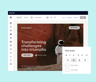
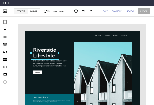
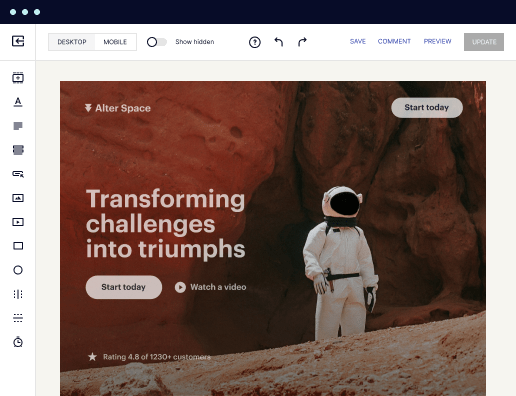
Easy to build without coding
With the intuitive drag-and-drop builder, anyone on your team can create high-converting pages without any knowledge of code or design. Make enhancements to your landing page with custom widgets using Javascript, HTML/CSS, or third-party scripts.
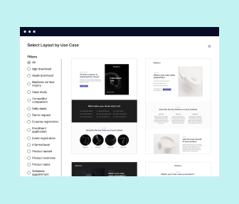
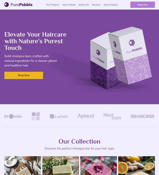
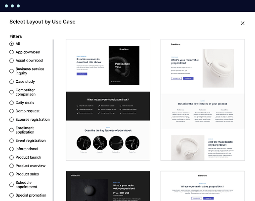
Multiple layouts for any industry and goal
Select from 500+ landing page layouts built to boost conversions across industry-specific scenarios. Customize them by adjusting fonts, adding images, and generating on-brand content with the AI assistant. Quickly scale with Instablocks® and Global Blocks that you can save, reuse, and update globally.
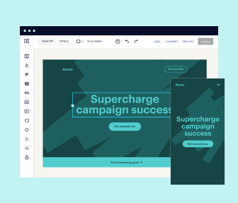
Loads fast and looks polished on any device
Every template is responsive, which means they present professionally on any device and load blazingly fast with our Thor Render Engine. You can also power them up with Google AMP technology to deliver an unparalleled mobile experience and drive higher conversions.
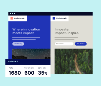
Robust analytics & experimentation
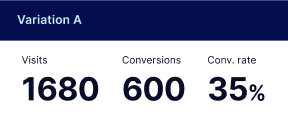
Get real-time updates and reporting across all your devices, showing the number of visitors, conversions, cost-per-visitor, and cost-per-lead. Launch AI-powered experiments, run A/B tests, and use heatmaps to analyze user behavior, then optimize your landing page to maximize conversions.
Easy to build without coding
With the intuitive drag-and-drop builder, anyone on your team can create high-converting pages without any knowledge of code or design. Make enhancements to your landing page with custom widgets using Javascript, HTML/CSS, or third-party scripts.
Multiple layouts for any industry and goal
Select from 500+ landing page layouts built to boost conversions across industry-specific scenarios. Customize them by adjusting fonts, adding images, and generating on-brand content with the AI assistant. Quickly scale with Instablocks® and Global Blocks that you can save, reuse, and update globally.
Loads fast and looks polished on any device
Every template is responsive, which means they present professionally on any device and load blazingly fast with our Thor Render Engine.
Robust analytics & experimentation
Get real-time updates and reporting across all your devices, showing the number of visitors, conversions, cost-per-visitor, and cost-per-lead. Launch AI-powered experiments, run A/B tests, and use heatmaps to analyze user behavior, then optimize your landing page to maximize conversions.
All the features you need to build wiki website templates

Landing page builder
Easily create landing pages with the intuitive drag-and-drop page builder that features contextual element editing, over 500 page layouts, and 33 million images.

Visual on-page collaboration
Invite teammates and clients to collaborate on page design in real time to get your pages created, reviewed, and launched faster.

AI content generation
Instantly generate audience-focused content with AI-crafted headlines, paragraphs, and CTAs directly within the Instapage builder.

500+ customizable layouts
Choose from a range of professionally tailored page layouts, specifically designed to enhance conversion rates across numerous industry-specific scenarios.
Instablocks
Quickly build personalized landing pages using individual page blocks that you can customize, save, and reuse.
Thor Render Engine
Our back-end technology ensures that your landing pages load quickly to increase conversions, SEO rankings, and enhance the overall user experience.
Analytics
Seamlessly connect to Google Analytics to get real-time updates on cost-per-visitor and cost-per-lead metrics directly in the Instapage platform.
Learn how to build top-performing landing pages for any goal
FAQs
“Instapage gives us the ability to tailor our landing page content and layout to tell a unique story for each geographical target. The platform also enables us to create different variations with content that performs well for each unique channel. Every marketing team needs this!”

"Instapage has truly maximized our digital advertising performance by enabling us to offer matching, personalized experiences for every ad and audience. Now we can scale our landing page experiences as efficiently and effectively as we scale the ads themselves."

"If we have to wait on a developer, our creative velocity plummets. But Instapage has made it possible for us to exponentially grow our advertising programs and convert more customers"

Leading the way in building high-performing landing pages


A step-by-step guide to mastering Instapage for landing page optimization
Creating effective landing pages is crucial for accelerating digital marketing campaigns and maximizing ROI. Instapage provides a powerful platform designed for marketers to easily develop, test, and optimize landing pages tailored for various sectors like education, financial services, and technology. This guide will walk you through how to utilize Instapage to enhance your marketing efforts.
Step 1: Choose the Right Template
Utilizing high-converting templates is essential for launching effective landing pages quickly. With over 100 customizable templates available on Instapage, you can begin crafting your unique campaign without the need for extensive design skills.
- Select a template based on your campaign goal — choose from lead generation, webinar registrations, and sales.
- Customize the chosen template using intuitive drag-and-drop elements, ensuring alignment with your brand for consistency.
- Include essential lead generation elements such as forms and CTAs that intuitively lead users towards taking action.
Step 2: Optimize for Higher Conversions
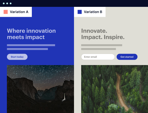
Once you've created your landing page, the next step involves optimization techniques to enhance its effectiveness. Instapage offers built-in experimentation features like A/B testing and detailed heatmaps.
- Conduct A/B testing on different page elements such as headlines, CTAs, and images to identify what resonates with your target audience.
- Utilize heatmaps to assess user behavior — understand where users click and how they navigate your page.
- Analyze performance metrics through Instapage's analytics dashboard to gain insights and implement necessary adjustments.
Step 3: Personalize User Experiences
Personalization is key to enhancing engagement and conversion rates. Instapage allows marketers to dynamically tailor content based on user segments.
- Implement dynamic text replacement to adjust headlines and content on pages based on the traffic source.
- Align specific ads to unique landing pages using AdMaps, improving relevance and user experience.
- Track audience-level metrics to refine campaigns and deliver targeted content that meets the specific needs of different user segments.
After completing these steps, you are well on your way to mastering Instapage and leveraging it for effective landing page creation.
To see significant improvements in your marketing campaigns, embrace tools like Instapage for efficient page production and optimization.
Ready to elevate your marketing strategy? Sign up for Instapage today and start creating high-converting landing pages that drive results!
People also ask about Responsive wiki website template
Exploring the capabilities of a responsive wiki website template
The essence of a responsive wiki website template
A responsive wiki website template is a specially designed layout where users can create, edit, and share content collaboratively. This type of template facilitates the continuous growth of knowledge bases through user-generated content and strong community involvement. Users can easily access the site from various devices without sacrificing functionality or aesthetics.
Responsiveness in web design refers to the capability of a website to adapt its layout and content to fit various screen sizes and orientations. Key attributes include fluid grids, flexible images, and media queries. This approach not only enhances accessibility for users on smartphones and tablets but also improves the overall user experience, making it essential for modern web applications.
The role of a wiki in information sharing
Wikis have transformed how information is shared and collaborated on online. They emerged in the late 1990s as platforms that allowed users to contribute content easily and edit it collaboratively. This change democratized content creation, enabling people from various backgrounds to participate in knowledge sharing.
User-generated content has become increasingly important as more individuals rely on the internet for information. Wikis allow content to be collectively refined, ensuring that the most accurate and up-to-date information is accessible. Consequently, they serve as crucial tools for knowledge sharing in educational, professional, and personal contexts.
Features that enhance user experience and engagement
The design of a responsive wiki website template puts a strong emphasis on user experience, primarily through its user interface and browsing experience. Intuitive navigation is critical, as it allows users of all backgrounds to find the information they need quickly and easily. Features such as sidebars, drop-down menus, and search bars should be easily accessible.
An organized interface plays a fundamental role in enhancing user satisfaction. Users are more likely to engage with a website when they can quickly locate their desired content. Responsive wiki templates should emphasize clarity and ease of use to encourage repeat visits and user contributions.
Intuitive navigation: Simplified access to diverse content.
Organized interface: Enhancing user satisfaction and engagement.
Advanced search feature: Finding information effortlessly
A powerful search feature is vital for any responsive wiki website template. Streamlined search functionalities empower users to quickly locate specific topics, articles, or resources. By incorporating advanced search filters, users can narrow down results based on criteria such as category, relevance, or date of publication.
Examples of effective search functions include options to sort information by popularity, most recently edited, or alphabetically. These features not only enhance usability but also ensure that users are more productive when navigating the wiki.
Facilitating collaboration and community-building
Collaboration is at the heart of what makes wikis unique and valuable. A good responsive wiki website template provides various collaboration features, such as editing permissions and user roles. This setup allows community members to dictate who can contribute or modify content, promoting a healthy and controlled environment for knowledge sharing.
Real-time collaboration is another significant benefit for wiki users. Tools that allow multiple users to work simultaneously encourage teamwork and diverse perspectives, ultimately enriching the content.
Editing permissions: Control who can modify content.
User roles: Allow varied levels of access for contributors.
Real-time collaboration: Empower teamwork and enrich content.
Engagement through hyperlink functionality
Hyperlink functionality enhances the interconnectedness of content within a wiki. By utilizing hyperlinks, content can directly reference related articles or resources, enriching users' understanding of a topic. This technique not only facilitates deeper engagement with the content but also improves the overall learning experience for users.
Effective hyperlinking strategies include linking to breakout topics, related articles, or even externally sourced materials. This gives users a more comprehensive understanding of the context surrounding the information they are exploring.
Tailoring the viewing experience for mobile devices
One of the most essential considerations for a responsive wiki website template is mobile optimization. With an increasing number of users accessing websites via mobile devices, having a layout that adapts smoothly to different screen sizes is vital. This adaptability helps ensure that all users can enjoy a consistent experience, whether they are on a smartphone or a tablet.
Several case studies demonstrate the efficacy of responsive wiki templates, showcasing improved user engagement and reduced bounce rates. Organizations that prioritize mobile-friendly design often see higher visitor retention and increased participation in content creation.
Structuring information with hierarchical content organization
A well-defined hierarchy is critical for organizing information on a wiki site. This structure allows users to navigate through the content effortlessly and locate specific information quickly. One effective approach is creating categories, which group related topics under broader themes, making it easier for users to find desired material.
Implementing tags and subpages further enhances the content organization. Tags can highlight specific themes or keywords across the wiki, while subpages allow for detailed discussions on a particular subject. Together, these strategies result in a logical framework that significantly improves user experience.
Categories: Group related topics for easier navigation.
Tags: Highlight specific themes or keywords across the wiki.
Subpages: Allow for detailed discussions on specific subjects.
Enriching content with analytics tools
Utilizing analytics tools is crucial for assessing and enhancing content quality on a wiki site. A comprehensive set of analytics features allows administrators to track user engagement, popular articles, and content effectiveness. This data-driven approach enables wiki managers to make informed decisions, optimizing both content and user experience.
Some available analytics tools include dashboards, user tracking, and heatmaps that visualize on-page behavior. By understanding how users interact with content, wiki operators can continuously improve the platform's usability and relevance.
Supporting users for a seamless experience
Robust support systems are fundamental to the success of any responsive wiki website template. Users should have easy access to various support options, such as FAQs, forums, or customer service. These resources empower users to solve problems independently or seek help when needed.
Additionally, knowledge bases and community support are crucial for ensuring ongoing user satisfaction. By fostering a supportive environment, wiki operators can encourage active participation and loyalty among their members.
Maximizing the benefits of a responsive wiki website template
A responsive wiki website has the potential to transform the way organizations manage information. Building a dynamic online resource center allows businesses to maintain a comprehensive repository of knowledge that is regularly updated and relevant. Best practices for maintaining wiki content include appointing dedicated contributors, encouraging regular updates, and integrating community feedback to keep information current.
Furthermore, organizations must stay informed about future trends in wiki website development. As user needs change, so do the features that will enhance collaboration and information sharing. Keeping abreast of innovations in this area helps ensure that a wiki site remains relevant and valuable.
Final thoughts: The future of responsive wiki templates
As user expectations and technological advancements continue to evolve, the future of responsive wiki templates will depend on anticipating those needs. Enhancements in user experience, design, and collaboration tools will play a significant role in shaping the development of these platforms. It’s crucial for developers to emphasize continuous improvement and innovation in features to adapt to emerging trends effectively.
By recognizing the importance of ongoing adaptation and strategic planning, organizations can build responsive wiki websites that address their users' changing needs. These platforms will maintain their relevance, support growing knowledge bases, and foster strong online communities.
Ready to skyrocket conversions?
Supercharge your ad campaigns with high-performing landing pages
Get started