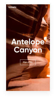
Bring your ideas to life with Instapage's responsive quick links page template
Unleash your creativity with the responsive quick links page template. Try Instapage today.
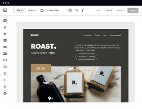
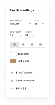
Easy to build without coding
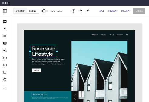
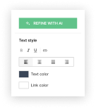
With the intuitive drag-and-drop builder, anyone on your team can create high-converting pages without any knowledge of code or design. Make enhancements to your landing page with custom widgets using Javascript, HTML/CSS, or third-party scripts.
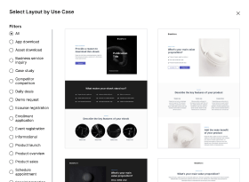
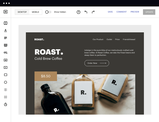
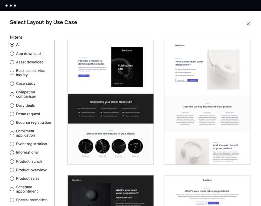
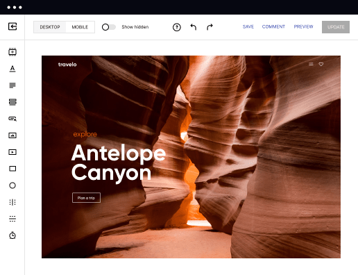
Multiple layouts for any industry and goal
Select from 500+ landing page layouts built to boost conversions across industry-specific scenarios. Customize them by adjusting fonts, adding images, and generating on-brand content with the AI assistant. Quickly scale with Instablocks® and Global Blocks that you can save, reuse, and update globally.
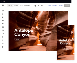
Loads fast and looks polished on any device
Every template is responsive, which means they present professionally on any device and load blazingly fast with our Thor Render Engine. You can also power them up with Google AMP technology to deliver an unparalleled mobile experience and drive higher conversions.
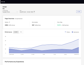
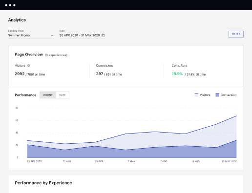
Robust analytics & experimentation
Get real-time updates and reporting across all your devices, showing the number of visitors, conversions, cost-per-visitor, and cost-per-lead. Launch AI-powered experiments, run A/B tests, and use heatmaps to analyze user behavior, then optimize your landing page to maximize conversions.
Easy to build without coding
With the intuitive drag-and-drop builder, anyone on your team can create high-converting pages without any knowledge of code or design. Make enhancements to your landing page with custom widgets using Javascript, HTML/CSS, or third-party scripts.
Multiple layouts for any industry and goal
Select from 500+ landing page layouts built to boost conversions across industry-specific scenarios. Customize them by adjusting fonts, adding images, and generating on-brand content with the AI assistant. Quickly scale with Instablocks® and Global Blocks that you can save, reuse, and update globally.
Loads fast and looks polished on any device
Every template is responsive, which means they present professionally on any device and load blazingly fast with our Thor Render Engine. You can also power them up with Google AMP technology to deliver an unparalleled mobile experience and drive higher conversions.
Robust analytics & experimentation
Get real-time updates and reporting across all your devices, showing the number of visitors, conversions, cost-per-visitor, and cost-per-lead. Launch AI-powered experiments, run A/B tests, and use heatmaps to analyze user behavior, then optimize your landing page to maximize conversions.
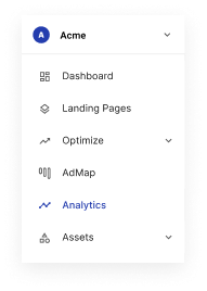
All the features you need to build lead-generating landing pages

Landing page builder
Easily create landing pages with the intuitive drag-and-drop page builder that features contextual element editing, over 500 page layouts, and 33 million images.

Visual on-page collaboration
Invite teammates and clients to collaborate on page design in real time to get your pages created, reviewed, and launched faster.

AI content generation
Instantly generate audience-focused content with AI-crafted headlines, paragraphs, and CTAs directly within the Instapage builder.

500+ customizable layouts
Choose from a range of professionally tailored page layouts, specifically designed to enhance conversion rates across numerous industry-specific scenarios.
Instablocks
Quickly build personalized landing pages using individual page blocks that you can customize, save, and reuse.
Thor Render Engine
Our back-end technology ensures that your landing pages load quickly to increase conversions, SEO rankings, and enhance the overall user experience.
AMP
Use Google AMP framework to build and A/B test mobile-responsive pages that load fast and drive more conversions.
Analytics
Seamlessly connect to Google Analytics to get real-time updates on cost-per-visitor and cost-per-lead metrics directly in the Instapage platform.
Learn how to build top-performing landing pages for any goal
FAQs
“Instapage gives us the ability to tailor our landing page content and layout to tell a unique story for each geographical target. The platform also enables us to create different variations with content that performs well for each unique channel. Every marketing team needs this!”

"Instapage has truly maximized our digital advertising performance by enabling us to offer matching, personalized experiences for every ad and audience. Now we can scale our landing page experiences as efficiently and effectively as we scale the ads themselves."

"If we have to wait on a developer, our creative velocity plummets. But Instapage has made it possible for us to exponentially grow our advertising programs and convert more customers"

Leading the way in building high-performing landing pages


A step-by-step guide to using instapage
Unlock the full potential of your digital marketing campaigns with Instapage's powerful landing page and CRO platform. By following this step-by-step guide, you can learn to utilize the robust features and templates Instapage offers, transforming your campaign strategies and maximizing your ROI. Each step ensures that marketers from various sectors can optimize their approach to customer engagement and lead generation effectively.
Step 1: Choose the Right Template
Selecting the perfect landing page template is crucial to capture your audience's attention. Instapage offers over 100 ready-to-use, high-converting templates that can be customized based on your brand's identity and campaign goals. Focus on templates designed for your specific industry to resonate better with your target audience. Consider the following:
- Customization: Adjust colors, fonts, and images to align with your brand.
- Relevance: Choose a template that caters to the specific offer or service you are promoting.
- Lead Generation: Opt for layouts that include lead capture forms and call-to-action buttons prominently.
Step 2: Optimize for Conversions
Once you've selected a template, it’s time to focus on optimization. Instapage includes built-in experimentation features that enable you to A/B test different elements of your landing page, ensuring you can identify what works best:
- Heatmaps: Utilize heatmaps to analyze on-page behavior and understand where users click most.
- A/B Testing: Run tests on headlines, images, and call-to-action buttons to gauge which variations drive the most conversions.
- Performance Analytics: Regularly check the analytics dashboard to assess which campaigns yield the highest ROI.
Step 3: Personalize Content
To engage visitors effectively, consider personalization strategies. Instapage allows dynamic text replacement to tailor messaging for different user demographics. You can also align banners with specific audience segments using the AdMaps feature. Here are some tactics to implement:
- Dynamic Content: Alter headlines or images based on the referring ad to enhance user relevance.
- Audience Segmentation: Use data tools to track engagement metrics specific to each audience type.
- Consistent Messaging: Ensure that the landing page content mirrors the promise made in the ad to maintain trust.
By following these steps, you're not just creating a basic landing page; you're building experiences that convert visitors into customers.
Instapage empowers marketers with the tools needed to enhance their landing page strategies, making it easier to achieve effective and optimized outreach.
Ready to transform your landing pages? Start with Instapage today, and watch your marketing campaigns thrive!
People also ask about Responsive quick links page template
Understanding the Importance of Responsive Quick Links Page Templates
The evolution of landing pages
The history of landing pages is closely intertwined with the growth of digital marketing. Initially, these pages emerged as effective tools for capturing leads, providing essential information about products and services. Early landing pages were typically basic, designed primarily for conversion without much regard for user experience. As the internet evolved, so too did the sophistication of these pages, transitioning from static HTML structures to dynamic designs that engage users on multiple levels.
Despite these advancements, the core purpose of landing pages remains the same: directing users towards taking specific actions. This emphasizes the importance of understanding the distinction between landing pages and other types of web pages. Unlike standard web pages that often serve broad purposes, landing pages are highly focused, designed with one intention — maximizing conversion rates. Their effectiveness lies in harnessing user engagement through streamlined navigation and compelling calls to action.
Exploring responsive design
Responsive design refers to a web development approach aimed at creating pages that adapt smoothly to various viewing environments. This means that a page built with responsive principles will function seamlessly on a wide range of devices, from desktop monitors to mobile phones. The importance of adaptability cannot be overstated; as users increasingly access the internet through their mobile devices, responsive design has become a critical factor for websites aiming to retain user interest and enhance overall satisfaction.
Statistics indicate that a significant portion of web traffic now comes from mobile users. This surge in mobile usage directly impacts user experience, influencing everything from navigation ease to load times. Websites that fail to provide mobile-friendly experiences risk alienating a substantial chunk of their audience, leading to decreased retention rates and reduced conversions. Thus, investing in responsive design is not merely a trend; it's a necessity for businesses aiming to succeed in the digital landscape.
The concept of quick links pages
Quick links pages serve as hubs of curated shortcuts, allowing users fast access to the most relevant content on a website. Typically characterized by their straightforward layout, these pages prioritize functionality, featuring essential links that guide users to important segments of a site. Common elements often found on quick links pages include categorized links, icons for easy navigation, and even brief descriptions to provide additional context about each link.
Businesses across various sectors utilize quick links pages in a multitude of ways. For instance, educational institutions may employ them to offer students a centralized location for resources like course materials and administrative services. Similarly, e-commerce platforms can simplify user navigation by directing customers to product categories, support options, and promotions. Ultimately, the structured navigation afforded by quick links pages enhances user experience by minimizing the effort required to find desired information.
Key features of responsive quick links page templates
An effective responsive quick links page template should boast intuitive layouts that promote ease of use. Design elements such as clear headings, adequate spacing, and logical flow enhance user interactions significantly. Visual hierarchy also plays a crucial role; it ensures that the most important links are prominently displayed, thereby guiding users naturally toward desired actions. Without a clear layout, users may find themselves confused or overwhelmed, diminishing the overall effectiveness of the quick links page.
Customization options should not be overlooked in responsive templates. Brands must maintain a unique identity, and the ability to align the design of quick links pages to specific branding enables this. This means incorporating colors, fonts, and logos to create cohesive user experiences across all touchpoints. Additionally, adaptive content blocks allow businesses to smartly organize resources, highlighting important links or newly featured content to keep users engaged and informed.
The technical backbone of quick links templates
For a quick links page template to function optimally, it must be compatible with popular platforms such as WordPress or HubSpot. Ensuring seamless integration into existing websites is vital for maintaining user experiences without disruptions. Marketers should consider practical steps to facilitate this integration, from understanding the necessary plugins to configuring settings correctly, making it simpler for users to navigate to relevant content.
Another crucial technical aspect is page load speed. In a world where users expect instant access to information, performance can significantly affect user retention. Techniques such as optimizing images, minimizing redirects, and utilizing content delivery networks (CDNs) can enhance loading times across devices. By prioritizing speed, businesses will not only improve user satisfaction but also benefit their overall search engine rankings.
Crafting the ideal responsive quick links page
Creating an effective responsive quick links page involves several key steps. First, selecting the right landing page template is crucial to ensure it aligns with brand identity and user expectations. Once a template is chosen, laying out links according to a logical hierarchy is essential; this helps users easily navigate through the page to find what they're looking for. Using groupings or categories will streamline access to different sections, ultimately improving usability.
To guarantee mobile optimization, businesses should prioritize accessibility and user-friendly navigation. Testing the responsiveness of the page across various devices and screen sizes is imperative. This process helps identify any areas that may need adjustments for mobile users. Tools like Google’s Mobile-Friendly Test can offer valuable insights to ensure pages are genuinely responsive, providing a consistent experience regardless of how users access the site.
Enhancing user experience through design
Visual appeal is paramount in engaging users and encouraging interactions. High-quality graphics, thoughtfully laid-out content, and appealing typography can make a significant difference in capturing user attention. Employing a clean and modern aesthetic contributes to a professional impression, communicating the brand's dedication to user experience and quality. Providing users with a pleasant visual experience can lead to increased time spent on the page and greater interaction rates.
User feedback plays a vital role in continually improving designs. Collecting insights from users about their experience can reveal weaknesses or areas for enhancement, guiding iterative improvements. Regularly updating designs based on this feedback not only optimizes the quick links page but also demonstrates to users that their opinions are valued, fostering customer loyalty.
Real-life examples and case studies
Numerous businesses have successfully implemented quick links pages to enhance user experience and boost conversion rates. For instance, an online retailer that designed a quick links page structured around user interests saw a notable increase in interactions. By directing users to popular categories and current promotions, they tracked higher engagement levels and lower bounce rates. These strategies highlight how effective organization and user-centric design can yield tangible results.
Additionally, analyzing metrics such as click-through rates and conversion performances helps ascertain the effectiveness of quick links pages. Tools like Google Analytics can provide vital data on user behavior, allowing marketers to make informed decisions and refine their strategies. By continuously monitoring these metrics, businesses can implement enduring optimization processes, ultimately leading to increased conversion rates over time.
Future trends in landing page development
As the landscape of web development continues to evolve, so do the templates we utilize for creating landing pages. One emerging trend is the use of AI-driven templates, which can automate aspects of design and content placement. This not only expedites the page creation process but also enhances user experience through personalized content and dynamic interfaces. Embracing these technologies can potentially reshape how businesses connect with their customers online.
In addition to AI, predictions for the evolution of responsive design suggest an ongoing emphasis on mobile-friendliness. As devices with varying screen sizes continue to proliferate, the need for adaptive design will remain vital. Businesses must prioritize mobile optimization to remain competitive, ensuring that their quick links pages cater to users' changing preferences and expectations.
Resources for further learning
For marketers eager to expand their understanding of creating impressive quick links pages, comprehensive tutorials focusing on platforms like WordPress provide invaluable insights. These educational resources cover essential steps for integrating quick links templates into existing websites, offering foundational knowledge for beginners and tips for advanced users aiming to elevate their pages further.
Staying current with design trends is equally crucial. Engaging with websites and communities that specialize in web design can keep marketers informed about evolving best practices. Continuous education in these areas not only aids in keeping landing pages fresh and engaging but also reinforces the competitive edge in an ever-changing digital marketplace.
Ready to skyrocket conversions?
Supercharge your ad campaigns with high-performing landing pages
Get started