Pastel heatmap page template
Explore Similar TemplatesAbout template
Unleash your creativity with the pastel heatmap page template. Try Instapage today.
Recommended templates

Easy to build without coding
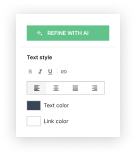
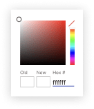
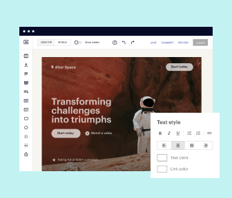
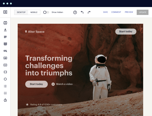
With the intuitive drag-and-drop builder, anyone on your team can create high-converting pages without any knowledge of code or design. Make enhancements to your landing page with custom widgets using Javascript, HTML/CSS, or third-party scripts.
Multiple layouts for any industry and goal
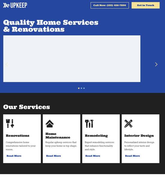
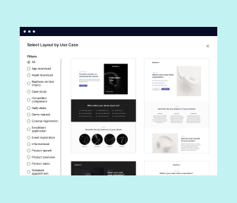
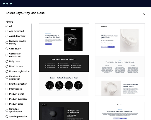
Select from 500+ landing page layouts built to boost conversions across industry-specific scenarios. Customize them by adjusting fonts, adding images, and generating on-brand content with the AI assistant. Quickly scale with Instablocks® and Global Blocks that you can save, reuse, and update globally.
Loads fast and looks polished on any device
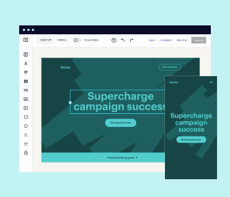
Every template is responsive, which means they present professionally on any device and load blazingly fast with our Thor Render Engine. You can also power them up with Google AMP technology to deliver an unparalleled mobile experience and drive higher conversions.
Robust analytics & experimentation
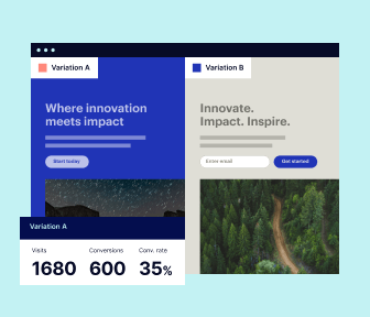
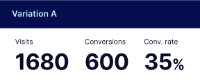
Get real-time updates and reporting across all your devices, showing the number of visitors, conversions, cost-per-visitor, and cost-per-lead. Launch AI-powered experiments, run A/B tests, and use heatmaps to analyze user behavior, then optimize your landing page to maximize conversions.

Easy to build without coding
With the intuitive drag-and-drop builder, anyone on your team can create high-converting pages without any knowledge of code or design. Make enhancements to your landing page with custom widgets using Javascript, HTML/CSS, or third-party scripts.
Multiple layouts for any industry and goal
Select from 500+ landing page layouts built to boost conversions across industry-specific scenarios. Customize them by adjusting fonts, adding images, and generating on-brand content with the AI assistant. Quickly scale with Instablocks® and Global Blocks that you can save, reuse, and update globally.
Loads fast and looks polished on any device
Every template is responsive, which means they present professionally on any device and load blazingly fast with our Thor Render Engine.
Robust analytics & experimentation
Get real-time updates and reporting across all your devices, showing the number of visitors, conversions, cost-per-visitor, and cost-per-lead. Launch AI-powered experiments, run A/B tests, and use heatmaps to analyze user behavior, then optimize your landing page to maximize conversions.
All the features you need to build lead-generating landing pages

Landing page builder
Easily create landing pages with the intuitive drag-and-drop page builder that features contextual element editing, over 500 page layouts, and 33 million images.

Visual on-page collaboration
Invite teammates and clients to collaborate on page design in real time to get your pages created, reviewed, and launched faster.

AI content generation
Instantly generate audience-focused content with AI-crafted headlines, paragraphs, and CTAs directly within the Instapage builder.

500+ customizable layouts
Choose from a range of professionally tailored page layouts, specifically designed to enhance conversion rates across numerous industry-specific scenarios.
Instablocks
Quickly build personalized landing pages using individual page blocks that you can customize, save, and reuse.
Thor Render Engine
Our back-end technology ensures that your landing pages load quickly to increase conversions, SEO rankings, and enhance the overall user experience.
Analytics
Seamlessly connect to Google Analytics to get real-time updates on cost-per-visitor and cost-per-lead metrics directly in the Instapage platform.
Learn how to build top-performing landing pages for any goal
FAQs
“Instapage gives us the ability to tailor our landing page content and layout to tell a unique story for each geographical target. The platform also enables us to create different variations with content that performs well for each unique channel. Every marketing team needs this!”

"Instapage has truly maximized our digital advertising performance by enabling us to offer matching, personalized experiences for every ad and audience. Now we can scale our landing page experiences as efficiently and effectively as we scale the ads themselves."

"If we have to wait on a developer, our creative velocity plummets. But Instapage has made it possible for us to exponentially grow our advertising programs and convert more customers"

Leading the way in building high-performing landing pages


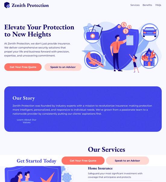
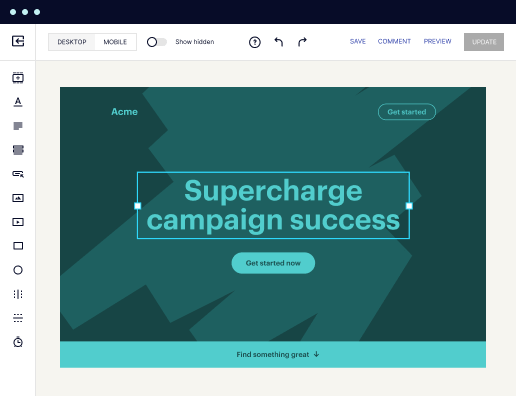
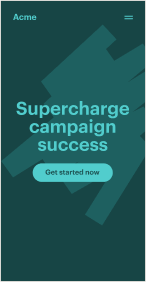
Unlock the Power of the Pastel Heatmap Page Template
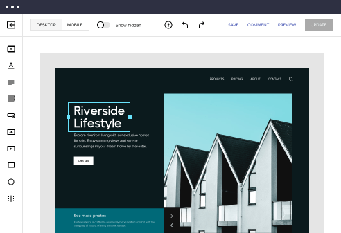
The Pastel heatmap page template is designed to enhance user experience and maximize conversion rates for your online marketing strategies. By integrating sophisticated design elements and analytics-driven insights, Instapage's heatmap feature empowers marketers to visualize user interactions effectively, ensuring every campaign is optimized for success.
Understanding Heatmap Functionality
Heatmaps provide a visual representation of user behavior on landing pages, showcasing where visitors click, scroll, and engage. With the Pastel heatmap page template, marketers can gain profound insights into user interactions, making it easier to identify areas needing improvement. Here are three key functionalities:
- Visualize user engagement: Instapage's heatmaps allow you to see the exact areas of your landing page that attract the most attention, helping you to optimize your design and layout.
- Identify user pain points: Pinpoint where visitors drop off or show disinterest, enabling you to adjust elements that may be hindering conversions.
- Make data-driven decisions: Understand the performance of different elements on your page, allowing you to iterate and enhance your content based on user behavior.
Setting Up the Pastel Heatmap Page Template
To effectively harness the capabilities of the Pastel heatmap page template, follow these initial steps:
- Choose the right template: Begin by selecting the Pastel heatmap template that aligns with your campaign goals, keeping in mind audience preferences and behavior.
- Integrate lead generation elements: Utilize the built-in lead generation tools to capture user data while allowing for seamless tracking through heatmap functionalities.
- Launch and monitor: After launching your page, use real-time analytics to track user behavior, gathering insights to inform future adjustments.
Analyzing Data from the Heatmap
Once user data flows in through the Pastel heatmap template, it’s essential to interpret this data effectively. Focus on these areas:
- Examine click patterns: Discover which calls-to-action or links are performing best to replicate successful elements across your campaign.
- Assess scroll depth: Evaluate how far users are scrolling down your page to adjust content length and visibility of key information.
- Identify conversion pathways: Recognize which pages lead users to complete desired actions and optimize them for enhanced performance.
The Pastel heatmap page template streamlines the process of optimizing landing pages, making it an invaluable resource for marketers aiming to boost their ROI.
Explore how the Pastel heatmap page template can elevate your marketing campaigns by providing deeper insights into user interactions.
Ready to enhance your landing page performance? Sign up for Instapage today and get started with the Pastel heatmap template to experience unparalleled conversion tracking.
Understanding the essence of pastel heatmap page templates
The beauty of pastels: A brief overview
Pastel colors are a range of soft, muted shades that offer a gentle visual appeal. These colors, often characterized by their low saturation and high brightness, evoke a sense of tranquility and warmth. In design, pastels hold significant value, especially when creating interfaces or experiences aimed at comfort and approachability. Their calming nature tends to resonate well with audiences, making them an excellent choice for marketing and branding.
Emotional impact plays a critical role in design, and pastel hues deliver subtle yet profound effects on viewers. These tones are typically linked with feelings of creativity and friendliness, disarming the observer and fostering a positive connection. Businesses aiming to communicate serenity and reliability often leverage pastel colors in their branding. By instilling a sense of calmness through color psychology, brands can enhance user experience and loyalty.
Visual dynamics: The role of heatmaps in design
Heatmaps have become invaluable tools in contemporary web design, serving the purpose of visually representing data concerning user interaction on a webpage. This technology utilizes color coding to indicate levels of activity; for instance, areas of a page that attract more clicks may display in warmer colors while cooler colors indicate less engagement. By deploying heatmaps, marketers can gain critical insights into users' behaviors and preferences.
Through this visualization, businesses can optimize their landing pages effectively. By analyzing heatmaps, they gather data on how users navigate their site, which elements draw interest, and where users become disengaged. This analytics-driven approach to design enables teams to enhance user engagement and conversion rates effectively, tailoring the webpage features to increase effectiveness and appeal.
Pastel color palette: Choosing the right shades for your brand
Choosing the right pastel colors for a brand involves understanding the psychology behind colors and their impact on the audience. For instance, soft pinks may evoke feelings of tenderness and care, while pastel greens can symbolize growth and tranquility. By thoughtfully orchestrating a pastel palette, businesses can foster a brand image that aligns with their values and resonates with their target audience.
Incorporating existing brand colors into a pastel palette can enhance brand consistency. A few strategies include identifying key shades from the brand logo and blending them with complementary pastel hues. For example, a tech company might blend their signature blue with soft lilac, crafting a soothing experience while reinforcing brand identity. Successful brands such as Airbnb and Mailchimp showcase how pastel schemes can enhance aesthetics without compromising brand recognition.
Tailoring the pastel heatmap experience for different audiences
Understanding your target demographic is essential when designing with pastels. Different segments may respond uniquely to color choices based on factors like age, culture, and gender. For example, younger audiences might favor bolder pastels that elude a sense of vibrancy, while older consumers may gravitate toward softer, muted shades that convey reliability and sophistication.
A persona-based pastel palette facilitates a more tailored approach. By recognizing the preferences and characteristics of specific audience segments, designers can create heatmap experiences that engage users effectively. Campaigns aimed at millennials could integrate fresh pastel colors like mint and coral, while targeting seniors might focus on more subdued shades like powder blue and soft beige. Engaging stories or messages can significantly enhance the effectiveness of these tailored strategies.
The intersection of information design and pastel heatmaps
Information design represents the art of communicating complex data in ways that are clear and understandable. By leveraging pastel heatmaps as part of this strategy, designers can create visual narratives that facilitate effective storytelling. Pastel heatmaps can convey engagement levels while remaining aesthetically pleasing, allowing users to understand interactions without feeling overwhelmed.
Practical applications abound when blending information design with pastel aesthetics. Case studies could highlight how a nonprofit used pastel heatmaps to visualize donation trends—successfully simplifying data interpretation for stakeholders. By using heatmaps, organizations can drive home impactful stories, compelling users to take action and engage with visually explained content.
Practical steps to create a pastel heatmap page template
Creating a pastel heatmap page template involves a series of practical steps designed to streamline the design process. First, gather your design tools. Essential software like Adobe XD or Sketch can help in creating mockups, while specific plugins for heatmap integration can make your design implementation seamless. Consider tools like Hotjar or Crazy Egg, which offer heatmap functionality to analyze interactions over time.
Next, craft your pastel palette. Choose complementary pastel shades that align with your brand’s identity—consider using resources like Adobe Color Wheel to test combinations. Lastly, utilize heatmap features effectively. If you are working on Instapage, implement heatmaps during the testing phase and analyze user interactions to optimize your design. Remember, understanding the heatmap data can enhance decision-making and improve overall page performance.
Enhancing user experience with emotional design
Pastel colors significantly influence user feelings and behaviors when interacting with landing pages. By invoking soft hues, designers can create inviting environments that elicit positive emotional responses from users, which leads to more effective engagement. Studies show that users tend to spend longer on pages designed with pastel colors compared to those with more aggressive palettes, enhancing the likelihood of conversion.
Additionally, balancing aesthetics and functionality remains crucial. Users appreciate visually appealing designs, but these must function effectively to retain attention. When executed correctly, pastel schemes can complement functional elements such as CTAs and navigation, creating a harmonious interface that feels natural and encouraging to the viewer.
Collaborative work: The role of team dynamics in design choices
Collaboration is a pivotal aspect of effective design processes. Making decisions about color palettes, especially with pastel schemes, requires diverse opinions to reflect the variety of audience perspectives. Encouraging cross-disciplinary brainstorming sessions among writers, designers, and marketers fosters a richer understanding of user needs and preferences. This collaborative environment leads to more informed design choices and innovative solutions.
During brainstorming, teams can explore various nuances of pastel choices—examining how different shades may resonate with target demographics. As collective insights influence conceptual development, the resulting designs typically better reflect the overarching goals of the campaign, yielding landing pages that resonate more deeply with audiences.
The human element: Stories behind pastel choices
Understanding why designers gravitate toward pastel colors can yield valuable insights into color usage in marketing. Interviews with designers who favor pastel palettes reveal personal stories and experiences influencing their choices. An underlying thread often emerges relating past experiences with color to present design decisions. These narratives lend a human element to pastel choices, emphasizing the emotional aspects of design.
Psychological studies into color usage confirm that our experiences shape emotional responses to specific colors. These relationships significantly impact design preferences, as designers aim to connect with audiences on a personal level. Insights drawn from these experiences can guide future design choices and increase the effectiveness of pastel color palettes in marketing contexts.
Tracking success: Measuring the impact of pastel heatmap designs
Tracking the success of pastel heatmap designs involves identifying key performance indicators (KPIs) that truly reflect effectiveness. Metrics such as conversion rates, bounce rates, and click-through rates offer valuable insights into user engagement. By analyzing these KPIs, marketers can better understand how users respond to their pastel heatmap designs and make informed decisions for adjustments.
User feedback is another crucial component. Conducting user surveys can reveal perceptions of color choices or overall design aesthetics. Behavioral analysis collected via heatmaps also highlights interactions and interests, allowing for further refinements. When businesses combine quantitative data with qualitative insights, they can create iterative cycles of improvements that enhance the effectiveness of their landing pages.
Overcoming common challenges in using pastel heatmap templates
Employing pastel heatmap templates can present challenges, such as ensuring visibility and usability. One common pitfall is creating designs that may feel too soft or muted, risking user disengagement. Ensuring that essential elements stand out against pastel backgrounds requires finely-tuned contrasts and visual hierarchies. Conducting thorough user testing can help identify visibility issues early in the design process.
Additionally, communicating any difficult design choices to clients or stakeholders can pose challenges. A transparent approach that showcases data-driven reasoning, supported by heatmap insights, can aid in justifying decisions. Problem-solving strategies should focus on maintaining an open dialogue about user feedback and design goals, fostering collaborative resolutions that satisfy both aesthetic and functional needs.
Future trends in pastel design and heatmapping
The landscape of pastel design and heatmapping continues to evolve, reflecting shifts in user preferences and advancements in technology. Emerging trends indicate that incorporating more interactive elements and customizable features in heatmaps will be vital, allowing designers to visualize data yet maintain the delightful aesthetics of pastel hues. As the focus on emotional design grows, blending functionality with captivating colors will remain essential.
Predictions reveal that the personalization of pastel palettes tailored to specific user segments will gain traction in marketing strategies. New tools and features in platforms like Instapage that enhance dynamic visualization could facilitate even greater customization, permitting teams to meet diverse user demands in real-time effectively. The continued advancement of design technology promises exciting possibilities for pastel palettes and heatmap integration in the years ahead.
Ready to skyrocket conversions?
Supercharge your ad campaigns with high-performing landing pages
Get started