
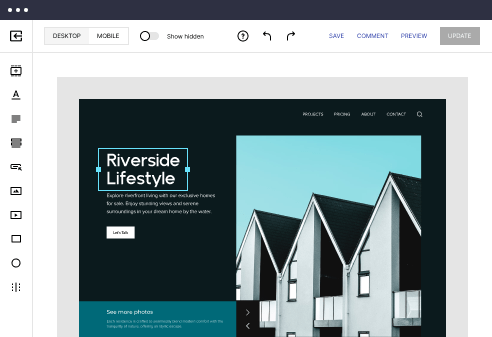
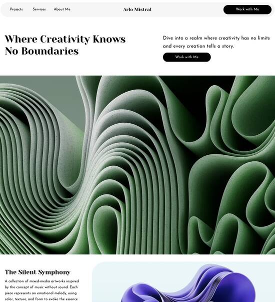
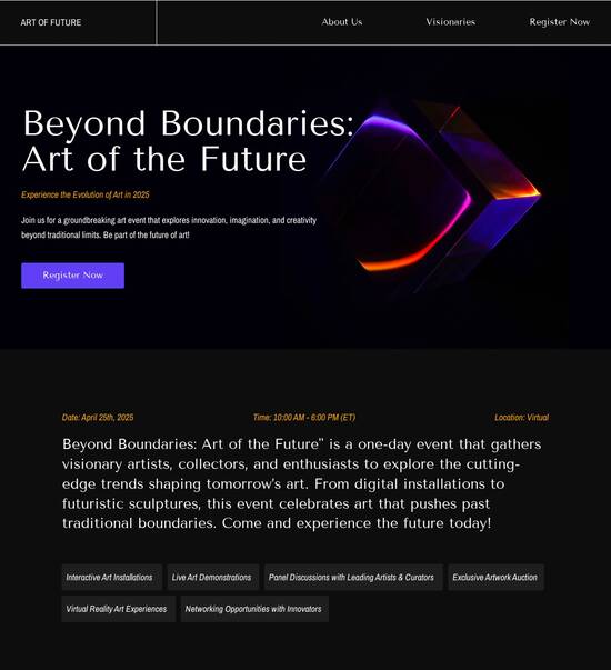
Natural & organic comparison website template
Explore Similar TemplatesAbout template
Drive more leads with Instapage natural & organic comparison website template built to maximize conversions. Easy customization - no designer or coding skills needed.
Recommended templates

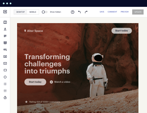
Easy to build without coding
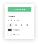
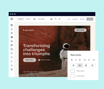
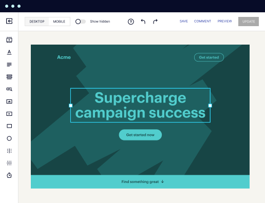
With the intuitive drag-and-drop builder, anyone on your team can create high-converting pages without any knowledge of code or design. Make enhancements to your landing page with custom widgets using Javascript, HTML/CSS, or third-party scripts.
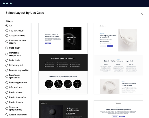
Multiple layouts for any industry and goal
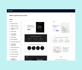
Select from 500+ landing page layouts built to boost conversions across industry-specific scenarios. Customize them by adjusting fonts, adding images, and generating on-brand content with the AI assistant. Quickly scale with Instablocks® and Global Blocks that you can save, reuse, and update globally.
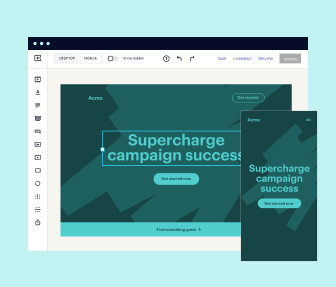
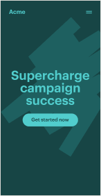
Loads fast and looks polished on any device
Every template is responsive, which means they present professionally on any device and load blazingly fast with our Thor Render Engine. You can also power them up with Google AMP technology to deliver an unparalleled mobile experience and drive higher conversions.
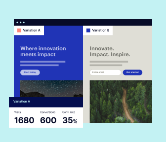
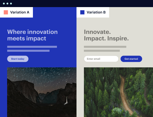
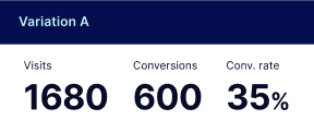
Robust analytics & experimentation
Get real-time updates and reporting across all your devices, showing the number of visitors, conversions, cost-per-visitor, and cost-per-lead. Launch AI-powered experiments, run A/B tests, and use heatmaps to analyze user behavior, then optimize your landing page to maximize conversions.
Easy to build without coding
With the intuitive drag-and-drop builder, anyone on your team can create high-converting pages without any knowledge of code or design. Make enhancements to your landing page with custom widgets using Javascript, HTML/CSS, or third-party scripts.
Multiple layouts for any industry and goal
Select from 500+ landing page layouts built to boost conversions across industry-specific scenarios. Customize them by adjusting fonts, adding images, and generating on-brand content with the AI assistant. Quickly scale with Instablocks® and Global Blocks that you can save, reuse, and update globally.
Loads fast and looks polished on any device
Every template is responsive, which means they present professionally on any device and load blazingly fast with our Thor Render Engine.
Robust analytics & experimentation
Get real-time updates and reporting across all your devices, showing the number of visitors, conversions, cost-per-visitor, and cost-per-lead. Launch AI-powered experiments, run A/B tests, and use heatmaps to analyze user behavior, then optimize your landing page to maximize conversions.
All the features you need to build lead-generating landing pages

Landing page builder
Easily create landing pages with the intuitive drag-and-drop page builder that features contextual element editing, over 500 page layouts, and 33 million images.

Visual on-page collaboration
Invite teammates and clients to collaborate on page design in real time to get your pages created, reviewed, and launched faster.

AI content generation
Instantly generate audience-focused content with AI-crafted headlines, paragraphs, and CTAs directly within the Instapage builder.

500+ customizable layouts
Choose from a range of professionally tailored page layouts, specifically designed to enhance conversion rates across numerous industry-specific scenarios.
Instablocks
Quickly build personalized landing pages using individual page blocks that you can customize, save, and reuse.
Thor Render Engine
Our back-end technology ensures that your landing pages load quickly to increase conversions, SEO rankings, and enhance the overall user experience.
Analytics
Seamlessly connect to Google Analytics to get real-time updates on cost-per-visitor and cost-per-lead metrics directly in the Instapage platform.
Learn how to build top-performing landing pages for any goal
FAQs
“Instapage gives us the ability to tailor our landing page content and layout to tell a unique story for each geographical target. The platform also enables us to create different variations with content that performs well for each unique channel. Every marketing team needs this!”

"Instapage has truly maximized our digital advertising performance by enabling us to offer matching, personalized experiences for every ad and audience. Now we can scale our landing page experiences as efficiently and effectively as we scale the ads themselves."

"If we have to wait on a developer, our creative velocity plummets. But Instapage has made it possible for us to exponentially grow our advertising programs and convert more customers"

Leading the way in building high-performing landing pages


A step-by-step guide to mastering Instapage for landing page success
Instapage offers a robust solution for marketers looking to enhance their digital presence through powerful landing pages. With its user-friendly interface, marketers from various sectors in the USA can quickly craft high-converting pages tailored to their audiences. This guide will provide a clear roadmap on how to leverage Instapage to maximize your marketing efforts and achieve outstanding ROI.
Understanding the benefits of Instapage
Instapage is not just a landing page builder; it’s a comprehensive conversion rate optimization (CRO) platform that empowers marketers to transform their campaigns. With over 100 customizable templates, businesses across verticals such as tech, education, and financial services can create stunning landing pages without prior coding experience. The platform’s emphasis on personalization allows for dynamic content delivery aligned with audience metrics.
- High-converting templates: Gain access to over 100 ready-to-use templates designed based on industry trends.
- Ease of use: Quickly assemble landing pages without needing a development team.
- Advanced analytics: Utilize in-depth performance metrics to assess page effectiveness and optimize accordingly.
Step 1: Creating your first landing page
Building your first landing page on Instapage is straightforward. Start by selecting a template that resonates with your campaign goals. Utilize the intuitive drag-and-drop editor to customize the layout and content as per your brand's needs.
Step 2: Implementing lead generation elements
Once your landing page is designed, integrate lead generation functionalities to increase conversions. Here’s how:
- Add forms: Include customizable forms that align with your campaign objectives.
- Incorporate lead magnets: Offer free resources in exchange for contact information to nurture leads.
- Use social proof: Showcase testimonials or case studies to build trust and credibility.
Step 3: Optimizing for performance
Optimization is key to ensuring your landing page achieves its full potential. Utilize Instapage’s built-in tools for A/B testing and heatmaps to gather data on user interaction.
- Real-time editing: Make changes on the fly based on performance insights.
- A/B Testing: Experiment with different versions of your landing page to identify the most effective elements.
- Heatmaps: Analyze user engagement patterns to make informed decisions on design and content placements.
By following these steps, marketers can harness the full power of Instapage to drive traffic, capture leads, and optimize their campaigns.
Ready to elevate your marketing strategy with high-converting landing pages? Start with Instapage today and leverage its powerful features tailored for your needs.
Natural organic comparison website templates: A comprehensive guide
Understanding the concept of natural organic comparison website templates
Natural organic comparison websites are specialized platforms that allow users to compare various products, services, or experiences based on organic criteria. Unlike conventional comparison sites that might rely heavily on paid advertisements or influencer promotions, these websites provide users with organic, unbiased data, helping them make informed choices. The core purpose of such platforms is to simplify the decision-making process for consumers, ensuring they receive quality options that align with their individual needs.
Key features that distinguish natural organic comparison website templates from their standard counterparts include enhanced personalization, eco-friendliness, and a focus on user-generated content. These attributes enable users to navigate the comparison process more seamlessly while connecting them to authentic product insights.
Functionality of a natural organic comparison website template
A well-designed natural organic comparison website template possesses essential functionalities that enhance user experience. A user-friendly interface is paramount, enabling visitors to navigate through comparisons with ease. This interface should include intuitive navigation menus, a clear layout, and easy access to important information.
Dynamic filtering options allow users to sift through products based on multiple metrics such as price, quality, and user ratings. Customizable comparison metrics ensure that visitors can sort and assess products based on their specific interests, leading to more relevant comparisons. These functionalities collectively make it easier for users to find the best options tailored to their preferences.
Browser compatibility and performance
Cross-browser functionality is essential for any website, including natural organic comparison platforms. Visitors may use various browsers, so ensuring consistent performance across platforms is critical for user retention. If users experience glitches or a lack of compatibility in their preferred browser, they are likely to abandon the website in favor of a more reliable option.
Moreover, optimization for speed and responsiveness significantly impacts user experience. A fast-loading website is crucial; users expect rapid information access without delays. Mobile-friendliness is equally vital, as more users are accessing the web via mobile devices. Ensuring that the template adapts seamlessly across device types fosters a positive experience, keeping users engaged.
Implementing Iolazy for enhanced load times
Iolazy is an innovative technique for optimizing images on web pages, especially useful in the context of natural organic comparison websites. By loading images only as they come into the viewport, this technique significantly reduces initial load times. This is particularly beneficial for websites that feature numerous high-resolution images, as it prevents sluggish performance.
The benefits of lazy loading images extend beyond just speed. By enhancing load times, Iolazy improves user satisfaction, leading to longer visits and better overall engagement. A website that performs efficiently can also lead to improved SEO rankings, as site speed is a factor in search algorithms.
Incorporating video features for user engagement
Video content plays a significant role in modern comparison websites, allowing users to engage with products on a deeper level. The types of videos that can be featured include explanatory videos that provide insights into product functions, promotional videos which present ongoing offers, and customer testimonials sharing authentic experiences. These varied video formats not only educate users but also create a connection that text alone may not achieve.
Integrating user-friendly video players and ensuring compatibility with various formats enhances user experience. Having video content readily available within comparison templates encourages users to explore additional resources, decreasing bounce rates and increasing the time spent on the website.
Color schemes that captivate and convert
The psychological impact of color choices on visitors is profound. Color schemes enhance visual interest and can influence user emotions, making the right selections crucial for success. For instance, blue often fosters trust, while green can evoke feelings of stability and eco-friendliness. Pairing colors appropriately can lead to more effective call-to-action buttons, improving conversion rates.
When selecting color palettes, it is essential to consider accessibility for all users, including those with visual impairments. Tools are available to ensure compliance with accessibility standards, enhancing the overall user experience. Examples of effective palettes for organic comparison websites include earthy tones combined with vibrant accent colors to signify freshness and reliability.
Customizable website template builder
An intuitive drag-and-drop interface is a fundamental feature of any customizable website template builder. This interface allows users, whether they have technical expertise or not, to craft unique layouts tailored to their specific needs. The simplicity of dragging elements into place eliminates the steep learning curve often associated with web design.
Additionally, having a library of pre-built domains and elements vastly simplifies the design process. Users can select existing frameworks, speeding up production and ensuring a cohesive brand aesthetic. These tools enable marketers to create visually appealing sites that align well with their branding, further enhancing user trust and recognition.
Font selection and typography best practices
Typography is a cornerstone of effective web design; it affects both readability and aesthetics. Selecting the right fonts ensures that users can consume content comfortably. Recommended font pairings include a combination of serif and sans-serif fonts which, when used correctly, can create a pleasing contrast and improve comprehension.
Moreover, implementing typography changes seamlessly within the template contributes to a polished overall look. Regularly testing different font sizes and styles can yield insights into which text combinations resonate best with the audience, ultimately guiding user engagement and retention.
Crafting engaging headers and subheaders
Creating enticing headlines is essential for capturing visitor interest. Strategies for designing compelling headers include using action-oriented language and including keywords that directly address user needs. The importance of hierarchy in the design helps guide content navigation, ensuring that users can quickly locate information.
Subheaders should complement headers by refining the focus, allowing for easier skimming. This structure supports both engagement and usability, enhancing the likelihood that users will remain on the page longer.
Utilizing columns for organized content presentation
Using multicolumn layouts is a best practice for organizing content effectively. Columns can help separate distinct comparisons while minimizing visual clutter. This organized presentation encourages users to interact with different offerings, as the information becomes easy to digest.
The impact of columns on user interaction is significant; users often prefer layouts that allow them to navigate information quickly. A well-structured format fosters positive experiences, leading to longer page views and higher engagement rates, which can ultimately drive conversions.
Layout strategies for optimal user experience
Effective layout design encompasses various approaches, including grid and freeform layouts. Grid layouts are often effective in comparison websites, offering a structured visual representation of products. They impose organization and make the information accessible at a glance.
On the other hand, freeform layouts allow for creativity and flexibility. Regardless of the choice between grid and freeform, adhering to responsive design principles is essential for accommodating various devices. A responsive framework maintains usability and aesthetic appeal no matter the screen size, ensuring that the website meets users' expectations across platforms.
Incorporating essential design elements
Key design elements such as buttons, icons, and interactive components are critical to enhancing user experience. Well-designed buttons can act as vital navigation aids, while icons help communicate ideas quickly. The use of whitespace throughout the design is just as important, as it allows users to focus on content without feeling overwhelmed by clutter.
Strategically utilizing these design elements contributes significantly to user navigation and engagement. It’s essential to ensure that buttons are easily identifiable, while interactive components prompt users to take desired actions, ultimately driving conversions.
Creating compelling content to drive user decisions
Authentic and relatable content is the cornerstone of any effective comparison website. It's essential to craft product descriptions that are not only informative but also compelling, highlighting aspects that matter most to the user. This structured content should clearly articulate the benefits and features of each offering, allowing visitors to compare options effectively.
Encouraging user-generated content, such as reviews and personal experiences, can also provide invaluable insights for potential customers. By incorporating community feedback, the website enhances trust and reliability, which is crucial in a competitive market.
Optimizing image integration for visual appeal
Selecting impactful images significantly enhances the visual appeal of a comparison website. High-quality images can serve as focal points that draw visitors in, making product comparisons more engaging. Therefore, it's essential to ensure that images are optimized for fast loading times, as delays can lead to increased bounce rates.
Utilizing image galleries for comparative visuals can also help visitors make informed decisions. A well-structured gallery allows users to view products side by side, allowing for quick assessments based on visual criteria, thereby facilitating a positive comparison experience.
Identifying common problems in comparison website design
Comparison websites are not without their design challenges. Common usability issues often arise from complicated navigation structures, which can frustrate users and result in high abandonment rates. Additionally, technical problems such as slow loading times and compatibility issues with various browsers can hinder the overall experience.
To address these issues, website designers must prioritize a user-centric approach. Regular testing and user feedback can help identify flaws early in the design process. Streamlining navigation, optimizing performance, and ensuring that technical aspects are functional can vastly improve usability and overall site success.
Utilizing the download panel for enhanced user experience
The download panel is a practical tool within comparison websites that enhances user experience by providing quick access to resources. Visitors can easily download product brochures, comparison charts, and other relevant documents directly from this panel. This kind of accessibility empowers users to engage with content at their convenience.
Moreover, offering downloadable content can promote user retention, as it provides added value. If visitors can take informative resources away with them, they are more likely to view the website as a credible source of information in the future.
Evolving trends in comparison website design
As the landscape of digital marketing continues to evolve, so do the trends in comparison website design. One influential factor is the integration of artificial intelligence, which enhances personalization efforts. AI allows for tailored user experiences based on individual preferences, significantly improving user satisfaction and conversion rates.
Emerging technologies, such as augmented reality and advanced data analytics, offer exciting potential for redefining comparison standards. These innovations may revolutionize how users conduct comparisons and interact with products, setting a new benchmark for future design strategies.
Leveraging analytics to improve template performance
Tracking user behavior and preferences through analytics is essential for improving template performance. Understanding how users interact with a website can reveal valuable insights about their needs and expectations. This data can inform adjustments to functionalities and designs, ultimately enhancing user experience.
Utilizing tools like heatmaps and user flow tracking can reveal patterns that might not be immediately noticeable. By analyzing these behaviors, marketers can iterate on their designs and feature placements to optimize conversions and usability.
Final thoughts on designing natural organic comparison websites
Designing natural organic comparison websites involves a blend of user-centric approaches, aesthetic considerations, and robust functionalities. Key takeaways from the transformative principles discussed include the significance of intuitive layouts, engaging multimedia content, and efficient performance optimizations. Each element contributes to creating a reliable platform that meets users' needs.
Encouraging designers and marketers alike to innovate beyond traditional frameworks can lead to exciting developments in comparison website design. By consistently prioritizing user experience and incorporating emerging trends, brands are likely to stay ahead in an evolving market.
Ready to skyrocket conversions?
Supercharge your ad campaigns with high-performing landing pages
Get started