
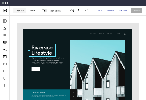
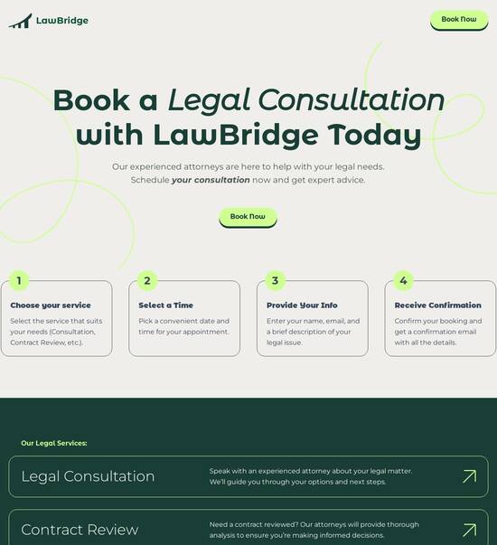
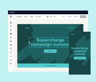
Mobile page templates optimized for Samsung Galaxy Tab
Use TemplateAbout template
Transform your customer experience with mobile page templates optimized for Samsung Galaxy Tab. Make your landing page accessible on any device.
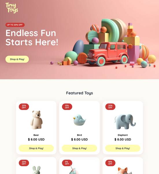
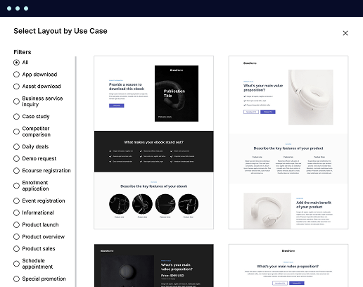
Recommended templates
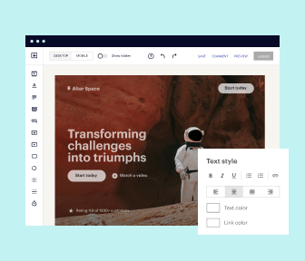
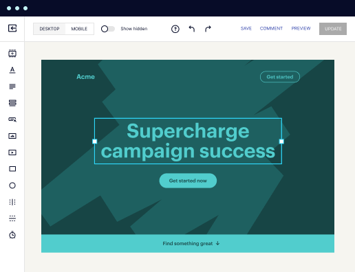
Easy to build without coding
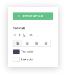
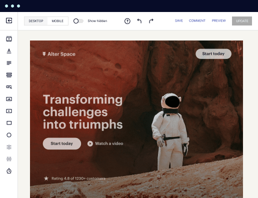
With the intuitive drag-and-drop builder, anyone on your team can create high-converting pages without any knowledge of code or design. Make enhancements to your landing page with custom widgets using Javascript, HTML/CSS, or third-party scripts.
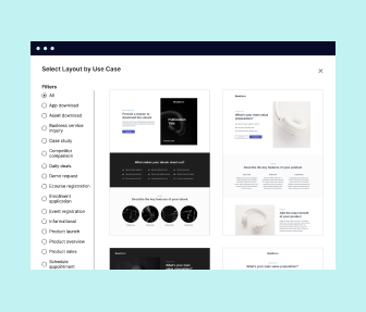
Multiple layouts for any industry and goal
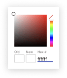
Select from 500+ landing page layouts built to boost conversions across industry-specific scenarios. Customize them by adjusting fonts, adding images, and generating on-brand content with the AI assistant. Quickly scale with Instablocks® and Global Blocks that you can save, reuse, and update globally.
Loads fast and looks polished on any device
Every template is responsive, which means they present professionally on any device and load blazingly fast with our Thor Render Engine. You can also power them up with Google AMP technology to deliver an unparalleled mobile experience and drive higher conversions.
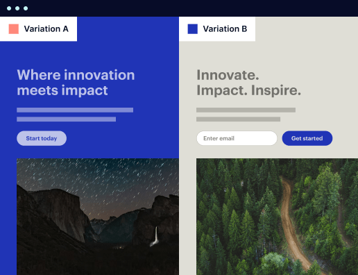
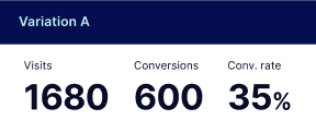
Robust analytics & experimentation
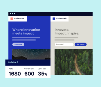
Get real-time updates and reporting across all your devices, showing the number of visitors, conversions, cost-per-visitor, and cost-per-lead. Launch AI-powered experiments, run A/B tests, and use heatmaps to analyze user behavior, then optimize your landing page to maximize conversions.

Easy to build without coding
With the intuitive drag-and-drop builder, anyone on your team can create high-converting pages without any knowledge of code or design. Make enhancements to your landing page with custom widgets using Javascript, HTML/CSS, or third-party scripts.
Multiple layouts for any industry and goal
Select from 500+ landing page layouts built to boost conversions across industry-specific scenarios. Customize them by adjusting fonts, adding images, and generating on-brand content with the AI assistant. Quickly scale with Instablocks® and Global Blocks that you can save, reuse, and update globally.
Loads fast and looks polished on any device
Every template is responsive, which means they present professionally on any device and load blazingly fast with our Thor Render Engine.
Robust analytics & experimentation
Get real-time updates and reporting across all your devices, showing the number of visitors, conversions, cost-per-visitor, and cost-per-lead. Launch AI-powered experiments, run A/B tests, and use heatmaps to analyze user behavior, then optimize your landing page to maximize conversions.
All the features you need to build lead-generating landing pages

Landing page builder
Easily create landing pages with the intuitive drag-and-drop page builder that features contextual element editing, over 500 page layouts, and 33 million images.

Visual on-page collaboration
Invite teammates and clients to collaborate on page design in real time to get your pages created, reviewed, and launched faster.

AI content generation
Instantly generate audience-focused content with AI-crafted headlines, paragraphs, and CTAs directly within the Instapage builder.

500+ customizable layouts
Choose from a range of professionally tailored page layouts, specifically designed to enhance conversion rates across numerous industry-specific scenarios.
Instablocks
Quickly build personalized landing pages using individual page blocks that you can customize, save, and reuse.
Thor Render Engine
Our back-end technology ensures that your landing pages load quickly to increase conversions, SEO rankings, and enhance the overall user experience.
Analytics
Seamlessly connect to Google Analytics to get real-time updates on cost-per-visitor and cost-per-lead metrics directly in the Instapage platform.
Learn how to build top-performing landing pages for any goal
FAQs
“Instapage gives us the ability to tailor our landing page content and layout to tell a unique story for each geographical target. The platform also enables us to create different variations with content that performs well for each unique channel. Every marketing team needs this!”

"Instapage has truly maximized our digital advertising performance by enabling us to offer matching, personalized experiences for every ad and audience. Now we can scale our landing page experiences as efficiently and effectively as we scale the ads themselves."

"If we have to wait on a developer, our creative velocity plummets. But Instapage has made it possible for us to exponentially grow our advertising programs and convert more customers"

Leading the way in building high-performing landing pages


How to create a mobile page template optimized for Samsung Galaxy Tab
Creating an effective mobile page template optimized for devices like the Samsung Galaxy Tab is essential for maximizing user engagement and conversions. Instapage offers powerful features that simplify this process, enabling marketers to design dynamic and responsive landing pages that cater specifically to mobile users.
Understanding mobile optimization
Mobile optimization goes beyond just making pages responsive; it involves ensuring that the content is tailored for mobile interactions. This includes optimizing load times, layouts, and user interface elements for smaller screens. The Samsung Galaxy Tab, with its unique display characteristics, requires specific considerations that enhance user experience and retention.
- Responsive design: Ensure that your layout adjusts seamlessly to fit the screen size.
- Fast loading speeds: Optimize images and reduce file sizes to improve loading times.
- Touch-friendly elements: Use larger buttons and interactive elements that are easy to navigate.
Utilizing Instapage templates
Instapage provides access to over 100 high-converting templates specifically designed for mobile optimization. You can quickly customize these templates to fit your needs by leveraging the intuitive drag-and-drop builder.
- Select a template: Choose a mobile-specific template from the library that suits your campaign.
- Customize content: Edit text, images, and colors to align with your brand identity.
- Preview on mobile: Utilize the mobile preview feature to ensure the layout appears correctly on devices like the Galaxy Tab.
Implementing personalization features
Personalization is crucial for boosting engagement. Instapage's dynamic text replacement and audience segmentation capabilities allow you to tailor your message based on user behavior and demographics.
- Dynamic text replacement: Customize headlines and CTAs based on the user’s origin.
- AdMaps integration: Align your ads with destination pages for consistency.
- Analytics tracking: Monitor user interactions and adjust your strategy accordingly.
In conclusion, leveraging Instapage’s tools allows you to develop a mobile page template optimized for Samsung Galaxy Tab users effectively. Considerations such as responsive design, template utilization, and personalization will significantly enhance your campaign.
Are you ready to create high-performing mobile templates for your marketing campaigns? Start using Instapage today to elevate your landing pages.
People also ask about Mobile page template optimized for Samsung Galaxy Tab
Mobile page template optimized for Samsung Galaxy Tab
Understanding mobile page templates: Tailoring for Samsung Galaxy Tab
As we navigate an increasingly mobile-first world, the importance of optimizing web pages for devices like the Samsung Galaxy Tab cannot be overstated. With a versatile range of models that dominate the tablet market, the Galaxy Tab series remains a preferred choice among users. As designers and marketers, shaping an exceptional mobile experience tailored to the Galaxy Tab enhances user engagement, retention, and conversion, ultimately aligning with business objectives.
The rise of mobile optimization
The shift towards mobile devices has been exponential over the past decade. Users are increasingly turning to their tablets and smartphones for convenience, entertainment, and productivity. According to recent statistics, over 50% of internet traffic now comes from mobile devices. In particular, Samsung Galaxy Tabs stand out due to their competitive pricing, sophisticated features, and robust performance, catering to a diverse audience from students to professionals.
Mobile usage increasing year-over-year, highlighting the need for optimization.
Samsung Galaxy Tabs are among the top alternatives in the tablet market, thus requiring tailored content.
The mobile-first design strategy is a critical approach in web development. This method prioritizes the mobile user experience, ensuring that users enjoy seamless interactions regardless of their device. Research indicates that mobile users often expect quick load times and easy navigability, setting a distinctly different expectation compared to desktop users, who might tolerate longer waits and complex layouts.
Exploring the Samsung Galaxy Tab ecosystem
The Samsung Galaxy Tab ecosystem spans various models, each with distinctive specifications tailored to different user needs. From the entry-level Galaxy Tab A to the high-end Tab S Ultra, the difference in screen size, resolution, and battery life can significantly influence how users interact with mobile pages. Understanding these specifications helps designers create content that fully utilizes the capabilities of these devices.
Different models may include unique display quality, e.g., AMOLED for the Tab S series.
Screen resolution impacts how visuals appear, necessitating high-quality images.
User demographics are diverse, or solutions should cater to professionals, students, families, and creatives.
User experience is crucial as it determines how well content is received. While browsing on the Galaxy Tab, users commonly find themselves in various situations—whether commuting, working remotely, or relaxing at home. Each scenario requires tailored approaches that consider quick access to information or engaging multimedia content.
Mobile page template features
Creating an effective mobile page template for the Samsung Galaxy Tab necessitates a focus on responsive design. A flexible grid layout adjusts dynamically to different screen sizes, ensuring that content is not only legible but also visually appealing. Orientation plays a vital role as well; templates must work seamlessly in both portrait and landscape modes, accommodating how users typically hold their devices.
Implementing media queries for responsive images and text.
Utilizing CSS frameworks to maintain adaptability across devices.
Speed and performance are equally imperative. Mobile users are less forgiving of slow-loading pages, often abandoning sites that take too long to display. To combat this, utilizing optimized images and CSS not only enhances speed but also improves the overall user experience. Tools such as image compressors and lazy loading techniques can effectively minimize load times.
Employing CDN for quicker image delivery.
Implementing cached content to reduce server requests.
Furthermore, incorporating interactive elements can drive engagement. Buttons, forms, and animations can enhance user interaction, making it vital to balance aesthetics with usability. Clear calls to action should be evident to guide users seamlessly through their journey.
Key components of an effective mobile homepage
The layout of a mobile homepage should prioritize simplicity and clarity. Effective navigation menus simplify the user's journey through the site. A clean structure with easily identifiable sections allows users to find critical information quickly, minimizing frustration and promoting positive experiences.
Using hamburger menus for space-efficient navigation.
Structuring content to prioritize essential information at the top.
When it comes to the content of a mobile page, it is vital to tailor messaging for brevity. Users skim through content quickly, demanding messages that get to the point while resonating with their expectations. Energizing visual elements should complement this, optimizing images and videos to make a memorable impression. Adopting best practices in color schemes and typography smooths visual distractions.
Crafting a seamless user journey
To enhance the user experience, mobile content should adapt to situational contexts, considering factors such as user location. Personalization strategies can significantly improve a user's journey, making them feel acknowledged and understood. Whether a user is at work, on-the-go, or browsing from home, tailored content based on this context enhances engagement.
Using geolocation for personalized content.
Tailoring promotional offers based on user context.
Additionally, integrating social media elements fosters a sense of community—allowing users to share content easily. User testimonials can lend credibility to offerings, motivating potential customers to explore further and ultimately convert.
Comparison with desktop versions
User expectations differ vastly between mobile and desktop versions. Generally, mobile users favor speed and straightforward navigation, while desktop users may explore more detailed layouts. Designing for mobile requires prioritizing essential features—such as straightforward access to key information—over embellishments. This understanding helps deliver a tailored experience that caters to each platform's unique strengths and weaknesses.
Mobile layouts must be simplified without sacrificing functionality.
If a feature serves desktop users well, it should be evaluated for mobile efficiency.
Strategies for ensuring consistency across platforms include adopting a responsive design that preserves brand identity while optimizing functionality. Utilizing analytics can guide content development, applying user data to enhance experience across devices and ensuring user satisfaction.
The impact of templates on page performance
Templates significantly influence how pages perform. Comprehensive analytics can uncover engagement metrics, revealing bounce rates and conversion patterns. By monitoring these metrics, marketers can adapt content to better resonate with users and respond to their preferences, improving overall engagement.
Utilizing A/B testing to assess the effectiveness of different templates.
Adjusting content based on performance and context.
Scalability and future-proofing are essential components of template performance. As device specifications evolve, such as larger screens and improved internet connectivity, templates should be designed with flexibility to accommodate these changes. Planning for advancements like 5G can position developers for success, ensuring their pages remain relevant as technology progresses.
Real-life case studies
Insights from successful implementations can provide a roadmap for enhancing mobile page templates. Brands using optimized templates for Samsung Galaxy Tab have reported significant increases in user engagement and conversion rates. For example, one leading service provider revamped their mobile page, which led to a 30% rise in click-through rates—a testament to the power of effective template design.
Analyzing brands that effectively utilized tailored templates showcases significant performance improvements.
Identifying areas that necessitate design revisions can minimize missteps in future projects.
Conversely, failures in mobile homepage design can offer vital lessons. Poor layout choices or slow loading times can lead to high abandonment rates. Understanding these pitfalls allows marketers to adapt and optimize their strategies for better outcomes, highlighting the cyclical nature of design and execution.
Future trends in mobile template design
Emerging technologies are poised to reshape mobile template design. The integration of AI and machine learning can provide enhanced personalization. Future Samsung Galaxy Tab features, such as augmented reality, will require templates that can incorporate interactive elements seamlessly. These advancements signal an exciting era that will demand innovative approaches to design.
Exploring AI-enhanced templates for finely-tuned user experiences.
Preparing templates for new functionalities within Samsung Galaxy Tab.
User-centric design will remain essential. Continuously prioritizing user feedback is vital to iterate and refine templates accordingly. Adapting to the fast-paced environment of mobile technology will ensure brands stay competitive and relevant in their approach to incredibly optimized mobile page templates.
Generating innovation in mobile page template development
Encouraging creative approaches to template design is essential for continued innovation. Establishing a culture of experimentation fosters new ideas, allowing teams to develop refreshing designs that break the mold. Inter-departmental collaboration enhances creativity, leading to the emergence of unique solutions that cater to diverse marketing goals.
Facilitating brainstorming sessions among teams for diversified perspectives.
Promoting inclusive participation across all departments in design processes.
Ongoing testing and optimization play a critical role in refining mobile pages. Employing A/B testing methodologies helps identify the most effective elements of a design, ensuring continuous improvement. By building a culture of feedback and adaptation, brands can transform mobile experiences, consistently driving conversions and enhancing user satisfaction.
Ready to skyrocket conversions?
Supercharge your ad campaigns with high-performing landing pages
Get started