
Mobile page templates optimized for Realme phone
Explore Similar TemplatesAbout template
Transform your customer experience with mobile page templates optimized for Realme phone. Make your landing page accessible on any device.
Recommended templates


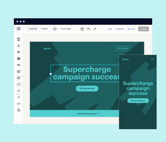
Easy to build without coding
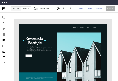
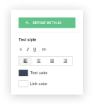
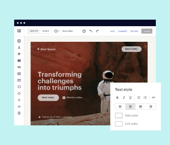
With the intuitive drag-and-drop builder, anyone on your team can create high-converting pages without any knowledge of code or design. Make enhancements to your landing page with custom widgets using Javascript, HTML/CSS, or third-party scripts.
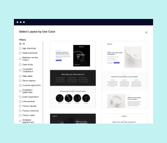
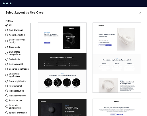
Multiple layouts for any industry and goal
Select from 500+ landing page layouts built to boost conversions across industry-specific scenarios. Customize them by adjusting fonts, adding images, and generating on-brand content with the AI assistant. Quickly scale with Instablocks® and Global Blocks that you can save, reuse, and update globally.
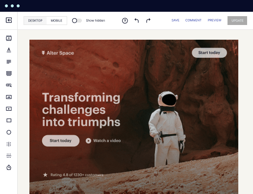
Loads fast and looks polished on any device
Every template is responsive, which means they present professionally on any device and load blazingly fast with our Thor Render Engine. You can also power them up with Google AMP technology to deliver an unparalleled mobile experience and drive higher conversions.
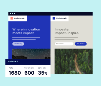
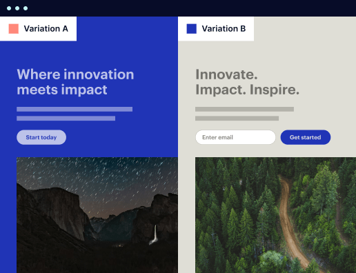
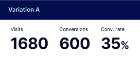
Robust analytics & experimentation
Get real-time updates and reporting across all your devices, showing the number of visitors, conversions, cost-per-visitor, and cost-per-lead. Launch AI-powered experiments, run A/B tests, and use heatmaps to analyze user behavior, then optimize your landing page to maximize conversions.
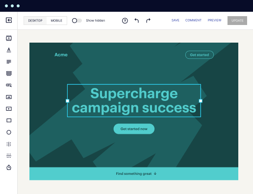

Easy to build without coding
With the intuitive drag-and-drop builder, anyone on your team can create high-converting pages without any knowledge of code or design. Make enhancements to your landing page with custom widgets using Javascript, HTML/CSS, or third-party scripts.
Multiple layouts for any industry and goal
Select from 500+ landing page layouts built to boost conversions across industry-specific scenarios. Customize them by adjusting fonts, adding images, and generating on-brand content with the AI assistant. Quickly scale with Instablocks® and Global Blocks that you can save, reuse, and update globally.
Loads fast and looks polished on any device
Every template is responsive, which means they present professionally on any device and load blazingly fast with our Thor Render Engine.
Robust analytics & experimentation
Get real-time updates and reporting across all your devices, showing the number of visitors, conversions, cost-per-visitor, and cost-per-lead. Launch AI-powered experiments, run A/B tests, and use heatmaps to analyze user behavior, then optimize your landing page to maximize conversions.
All the features you need to build apps for phone themes

Landing page builder
Easily create landing pages with the intuitive drag-and-drop page builder that features contextual element editing, over 500 page layouts, and 33 million images.

Visual on-page collaboration
Invite teammates and clients to collaborate on page design in real time to get your pages created, reviewed, and launched faster.

AI content generation
Instantly generate audience-focused content with AI-crafted headlines, paragraphs, and CTAs directly within the Instapage builder.

500+ customizable layouts
Choose from a range of professionally tailored page layouts, specifically designed to enhance conversion rates across numerous industry-specific scenarios.
Instablocks
Quickly build personalized landing pages using individual page blocks that you can customize, save, and reuse.
Thor Render Engine
Our back-end technology ensures that your landing pages load quickly to increase conversions, SEO rankings, and enhance the overall user experience.
Analytics
Seamlessly connect to Google Analytics to get real-time updates on cost-per-visitor and cost-per-lead metrics directly in the Instapage platform.
Learn how to build realme
Frequently asked questions about realme theme store latest version
“Instapage gives us the ability to tailor our landing page content and layout to tell a unique story for each geographical target. The platform also enables us to create different variations with content that performs well for each unique channel. Every marketing team needs this!”

"Instapage has truly maximized our digital advertising performance by enabling us to offer matching, personalized experiences for every ad and audience. Now we can scale our landing page experiences as efficiently and effectively as we scale the ads themselves."

"If we have to wait on a developer, our creative velocity plummets. But Instapage has made it possible for us to exponentially grow our advertising programs and convert more customers"

Leading the way in building high-performing landing pages


An all-in-one landing page platform for optimizing marketing campaigns
In today's competitive digital marketing landscape, having a powerful landing page platform like Instapage can significantly enhance your campaigns. With its extensive features tailored specifically for marketers in sectors like tech, education, and financial services, Instapage empowers users to create high-converting pages without any coding experience. This guide will take you through step-by-step instructions on leveraging Instapage to maximize your digital marketing efforts.
Understanding the core features of Instapage
Instapage offers a suite of tools designed to simplify and enhance the landing page creation process. Key features include:
- Templates: Choose from over 100 high-converting templates tailored to various industries and marketing goals, allowing you to jump-start your campaigns.
- Optimization Tools: Utilize built-in A/B testing and analytics dashboards to track performance and iterate designs for better results.
- Personalization: Use dynamic text replacement to deliver tailored experiences for each audience segment, improving engagement and conversion rates.
Step 1: Launching your first landing page
Creating your first landing page with Instapage is straightforward. Follow these steps:
Step 2: Customizing your page for optimized performance
Once your page is set up, focus on the following elements to enhance your performance:
- SEO Optimization: Ensure your page is optimized for search engines with keyword integration, meta tags, and alt text for images.
- Visual Layout: Adjust your page layout using Instablocks to enhance visual appeal and user experience.
- Call-to-Action (CTA): Place compelling CTAs strategically to guide users toward desired actions effectively.
Step 3: Analyzing performance and making improvements
After your landing page goes live, it's crucial to monitor its performance and make necessary adjustments. Here’s how:
- Use Heatmaps: Leverage heatmaps to understand user interactions and adjust design elements accordingly.
- Conduct A/B Tests: Test different variations of headlines, images, and CTAs to see which combinations yield the best results.
- Analyze Data: Regularly review your analytics dashboard to assess traffic sources, conversion rates, and user behavior.
By following these steps, you can create impactful landing pages that resonate with your audience and drive conversions.
Ready to supercharge your marketing campaigns with Instapage? Sign up now to access our vast library of templates and tools designed to help you succeed.
People also ask about Mobile page template optimized for Realme phone
Unraveling the Potential: Mobile Page Templates Tailored for Realme Phones
Understanding the landscape of mobile optimized websites
With the increase in smartphone ownership globally, mobile browsing has surged in popularity compared to desktop usage. As per recent statistics, mobile usage accounts for over 54% of all website traffic, a figure that continues to rise year over year. This trend highlights the significance of mobile-friendly websites, particularly in e-commerce, where mobile transactions represent approximately 50% of all online sales. Users now expect a seamless shopping experience on their mobile devices, leading businesses to rethink their digital strategies.
Realme, as a brand, focuses on providing high-quality yet affordable smartphones targeted mainly at young and tech-savvy consumers. Its market share has seen considerable growth within the budget segment, appealing to users who seek functionality without a hefty price tag. Given this demographic, optimizing mobile pages for Realme users is paramount for engaging this audience effectively.
The essence of mobile page templates
Mobile page templates serve as the foundation for creating websites that provide optimal experiences on mobile devices. These templates are designed with the end-user in mind, focusing on aspects like load speed, user navigation, and touch-friendly elements. Importance is placed on a simple yet appealing layout that enhances user engagement while maintaining brand identity.
Key characteristics that make a template mobile-friendly include responsive layouts, touch-friendly buttons, and fast loading times. Such templates ensure that content is easily accessible while catering to various screen sizes and orientations. Overall, adopting mobile page templates significantly streamlines web design processes and improves user experience.
Multipurpose OpenCart responsive templates
OpenCart stands out as a reliable platform for e-commerce, offering numerous ready-made templates that facilitate the creation of online stores. Multipurpose templates in OpenCart cater to various industries, including fashion, kitchenware, food, electronics, and more. These templates are not just visually appealing but are also designed for optimal performance across multiple devices, making them a versatile choice for any business.
Customization flexibility is another strong feature of these templates. They allow business owners to tailor their sites according to their unique brand aesthetics, ensuring that the final product resonates with their target audience while remaining functional.
Key features of mobile templates for e-commerce
Responsive design is arguably one of the most critical features for mobile shoppers. A responsive site automatically adapts its layout to fit the screen size of the device used, which is essential for Realme phones and other smartphones. Techniques to enhance responsiveness include CSS media queries and flexible grids, ensuring every element of the site flows seamlessly.
Moreover, ensuring cross-compatibility and PHP version compatibility can significantly enhance performance. Many mobile templates are built to work with various PHP versions, meaning they can operate smoothly on a range of hosting environments. This compatibility is vital to prevent performance issues that could deter users and ultimately affect conversions.
Exploring template categories
When considering mobile templates, businesses should explore various categories based on their niche. Fashion and apparel templates often focus on trendy designs with vibrant colors and bold fonts that shoulder high visual appeal. The user experience plays a crucial role, featuring galleries that showcase products effectively while allowing users to navigate easily.
In the kitchenware and food sectors, clean aesthetics and usability features such as recipe cards and ingredient lists enhance user engagement. Templates in electronics and tools sectors typically highlight technical specifications and could include product comparison features, facilitating informed purchase decisions.
Lastly, furniture and medical templates require detailed product displays and trust signals like customer reviews and detailed descriptions, ensuring that consumers feel confident in their purchasing decisions.
Themes and customization options
The diversity of themes provides businesses a unique branding opportunity, allowing them to align their website's theme with their brand's identity. Each industry can leverage specialized themes to cater to the preferences of their target market; for example, a wellness brand might use soft colors and tranquil designs while a tech brand could opt for sleek, modern aesthetics.
Customization options are also abundant, enabling store owners to personalize templates without needing extensive coding knowledge. Visual editors and drag-and-drop features help shorten the time required for setup, ensuring that the focus remains on creating a user-friendly online store.
The intersection of performance and user experience
Page loading times significantly impact user experience on mobile devices. Studies reveal that roughly 40% of users abandon a website that takes more than three seconds to load, making it crucial to optimize page speed, particularly for Realme phones. Techniques to enhance loading speed include image optimization, reducing server response time, and minimizing the use of heavy scripts. These optimizations ensure users receive the best possible experience.
In the realm of user experience design, following best practices is vital. This includes clarity of navigation, logical layouts, and intuitive usability on mobile devices. Templates must be adapted for touch interactions, ensuring clickable elements are sizable enough for easy access on smaller screens.
SEO and marketing implications
Search engine optimization (SEO) for mobile templates is essential to enhance search engine visibility. Mobile-friendly websites are favored by search engines, making it vital for businesses to adopt SEO best practices tailored for mobile experiences. This includes optimizing title tags, meta descriptions, and ensuring overall mobile compatibility, as these features directly influence search rankings.
Analytics tools play a crucial role in refining mobile templates. By tracking mobile user engagement metrics, brands can gain insights into user behavior and preferences. Understanding these elements enables iterative improvements while optimizing the mobile experience further.
Future trends in mobile templates
The future of mobile templates is marked by the emergence of technologies like progressive web apps, enhancing the user experience beyond traditional mobile browsers. They combine the best of web and app experiences, enabling features such as offline access and push notifications, which can lead to improved user engagement.
Artificial intelligence integration is also expected to evolve in mobile templates. AI-powered features could involve personalized shopping experiences, predictive analytics, and intelligent chatbots, which further enhance the user journey and streamline commerce operations.
Realme-specific considerations
Mobile templates should also account for Realme's unique features, such as its impressive camera capabilities. This allows for high-quality product images that can significantly enhance product listings, drawing consumers' attention and potentially driving conversions. It's crucial to size and optimize these images appropriately for mobile displays.
Moreover, leveraging Realme's display technologies can further improve visual appeal, ensuring that colors and designs reflect positively on the user's screens.
Practical steps for implementation
Choosing the right mobile page template is a process that requires careful consideration. Begin by evaluating templates based on specific needs such as compatibility with existing systems, user journeys, and inventory types. Create a checklist outlining essential features to compare templates effectively.
Best practices for launching a mobile-optimized store include testing the website across different devices before going live, ensuring that every feature functions properly. Additionally, soliciting feedback from early users can help identify areas for improvement, making the transition smoother when full deployment occurs.
Ready to skyrocket conversions?
Supercharge your ad campaigns with high-performing landing pages
Get started