
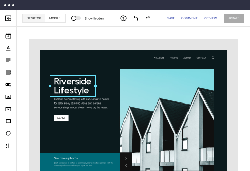
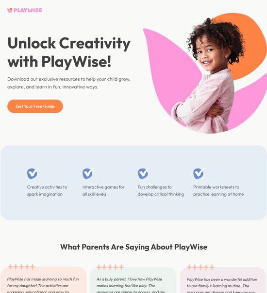
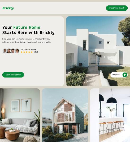
Mobile page templates compatible with PrestaShop
Explore Similar TemplatesAbout template
Boost your marketing strategy with mobile page templates compatible with PrestaShop. Increase your traffic without compromising your design quality.
Recommended templates

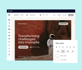
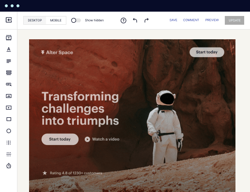
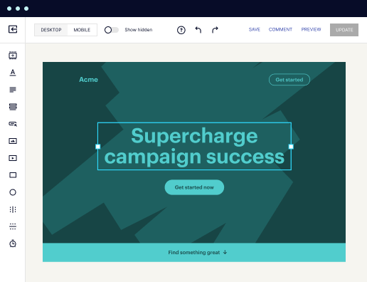
Easy to build without coding
With the intuitive drag-and-drop builder, anyone on your team can create high-converting pages without any knowledge of code or design. Make enhancements to your landing page with custom widgets using Javascript, HTML/CSS, or third-party scripts.
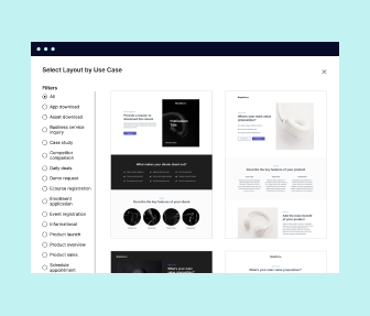
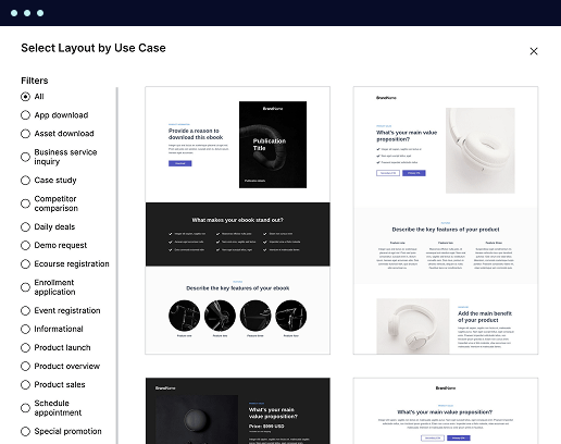
Multiple layouts for any industry and goal
Select from 500+ landing page layouts built to boost conversions across industry-specific scenarios. Customize them by adjusting fonts, adding images, and generating on-brand content with the AI assistant. Quickly scale with Instablocks® and Global Blocks that you can save, reuse, and update globally.
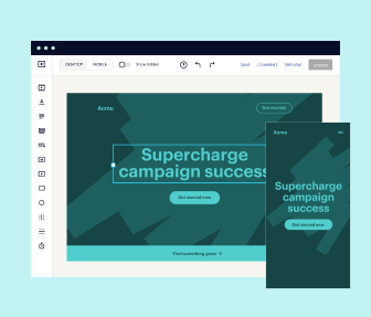
Loads fast and looks polished on any device
Every template is responsive, which means they present professionally on any device and load blazingly fast with our Thor Render Engine. You can also power them up with Google AMP technology to deliver an unparalleled mobile experience and drive higher conversions.
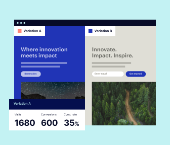
Robust analytics & experimentation
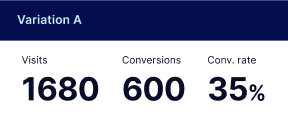
Get real-time updates and reporting across all your devices, showing the number of visitors, conversions, cost-per-visitor, and cost-per-lead. Launch AI-powered experiments, run A/B tests, and use heatmaps to analyze user behavior, then optimize your landing page to maximize conversions.

Easy to build without coding
With the intuitive drag-and-drop builder, anyone on your team can create high-converting pages without any knowledge of code or design. Make enhancements to your landing page with custom widgets using Javascript, HTML/CSS, or third-party scripts.
Multiple layouts for any industry and goal
Select from 500+ landing page layouts built to boost conversions across industry-specific scenarios. Customize them by adjusting fonts, adding images, and generating on-brand content with the AI assistant. Quickly scale with Instablocks® and Global Blocks that you can save, reuse, and update globally.
Loads fast and looks polished on any device
Every template is responsive, which means they present professionally on any device and load blazingly fast with our Thor Render Engine.
Robust analytics & experimentation
Get real-time updates and reporting across all your devices, showing the number of visitors, conversions, cost-per-visitor, and cost-per-lead. Launch AI-powered experiments, run A/B tests, and use heatmaps to analyze user behavior, then optimize your landing page to maximize conversions.
All the features you need to build landing page prestashop

Landing page builder
Easily create landing pages with the intuitive drag-and-drop page builder that features contextual element editing, over 500 page layouts, and 33 million images.

Visual on-page collaboration
Invite teammates and clients to collaborate on page design in real time to get your pages created, reviewed, and launched faster.

AI content generation
Instantly generate audience-focused content with AI-crafted headlines, paragraphs, and CTAs directly within the Instapage builder.

500+ customizable layouts
Choose from a range of professionally tailored page layouts, specifically designed to enhance conversion rates across numerous industry-specific scenarios.
Instablocks
Quickly build personalized landing pages using individual page blocks that you can customize, save, and reuse.
Thor Render Engine
Our back-end technology ensures that your landing pages load quickly to increase conversions, SEO rankings, and enhance the overall user experience.
Analytics
Seamlessly connect to Google Analytics to get real-time updates on cost-per-visitor and cost-per-lead metrics directly in the Instapage platform.
Learn how to build top-performing landing pages for any goal
FAQs
“Instapage gives us the ability to tailor our landing page content and layout to tell a unique story for each geographical target. The platform also enables us to create different variations with content that performs well for each unique channel. Every marketing team needs this!”

"Instapage has truly maximized our digital advertising performance by enabling us to offer matching, personalized experiences for every ad and audience. Now we can scale our landing page experiences as efficiently and effectively as we scale the ads themselves."

"If we have to wait on a developer, our creative velocity plummets. But Instapage has made it possible for us to exponentially grow our advertising programs and convert more customers"

Leading the way in building high-performing landing pages


A comprehensive guide to using Instapage for landing page optimization
Instapage stands out as the most powerful landing page and conversion rate optimization (CRO) platform available today. Marketers across various sectors, including business services, technology, and financial services, are harnessing its robust capabilities to accelerate and optimize their digital campaigns. This guide will walk you through a step-by-step approach to leverage Instapage's features effectively to maximize your ROI.
Understanding the fundamentals of landing pages
Creating an effective landing page is crucial for converting visitors into leads. Instapage offers over 100 high-converting templates that are fully customizable, empowering you to develop landing pages without needing technical skills. It's essential to understand the key components that make a landing page successful, including compelling headlines, effective calls-to-action (CTAs), and aesthetically pleasing layouts.
- Call-to-action: The CTA should be clear and compel users to take action, whether it's signing up for a newsletter or making a purchase.
- Visual elements: Engaging images or videos that resonate with your target audience can significantly enhance user experience.
- Responsive design: Ensure that your landing page looks great on all devices, which Instapage supports with its mobile-responsive layouts.
Step 1: Creating your landing page
To start creating your landing page with Instapage, follow these steps:
- Select a template: Choose from over 100 pre-built templates tailored for different industries. Each template is designed for high conversion rates.
- Customize your content: Utilize Instapage's drag-and-drop builder to add your branding, text, and images effortlessly.
- Incorporate lead generation elements: Add forms and other lead capture tools to ensure you can gather valuable information from your visitors.
Step 2: Optimizing your landing page
Once your landing page is live, optimizing it for better conversions is key. Here’s how to do it effectively:
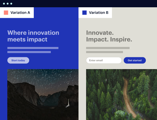
- A/B testing: Use Instapage's built-in A/B testing features to test different versions of your landing page, allowing you to find the most effective layout and content.
- Heatmaps: Analyze user interaction with heatmaps to understand how visitors are engaging with your page and identify areas for improvement.
- Performance analytics: Regularly review Instapage's analytics dashboard to assess traffic sources, conversion rates, and other metrics critical to optimizing your marketing efforts.
Step 3: Personalizing the user experience
Personalization can significantly impact conversion rates. Instapage allows you to tailor the user experience based on audience segmentation:
- Dynamic text replacement: Leverage this feature to customize text based on user demographics, ensuring a relevant message for every visitor.
- AdMaps: Align your ads to specific landing pages dynamically, which can increase relevance and improve conversion rates.
- Audience-level metrics: Track engagement and performance at the audience level to refine your targeting strategies.
In conclusion, Instapage provides a robust platform for creating high-quality landing pages that can significantly enhance your marketing campaigns. By following these steps, you can leverage its features to drive better results.
Ready to elevate your digital marketing strategy? Start using Instapage today to create landing pages that convert visitors into customers.
People also ask about Mobile page template compatible with PrestaShop
Mobile page templates compatible with PrestaShop
Understanding mobile page templates and their importance in PrestaShop
As the world of e-commerce continues to evolve, understanding mobile page templates and their integration within platforms like PrestaShop is critical for success. Today's consumers are increasingly using mobile devices for shopping, forcing merchants to adapt their websites for mobile usability. A mobile-optimized site not only enhances user experience but also drives higher engagement and sales.
The evolution of online shopping: why mobile compatibility matters
Over recent years, consumer behaviors have shifted dramatically towards mobile shopping. Recent statistics reveal that nearly 80% of internet users own a smartphone, and about 50% of all e-commerce sales now come from mobile devices. This shift necessitates that PrestaShop merchants pay close attention to their mobile presence. Failing to acknowledge the importance of mobile compatibility can result in losing potential customers and ultimately lower sales.
Defining mobile page templates in PrestaShop
Mobile page templates in PrestaShop are specifically designed layouts optimized for mobile devices. Unlike standard templates, which may be designed for desktop viewing, mobile templates prioritize streamlined navigation, faster loading times, and content that resonates with mobile users. Key components of these templates include touch-friendly buttons, simplified layouts, and adaptive images, all of which work together to enhance user experience.
Key features of mobile page templates in PrestaShop
To fully leverage mobile page templates in PrestaShop, merchants must understand the key features that enhance their website's performance on mobile devices. These features help create a seamless shopping experience, promoting customer retention and conversions.
Responsive design and media queries
Responsive design is critical as it ensures a consistent user experience across various devices. Media queries specifically allow developers to tailor the website’s appearance based on different screen sizes.
Versatile themes and customization options
PrestaShop offers a range of mobile-compatible themes, allowing merchants to select and customize their sites to reflect their brand identity effectively.
User-friendly navigation and menu design
Intuitive menus built into mobile templates guide users easily, improving navigation and enhancing the overall shopping experience.
Optimized media and image handling
Optimized images designed for mobile devices ensure quick load times without sacrificing quality, significantly improving user interaction.
The role of modules in enhancing mobile templates
Modules play a crucial role in augmenting the capabilities of mobile page templates. PrestaShop includes various modules that improve user engagement and boost conversion rates, making them indispensable to an effective mobile strategy. Merchants can choose from several essential modules designed to cater to mobile users.
User engagement modules
Modules like live chat or customer review features can improve user experience and foster trust.
Conversion-focused modules
Modules that provide upselling or cross-selling suggestions lead to increased order values and improved sales margins.
Third-party integration modules
Integrating third-party modules can expand functionality, allowing features like enhanced analytics and marketing tools.
Exploring PrestaShop's backoffice setup for mobile templates
Configuring mobile templates in PrestaShop is straightforward, thanks to its user-friendly backoffice interface. Merchants can easily access mobile settings, enabling them to optimize their website for various devices.
Step 1: Access modules section
Navigate to the modules section in the backoffice to explore available mobile templates.
Step 2: Choose the mobile template
Select a mobile template compatible with your existing setup, considering design and functionality.
Step 3: Customize settings
Adjust layout and design settings specific to mobile to ensure the best user experience.
Step 4: Preview and test
Preview the changes on different devices to ensure compatibility and seamless navigation.
Transforming your website with mobile templates: design and usability
A mobile-first design approach is crucial in today’s e-commerce landscape. By designing for mobile users first, websites can respond adequately to the needs of a growing number of shoppers engaging on their devices. It's essential to focus on aesthetic elements such as font size, color schemes, and image placement to ensure high engagement levels.
Fonts
Select readable font sizes that enhance visibility on smaller screens.
Color schemes
Employ color schemes that are visually appealing and promote brand recognition.
Layouts
Use simpler layouts that allow users to navigate quickly without getting overwhelmed.
Usability testing with real users helps identify areas of improvement. By conducting usability tests, merchants can gather valuable feedback that informs adjustments and enhances overall effectiveness.
Keeping up with the latest versions: updates and improvements in mobile templates
PrestaShop regularly releases updates that enhance mobile compatibility and performance. Staying current with these updates is crucial to maintaining website security and functionality. Each new version often brings improvements that can impact page load times, SEO rankings, and overall template performance.
Security enhancements
Regular updates often patch vulnerabilities, protecting your site from potential threats.
Performance improvements
Updates often bring optimizations that make templates load faster on mobile devices.
New features
Each version may introduce new features that improve user experience and engagement.
Creating an engaging user experience through dynamic templates
An engaging user experience is fundamental for retaining customers in mobile e-commerce. Dynamic templates that adjust in real-time based on user behavior can drive significantly better engagement. Features like clickable elements, interactive sliders, and contextual pop-ups help keep users interested.
Personalized content
Templates that adjust content based on user data can increase relevance and engagement.
Interactive features
Adding interactive elements can enhance user experience and encourage exploration.
Analytics for improvement
Utilizing metrics from A/B testing can inform necessary adjustments for ongoing improvement.
Maximizing the benefits of mobile page templates
After implementing mobile page templates, it’s critical to monitor and assess their performance continuously. Regular analysis can reveal insights into mobile user behaviors, informing ongoing optimization efforts. Load speed, user engagement, and feedback should all be taken into account.
Monitor load speeds
Analyze data to ensure your site loads quickly on mobile devices, as this significantly affects user experience.
Gather user feedback
Incorporate feedback loops to understand user challenges and successes.
Utilize analytics tools
Regularly review site analytics to make informed decisions on adjustments and improvements.
Inspirational case studies of mobile templates in action
Several leading e-commerce websites have successfully implemented mobile templates, providing excellent case studies for PrestaShop merchants. By analyzing these successful sites, merchants can glean insights into effective design strategies and features that drive sales and improve customer loyalty.
Brand X
Utilizes a straightforward mobile layout that enhances product visibility and reduces clutter.
Brand Y
Incorporates personalized recommendations based on user engagement data, increasing conversions.
Brand Z
Implements an intuitive user interface making navigation easier, contributing to a seamless user experience.
Future trends in mobile templates for e-commerce
Looking ahead, mobile template design is poised for future innovations. Emerging technologies such as augmented reality (AR) and artificial intelligence (AI) are beginning to shape the e-commerce landscape, creating exciting opportunities for engagement. Brands that can quickly adapt to these trends will likely lead the market, making flexibility a crucial aspect of future mobile strategies.
Augmented reality
Integrating AR can enhance product visualization for customers, allowing them to interact with products before purchase.
AI-driven personalization
Utilizing AI can lead to highly personalized shopping experiences based on behavioral data.
Advancements in mobile design
Responsive design techniques will continue evolving, improving usability for all types of devices.
Frequently asked questions (FAQs) about mobile page templates in PrestaShop
Merchants often have questions regarding mobile page templates and their implementation. Understanding behaviors and challenges can facilitate better decisions and enhance the overall mobile experience.
What are the benefits of using a mobile template?
Mobile templates enhance user experience, increase loading speeds, and improve conversion rates.
How do I know if my site is mobile-friendly?
Utilize Google’s Mobile-Friendly Test to evaluate your site’s performance on mobile devices.
Can I customize mobile templates?
Yes, PrestaShop allows a variety of customization options within mobile templates to align with your branding.
Ready to skyrocket conversions?
Supercharge your ad campaigns with high-performing landing pages
Get started