
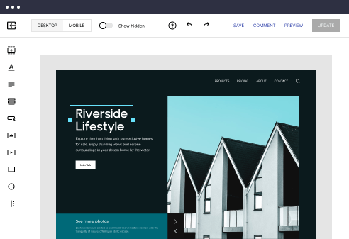
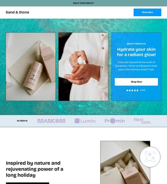
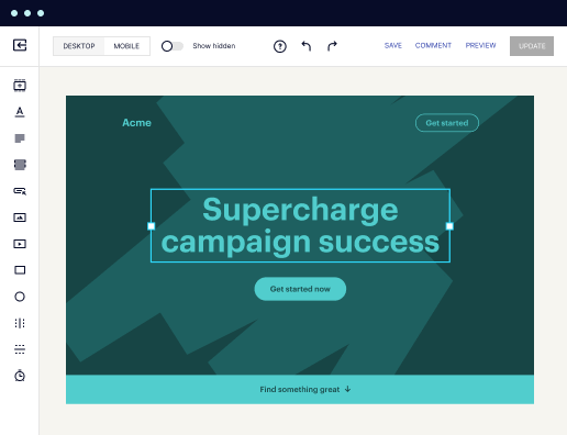
Mobile friendly user journey page template
Explore Similar TemplatesAbout template
Unleash your creativity with the mobile friendly user journey page template. Try Instapage today.
Recommended templates

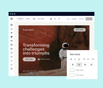
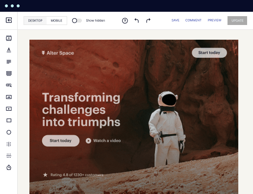
Easy to build without coding
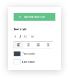
With the intuitive drag-and-drop builder, anyone on your team can create high-converting pages without any knowledge of code or design. Make enhancements to your landing page with custom widgets using Javascript, HTML/CSS, or third-party scripts.
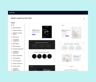
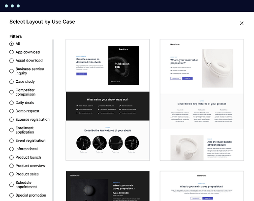
Multiple layouts for any industry and goal
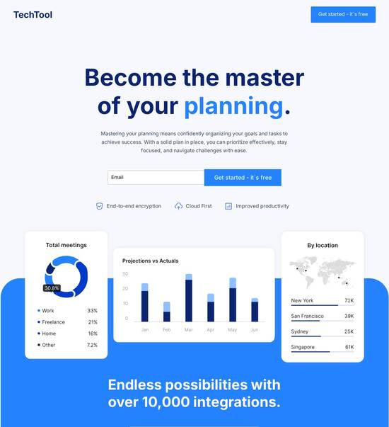
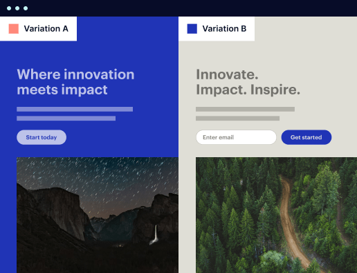
Select from 500+ landing page layouts built to boost conversions across industry-specific scenarios. Customize them by adjusting fonts, adding images, and generating on-brand content with the AI assistant. Quickly scale with Instablocks® and Global Blocks that you can save, reuse, and update globally.
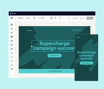
Loads fast and looks polished on any device
Every template is responsive, which means they present professionally on any device and load blazingly fast with our Thor Render Engine. You can also power them up with Google AMP technology to deliver an unparalleled mobile experience and drive higher conversions.
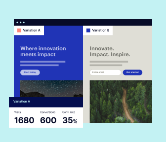
Robust analytics & experimentation
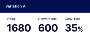
Get real-time updates and reporting across all your devices, showing the number of visitors, conversions, cost-per-visitor, and cost-per-lead. Launch AI-powered experiments, run A/B tests, and use heatmaps to analyze user behavior, then optimize your landing page to maximize conversions.

Easy to build without coding
With the intuitive drag-and-drop builder, anyone on your team can create high-converting pages without any knowledge of code or design. Make enhancements to your landing page with custom widgets using Javascript, HTML/CSS, or third-party scripts.
Multiple layouts for any industry and goal
Select from 500+ landing page layouts built to boost conversions across industry-specific scenarios. Customize them by adjusting fonts, adding images, and generating on-brand content with the AI assistant. Quickly scale with Instablocks® and Global Blocks that you can save, reuse, and update globally.
Loads fast and looks polished on any device
Every template is responsive, which means they present professionally on any device and load blazingly fast with our Thor Render Engine.
Robust analytics & experimentation
Get real-time updates and reporting across all your devices, showing the number of visitors, conversions, cost-per-visitor, and cost-per-lead. Launch AI-powered experiments, run A/B tests, and use heatmaps to analyze user behavior, then optimize your landing page to maximize conversions.
All the features you need to build lead-generating landing pages

Landing page builder
Easily create landing pages with the intuitive drag-and-drop page builder that features contextual element editing, over 500 page layouts, and 33 million images.

Visual on-page collaboration
Invite teammates and clients to collaborate on page design in real time to get your pages created, reviewed, and launched faster.

AI content generation
Instantly generate audience-focused content with AI-crafted headlines, paragraphs, and CTAs directly within the Instapage builder.

500+ customizable layouts
Choose from a range of professionally tailored page layouts, specifically designed to enhance conversion rates across numerous industry-specific scenarios.
Instablocks
Quickly build personalized landing pages using individual page blocks that you can customize, save, and reuse.
Thor Render Engine
Our back-end technology ensures that your landing pages load quickly to increase conversions, SEO rankings, and enhance the overall user experience.
Analytics
Seamlessly connect to Google Analytics to get real-time updates on cost-per-visitor and cost-per-lead metrics directly in the Instapage platform.
Learn how to build top-performing landing pages for any goal
FAQs
“Instapage gives us the ability to tailor our landing page content and layout to tell a unique story for each geographical target. The platform also enables us to create different variations with content that performs well for each unique channel. Every marketing team needs this!”

"Instapage has truly maximized our digital advertising performance by enabling us to offer matching, personalized experiences for every ad and audience. Now we can scale our landing page experiences as efficiently and effectively as we scale the ads themselves."

"If we have to wait on a developer, our creative velocity plummets. But Instapage has made it possible for us to exponentially grow our advertising programs and convert more customers"

Leading the way in building high-performing landing pages


An effective mobile friendly user journey page template
Creating a mobile friendly user journey page template is essential for maximizing the effectiveness of your digital marketing campaigns. Instapage's powerful capabilities enable marketers to design pages that not only attract users but also convert them into leads and customers by providing seamless mobile experiences.
Understanding user journeys
A well-defined user journey helps in identifying the path your audience takes from awareness to conversion. Understanding this journey is crucial in optimizing the mobile experience, ensuring users can navigate easily and achieve their goals without frustration. The flow of the user journey can be enhanced by considering design elements that cater to a mobile-first audience.
- Clarity: Ensure every step in the user journey is clear and concise, reducing cognitive load on the user.
- Accessibility: Make navigation straightforward, with easy-to-click buttons and links that accommodate touch screens.
- Responsive design: Guarantee that the template adapts to various screen sizes for a consistent experience.
Step 1: Designing for mobile
The first step in creating your mobile friendly user journey page template is to design for mobile devices from the ground up. This involves establishing a layout that's visually appealing and simple to use.
- Grid layouts: Use grid systems to organize content dynamically, which helps maintain order across devices.
- Touch targets: Optimize the size and spacing of buttons for easy tapping, enhancing the mobile usability.
- Font size: Ensure text is legible without zooming, using appropriate font sizes for mobile screens.
Step 2: Optimizing load speed
Next, optimization of loading speeds is critical. Pages that load quickly significantly improve user engagement and retention. You can achieve this by utilizing lighter images and efficient coding practices.
- Image compression: Use tools to reduce image sizes without sacrificing quality, ensuring faster load times.
- Minified CSS and JavaScript: Reduce file sizes by eliminating unnecessary characters and spaces, making your template lightweight.
- Content Delivery Network (CDN): Employ a CDN to distribute content more efficiently based on user location.
Step 3: Testing and iterating
Finally, after implementing your mobile friendly user journey page template, it's important to test its effectiveness. Use A/B testing to compare different designs and features to see what works best.
- Usability tests: Conduct tests with real users to identify friction points in the user journey.
- Analytics: Utilize heatmaps and analytics dashboards to track user behavior and conversion metrics.
- Feedback loop: Gather user feedback continuously and iterate on designs based on qualitative and quantitative data.
In conclusion, creating a mobile friendly user journey page template is crucial for marketers looking to maximize conversions while delivering exceptional user experiences.
Start optimizing your landing pages today with Instapage, ensuring your campaigns are not only effective but also engaging on all devices!
People also ask about Mobile friendly user journey page template
Mobile friendly user journey page template: A guide for marketers
Understanding the mobile friendly user journey page template
The transition from desktop to mobile devices is no longer a trend; it's a fundamental shift that has transformed how users interact with websites. A mobile friendly user journey page template plays a crucial role in ensuring that these interactions are seamless and effective. By focusing on optimizing user experiences for mobile screens, businesses can greatly enhance engagement, conversion, and overall customer satisfaction.
With the growing emphasis on mobile accessibility, it’s important for marketers to recognize how user journeys differ on mobile compared to traditional desktop experiences. The combination of smaller screens and touch interfaces brings unique challenges and opportunities to the navigation and usability of digital content.
The evolution of user experience in the mobile era
As smartphone usage continues to skyrocket, we see a shift in how users engage with online content. Recent studies indicate that over 50% of web traffic now originates from mobile devices. This has significant implications for website design, compelling brands to prioritize mobile responsiveness. Users expect smooth navigation, quick load times, and engaging content tailored specifically for their mobile experience.
The importance of user journeys in this context cannot be overstated. With quick user decision-making becoming the norm, guiding customers through their mobile experience effectively is essential. Marketers must ensure that every touchpoint from discovery to conversion offers value and relevance.
Defining the mobile friendly user journey page template
A mobile-friendly user journey page template comprises various elements designed to enhance the user's interaction. The core focus should be on creating layouts that are easy to navigate while adhering to essential design principles such as simplicity, consistency, and efficient use of white space. Mobile optimization requires that all components are intuitively placed, ensuring users find what they need without unnecessary scrolling or searching.
Responsive design: Ensure your templates adapt to various screen sizes.
Accessibility: Maintain high visibility, readable fonts, and accessible navigation.
Streamlined content: Prioritize important information and minimize distractions.
Instapage offers a range of mobile-friendly template features that highlight the importance of customization. With the ability to modify layouts, users can align their templates with brand identity while improving user experience through relevant content and visuals.
Mapping the user journey: Strategies for success
To design an effective mobile journey experience, understanding your users is vital. Here are some strategies that can help marketers succeed.
Identifying user personas
By researching target demographics and psychographics, marketers can design effective user journeys. This research captures what the users care about the most.
Creating user journey maps
Drafting user journey maps involves outlining each stage of a user's interaction with your mobile pages. Use tools and resources to visualize these interactions effectively.
Identifying key touchpoints
Recognize critical moments that affect user decisions, such as when they become aware of your service, considering options, and the final conversion phase.
With the right focus on each touchpoint, marketers can ensure that users face minimal obstacles during their journey, boosting conversion rates significantly.
Advantages of utilizing a mobile friendly user journey page template
Using a mobile friendly user journey page template presents numerous advantages. Firstly, these templates streamline experiences, ensuring users are not overwhelmed, which leads to heightened satisfaction. Moreover, targeted design approaches tend to significantly boost conversion rates. With efficiently laid out touches across the journey, users are more likely to make purchasing decisions.
In comparison to traditional templates, mobile-friendly designs cater to a more diverse set of user needs. The layouts are not just about aesthetics but also about functionality and ease of use, keeping users engaged. Ultimately, brands focusing on mobile journey templates will see a positive impact on user retention and brand loyalty.
Empowering startups and designers with innovative mobile tools
As startups navigate the complexities of market entry, mobile journey templates provide a solid foundation for quick project turnarounds. With pre-designed templates, designers can focus on usability without getting bogged down by lengthy development processes.
Usability testing: Evaluate user interactions with the mobile templates.
Incorporating user feedback: Looping in user insights ensures continual improvement of the design.
Real-world case studies: Analyzing successes and failures can guide future designs.
By arming themselves with such insights, startups can transition from concept to effective execution with confidence.
Insights from industry experts: Mentoring for mobile success
Gathering insights from seasoned UX/UI designers can significantly enhance the design process. These experts often provide valuable lessons through their experiences in mobile journey implementations. Incorporating their advice allows marketers to avoid common pitfalls and adopt best practices that can lead to successful user experiences.
Understanding user needs is essential for crafting relevant content.
Regular testing and iteration are keys to staying aligned with user expectations.
Future predictions suggest an increasing integration of AI and enhanced personalization in mobile journeys.
Marketers must remain agile, adapting strategies as technology evolves and new insights surface.
Realizing the full potential of mobile user journey pages
Optimizing mobile user journey pages is not a one-and-done task but an ongoing effort. Continuous testing, monitoring, and refining each interaction helps businesses stay relevant in a rapidly changing digital landscape. By leveraging analytics tools, marketers can derive strategic insights that inform every iteration of their templates.
Staying proactive with mobile-friendly designs includes following best practices, such as ensuring fast loading times and maintaining user-friendly navigation, which are fundamental in retaining user trust.
Transforming events into engaging mobile experiences
Events provide an exceptional opportunity to foster engagement and community among attendees. By utilizing mobile user journey templates for event pages, organizers can ensure that participants have easy access to information and resources. This simplifies the process of connecting with event content, engaging with other attendees, and ultimately enhancing satisfaction.
Easy navigation to schedules and speakers helps attendees plan their visit.
Interactive features can be introduced for live polling or Q&A, fostering engagement.
Follow-up templates can help solicit feedback post-event, reinforcing future planning.
Success stories from various events demonstrate the effectiveness of mobile templates in revitalizing event marketing strategies.
Bridging the gap: Repairs in user journey design
Identifying common pain points in mobile user journeys ensures that businesses can proactively address issues before they escalate to user frustration. Frequent problems such as slow load times, confusing navigation, or unclear calls-to-action can undermine user experience.
User testing should be consistently employed to discover potential hiccups in the journey.
Regularly updating content and layouts based on evolving trends keeps the experience fresh.
Analyzing bounce rates and user flow helps understand where users commonly disengage.
Incorporating these practices fosters a culture of ongoing improvement that reinforces the commitment to user journey enhancement.
Embracing future trends in mobile user journey design
With the rapid pace of technological advancements, mobile journey templates must adapt to stay current. Staying ahead by adopting new innovations is crucial in this arena. Features like voice search optimization and augmented reality could very well define future user experiences.
Investing in AI-driven personalization tools can vastly improve user interactions.
Keeping an eye on emerging design trends ensures that the templates offer modern aesthetics.
Engaging with community and industry resources helps in continuous adaptation and growth.
To remain competitive, marketers must be willing to explore and integrate emerging technologies into their mobile strategies.
Synthesis of insights: The transformative power of mobile templates
In conclusion, the mobile friendly user journey page template stands as a crucial tool for modern marketers. Each section of this guide has highlighted the significance of understanding, optimizing, and continually enhancing user journeys on mobile devices. By synthesizing insights from user experiences and expert opinions, we project a future characterized by resilient, user-centric designs that prioritize seamless interactions.
Marketers are encouraged to collaborate, share ideas, and work towards creating a better mobile experience for all users. The landscape of mobile usability is ever-evolving, and staying at the forefront of innovation will ultimately enhance user satisfaction and drive brand loyalty.
Ready to skyrocket conversions?
Supercharge your ad campaigns with high-performing landing pages
Get started