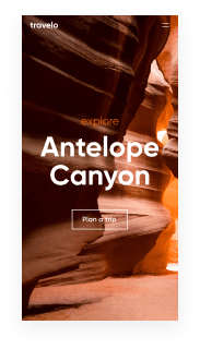
Bring your ideas to life with Instapage's mobile friendly case study page template
Unleash your creativity with the mobile friendly case study page template. Try Instapage today.
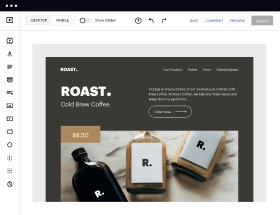
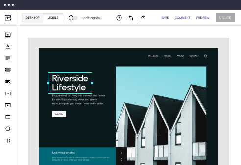
Easy to build without coding
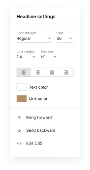
With the intuitive drag-and-drop builder, anyone on your team can create high-converting pages without any knowledge of code or design. Make enhancements to your landing page with custom widgets using Javascript, HTML/CSS, or third-party scripts.
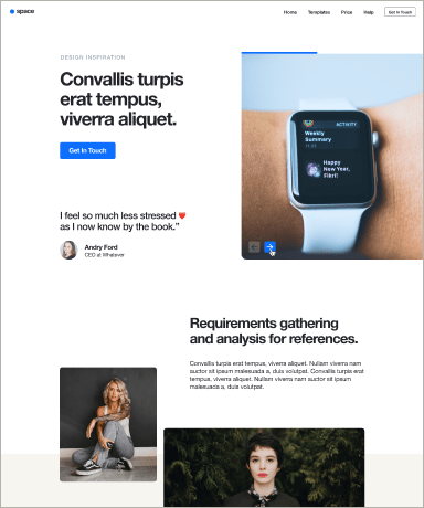
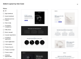
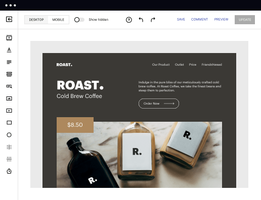
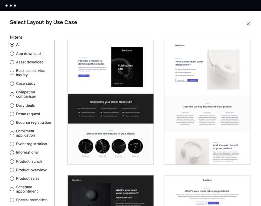
Multiple layouts for any industry and goal
Select from 500+ landing page layouts built to boost conversions across industry-specific scenarios. Customize them by adjusting fonts, adding images, and generating on-brand content with the AI assistant. Quickly scale with Instablocks® and Global Blocks that you can save, reuse, and update globally.
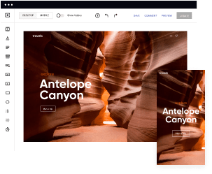
Loads fast and looks polished on any device
Every template is responsive, which means they present professionally on any device and load blazingly fast with our Thor Render Engine. You can also power them up with Google AMP technology to deliver an unparalleled mobile experience and drive higher conversions.
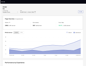
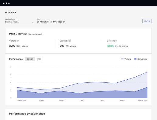
Robust analytics & experimentation
Get real-time updates and reporting across all your devices, showing the number of visitors, conversions, cost-per-visitor, and cost-per-lead. Launch AI-powered experiments, run A/B tests, and use heatmaps to analyze user behavior, then optimize your landing page to maximize conversions.
Easy to build without coding
With the intuitive drag-and-drop builder, anyone on your team can create high-converting pages without any knowledge of code or design. Make enhancements to your landing page with custom widgets using Javascript, HTML/CSS, or third-party scripts.
Multiple layouts for any industry and goal
Select from 500+ landing page layouts built to boost conversions across industry-specific scenarios. Customize them by adjusting fonts, adding images, and generating on-brand content with the AI assistant. Quickly scale with Instablocks® and Global Blocks that you can save, reuse, and update globally.
Loads fast and looks polished on any device
Every template is responsive, which means they present professionally on any device and load blazingly fast with our Thor Render Engine. You can also power them up with Google AMP technology to deliver an unparalleled mobile experience and drive higher conversions.
Robust analytics & experimentation
Get real-time updates and reporting across all your devices, showing the number of visitors, conversions, cost-per-visitor, and cost-per-lead. Launch AI-powered experiments, run A/B tests, and use heatmaps to analyze user behavior, then optimize your landing page to maximize conversions.
All the features you need to build lead-generating landing pages

Landing page builder
Easily create landing pages with the intuitive drag-and-drop page builder that features contextual element editing, over 500 page layouts, and 33 million images.

Visual on-page collaboration
Invite teammates and clients to collaborate on page design in real time to get your pages created, reviewed, and launched faster.

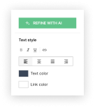
AI content generation
Instantly generate audience-focused content with AI-crafted headlines, paragraphs, and CTAs directly within the Instapage builder.

500+ customizable layouts
Choose from a range of professionally tailored page layouts, specifically designed to enhance conversion rates across numerous industry-specific scenarios.
Instablocks
Quickly build personalized landing pages using individual page blocks that you can customize, save, and reuse.
Thor Render Engine
Our back-end technology ensures that your landing pages load quickly to increase conversions, SEO rankings, and enhance the overall user experience.
AMP
Use Google AMP framework to build and A/B test mobile-responsive pages that load fast and drive more conversions.
Analytics
Seamlessly connect to Google Analytics to get real-time updates on cost-per-visitor and cost-per-lead metrics directly in the Instapage platform.
Learn how to build top-performing landing pages for any goal
FAQs
“Instapage gives us the ability to tailor our landing page content and layout to tell a unique story for each geographical target. The platform also enables us to create different variations with content that performs well for each unique channel. Every marketing team needs this!”

"Instapage has truly maximized our digital advertising performance by enabling us to offer matching, personalized experiences for every ad and audience. Now we can scale our landing page experiences as efficiently and effectively as we scale the ads themselves."

"If we have to wait on a developer, our creative velocity plummets. But Instapage has made it possible for us to exponentially grow our advertising programs and convert more customers"

Leading the way in building high-performing landing pages


The Ultimate Guide to Creating a Mobile Friendly Case Study Page Template
A mobile friendly case study page template is essential for marketers looking to showcase success stories effectively across various devices. Instapage offers a robust solution with customizable designs that fit the needs of your target audience, enhancing engagement and conversions. Optimizing for mobile ensures that your case studies reach users where they are, on-the-go.
Understanding the Importance of Mobile Friendly Case Study Pages
In a world where mobile browsing dominates, having a mobile-friendly case study page is not just an option; it's a necessity. Mobile-friendly designs improve user experience, reduce bounce rates, and increase time spent on your page. These elements are crucial for capturing leads and driving conversions. Marketers must prioritize this aspect to optimize campaigns effectively.
- Enhanced user experience: Mobile designs ensure easy navigation and readability on smaller screens.
- Increased conversion rates: Optimized pages can lead to higher engagement and lead capture through effective call-to-action placements.
- Improved SEO rankings: Search engines favor mobile-friendly websites, enhancing visibility.
Step 1: Choosing the Right Template
Selecting a template designed for mobile responsiveness is key. Instapage provides over 100 high-converting templates tailored for various industries. Look for templates that offer flexibility, ease of customization, and integration options.
- Industry-specific designs: Use templates tailored to your niche for more relatable content.
- Customization options: Ensure it allows for personalized branding and color schemes.
- Pre-built lead gen features: Templates should include elements like forms and CTAs to capture information effortlessly.
Step 2: Incorporating Engaging Content
Engaging content is imperative for case studies. Use storytelling techniques to connect with your audience, supporting claims with data and visuals. Utilize dynamic text replacement to cater content specifically to unique audience segments, thus enhancing relevance.
- Compelling headlines: Start with attention-grabbing headings that summarize your case study.
- Data-driven insights: Include relevant statistics and outcomes to showcase success clearly.
- Visual elements: Infographics and images can add depth and retain user interest.
Step 3: Testing and Optimizing Your Page
Once your mobile friendly case study page is live, it’s crucial to test its performance. Use A/B testing and heatmaps to analyze user behavior. Adapt your design and content based on this feedback for continuous improvement.
In conclusion, a mobile friendly case study page template is vital in today's digital marketing landscape. By following these steps, you can create a template that not only looks great on any device but also drives results.
Ready to elevate your case studies to the next level? Sign up for Instapage today and explore the powerful mobile friendly templates that can enhance your digital marketing efforts.
People also ask about Mobile friendly case study page template
Ready to skyrocket conversions?
Supercharge your ad campaigns with high-performing landing pages
Get started