
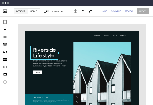
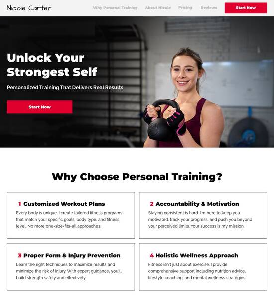
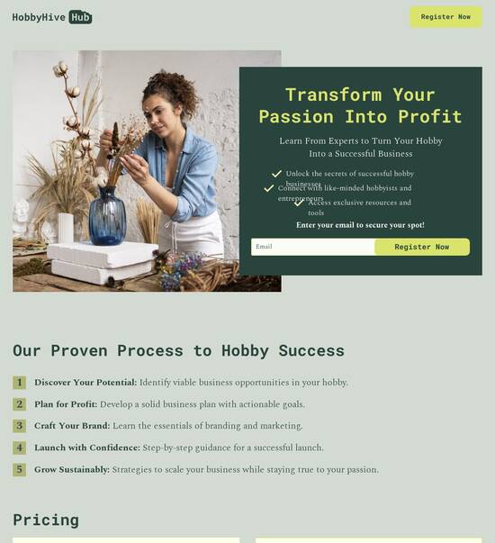
Mobile friendly brochure website template
Explore Similar TemplatesAbout template
Drive more leads with Instapage mobile friendly brochure website template built to maximize conversions. Easy customization - no designer or coding skills needed.
Recommended templates
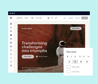
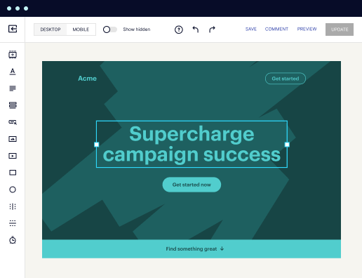
Easy to build without coding
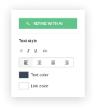
With the intuitive drag-and-drop builder, anyone on your team can create high-converting pages without any knowledge of code or design. Make enhancements to your landing page with custom widgets using Javascript, HTML/CSS, or third-party scripts.
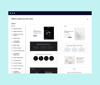
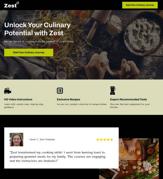
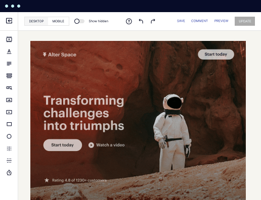
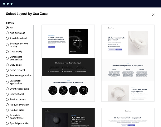
Multiple layouts for any industry and goal
Select from 500+ landing page layouts built to boost conversions across industry-specific scenarios. Customize them by adjusting fonts, adding images, and generating on-brand content with the AI assistant. Quickly scale with Instablocks® and Global Blocks that you can save, reuse, and update globally.
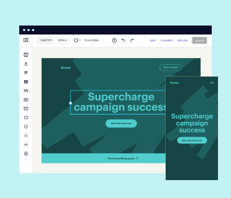
Loads fast and looks polished on any device
Every template is responsive, which means they present professionally on any device and load blazingly fast with our Thor Render Engine. You can also power them up with Google AMP technology to deliver an unparalleled mobile experience and drive higher conversions.
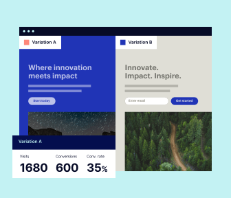
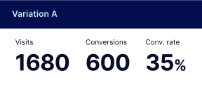
Robust analytics & experimentation
Get real-time updates and reporting across all your devices, showing the number of visitors, conversions, cost-per-visitor, and cost-per-lead. Launch AI-powered experiments, run A/B tests, and use heatmaps to analyze user behavior, then optimize your landing page to maximize conversions.

Easy to build without coding
With the intuitive drag-and-drop builder, anyone on your team can create high-converting pages without any knowledge of code or design. Make enhancements to your landing page with custom widgets using Javascript, HTML/CSS, or third-party scripts.
Multiple layouts for any industry and goal
Select from 500+ landing page layouts built to boost conversions across industry-specific scenarios. Customize them by adjusting fonts, adding images, and generating on-brand content with the AI assistant. Quickly scale with Instablocks® and Global Blocks that you can save, reuse, and update globally.
Loads fast and looks polished on any device
Every template is responsive, which means they present professionally on any device and load blazingly fast with our Thor Render Engine.
Robust analytics & experimentation
Get real-time updates and reporting across all your devices, showing the number of visitors, conversions, cost-per-visitor, and cost-per-lead. Launch AI-powered experiments, run A/B tests, and use heatmaps to analyze user behavior, then optimize your landing page to maximize conversions.
All the features you need to build lead-generating landing pages

Landing page builder
Easily create landing pages with the intuitive drag-and-drop page builder that features contextual element editing, over 500 page layouts, and 33 million images.

Visual on-page collaboration
Invite teammates and clients to collaborate on page design in real time to get your pages created, reviewed, and launched faster.

AI content generation
Instantly generate audience-focused content with AI-crafted headlines, paragraphs, and CTAs directly within the Instapage builder.

500+ customizable layouts
Choose from a range of professionally tailored page layouts, specifically designed to enhance conversion rates across numerous industry-specific scenarios.
Instablocks
Quickly build personalized landing pages using individual page blocks that you can customize, save, and reuse.
Thor Render Engine
Our back-end technology ensures that your landing pages load quickly to increase conversions, SEO rankings, and enhance the overall user experience.
Analytics
Seamlessly connect to Google Analytics to get real-time updates on cost-per-visitor and cost-per-lead metrics directly in the Instapage platform.
Learn how to build top-performing landing pages for any goal
FAQs
“Instapage gives us the ability to tailor our landing page content and layout to tell a unique story for each geographical target. The platform also enables us to create different variations with content that performs well for each unique channel. Every marketing team needs this!”

"Instapage has truly maximized our digital advertising performance by enabling us to offer matching, personalized experiences for every ad and audience. Now we can scale our landing page experiences as efficiently and effectively as we scale the ads themselves."

"If we have to wait on a developer, our creative velocity plummets. But Instapage has made it possible for us to exponentially grow our advertising programs and convert more customers"

Leading the way in building high-performing landing pages


Maximize your marketing ROI with Instapage's powerful landing page and CRO platform
In an era where digital marketing is paramount, utilizing a dedicated landing page and conversion rate optimization (CRO) platform like Instapage can significantly enhance your marketing efforts. This guide will take you through the essential steps of leveraging Instapage to maximize your digital campaigns, especially relevant for marketers in sectors such as business services, education, and technology.
Step 1: Choose from a vast range of high-converting templates
Instapage offers over 100 ready-to-use templates designed specifically for conversion optimization, allowing you to launch campaigns quickly. Each template is customizable, catering to various industries, ensuring that your brand's unique voice is heard.
- Flexibility: Easily adjust color schemes, images, and content to reflect your brand identity.
- Speed: Quickly deploy campaigns without the need for extensive coding or technical skills.
- Performance: High-converting designs tested for effectiveness, allowing you to collect leads efficiently.
Step 2: Optimize your landing pages for maximum conversion
Once your landing pages are set up, it’s crucial to continually optimize them to enhance conversion rates. Instapage provides built-in tools for A/B testing, allowing marketers to make data-driven decisions to improve their campaigns.
- Heatmaps: Understand how users navigate your pages and identify areas for improvement.
- A/B Testing: Run experiments to test different elements and see which perform better with your audience.
- Analytics Dashboard: Utilize comprehensive analytics to monitor performance and make informed strategies.
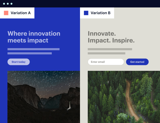
Step 3: Personalize your content for targeted audiences
Tailoring your messaging is key to appealing to specific audience segments. Instapage's personalization features enable dynamic content delivery, aligning your landing pages with unique audience attributes.
- Dynamic Text Replacement: Show different headlines or content pieces based on the traffic source.
- Specific Ads to Landing Pages: Use AdMaps to connect specific advertisements to targeted landing pages.
- Audience Level Metrics: Track how different segments interact with your content for refined messaging.
Effective collaboration between marketing teams can significantly reduce production time and enhance creativity during the landing page creation process.
By following these steps, you can effectively leverage Instapage to create high-performing landing pages and optimize your campaigns for maximum impact.
Start your journey towards better marketing performance today by exploring Instapage's features to boost your ROI!
People also ask about Mobile friendly brochure website template
Mobile friendly brochure website templates: A comprehensive guide
Understanding mobile friendly brochure website templates
In a world that thrives on technology and interconnectedness, mobile friendly brochure website templates have emerged as essential tools for businesses looking to establish a significant online presence. These templates are designed not only to showcase services and products effectively but also to ensure an optimal user experience on mobile devices. This guide will explore the evolution, features, and best practices of utilizing these templates for maximum impact.
The evolution of brochure websites
Historically, brochure websites provided a digital alternative to printed marketing materials, allowing companies to transition from paper to pixel seamlessly. This shift indicated a remarkable transformation in how businesses conveyed information, evolving from static content to interactive experiences that engage users at various levels. Over time, defining characteristics of brochure websites became clear: they prioritize simplicity, clarity, and the conveyance of essential information without overwhelming the audience.
The push for mobile responsiveness began as smartphones and tablets became ubiquitous. Businesses quickly recognized that an increasing number of potential customers were interacting with their content on smaller screens, necessitating a shift in design philosophy. Mobile friendly brochure website templates emerged to address this need, ensuring that every aspect of a website—from text to images and navigation—is tailored specifically for mobile devices.
Key features of mobile friendly brochure website templates
A mobile friendly brochure website template incorporates various key features to enhance user experience, starting with responsive design principles. Fluid grids allow layouts to adapt seamlessly to different screen sizes, ensuring that content remains accessible and visually appealing, no matter the device. This adaptability is complemented by flexible images, which scale appropriately to avoid distortion, thereby enhancing overall performance.
Touch-friendly navigation plays a crucial role as well, as larger clickable areas facilitate easy engagement for users navigating with their fingers. Incorporating gesture-based interactions such as swipe, tap, and pinch enhances usability, making it vital for template designers to include these elements. Furthermore, optimized load times are essential, as slow-loading websites can deter users. Compression techniques and utilizing content delivery networks (CDNs) contribute to fast rendering, ensuring that mobile users have a satisfactory browsing experience.
The role of functionality in template design
Functionality within mobile friendly brochure website templates is paramount for delivering an intuitive user interface (UI). A well-structured UI allows visitors to find information quickly, contributing to lower bounce rates and increased user engagement. Additionally, integrating multimedia elements like video backgrounds or image galleries can capture attention effectively. Videos provide an engaging medium for storytelling, while galleries showcase products or services vividly, creating an immersive experience for potential clients.
Moreover, code efficiency is a critical consideration. By focusing on minimizing bloat, developers can ensure that mobile friendly templates load quickly. This emphasis on speed also plays a significant role in the overall user experience, as sluggish performance can lead to frustration and deter repeat visits. Prioritizing essential functionalities without unnecessary extras allows brands to maintain a clean aesthetic and effective engagement.
The technical backbone: iolazy and document.addEventListener
A deeper understanding of modern web technologies such as iolazy and document.addEventListener can significantly enhance the effectiveness of mobile friendly brochure website templates. iolazy is a technique that improves loading times by delaying the loading of images until they are needed, resulting in quicker initial page loads. This lazy loading strategy keeps users engaged while also preserving bandwidth, ultimately contributing to a more pleasant browsing experience.
On the other hand, implementing document.addEventListener allows for more straightforward event handling within the Document Object Model (DOM). With this method, developers can manage user interactions efficiently. Using events such as DOMContentLoaded to enhance site performance enables specific scripts to load only when necessary. In practical terms, this means that users experience a more responsive and engaging site from the moment they arrive, leading to increased satisfaction and longer visit durations.
Enhancing user engagement with interactive elements
Interactive elements are essential for enhancing user engagement within a mobile friendly brochure website template. Call to action buttons, for example, should be strategically placed and designed for maximum impact. Their accessibility and visualization can lead to increased conversion rates, providing marketers a way to prompt users effectively. Employing A/B testing can further optimize these elements, determining which designs yield the best results for conversions.
Another significant factor is the integration of forms and lead capturing mechanisms. Utilizing inline forms allows for seamless user interaction, encouraging visitors to provide their information willingly. When integrated with third-party services, follow-ups become more manageable and organized. Additionally, displaying social proof—such as testimonials or reviews—succinctly and effectively builds credibility. Incorporating trust badges and awards can significantly enhance how potential customers perceive a brand's reliability.
SEO optimization for mobile friendly templates
As mobile search continues to rise, optimizing mobile friendly brochure website templates for search engines becomes critical. Mobile-first indexing means that search engines prioritize mobile versions of websites for ranking, making it essential for businesses to invest in SEO practices tailored for mobile platforms. Implementing responsive meta tags and appropriate viewport settings helps ensure search engines can effectively crawl and index content.
Structured data is another vital component that enhances visibility in search results. By organizing content meaningfully, businesses can attract more clicks from potential customers. Monitoring performance through analytics tools aids in tracking user behavior and metrics, paving the way for continuous improvement. Gleaning insights from user interactions allows for adjustments that align content and design to market needs.
Visual appeal: crafting compelling aesthetics
The visual landscape of a mobile friendly brochure website template plays a vital role in creating compelling user experiences. Balancing design with usability is crucial—achieving an attractive aesthetic while ensuring users can navigate seamlessly is essential. Choosing color schemes, typography, and imagery carefully can reinforce branding and resonate with target audiences effectively.
Utilizing white space is equally important, as it enhances readability and focus. By allowing elements to breathe, users can absorb information without feeling overwhelmed. Combining these design principles fosters positive impressions, encouraging deeper engagement and building trust with potential customers.
Case studies: successful implementations of mobile friendly templates
Looking at industry leaders, we can see significant success in implementing mobile friendly brochure website templates. Companies that adopted these designs early on often report substantial traffic increases and higher conversion rates compared to their previous sites. For example, a tech company redesigned its online presence with a mobile-first approach and experienced a 40% boost in traffic within six months, showcasing the tangible benefits of prioritizing mobile design.
Lessons learned from these implementations underscore the importance of effective design and functionality. Industry leaders emphasize the need for continuous testing and optimization, adjusting elements based on user feedback and behavior analysis. Through this iterative process, brands can adapt to changing market dynamics and refine their offerings effectively.
Future trends in brochure website development
As we look ahead, several key trends are emerging within brochure website development. The shift towards progressive web apps (PWAs) indicates that businesses are increasingly seeking solutions that combine the benefits of both websites and applications. PWAs provide faster loading times, offline access, and enhanced interactivity, appealing to users who expect seamless experiences.
In addition, anticipating user expectations in 2024 and beyond involves recognizing the growing significance of artificial intelligence (AI) and machine learning in design tools. These technologies can enable more personalized web experiences, with dynamic content that adapts in real-time based on user interactions, leading to greater satisfaction and continued engagement.
Crafting your own mobile friendly brochure website
Building a mobile friendly brochure website can seem daunting, yet the process can be streamlined with a step-by-step approach. Start by selecting the right template for your needs, identifying features that align with your brand goals. Once a suitable template is chosen, editing text and images requires a focus on clarity and brevity to convey messages effectively.
Testing across multiple devices and browsers is essential to ensure compatibility. Prior to launching your website, simulate user interactions through various platforms to identify potential issues. Common pitfalls include overcomplicating design elements or ignoring performance optimization, both of which can detract from user experience.
The long-term benefits of investing in mobile friendly templates
Investing in mobile friendly brochure website templates yields numerous long-term benefits. Cost-effectiveness comes from saving time and resources—pre-designed templates reduce development time while maintaining high-quality features. This approach not only optimizes budgets but also allows for faster deployment of marketing strategies.
Furthermore, enhancing brand perception and trustworthiness is crucial in today’s competitive landscape. A well-designed mobile friendly website communicates professionalism, establishing credibility among potential customers. As technological advances continue to progress, being equipped with responsive templates prepares businesses to meet the evolving needs and behaviors of users efficiently.
Ready to skyrocket conversions?
Supercharge your ad campaigns with high-performing landing pages
Get started