Bring your ideas to life with Instapage's mobile friendly archive page template
Unleash your creativity with the mobile friendly archive page template. Try Instapage today.
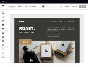
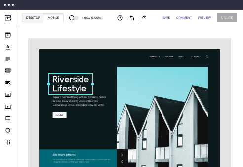
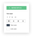
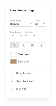
Easy to build without coding
With the intuitive drag-and-drop builder, anyone on your team can create high-converting pages without any knowledge of code or design. Make enhancements to your landing page with custom widgets using Javascript, HTML/CSS, or third-party scripts.
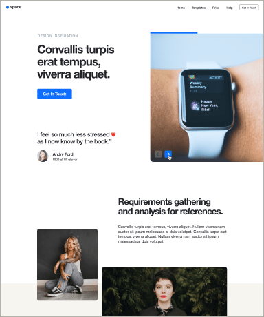
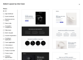
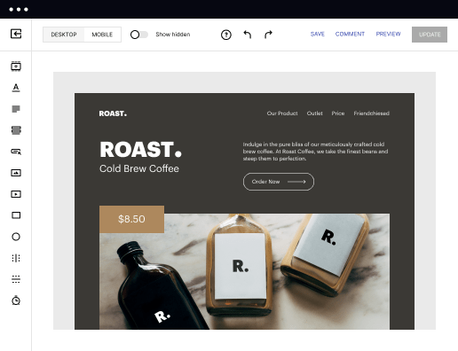
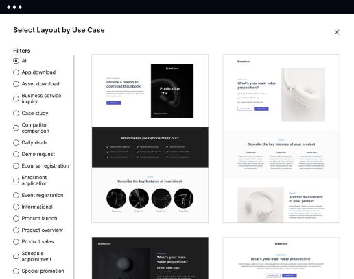
Multiple layouts for any industry and goal
Select from 500+ landing page layouts built to boost conversions across industry-specific scenarios. Customize them by adjusting fonts, adding images, and generating on-brand content with the AI assistant. Quickly scale with Instablocks® and Global Blocks that you can save, reuse, and update globally.
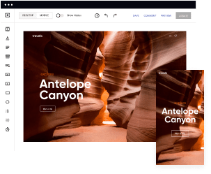
Loads fast and looks polished on any device
Every template is responsive, which means they present professionally on any device and load blazingly fast with our Thor Render Engine. You can also power them up with Google AMP technology to deliver an unparalleled mobile experience and drive higher conversions.
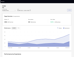
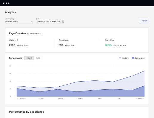
Robust analytics & experimentation
Get real-time updates and reporting across all your devices, showing the number of visitors, conversions, cost-per-visitor, and cost-per-lead. Launch AI-powered experiments, run A/B tests, and use heatmaps to analyze user behavior, then optimize your landing page to maximize conversions.

Easy to build without coding
With the intuitive drag-and-drop builder, anyone on your team can create high-converting pages without any knowledge of code or design. Make enhancements to your landing page with custom widgets using Javascript, HTML/CSS, or third-party scripts.
Multiple layouts for any industry and goal
Select from 500+ landing page layouts built to boost conversions across industry-specific scenarios. Customize them by adjusting fonts, adding images, and generating on-brand content with the AI assistant. Quickly scale with Instablocks® and Global Blocks that you can save, reuse, and update globally.
Loads fast and looks polished on any device
Every template is responsive, which means they present professionally on any device and load blazingly fast with our Thor Render Engine. You can also power them up with Google AMP technology to deliver an unparalleled mobile experience and drive higher conversions.
Robust analytics & experimentation
Get real-time updates and reporting across all your devices, showing the number of visitors, conversions, cost-per-visitor, and cost-per-lead. Launch AI-powered experiments, run A/B tests, and use heatmaps to analyze user behavior, then optimize your landing page to maximize conversions.
All the features you need to build lead-generating landing pages

Landing page builder
Easily create landing pages with the intuitive drag-and-drop page builder that features contextual element editing, over 500 page layouts, and 33 million images.

Visual on-page collaboration
Invite teammates and clients to collaborate on page design in real time to get your pages created, reviewed, and launched faster.

AI content generation
Instantly generate audience-focused content with AI-crafted headlines, paragraphs, and CTAs directly within the Instapage builder.

500+ customizable layouts
Choose from a range of professionally tailored page layouts, specifically designed to enhance conversion rates across numerous industry-specific scenarios.
Instablocks
Quickly build personalized landing pages using individual page blocks that you can customize, save, and reuse.
Thor Render Engine
Our back-end technology ensures that your landing pages load quickly to increase conversions, SEO rankings, and enhance the overall user experience.
AMP
Use Google AMP framework to build and A/B test mobile-responsive pages that load fast and drive more conversions.
Analytics
Seamlessly connect to Google Analytics to get real-time updates on cost-per-visitor and cost-per-lead metrics directly in the Instapage platform.
Learn how to build top-performing landing pages for any goal
FAQs
“Instapage gives us the ability to tailor our landing page content and layout to tell a unique story for each geographical target. The platform also enables us to create different variations with content that performs well for each unique channel. Every marketing team needs this!”

"Instapage has truly maximized our digital advertising performance by enabling us to offer matching, personalized experiences for every ad and audience. Now we can scale our landing page experiences as efficiently and effectively as we scale the ads themselves."

"If we have to wait on a developer, our creative velocity plummets. But Instapage has made it possible for us to exponentially grow our advertising programs and convert more customers"

Leading the way in building high-performing landing pages


An intuitive guide to creating powerful landing pages with Instapage
Designing high-converting landing pages is crucial for any marketing strategy, and Instapage provides the most powerful tools to help you achieve your digital marketing goals. With its vast library of templates and user-friendly page creation features, you can easily transform your campaigns and maximize your ROI.
Understanding the purpose of landing pages
Landing pages are distinct from standard web pages, designed specifically to drive conversions by guiding visitors towards a single action, such as signing up or making a purchase. The focus on targeted messaging and minimal distractions will significantly enhance the effectiveness of your campaigns.
- Effective messaging: Clearly communicate your offer with a compelling headline and concise copy.
- Strong visuals: Use eye-catching images and designs that resonate with your target audience.
- Clear call-to-action: Direct visitors clearly towards the desired action with noticeable buttons.
Step 1: Selecting the right template
Choosing the right landing page template is the first and crucial step in your design process. Instapage offers over 100 ready-to-use templates, allowing you to find one that suits your specific marketing goal.
- Consider your audience: Select a design that resonates with your identified market segment.
- Assess conversion focus: Opt for templates designed for higher engagement based on your campaign analysis.
- Customization potential: Ensure the template you select can be personalized to cater to your unique branding.
Step 2: Customizing your landing page
With the template chosen, it’s time to customize it using Instapage’s intuitive builder. Add your own branding elements, modify text and visuals, and ensure the layout aligns with your campaign’s objectives.
- Utilize dynamic text replacement for personalized user experiences.
- Incorporate testimonials or social proof to enhance credibility.
- A/B testing different layouts and copy to discover what resonates best with your audience.
Step 3: Optimizing for conversion
After building and customizing, the final step is to optimize your landing pages for maximum conversions. Instapage’s built-in analytics and heatmaps allow you to assess user interactions and make data-driven decisions.
- Regularly check analytics: Analyze conversion rates and traffic sources to inform future strategies.
- Utilize A/B testing: Test different versions of your landing page to fine-tune performance.
- Focus on loading speed: Ensure fast loading times to minimize visitor drop-off rates.
Following these steps will ensure your landing pages effectively convert visitors into leads or customers.
Ready to elevate your marketing campaigns? Start using Instapage today to build conversion-centric landing pages tailored to your audience!
People also ask about Mobile friendly archive page template
Creating a mobile friendly archive page template
Understanding the essence of a mobile friendly archive page template
The importance of designing a mobile friendly archive page template cannot be overstated for today's website users. With a growing number of visitors accessing websites from smartphones and tablets, ensuring your archive page is optimized for mobile devices is essential. A mobile friendly design focuses on user experience, balancing aesthetic appeal with functionality to facilitate browsing.
Defining mobile friendly archive page templates
Mobile friendly archive page templates embody design principles that prioritize accessibility and usability on smaller screens. They serve as crucial repositories for blog posts, articles, and multimedia content, enabling users to find relevant information quickly and easily. Essential elements include simplicity in design, easy navigation, and a layout that adapts seamlessly to different screen sizes.
Responsive layout to accommodate screens of all sizes.
Concise categories or tags to streamline content discovery.
Clear calls to action guiding users to relevant content.
The architecture of a mobile friendly archive page template
Building a mobile friendly archive page requires consideration of its architecture. The layout design should utilize responsive strategies to ensure it looks good on any device, while content structuring and consistent styling make navigation a breeze for users.
Layout design
Responsive design is at the heart of an effective mobile friendly archive page template. This means employing a flexible grid system to ensure that the layout adjusts according to the screen dimensions. Implement spacious navigational elements that facilitate easy tapping. In practical terms, this might mean larger buttons and links, reducing the chance of misclicks which are common on smaller screens.
Content structuring
Content should be arranged optimally to enhance readability. Using summary cards provides a visually appealing way to showcase post previews. Each summary can include an eye-catching image, the title, and a brief description. Ensure your archive is navigable for users with disabilities; this means using alt text for images and ensuring compatibility with screen readers.
Consistency in styles
Your theme should maintain consistency across devices. Choose typography with clear readability and ensure that your color schemes provide high contrast to enhance visibility. This not only aids user experience but also reinforces your brand identity, making it easier for users to recognize and trust your website.
Enhancing user experience with selectors
Selectors play a significant role in creating a seamless user experience on your mobile friendly archive page. By enabling filters and categories, users can easily navigate through different posts, making their journey more enjoyable and efficient.
Filters and categories
Allowing users to filter and categorize content fosters a sense of control over their browsing experience. Well-organized categories can directly impact user engagement, giving visitors quick access to topics that interest them without excessive scrolling.
Hierarchical categorization for intuitive navigation.
Tag clouds for popular topics.
Checkboxes for multi-selection filtering.
Search functionality
Embedding search functionality is essential for enhancing the discoverability of archived content. Users appreciate robust search tools that can sift through multiple posts quickly.
Incorporate an auto-suggest feature to improve search efficiency.
Utilize filters in search results to narrow down options.
Ensure your search bar is prominent and always accessible.
Key features of an effective mobile friendly archive page template
Having outlined the architectural elements, it’s crucial to dig deeper into the key features that can make your mobile friendly archive page template truly effective. Fast loading times and visual appeal through multimedia integration are just the start.
Fast loading times
Optimizing loading speeds on mobile devices is fundamental in keeping users engaged. Techniques such as compressing images, using browser caching, and minimizing the use of heavy scripts can significantly enhance speed. Additionally, mobile optimization plays a pivotal role in search engine ranking, meaning faster pages can positively impact your SEO.
Visual appeals with multimedia
Embedding images and videos seamlessly is essential for creating visual interest. Best practices include using optimized thumbnail sizes that load quickly without sacrificing quality. Videos should be positioned strategically within your layout to complement the content effectively and not disrupt user flow.
Integration of plugins
To enhance functionality, consider integrating plugins that can streamline social sharing, boost SEO, or add analytics capability. A variety of plugins are available across platforms, and establishing communication with plugin authors for customization support can further enhance usability.
Benefits of implementing a mobile friendly archive page template
Adopting a mobile friendly archive page template bears multiple benefits that resonate with your audience and improve engagement metrics. Users are more likely to spend more time on your site and interact with content for longer periods when the experience feels optimized for their devices.
Improved engagement metrics
When users find the content they want quickly and efficiently, they're more inclined to stay on the website longer, resulting in reduced bounce rates. The connection between positive user experience and conversions becomes increasingly apparent, making it clear why prioritizing a mobile friendly design is key.
SEO advantages
Mobile-friendliness has become a critical ranking factor for search engines. Ensuring your archive page is optimized not only augments user experience but also enhances your website's visibility. Archive strategies that prioritize mobile optimization can lead to increased organic traffic, boosting your overall SEO performance.
Adaptability for future needs
Preparing your archive template for emerging technologies is a pivotal aspect of long-term planning. An adaptable design allows for easy updates and scalability, ensuring that your archive remains relevant as new trends and technologies arise.
Best practices for creating a high-performing archive page
To ensure your mobile friendly archive page template performs well, adhering to best practices is essential. Prioritizing performance with tools that gauge and enhance page speed should be at the forefront of your strategy.
Continuous user testing
Regularly gathering feedback from users can drive informed design choices. A/B testing different layouts and styles provides needed insights that can significantly shape future updates.
Using analytics for optimization
Utilize analytics to track user interactions, identifying areas that may require improvement. Monitoring metrics such as page views, time spent on page, and bounce rates can offer essential insights for ongoing optimization.
Case studies: Success stories of effective mobile friendly archive pages
Real-world examples of businesses implementing effective mobile friendly archive pages can provide valuable insights for your own strategies. Examining transformative cases where companies excelled in their archive design reveals specific elements that contributed to their success.
Transformative examples
Take note of companies that have significantly improved their user experience with redesigned mobile friendly archive pages. Notable transformations can often be traced back to clear navigation, appealing visuals, and swift loading times.
Lessons learned from failed implementations
Analyze instances where poorly designed mobile friendly archive pages resulted in user frustration. Avoid common pitfalls such as cluttered layouts, unresponsive design, and messy navigation, and instead focus on fundamental planning before deployment.
Future trends in mobile friendly archive page design
Anticipating future trends in mobile friendly archive page design can help you remain competitive. The rise of artificial intelligence promises to shape user experience dramatically.
The rise of AI in content layout
AI technologies can potentially revolutionize how content is arranged on mobile friendly archive pages. Adaptive algorithms may analyze user behavior to tailor layouts that intuitively present content visitors are likely to engage with.
Expected technological advances
Innovations such as augmented reality and voice search are expected to shape the future of web design. Therefore, keeping an eye on tech developments and preparing to integrate them into your mobile friendly archive page template will ensure you stay ahead.
Navigating the technical aspects
Understanding the technical aspects behind a mobile friendly archive page template is essential for customization. Leveraging CSS selectors for unique styling can allow you to develop a distinct brand identity.
Understanding coding selectors for customization
Familiarizing yourself with CSS selectors can enhance your ability to fine-tune templates through code. Grasping key concepts can transform your approach to design, aiding in the creation of truly unique layouts.
Leveraging content management systems (cms)
Selecting the right CMS can drastically impact your archive page's functionality. Popular CMS options provide diverse templates, each allowing varying degrees of customization.
Creating your own mobile friendly archive page template
Building a mobile friendly archive page template is a rewarding experience. By following a structured approach that allows you to design a basic template from scratch, you can develop a system that integrates all necessary functionality.
Step-by-step tutorial
Start by creating a wireframe of your layout, focusing on how elements will flow on mobile screens. After defining spaces for posts, categories, and navigational elements, build out the template with your chosen CMS or coding framework, constantly testing for usability.
Resources for continuous improvement
Tap into communities of designers and developers for feedback and inspiration. Continuously seeking out new tools and learning about mobile design best practices will keep your skills sharp and your templates relevant.
Ready to skyrocket conversions?
Supercharge your ad campaigns with high-performing landing pages
Get started