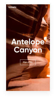
Find your interactive website template optimized for Nokia smartphone and reach your audience wherever they are
Instapage interactive website templates look great and convert on any device, including Nokia smartphone. Start customizing it now!
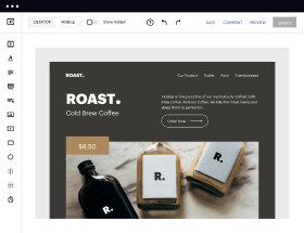
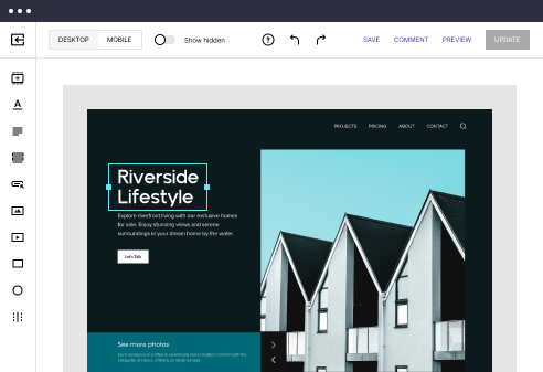
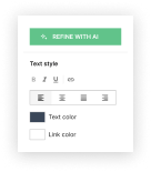
Easy to build without coding
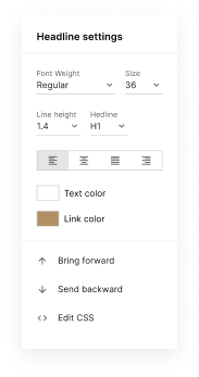
With the intuitive drag-and-drop builder, anyone on your team can create high-converting pages without any knowledge of code or design. Make enhancements to your landing page with custom widgets using Javascript, HTML/CSS, or third-party scripts.
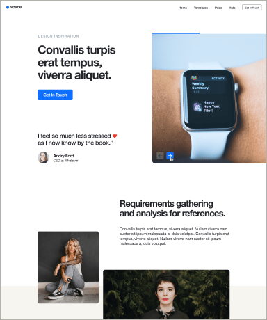
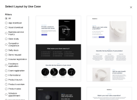
Multiple layouts for any industry and goal
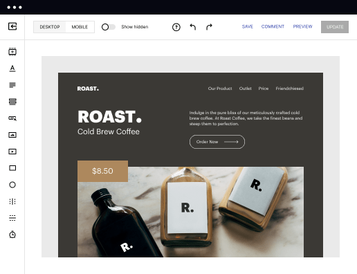
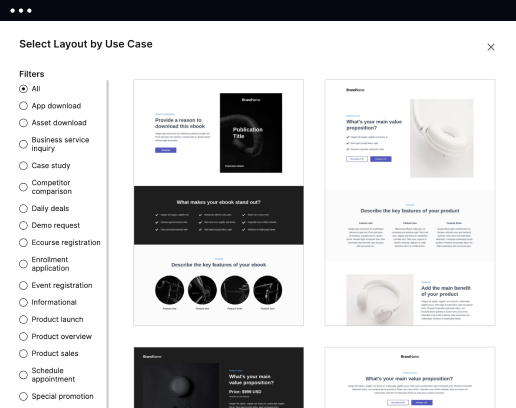
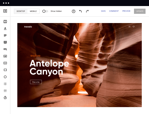
Select from 500+ landing page layouts built to boost conversions across industry-specific scenarios. Customize them by adjusting fonts, adding images, and generating on-brand content with the AI assistant. Quickly scale with Instablocks® and Global Blocks that you can save, reuse, and update globally.
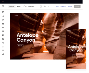
Loads fast and looks polished on any device
Every template is responsive, which means they present professionally on any device and load blazingly fast with our Thor Render Engine. You can also power them up with Google AMP technology to deliver an unparalleled mobile experience and drive higher conversions.
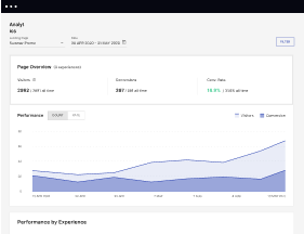
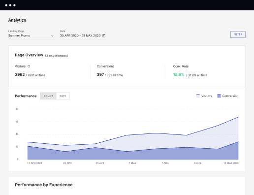
Robust analytics & experimentation
Get real-time updates and reporting across all your devices, showing the number of visitors, conversions, cost-per-visitor, and cost-per-lead. Launch AI-powered experiments, run A/B tests, and use heatmaps to analyze user behavior, then optimize your landing page to maximize conversions.
Easy to build without coding
With the intuitive drag-and-drop builder, anyone on your team can create high-converting pages without any knowledge of code or design. Make enhancements to your landing page with custom widgets using Javascript, HTML/CSS, or third-party scripts.
Multiple layouts for any industry and goal
Select from 500+ landing page layouts built to boost conversions across industry-specific scenarios. Customize them by adjusting fonts, adding images, and generating on-brand content with the AI assistant. Quickly scale with Instablocks® and Global Blocks that you can save, reuse, and update globally.
Loads fast and looks polished on any device
Every template is responsive, which means they present professionally on any device and load blazingly fast with our Thor Render Engine. You can also power them up with Google AMP technology to deliver an unparalleled mobile experience and drive higher conversions.
Robust analytics & experimentation
Get real-time updates and reporting across all your devices, showing the number of visitors, conversions, cost-per-visitor, and cost-per-lead. Launch AI-powered experiments, run A/B tests, and use heatmaps to analyze user behavior, then optimize your landing page to maximize conversions.
All the features you need to build lead-generating landing pages

Landing page builder
Easily create landing pages with the intuitive drag-and-drop page builder that features contextual element editing, over 500 page layouts, and 33 million images.

Visual on-page collaboration
Invite teammates and clients to collaborate on page design in real time to get your pages created, reviewed, and launched faster.

AI content generation
Instantly generate audience-focused content with AI-crafted headlines, paragraphs, and CTAs directly within the Instapage builder.

500+ customizable layouts
Choose from a range of professionally tailored page layouts, specifically designed to enhance conversion rates across numerous industry-specific scenarios.
Instablocks
Quickly build personalized landing pages using individual page blocks that you can customize, save, and reuse.
Thor Render Engine
Our back-end technology ensures that your landing pages load quickly to increase conversions, SEO rankings, and enhance the overall user experience.
AMP
Use Google AMP framework to build and A/B test mobile-responsive pages that load fast and drive more conversions.
Analytics
Seamlessly connect to Google Analytics to get real-time updates on cost-per-visitor and cost-per-lead metrics directly in the Instapage platform.
Learn how to build top-performing landing pages for any goal
FAQs
“Instapage gives us the ability to tailor our landing page content and layout to tell a unique story for each geographical target. The platform also enables us to create different variations with content that performs well for each unique channel. Every marketing team needs this!”

"Instapage has truly maximized our digital advertising performance by enabling us to offer matching, personalized experiences for every ad and audience. Now we can scale our landing page experiences as efficiently and effectively as we scale the ads themselves."

"If we have to wait on a developer, our creative velocity plummets. But Instapage has made it possible for us to exponentially grow our advertising programs and convert more customers"

Leading the way in building high-performing landing pages


A comprehensive guide to optimizing landing pages with Instapage
Optimizing landing pages is crucial for enhancing the performance of your digital marketing campaigns, especially when using a powerful platform like Instapage. This guide will walk you through the steps necessary to maximize your ROI while leveraging Instapage's tools and features to create high-converting, personalized landing pages tailored to your audience's needs.
Understand your target audience
To effectively optimize landing pages, start by gaining a deep understanding of your target audience. This will enable you to tailor your content and design to resonate with different segments. Identify their pain points, preferences, and behaviors to craft compelling messages that drive conversions.
- Utilize audience insights to shape your copy and offers, ensuring they align with your audience's interests.
- Segment your audience based on demographics, behavior, or preferences to deliver personalized experiences.
- Conduct surveys or use analytics to gather feedback directly from potential customers.
Leverage Instapage’s templates and design tools
Instapage provides a robust library of over 100 high-converting templates and intuitive page builders, enabling you to create captivating landing pages without needing coding skills. Customize these templates to reflect your brand identity and appeal to your audience.
- Choose templates that align with your marketing objectives, ensuring they are optimized for conversion.
- Use Instablocks to quickly add pre-designed elements for cohesion across your campaigns.
- Swap images, colors, and text elements to personalize and optimize the landing page design.
Implement A/B testing and optimization techniques
Regularly testing different versions of your landing pages through A/B tests allows you to determine what works best for your audience. Utilize Instapage's built-in experimentation tools to analyze performance metrics and make informed adjustments.
- Test variations of headlines, calls to action, and layouts to identify high-performing strategies.
- Use heatmaps to visualize user engagement and adjust designs based on actual user behavior.
- Monitor conversions and tweak campaigns in real-time to ensure maximum performance.
By following these steps, you can significantly enhance your landing page optimization efforts using Instapage. Now it's time to get started!
Don't wait to improve your marketing results! Start leveraging the full potential of Instapage to create high-converting landing pages today.
People also ask about Interactive website template optimized for Nokia smartphone
Navigating the Future: Interactive Website Templates for Nokia Smartphones
Evolution of mobile web design: A journey to optimization
The rise of mobile devices has profoundly transformed the landscape of web design. As more users access the internet via smartphones, designers have had to shift focus, ensuring that websites are optimized for smaller screens. This mobile-first approach facilitates faster loading times and enhances user engagement, essential elements that directly impact bounce rates and conversions.
Nokia has been a household name in the mobile industry for decades, transitioning from feature phones to smartphones with remarkable adaptability. Its legacy of robust devices is now complemented by increasing relevance in a market that continues to evolve. Understanding Nokia’s unique position helps tailor website templates specifically for its devices' capabilities.
Understanding interactive website templates
Interactive website templates stand out from standard templates by incorporating engaging elements that encourage user interaction. Features such as dynamic content updates, interactive forms, and multimedia integration create a more immersive experience. These enhancements lead to increased user retention and higher conversion rates.
Optimized templates not only address the technical requirements of mobile devices, such as loading speed, specifically for Nokia smartphones, but they also enhance overall user experience. Smooth navigation and quick responsiveness are pivotal, especially given that users may utilize various applications concurrently on their devices.
Improved loading speeds due to optimized asset delivery.
Enhanced user interface ensuring intuitive navigation.
Greater flexibility for integrating multimedia elements.
Essential features of interactive templates for Nokia smartphones
Integrating web apps into interactive templates can significantly elevate functionality. Web applications can offer various features from booking systems to customer relationship management. For Nokia users, apps like mobile payment gateways or real-time chat services can add great value, making websites not only informative but also actionable.
Tools 2.0 play a pivotal role in streamlining the design process. Features such as drag-and-drop interfaces and real-time editing capabilities empower users to create and modify templates with ease. This facilitates design adaptability, allowing users to tailor their websites to meet unique business needs or personal preferences.
The power of visual elements in templates
Incorporating carousel galleries into interactive templates provides an engaging way to showcase content. These rotating displays are particularly advantageous for showcasing products or visuals without sacrificing screen real estate, a crucial aspect for Nokia smartphone users. Designers should ensure carousels are responsive, allowing for seamless integration and smooth transitions.
Accordion menus serve as an effective navigation tool, particularly beneficial for smaller screens. They help maintain a clean design while offering easy access to extensive information. The best practice involves clear labeling and minimal clicks for users, combining functionality with aesthetics effortlessly.
Leveraging user engagement with advanced features
Implementing tab control in interactive templates enhances organized content delivery. Tabs allow users to navigate through sections without leaving the page, maintaining engagement and encouraging exploration. Websites that utilize tab controls effectively can increase the likelihood of users staying longer, as they can easily access various types of content in one place.
Multi-view functionality creates diverse presentation layers for content. This approach not only minimizes clutter but also enhances user retention by catering to different interests simultaneously. For example, incorporating a product view, customer testimonial, and detailed descriptions on a single page can significantly improve interaction rates.
Streamlining communication with built-in features
The integration of RSS feeds into templates can significantly streamline content updates. By automating content delivery, users can remain informed without frequent manual updates. This feature is particularly appealing for news websites or blogs, as it empowers content creators to focus on quality while ensuring their audience receives timely information.
Embedding interactive webinars within templates can offer a dynamic avenue for user engagement. By using platforms tailored for educational purposes or product demonstrations, businesses can create an interactive environment that increases interest and participation from users, ultimately enhancing brand loyalty.
Language and accessibility in interactive templates
Providing multi-language support within templates is essential for reaching diverse audiences. Implementing language selection features allows users to engage in their preferred language, enhancing user experience and fostering inclusivity. Utilizing modern frameworks can facilitate this dynamic adjustment, ensuring that templates are ready to cater to global audiences effectively.
Ensuring accessibility is another critical element of modern web design. By following design principles that focus on inclusivity, creators can guarantee that all users, regardless of ability, can navigate and utilize web content effectively. Testing accessibility specifically on Nokia smartphones helps identify and resolve potential barriers, creating a more welcoming digital space.
Crafting unique experiences with sample apps
Meaningful sample applications can demonstrate the capabilities of interactive templates effectively. Showcasing innovative apps allows potential users to visualize how the templates can meet their needs. Collecting user feedback and testimonials further enriches this narrative, providing real-world examples of success.
Collaborating with consultants can also enhance the effectiveness of interactive templates tailored for specific business requirements. Their expertise can lead to optimized designs that cater to unique audiences, ensuring a more effective approach to web engagement. Finding the right consultant involves thorough research and clear communication regarding business goals.
Future trends in mobile web design for Nokia
As technological advancements continue, anticipating future developments in mobile web design will be vital. Features such as advanced AI integration or adaptive layout technologies may reshape the way templates are designed for mobile users. Understanding Nokia’s strategic direction can also signal shifts in template design trends.
Continuous learning is essential in the dynamic field of web design. With the rapid growth of new tools and technologies, marketers and designers should leverage available resources and platforms to stay updated. Engaging in online courses or attending workshops focused on mobile web design can enhance skills and foster innovation.
Case studies & real-world applications
Examining success stories from businesses using interactive templates reveals the tangible benefits they can offer. These case studies often highlight increased user engagement, enhanced conversion rates, and improved brand trust, revealing how optimized templates specifically designed for Nokia smartphones can drive considerable outcomes.
Analyzing these results can uncover valuable lessons and best practices for web designers. Understanding what worked well, as well as potential pitfalls that hindered performance, creates a learning opportunity for businesses aiming to implement mobile-optimized sites effectively.
Final thoughts on transformative design for Nokia users
User-centric design principles are crucial when developing interactive templates for Nokia smartphones. By prioritizing features that enhance the user experience, transitions, and functionalities, marketers can create engaging content that resonates with their audience.
The evolution of interactive templates continues to shape the digital landscape. Focusing on aspects that elevate user engagement will remain pivotal, ensuring that businesses can effectively cater to the needs of their users while achieving strategic goals.
Ready to skyrocket conversions?
Supercharge your ad campaigns with high-performing landing pages
Get started