
Inspirational website template optimized for Android tablet
Explore Similar TemplatesAbout template
Instapage inspirational website templates look great and convert on any device, including Android tablet. Start customizing it now!
Recommended templates
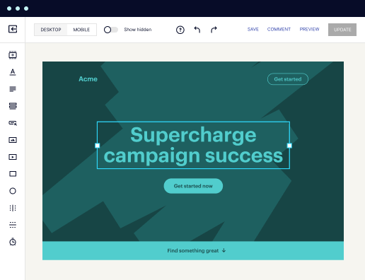
Easy to build without coding
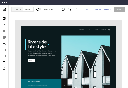
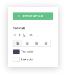
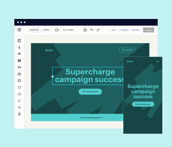
With the intuitive drag-and-drop builder, anyone on your team can create high-converting pages without any knowledge of code or design. Make enhancements to your landing page with custom widgets using Javascript, HTML/CSS, or third-party scripts.
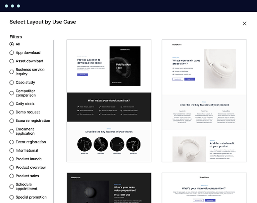
Multiple layouts for any industry and goal
Select from 500+ landing page layouts built to boost conversions across industry-specific scenarios. Customize them by adjusting fonts, adding images, and generating on-brand content with the AI assistant. Quickly scale with Instablocks® and Global Blocks that you can save, reuse, and update globally.
Loads fast and looks polished on any device
Every template is responsive, which means they present professionally on any device and load blazingly fast with our Thor Render Engine. You can also power them up with Google AMP technology to deliver an unparalleled mobile experience and drive higher conversions.
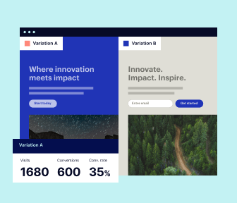
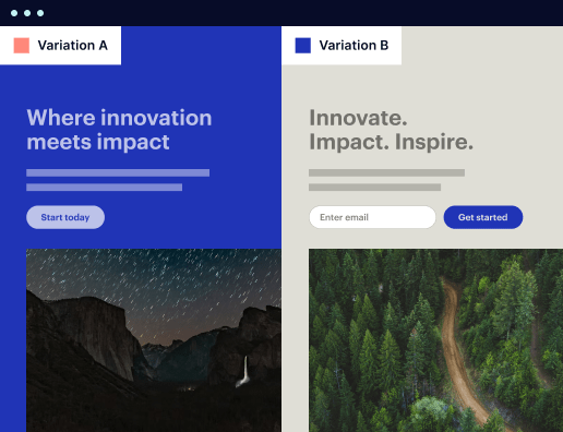
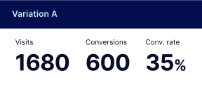
Robust analytics & experimentation
Get real-time updates and reporting across all your devices, showing the number of visitors, conversions, cost-per-visitor, and cost-per-lead. Launch AI-powered experiments, run A/B tests, and use heatmaps to analyze user behavior, then optimize your landing page to maximize conversions.

Easy to build without coding
With the intuitive drag-and-drop builder, anyone on your team can create high-converting pages without any knowledge of code or design. Make enhancements to your landing page with custom widgets using Javascript, HTML/CSS, or third-party scripts.
Multiple layouts for any industry and goal
Select from 500+ landing page layouts built to boost conversions across industry-specific scenarios. Customize them by adjusting fonts, adding images, and generating on-brand content with the AI assistant. Quickly scale with Instablocks® and Global Blocks that you can save, reuse, and update globally.
Loads fast and looks polished on any device
Every template is responsive, which means they present professionally on any device and load blazingly fast with our Thor Render Engine.
Robust analytics & experimentation
Get real-time updates and reporting across all your devices, showing the number of visitors, conversions, cost-per-visitor, and cost-per-lead. Launch AI-powered experiments, run A/B tests, and use heatmaps to analyze user behavior, then optimize your landing page to maximize conversions.
All the features you need to build lead-generating landing pages

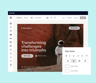
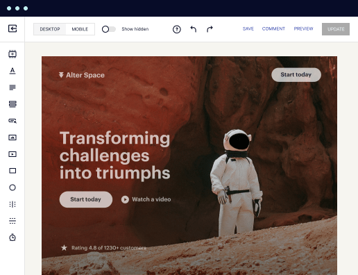
Landing page builder
Easily create landing pages with the intuitive drag-and-drop page builder that features contextual element editing, over 500 page layouts, and 33 million images.

Visual on-page collaboration
Invite teammates and clients to collaborate on page design in real time to get your pages created, reviewed, and launched faster.

AI content generation
Instantly generate audience-focused content with AI-crafted headlines, paragraphs, and CTAs directly within the Instapage builder.

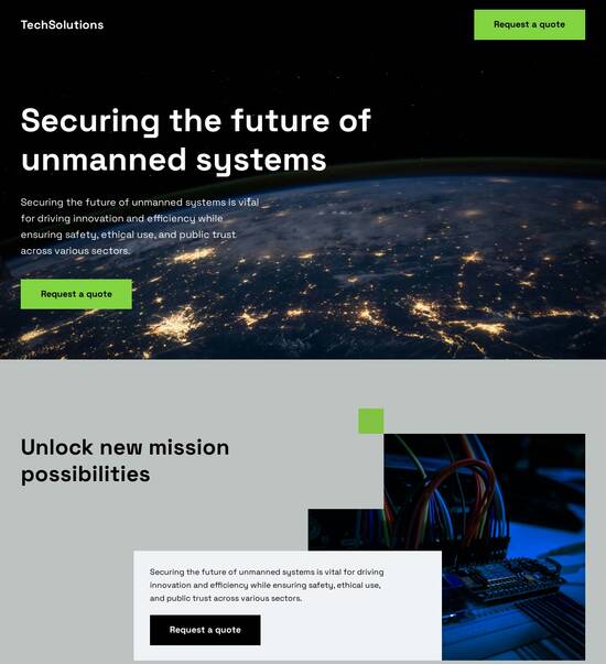
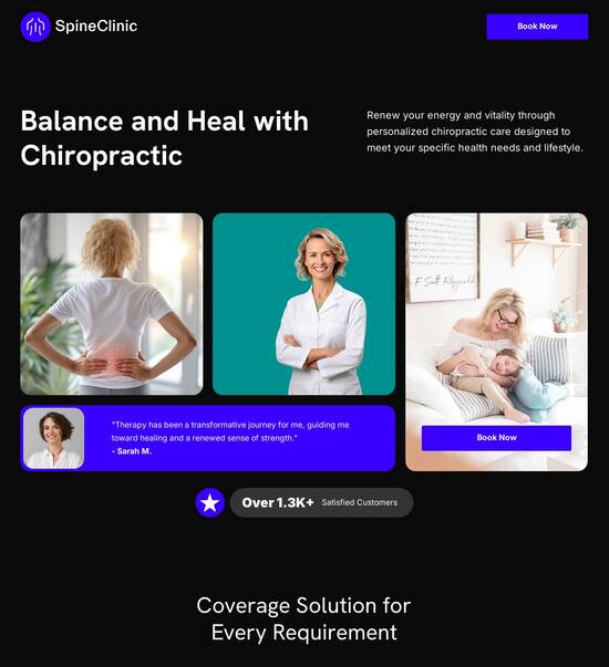
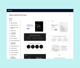
500+ customizable layouts
Choose from a range of professionally tailored page layouts, specifically designed to enhance conversion rates across numerous industry-specific scenarios.
Instablocks
Quickly build personalized landing pages using individual page blocks that you can customize, save, and reuse.
Thor Render Engine
Our back-end technology ensures that your landing pages load quickly to increase conversions, SEO rankings, and enhance the overall user experience.
Analytics
Seamlessly connect to Google Analytics to get real-time updates on cost-per-visitor and cost-per-lead metrics directly in the Instapage platform.
Learn how to build top-performing landing pages for any goal
FAQs
“Instapage gives us the ability to tailor our landing page content and layout to tell a unique story for each geographical target. The platform also enables us to create different variations with content that performs well for each unique channel. Every marketing team needs this!”

"Instapage has truly maximized our digital advertising performance by enabling us to offer matching, personalized experiences for every ad and audience. Now we can scale our landing page experiences as efficiently and effectively as we scale the ads themselves."

"If we have to wait on a developer, our creative velocity plummets. But Instapage has made it possible for us to exponentially grow our advertising programs and convert more customers"

Leading the way in building high-performing landing pages


A powerful landing page solution for optimized digital campaigns
Instapage offers a comprehensive approach to create and optimize highly effective landing pages that enhance the ROI of your digital marketing strategies. With over 100 high-converting templates and a suite of lead generation tools, marketers can quickly build pages tailored to their specific audience needs without any coding knowledge. This guide walks you through the essential steps to leverage Instapage for crafting standout landing pages.
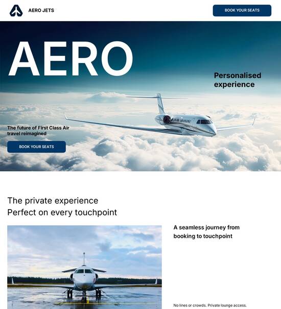
Step 1: Choosing the right template
The first step in your landing page journey is selecting a template that resonates with your target audience. Instapage provides a robust library of conversion-focused layouts designed for various industries, ensuring you have the right start for your marketing efforts.
- Business services: Choose templates that emphasize professionalism and service offerings.
- Tech/SaaS: Opt for modern, sleek designs that highlight technological features.
- Educational institutions: Use templates that are engaging and informative, perfect for showcasing courses.
Step 2: Utilizing lead generation elements
After selecting your template, the next vital aspect is integrating lead generation elements that capture visitor information effectively. Instapage offers pre-built forms, CTA buttons, and more, allowing you to streamline the lead capture process.
- Custom forms: Create tailored forms capturing essential data while maximizing user comfort.
- Engaging CTAs: Implement action-oriented buttons that motivate clicks and conversions.
- Pop-up lead captures: Use timed pop-ups to capture leads before they leave the page.
Step 3: Optimize through personalization
To increase conversion rates, leveraging personalization techniques on your landing pages is crucial. Instapage allows for dynamic text replacement and audience segmentation, ensuring each visitor has a tailored experience.
- Dynamic text: Adjust content based on incoming traffic sources for a personalized touch.
- AdMaps: Align ad campaigns with specific landing pages to improve consistency and relevance.
- Audience-level metrics: Track the performance to refine your approach continually.
By focusing on these steps, your Instapage experience will yield improved results for your marketing campaigns, driving better engagement and increased conversions.
In conclusion, mastering Instapage not only enhances your landing page creation but also empowers your overall digital marketing strategy through optimization and personalization.
Ready to transform your landing pages? Start utilizing Instapage today to elevate your digital marketing efforts and watch your conversion rates soar.
People also ask about Inspirational website template optimized for Android tablet
Inspirational website template optimized for Android tablet
Understanding the essentials: The role of Android tablet optimization for website templates
The importance of mobile accessibility has surged in recent years as the number of users accessing the internet on mobile devices grows steadily. Studies show that a significant part of web traffic now originates from mobile devices, and Android tablets form a crucial segment of this demographic. It is vital for businesses and developers to grasp the unique characteristics of Android tablets compared to other devices, addressing specific size, resolution, and interaction styles to enhance user experience.
Android tablets differ from smartphones and PCs in that they provide a larger screen experience while still maintaining touch-based navigation. This necessitates an approach to website templates that harness the specific advantages of larger displays, allowing for more content visibility. Given that responsive design plays a pivotal role in contemporary web development, templates optimized for Android tablets must ensure fluid adaptation to varying screen sizes while maintaining functionality.
Mobile device accessibility boosts user engagement and retention.
Android tablets offer unique user interaction opportunities.
Responsive designs are essential for effective web development.
Innovations in design: Features of an inspirational website template
When creating a website template optimized for Android tablets, several innovative design features stand out. First, an intuitive user interface is critical in ensuring seamless navigation, tailored specifically for tablet ergonomics. This means larger buttons and simplified menus that enable users to browse effortlessly. Moreover, employing touch-friendly elements and gesture support can elevate the user experience, making interaction feel natural and engaging.
Another essential feature is dynamic layout adaptability. A well-structured fluid grid system is capable of adjusting to various screen sizes, ensuring that content remains accessible and visually appealing, regardless of device orientation. Additionally, split-screen options for multi-page viewing can greatly enhance user productivity, allowing information to be consumed more efficiently, especially in professional settings.
Integrating rich multimedia options elevates the overall aesthetic and interactive quality of a website. Support for high-resolution images and the inclusion of video backgrounds create immersive experiences that captivate users. Similarly, having optimal audio playback features ensures that video content is not only visually appealing but also auditory engaging, allowing users to consume content in rich detail.
Intuitive user interface improves navigation on tablets.
Dynamic layouts respond to various screen sizes and orientations.
Rich multimedia integration enhances user engagement.
Enhancing user experience: How templates transform engagement
A well-designed website template significantly boosts user experience by incorporating personalized content displays. This allows for tailored messaging and layout configurations based on user behavior, ensuring that what users see is relevant and engaging. Techniques for A/B testing can help identify the best-performing designs, enabling businesses to optimize their templates further to meet audience expectations.
Another critical factor in enhancing user experience is fast load times. Optimizing a template for faster loading on Android tablets involves specific practices such as image compression and minimizing scripts. Speed plays an essential role not only in user retention but also in search engine optimization (SEO) rankings, as search engines prioritize faster-loading sites in their results.
Moreover, accessibility compliance is crucial for widening a site's audience. Ensuring that templates meet accessibility standards allows businesses to cater to a broader demographic, including individuals with disabilities. Implementing strategies that enhance usability—including text alternatives for images and keyboard-friendly navigation—can significantly improve overall user experience.
Personalized content increases user engagement.
Fast load times are essential for retention and SEO.
Accessibility compliance enhances usability for all users.
Catering to startups and businesses: The business case for optimized templates
For startups and established businesses alike, utilizing optimized website templates presents cost-effective solutions for brand building. These templates reduce design costs, making it feasible for emerging startups to establish a professional online presence without engaging extensive development resources. Numerous businesses have successfully leveraged templates to scale their operations while maintaining a functional and appealing online experience.
Targeted marketing capabilities provided by templates also enhance their value. Many templates come packed with features that allow marketers to precisely target demographics and tailor content accordingly. By analyzing user statistics, businesses can refine their marketing efforts, ensuring that each template resonates with its intended audience.
The ability to implement agile development and updates cannot be ignored either. The iterative design process allows for quick changes based on real-time feedback from users. This ensures that the website stays aligned with emerging trends and user preferences without disrupting the overall user experience or requiring extensive downtime.
Templates reduce design costs and streamline brand building.
Targeted marketing features enhance audience relevance.
Agile development allows for rapid iterations and updates.
Examples of successful implementation: Case studies
Exploring real-world examples highlights the effectiveness of optimized templates. Several businesses, ranging from tech startups to educational institutions, have successfully utilized these templates to enhance their online presence. By examining traffic statistics, engagement metrics, and user feedback, we can draw valuable insights into the practical benefits that come from implementing optimized solutions.
For instance, a SaaS company that adopted a template focusing on responsive design noted a 50% increase in mobile traffic within their first month post-launch. Similarly, a marketing agency employing personalized content delivery saw a significant uptick in user engagement and conversion rates. Such case studies offer a roadmap for businesses eager to tap into the potential of optimized templates.
Future-proofing your online presence: The potential for growth
Staying ahead in the digital landscape demands an understanding of evolving market trends. Insights into new design standards for mobile devices suggest a continuous shift towards minimalistic aesthetics paired with faster accessibility. Businesses must remain vigilant to predict the future needs of users to ensure their website templates remain relevant and effective.
Integration with emerging technologies presents exciting opportunities for transformation. For example, the potential for incorporating artificial intelligence and machine learning could significantly enhance user interaction by delivering personalized experiences. Additionally, as augmented reality (AR) and virtual reality (VR) technologies mature, their integration into web templates could lead to richer user experiences, enhancing content engagement even further.
Best practices for choosing the right template for your needs
Selecting an appropriate template involves careful consideration of specific business goals and target audience characteristics. This means assessing the template's customization options to ensure flexibility while maintaining usability. A template that offers basic customization features without overwhelming the user can significantly improve overall satisfaction.
Testing template performance metrics before full deployment is crucial. This enables businesses to evaluate key features such as loading speed, aesthetic appeal, and responsiveness on Android tablets before committing to a design. Gathering insights during this phase can lead to more informed decision-making and ultimately result in a more effective online presence.
The philosophy behind aesthetic design: Balancing form and function
An effective website template balances aesthetic design with functional performance, a concept critical to user engagement. The visual appeal of a site is not merely a stylistic choice; it impacts how users perceive and interact with a brand. Thoughtful design choices can communicate brand values, influence user emotion, and enhance the overall user experience.
Discussing the psychological impact of colors, shapes, and layouts is essential to understanding how design affects user behaviors. For instance, certain colors may evoke specific emotions or responses while particular layouts can guide users through their journey, improving engagement and satisfaction. Therefore, understanding these nuances is key to creating templates that truly resonate with users.
Conclusion: Embracing change and innovating with technology
The transformational capacity of inspirational website templates cannot be overstated. Their ability to enhance user engagement and cater to diverse business needs creates ample opportunities in the digital landscape. As technology continues to evolve, the importance of adopting well-designed, optimized templates becomes increasingly clear, enabling businesses to thrive within a competitive environment.
Continuous exploration and adaptation are crucial in this ever-changing field. Encouraging businesses to stay up-to-date with design trends, user needs, and technological innovations ensures they remain at the forefront of their industries. Ultimately, embracing change will equip organizations with the tools necessary to cultivate a robust online presence that meets and exceeds customer expectations.
Ready to skyrocket conversions?
Supercharge your ad campaigns with high-performing landing pages
Get started