
HTML/CSS optimized glossary page template
Explore Similar TemplatesAbout template
Supercharge your glossary page with HTML/CSS for outstanding performance! Learn more today.
Recommended templates

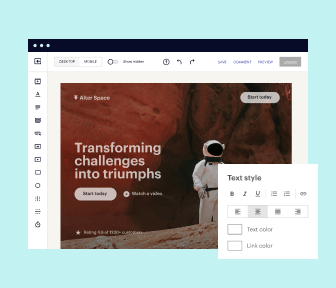
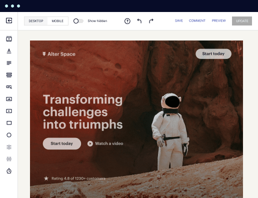
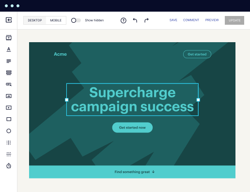
Easy to build without coding
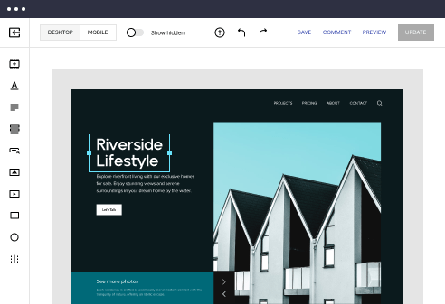
With the intuitive drag-and-drop builder, anyone on your team can create high-converting pages without any knowledge of code or design. Make enhancements to your landing page with custom widgets using Javascript, HTML/CSS, or third-party scripts.
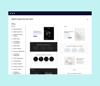
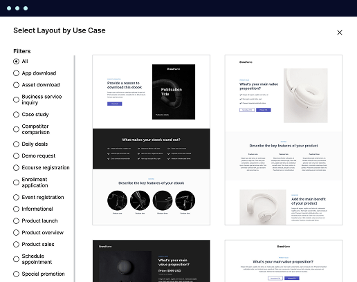
Multiple layouts for any industry and goal
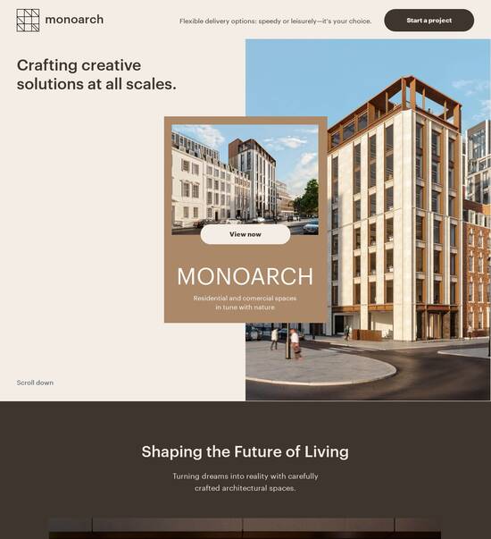
Select from 500+ landing page layouts built to boost conversions across industry-specific scenarios. Customize them by adjusting fonts, adding images, and generating on-brand content with the AI assistant. Quickly scale with Instablocks® and Global Blocks that you can save, reuse, and update globally.
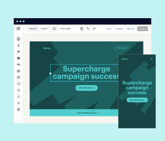
Loads fast and looks polished on any device
Every template is responsive, which means they present professionally on any device and load blazingly fast with our Thor Render Engine. You can also power them up with Google AMP technology to deliver an unparalleled mobile experience and drive higher conversions.
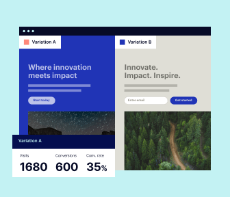
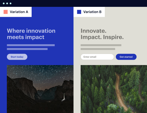
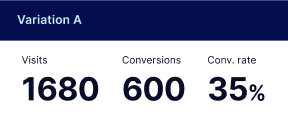
Robust analytics & experimentation
Get real-time updates and reporting across all your devices, showing the number of visitors, conversions, cost-per-visitor, and cost-per-lead. Launch AI-powered experiments, run A/B tests, and use heatmaps to analyze user behavior, then optimize your landing page to maximize conversions.

Easy to build without coding
With the intuitive drag-and-drop builder, anyone on your team can create high-converting pages without any knowledge of code or design. Make enhancements to your landing page with custom widgets using Javascript, HTML/CSS, or third-party scripts.
Multiple layouts for any industry and goal
Select from 500+ landing page layouts built to boost conversions across industry-specific scenarios. Customize them by adjusting fonts, adding images, and generating on-brand content with the AI assistant. Quickly scale with Instablocks® and Global Blocks that you can save, reuse, and update globally.
Loads fast and looks polished on any device
Every template is responsive, which means they present professionally on any device and load blazingly fast with our Thor Render Engine.
Robust analytics & experimentation
Get real-time updates and reporting across all your devices, showing the number of visitors, conversions, cost-per-visitor, and cost-per-lead. Launch AI-powered experiments, run A/B tests, and use heatmaps to analyze user behavior, then optimize your landing page to maximize conversions.
All the features you need to build free glossary template

Landing page builder
Easily create landing pages with the intuitive drag-and-drop page builder that features contextual element editing, over 500 page layouts, and 33 million images.

Visual on-page collaboration
Invite teammates and clients to collaborate on page design in real time to get your pages created, reviewed, and launched faster.

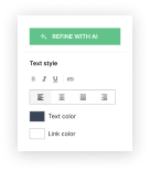
AI content generation
Instantly generate audience-focused content with AI-crafted headlines, paragraphs, and CTAs directly within the Instapage builder.

500+ customizable layouts
Choose from a range of professionally tailored page layouts, specifically designed to enhance conversion rates across numerous industry-specific scenarios.
Instablocks
Quickly build personalized landing pages using individual page blocks that you can customize, save, and reuse.
Thor Render Engine
Our back-end technology ensures that your landing pages load quickly to increase conversions, SEO rankings, and enhance the overall user experience.
Analytics
Seamlessly connect to Google Analytics to get real-time updates on cost-per-visitor and cost-per-lead metrics directly in the Instapage platform.
Learn how to build create glossary html css
Frequently asked questions about glossary website template
“Instapage gives us the ability to tailor our landing page content and layout to tell a unique story for each geographical target. The platform also enables us to create different variations with content that performs well for each unique channel. Every marketing team needs this!”

"Instapage has truly maximized our digital advertising performance by enabling us to offer matching, personalized experiences for every ad and audience. Now we can scale our landing page experiences as efficiently and effectively as we scale the ads themselves."

"If we have to wait on a developer, our creative velocity plummets. But Instapage has made it possible for us to exponentially grow our advertising programs and convert more customers"

Leading the way in building high-performing landing pages


Content design glossary template: Your ultimate how-to guide
Creating high-converting landing pages is essential for maximizing the effectiveness of your digital marketing campaigns. Instapage empowers marketers from various industries, including business services, tech, and education, by offering an all-in-one solution designed to optimize Return on Investment (ROI) through robust landing page and conversion rate optimization (CRO) functionalities.
Understanding the importance of landing pages
Landing pages play a critical role in guiding potential customers through the buying journey. They are specifically designed to capture leads by focusing on a singular action that aligns with your marketing goals. Key reasons landing pages matter include:
- Focused content that eliminates distractions, leading users to take desired actions.
- Enhanced tracking and analytics to understand user behavior and improve future campaigns.
- Improved conversion rates by using targeted messaging compared to general website pages.
Step 1: Choose the right template
Start with the extensive library of over 100 ready-to-use templates available in Instapage. Consider your marketing objectives and audience demographics when selecting a template. Key features to look for include:
- Mobile responsiveness to cater to users on all devices, maximizing reach.
- Customization opportunities, allowing you to personalize the template to fit your brand.
- Incorporation of lead generation forms seamlessly integrated within the design.
Step 2: Optimize your landing page for conversions
Once your template is selected, optimizing the page for higher conversions is essential. Instapage provides built-in experimentation features to facilitate this process. Consider applying these tactics:
- Implement A/B testing to compare different page elements such as headlines, images, and calls to action.
- Use heatmaps to assess user behavior and make data-driven adjustments.
- Integrate dynamic text replacement to personalize messages for various audience segments.
Step 3: Launch and analyze performance
After designing and optimizing your landing page, it's time to launch and monitor performance. Instapage’s robust analytics dashboard provides real-time insights, allowing you to measure key metrics such as conversion rates and user engagement.
Regular reviews of performance data enable marketers to iteratively improve their campaigns and maximize ROI. Increased collaboration among team members enhances approval workflows, streamlining the process from creation to launch.
Start optimizing your marketing performance today by leveraging Instapage's innovative landing page solutions tailored to your unique business needs and goals.
People also ask about HTML/CSS optimized glossary page template
HTML/CSS optimized glossary page template
Understanding the concept of an optimized glossary page template
A glossary page serves as an essential resource that presents terms and their definitions, helping users understand specific jargon relevant to a subject matter. It’s particularly important for industries where technical language may alienate newcomers or non-experts. An optimized glossary page goes beyond just offering definitions; it provides a streamlined user experience, making navigation easier, enhancing comprehension, and consequently boosting retention.
HTML and CSS optimization plays a critical role in shaping user interactions on these pages. An effective layout, combined with responsive design, ensures that users accessing glossary content on any device experience it with the same level of accessibility and ease. Moreover, an optimized glossary page can serve many unique use cases, from aiding educational platforms in clarifying subject-specific language to assisting e-commerce sites in defining product-related terminologies.
Educational institutions utilizing glossaries to support learning materials.
Corporate sites offering industry jargon explanations for customer clarity.
Online communities creating lexicons for specialized interests.
The anatomy of a glossary page template
A well-constructed glossary page comprises several essential elements that enhance the overall user experience. Core components include terms and their definitions, which are at the heart of the glossary. Each entry should be clear and concise to facilitate easy learning. Additionally, adding a search functionality empowers users to quickly locate definitions without excessive scrolling.
Organizing content into categories and subcategories can significantly improve navigation. For instance, an educational glossary could have sections for mathematics, science, and language arts, helping users find relevant terms more efficiently. Contextual examples are also valuable, providing users with real-world applications of each term. These considerations not only enhance navigation simplicity but also contribute to a visually appealing layout.
Terms and definitions that clearly explain key concepts.
Search functionality that allows users to efficiently locate terms.
Categories and subcategories to organize terms logically.
Contextual examples to help users understand terms in practical settings.
Leveraging HTML for structure and accessibility
HTML provides the foundational structure for glossary pages. Using semantic elements like ``, ``, and `` not only enhances the page's structure but also improves accessibility. Search engines and screen readers utilize these tags to interpret and present content meaningfully. For instance, content within these tags becomes more recognizable, facilitating better indexing and easier navigation for users relying on assistive technologies.
Creating screen reader-friendly content is crucial. This includes using appropriate `alt` text for images and ensuring that navigation elements are keyboard-accessible. Best practices for responsive design in HTML help make glossary pages functional across devices, ensuring that the terms and their definitions look great on both mobile and desktop screens.
Using semantic HTML elements for improved structure.
Implementing accessibility features to enhance user experience.
Adhering to responsive design principles for multi-device compatibility.
CSS techniques for a polished look
Styling guidelines for glossary page elements can make a substantial difference in readability and user engagement. Choosing color schemes that contrast well with text enhances legibility, while font choices should cater to easy reading. Responsive typography ensures that the text size adjusts wisely based on the device screen, creating a uniform experience across platforms.
Advanced CSS techniques like hover effects and animations offer an interactive experience that can entice users to engage more deeply with glossary content. When considering whether to use CSS Grid or Flexbox, evaluating the layout requirements is essential; CSS Grid is excellent for complex layouts, while Flexbox shines in simpler, linear designs.
Selecting color schemes that improve readability and user focus.
Incorporating responsive typography for uniform experiences.
Using hover effects and CSS animations to enhance interactivity.
Choosing between Grid and Flexbox based on layout needs.
Integrating technologies for added functionality
JavaScript can significantly enhance the functionality of glossary pages. With dynamic search filters, users can refine their searches based on specific categories, making it easier to find relevant terms. Implementing lazy loading can drastically improve performance, ensuring that content loads swiftly without overwhelming users or causing delays.
Moreover, considering frontend libraries like React or Vue.js can streamline the development process. React is particularly useful for building interactive component-based architectures, while Vue.js's reactivity can optimize user interaction. Both options contribute to creating a modern and responsive user experience.
Dynamic search filters to enable user-friendly content finding.
Implementing lazy loading techniques for better performance.
Using React for building interactive components.
Opting for Vue.js to enhance reactivity in user interfaces.
Crafting an engaging user experience through design
Visual design principles play a pivotal role in user engagement. Elements like color, typography, and layout must be carefully chosen to guide users through the glossary. Cohesive design not only makes information accessible but also creates a visually pleasing interface, significantly improving user satisfaction.
Design impacts user interaction at a psychological level. For instance, users are likely to spend more time on pages that they find aesthetically appealing. Therefore, understanding the target audience is essential for creating user-centered designs. This involves conducting user research to discern preferences and expectations, allowing for tailored design solutions.
Applying visual design principles to enhance user engagement.
Understanding user psychology impacts design choices.
Conducting user research to tailor designs to audience needs.
Implementing template functions in glossary pages
Dynamic content loading can be highly beneficial for glossary pages. By leveraging template functions, you can preload content or load definitions based on user interactions, creating an efficient browsing experience. Customizing templates for specific use cases allows businesses to align glossary functionality with their unique requirements, such as industry-specific terminology or audience-driven content.
Quick implementation can also be achieved through sample code snippets that serve as a base for developers. These snippets can simplify the creation of interactive elements such as searchable databases, ensuring that the pages remain engaging and informative. Providing developers with ready-to-use code enhances productivity and accelerates the deployment of glossary pages.
Utilizing dynamic content loading for enhanced user experience.
Customizing templates based on specific business needs.
Providing sample code snippets for rapid development.
Examples of successful glossary pages
Numerous businesses have excelled through effective use of glossary pages. By analyzing case studies, we can reveal innovative solutions adopted across diverse industries. For example, a financial services company may implement a glossary to clarify specialized banking jargon, while an educational platform might use it to support learners navigating complex academic terms.
Case studies often highlight effective layout and functionality choices. Elements such as clear categorization, accessible explanations, and engaging visual structures contribute to achieving a high level of user engagement. Understanding what works well helps others learn from these successes, paving the way for the adoption of best practices in their glossary design.
Studying companies that successfully implemented glossary pages.
Analyzing layout and functionality choices for enhanced engagement.
Gathering insights for best practices in glossary design.
Building communities through glossary pages
Glossary pages have the potential to build and strengthen communities by fostering knowledge sharing. As users contribute to the glossary, not only do they help enhance the content, but they also create an environment that encourages collaboration. This interaction transforms glossary pages into resources that engage teams and contributors, aligning them on shared terminology and understanding.
Moreover, glossary pages create opportunities for user interaction. Comments and suggestions sections can facilitate discussions about terms and definitions, further enriching the shared knowledge base. This communal approach can ultimately lead to a more robust understanding of topics over time, nurturing a culture of continuous learning among users.
Fostering communities through engaged knowledge sharing.
Encouraging contributions from users to enhance content quality.
Creating avenues for meaningful user interaction on glossary pages.
Common questions and challenges
Understanding user questions and challenges is vital when developing an optimized glossary page. Anticipating common queries helps you design an FAQ section that addresses user concerns clearly. A well-structured FAQ not only helps users find answers but also reduces the burden on customer support teams.
Designing an effective FAQ section involves grouping questions by topic, using clear language, and employing collapsible menus for easy navigation. Common technical challenges can arise during implementation, such as browser compatibility issues or difficulties with optimization for search engines. Preparing for these challenges by adhering to web standards and regularly testing across platforms can help mitigate issues.
Anticipating user questions to improve the FAQ section.
Structuring the FAQ section for clarity and ease of navigation.
Addressing common technical issues through best practices.
Future-proofing your glossary page template
In an ever-evolving digital landscape, ensuring that your glossary page template remains relevant is paramount. Keeping up with new web technologies—such as advances in HTML5 and CSS3—will ensure compatibility and enhance features. Furthermore, remaining aware of how trends like artificial intelligence (AI) and natural language processing (NLP) might influence glossary functionality can give you a competitive edge.
Establishing a solid content management strategy allows for ongoing optimization. Regularly updating the glossary with new terms, revising definitions, and enhancing user interaction will keep the resource fresh and relevant. Preparing for shifts in technology and user behavior ensures that your glossary page continues to serve its purpose effectively.
Staying updated with evolving web technologies for compatibility.
Monitoring trends in AI and NLP for improved glossary functionality.
Implementing a content management strategy for ongoing updates.
Accessing open source code for customization
Finding reliable open source libraries and frameworks can greatly facilitate building an optimized glossary page. Developer communities often provide valuable resources, sharing code snippets and entire template solutions. Collaborating within these communities allows developers to collectively improve upon existing content and share insights for customization.
Contributing to open source projects not only enhances your skills but enriches the overall community framework. Engaging with and learning from shared codebases can lead to innovative solutions and set the benchmark for how glossary pages evolve. Finding a balance between utilizing existing resources and implementing your unique enhancements is key to creating a standout glossary.
Exploring open source libraries for enhanced glossary development.
Collaborating within developer communities for shared insights.
Contributing to open source projects to innovate and learn.
Summary of key takeaways
Creating an HTML/CSS optimized glossary page template involves numerous considerations from structure and design to functionality and community building. Key elements like clear terms and definitions, effective search capabilities, and well-organized content categories contribute significantly to user engagement. Understanding and applying the principles of user-centered design ensures that the glossary meets its intended purpose and serves the audience effectively.
As technology continues to evolve, staying aware of trends and incorporating flexible design will prepare glossary pages for the future. By engaging with open source communities and continuously updating content, developers can enhance glossary functionalities, delivering a valuable resource for users while fostering a collaborative knowledge-sharing environment.
Ensure clarity and accessibility in glossary terms and definitions.
Utilize advanced HTML and CSS techniques for enhanced design.
Engage with user communities and continue to evolve glossary content.
Ready to skyrocket conversions?
Supercharge your ad campaigns with high-performing landing pages
Get started