
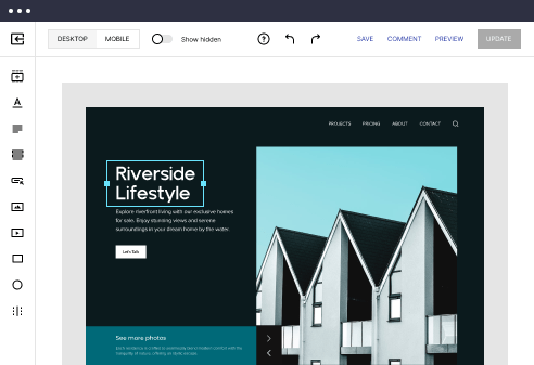
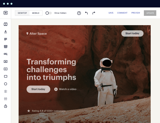
HTML page template with interactive sticky sidebar
Explore Similar TemplatesAbout template
Use HTML page templates with interactive sticky sidebar and make your communications easy and transparent. Try our solution today.
Recommended templates


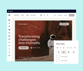
Easy to build without coding
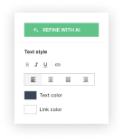
With the intuitive drag-and-drop builder, anyone on your team can create high-converting pages without any knowledge of code or design. Make enhancements to your landing page with custom widgets using Javascript, HTML/CSS, or third-party scripts.
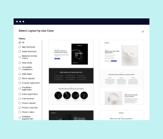
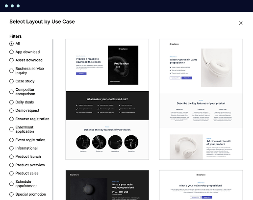
Multiple layouts for any industry and goal
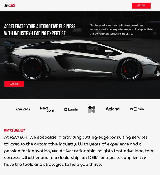
Select from 500+ landing page layouts built to boost conversions across industry-specific scenarios. Customize them by adjusting fonts, adding images, and generating on-brand content with the AI assistant. Quickly scale with Instablocks® and Global Blocks that you can save, reuse, and update globally.
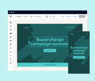
Loads fast and looks polished on any device
Every template is responsive, which means they present professionally on any device and load blazingly fast with our Thor Render Engine. You can also power them up with Google AMP technology to deliver an unparalleled mobile experience and drive higher conversions.
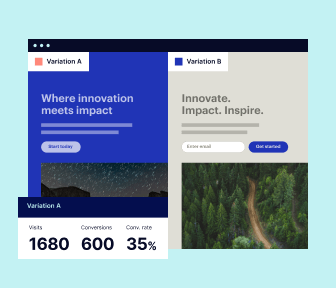
Robust analytics & experimentation
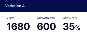
Get real-time updates and reporting across all your devices, showing the number of visitors, conversions, cost-per-visitor, and cost-per-lead. Launch AI-powered experiments, run A/B tests, and use heatmaps to analyze user behavior, then optimize your landing page to maximize conversions.

Easy to build without coding
With the intuitive drag-and-drop builder, anyone on your team can create high-converting pages without any knowledge of code or design. Make enhancements to your landing page with custom widgets using Javascript, HTML/CSS, or third-party scripts.
Multiple layouts for any industry and goal
Select from 500+ landing page layouts built to boost conversions across industry-specific scenarios. Customize them by adjusting fonts, adding images, and generating on-brand content with the AI assistant. Quickly scale with Instablocks® and Global Blocks that you can save, reuse, and update globally.
Loads fast and looks polished on any device
Every template is responsive, which means they present professionally on any device and load blazingly fast with our Thor Render Engine.
Robust analytics & experimentation
Get real-time updates and reporting across all your devices, showing the number of visitors, conversions, cost-per-visitor, and cost-per-lead. Launch AI-powered experiments, run A/B tests, and use heatmaps to analyze user behavior, then optimize your landing page to maximize conversions.
All the features you need to build sticky sidebar on scroll codepen

Landing page builder
Easily create landing pages with the intuitive drag-and-drop page builder that features contextual element editing, over 500 page layouts, and 33 million images.

Visual on-page collaboration
Invite teammates and clients to collaborate on page design in real time to get your pages created, reviewed, and launched faster.

AI content generation
Instantly generate audience-focused content with AI-crafted headlines, paragraphs, and CTAs directly within the Instapage builder.

500+ customizable layouts
Choose from a range of professionally tailored page layouts, specifically designed to enhance conversion rates across numerous industry-specific scenarios.
Instablocks
Quickly build personalized landing pages using individual page blocks that you can customize, save, and reuse.
Thor Render Engine
Our back-end technology ensures that your landing pages load quickly to increase conversions, SEO rankings, and enhance the overall user experience.
Analytics
Seamlessly connect to Google Analytics to get real-time updates on cost-per-visitor and cost-per-lead metrics directly in the Instapage platform.
Learn how to build bootstrap 5 sticky sidebar on scroll codepen
Frequently asked questions about sticky sidebar codepen
“Instapage gives us the ability to tailor our landing page content and layout to tell a unique story for each geographical target. The platform also enables us to create different variations with content that performs well for each unique channel. Every marketing team needs this!”

"Instapage has truly maximized our digital advertising performance by enabling us to offer matching, personalized experiences for every ad and audience. Now we can scale our landing page experiences as efficiently and effectively as we scale the ads themselves."

"If we have to wait on a developer, our creative velocity plummets. But Instapage has made it possible for us to exponentially grow our advertising programs and convert more customers"

Leading the way in building high-performing landing pages


Responsive sidebar html css codepen: Your ultimate how-to guide
Instapage stands out as a premier landing page and CRO platform that facilitates the rapid creation and optimization of digital marketing campaigns. With its vast array of tools and resources, marketers across business services, tech, education, and more can unlock unparalleled efficiency and ROI.
Understanding the fundamentals of landing pages
Landing pages are designed to drive conversions through focused messaging and engaging layouts. To fully utilize Instapage’s offerings, starting with the basics is essential. A well-structured landing page includes tailored content and a compelling call-to-action, all geared toward specific audience needs.
- Define your campaign goal: Understand what you want to achieve, whether it's lead generation, product sales, or event registrations. This clarity shapes your design and content.
- Know your audience: Identifying who your ideal customer is helps in creating personalized experiences that resonate and engage.
- Craft compelling content: Use clear, persuasive language and strong visuals. Ensure that your message speaks directly to your audience's needs and pain points.
Step 1: Choosing the right template
Instapage offers over 100 pre-built, high-converting templates designed for various industries. These templates can be customized to fit your specific campaign goals.
- Select a template that aligns with your objectives: Look for designs that emphasize your product or service.
- Customize the content: Tailor text and images to reflect your brand voice and messaging.
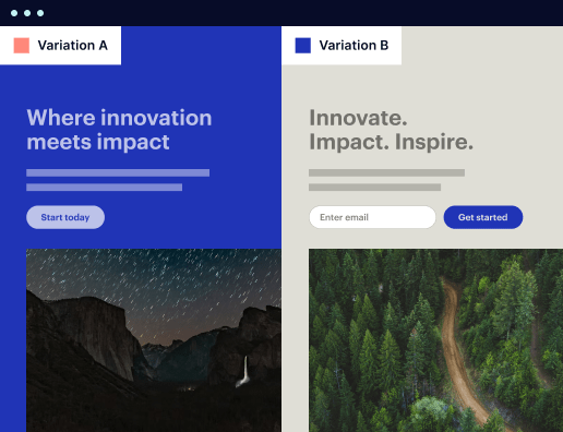
- Test variations: Create multiple versions of your landing page to find the one that performs best through A/B testing.
Step 2: Optimizing for conversions
After selecting and customizing your template, utilizing Instapage’s built-in optimization tools is crucial for enhancing conversions.
- Utilize A/B testing: Experiment with different headlines, layouts, and CTAs to find the combination that converts best.
- Implement heatmaps: Analyze user interactions to refine the layout based on engagement data.
- Leverage analytics: Use the performance dashboard to track key metrics such as conversion rates and bounce rates.
Following these steps ensures your landing pages are not only visually appealing but also optimized for high conversion rates.
By employing these methods, marketers can significantly enhance their campaign effectiveness and engagement.
Ready to create your high-converting landing pages? Start leveraging Instapage's powerful tools to drive your marketing success today!
People also ask about responsive about us page codepen
The evolution of web design: harnessing an HTML page template with an interactive sticky sidebar
Understanding HTML page templates
HTML page templates serve as essential foundations in web development, providing a structured approach to building web pages that are both functional and visually appealing. By utilizing templates, developers can standardize their workflow, making it faster and easier to produce consistent designs across multiple pages. A well-crafted template ensures that best practices in coding and design are adhered to, paving the way for better user experiences and easier maintenance.
Key components of an HTML page template include its structure, styling, and scripting. Each of these elements plays a critical role in ensuring that the final product meets design and functional goals. The structure comprises the building blocks of the template, typically organized with headers, footers, sidebars, and content areas. Adding styling with CSS transforms a plain text-based template into an engaging visual experience, while scripted interactivity achieved through JavaScript adds layers of functionality that enhance user interactions.
Structure: Organizing content with a clear hierarchy.
Styling: Utilizing CSS to improve aesthetics.
Scripting: Adding JavaScript for dynamic behaviors.
Unpacking the interactive sticky sidebar
An interactive sticky sidebar is a design feature that remains fixed in place while the main content of the page scrolls. This technique ensures that important navigation elements or content stay accessible to users, enhancing their overall experience on the website. The purpose of implementing sticky sidebars is to keep users focused on the main objectives of the page, whether it be to read an article, browse products, or engage with interactive elements.
The benefits of using interactive sticky sidebars are significant. One notable advantage is the ability to keep users engaged through constant access to relevant links and features. The psychology behind this design choice suggests that perpetual access to navigational elements can lead to higher engagement rates. Additionally, sticky sidebars streamline user experiences, making it easier to navigate vast amounts of information without losing sight of key action elements.
Keeping users engaged: Always visible navigation encourages interaction.
Navigational ease: Simplifies browsing without distractions.
Content focus: Reinforces key actions and information for users.
Implementing an interactive sticky sidebar is ideal in scenarios where user engagement is critical, such as long-form content, e-commerce sites, or anytime a user may benefit from quick access to additional resources.
Technologies behind interactive sticky sidebars
To create engaging and effective interactive sticky sidebars, various technologies come into play. HTML/CSS frameworks such as Bootstrap and Foundation offer powerful tools for developers to design responsive and flexible layouts quickly. Bootstrap provides a plethora of predefined classes, enabling rapid design implementation while ensuring that the sidebars remain aesthetically balanced with other content. On the other hand, Foundation excels in customization and responsiveness, allowing developers to craft unique designs catered to specific project needs.
JavaScript libraries further enhance interactivity. jQuery simplifies DOM manipulation, making it easy to implement features such as smooth scrolling or dynamic updates. The Intersection Observer API also proves invaluable for performance optimization, enabling developers to determine when the sidebar elements enter or exit the viewport, which results in a more seamless user experience.
Bootstrap: Simplifies design with predefined classes.
Foundation: Provides extensive capabilities for customization.
jQuery: Facilitates quick and easy DOM manipulations.
Intersection Observer: Enhances performance by optimizing visibility tracking.
Accessibility considerations are paramount, as well. Implementing ARIA roles and properties in sticky sidebars ensures that all users, including those using assistive technologies, can navigate and interact with the content seamlessly.
Crafting your HTML page template
Developing an effective HTML page template involves a systematic approach to building out the necessary components. Start by setting up the basic document structure, which includes the doctype declaration, HTML element, head, and body sections. This foundation is crucial for both organization and search engine optimization.
Next, insert a header with navigation links for user orientation. A well-designed navigation menu ensures users can move between different parts of your site without feeling lost. After establishing the header, define main content areas where the primary information will reside, being mindful to include elements like titles, paragraphs, and images.
Integrate the sticky sidebar at this stage to enhance the user experience. Utilizing CSS styles with properties like 'position: sticky;' and relevant JavaScript for interactivity will bring your sidebar to life, making it responsive to user actions.
Create basic HTML scaffold to establish document structure.
Insert a header with navigation links for easy accessibility.
Define main content areas where primary information is presented.
Integrate the sticky sidebar with CSS and JavaScript for dynamic interaction.
For coders, seeing sample code can greatly aid implementation. Basic HTML scaffold code might look like this: `Your Page Title............`. To add styling for sidebars, write CSS rules that define dimensions, colors, and positioning to create a visually appealing design.
Creating an interactive user experience
To ensure your sticky sidebar is not just functional but also interactive, consider integrating features that enhance user engagement. One effective way is through dynamic content updates using AJAX technologies, allowing users to receive real-time information without having to refresh the page. For example, pulling in live data updates for sports scores or news headlines can keep users glued to the sidebar, thus increasing interaction rates.
User-triggered actions are another excellent way to enhance sidebar functionality. Implementing features such as expandable FAQ sections allows users to click and reveal answers to common questions, thus maintaining engagement and minimizing user frustration. These thoughtful interactions can significantly impact how users perceive the website’s value.
Dynamic content updates for real-time information.
User-triggered actions for expandable or collapsible sections.
Social media integration for sharing content conveniently.
Looking at real-world examples can illuminate the effectiveness of these features. Websites with successful interactive sticky sidebars typically see increased dwell times and more interactions, confirming the value of such designs.
The role of content in effective sidebar design
Content is central to the design of an effective sticky sidebar. The types of content best suited for this location include Q&A formats that address common user questions and community guidelines to build trust and provide clarity. These formats not only facilitate user engagement but also guide visitors toward desired actions, such as exploring product offerings or subscribing to newsletters.
Strategies for content curation and presentation are essential in maximizing user interaction. One effective approach is to integrate multimedia elements within the sidebar content. Incorporating images, videos, and infographics can create a dynamic user experience, attracting visitors' attention and promoting further engagement. Additionally, adapting content based on user location, preferences, or behavior can significantly enhance relevance and increase interaction rates.
Q&A formats for addressing common user inquiries.
Community guidelines to promote trust and understanding.
Multimedia integration for richer engagement.
Location-based content adaptation for personalized experiences.
Analyzing user engagement and feedback
Understanding how users interact with your interactive sticky sidebar is key to optimizing its design and functionality. Employing various analytics tools allows marketers to gauge interaction levels, examining metrics like click-through rates, dwell time, and user pathways. These insights offer valuable data on what elements resonate with users, enabling continuous improvements to the sidebar’s content and layout.
Implementing feedback forms on the website provides a direct line to users, enabling them to voice their opinions about the sidebar's effectiveness. This feedback loop is crucial for identifying areas of improvement or affirmation of successful features, making it easier to adapt over time based on user preferences.
Utilize analytics tools to monitor interaction levels.
Implement feedback forms for direct user insights.
Adapt design based on user behavior and data feedback.
The impact of user behavior on future design decisions cannot be understated. By adopting an iterative design process informed by real-time data, developers can pinpoint what features resonate with users, thus refining and enhancing the overall sidebar experience.
Collaborating with teams to optimize design
Creating an interactive sticky sidebar involves collaboration among various roles within a project team. Frontend developers play a pivotal role in delivering visually appealing templates that include the sticky sidebar feature, ensuring that it is well integrated into the overall design. Their expertise enables the creation of user-friendly and aesthetically pleasing layouts that attract many audience segments.
Content creators are equally important, as they craft meaningful messages and materials for the sidebar. Their insights into user needs and preferences guide the content presented in sidebars, optimizing engagement and satisfaction. User experience designers enhance interactions through thoughtful designs, ensuring that the sidebar elements encourage seamless navigation and enjoyable user interactions.
Frontend developers: Delivering appealing and responsive templates.
Content creators: Crafting messages that resonate with users.
User experience designers: Enhancing interaction quality.
Establishing an ongoing feedback loop between teams fosters communication and collaboration, allowing adjustments based on real-world applications and user reactions. This approach in team dynamics ultimately leads to a better-designed sticky sidebar that meets user expectations and enhances overall site effectiveness.
Expanding your knowledge base: community involvement
Engagement with tech communities and collectives provides an invaluable opportunity for learning and growth within the web development sphere. Online forums and discussion groups offer platforms for sharing experiences, asking questions, and obtaining insights from both professionals and amateurs. These interactions can help developers stay updated on the latest trends, best practices, and emerging technologies that influence sticky sidebar designs.
Knowledge sharing platforms play a crucial role in consolidating solutions to common challenges. Participating in workshops, webinars, or community events aids in building a support network, allowing developers to benefit from shared learning experiences and lessons learned from peers.
Engage in online forums for community support and insights.
Participate in knowledge sharing platforms for collaborative solutions.
Attend workshops and webinars to build expertise.
Addressing common questions about interactive sidebars
As web developers and marketers explore the benefits of interactive sticky sidebars, common questions may arise regarding best practices and optimization strategies. One frequently asked question is about the optimal use cases for sticky sidebars. They are particularly effective in long-form articles, e-commerce sites, and any platform requiring easy access to navigational links or resources.
Maintenance and updates are also critical considerations in keeping your sticky sidebar relevant. Regular content refreshes and updates to design based on user feedback ensure that the sidebar remains engaging and functional. Analyzing user behavior and performance metrics will inform necessary adjustments, allowing for a smoother and more engaging experience for all website visitors.
FAQs: Addressing common developer concerns effectively.
Optimal use cases: Identifying ideal applications for sticky sidebars.
Maintenance protocols: Keeping content fresh and user-centered.
Future of HTML templates with interactive features
Looking ahead, several trends are poised to shape the future of HTML templates with interactive features like sticky sidebars. The integration of AI and machine learning technology has the potential to transform user interactions and sidebar functionalities significantly. These innovations may include predictive content display tailored to individual user behavior, further enhancing engagement and satisfaction.
Furthermore, an increasing emphasis on mobile-first design will shift focus toward responsive, adaptive layouts, ensuring that sticky sidebars maintain their effectiveness across diverse devices. Anticipating changes in user interaction patterns will be crucial as the web continues to evolve, compelling developers to adapt designs to cater to these shifting needs.
Trends emerging in web design: Fostering adaptability and relevance.
Anticipating changes in user interaction patterns for effective adaptation.
Incorporating AI and machine learning for personalized sidebar experiences.
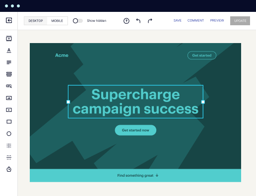
Ready to skyrocket conversions?
Supercharge your ad campaigns with high-performing landing pages
Get started