
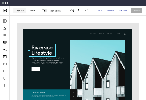
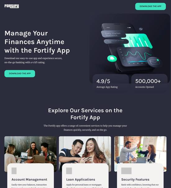
HTML page templates optimized for Samsung Galaxy
Use TemplateAbout template
Transform your customer experience with HTML page templates optimized for Samsung Galaxy. Make your landing page accessible on any device.
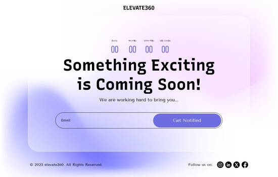
Recommended templates

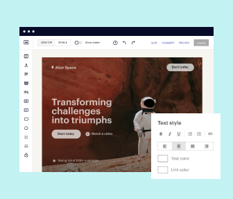
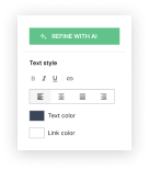
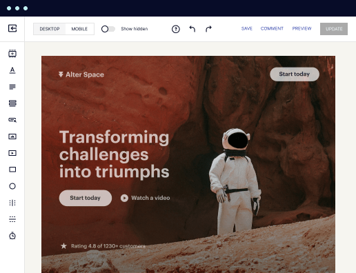
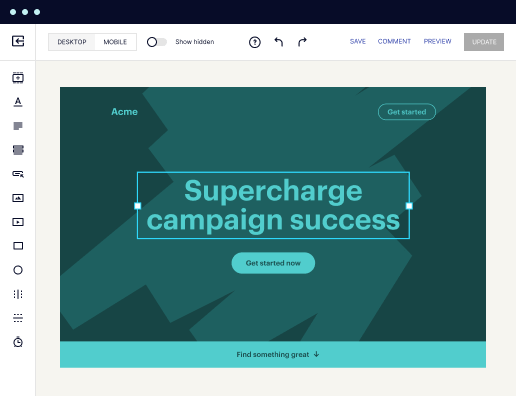
Easy to build without coding
With the intuitive drag-and-drop builder, anyone on your team can create high-converting pages without any knowledge of code or design. Make enhancements to your landing page with custom widgets using Javascript, HTML/CSS, or third-party scripts.
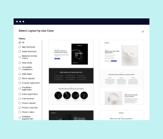
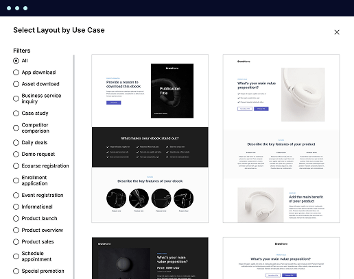
Multiple layouts for any industry and goal
Select from 500+ landing page layouts built to boost conversions across industry-specific scenarios. Customize them by adjusting fonts, adding images, and generating on-brand content with the AI assistant. Quickly scale with Instablocks® and Global Blocks that you can save, reuse, and update globally.
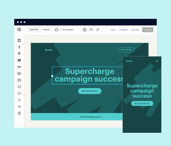
Loads fast and looks polished on any device
Every template is responsive, which means they present professionally on any device and load blazingly fast with our Thor Render Engine. You can also power them up with Google AMP technology to deliver an unparalleled mobile experience and drive higher conversions.
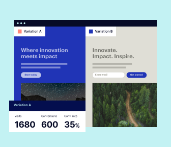
Robust analytics & experimentation
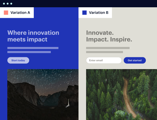
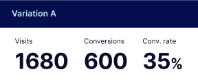
Get real-time updates and reporting across all your devices, showing the number of visitors, conversions, cost-per-visitor, and cost-per-lead. Launch AI-powered experiments, run A/B tests, and use heatmaps to analyze user behavior, then optimize your landing page to maximize conversions.

Easy to build without coding
With the intuitive drag-and-drop builder, anyone on your team can create high-converting pages without any knowledge of code or design. Make enhancements to your landing page with custom widgets using Javascript, HTML/CSS, or third-party scripts.
Multiple layouts for any industry and goal
Select from 500+ landing page layouts built to boost conversions across industry-specific scenarios. Customize them by adjusting fonts, adding images, and generating on-brand content with the AI assistant. Quickly scale with Instablocks® and Global Blocks that you can save, reuse, and update globally.
Loads fast and looks polished on any device
Every template is responsive, which means they present professionally on any device and load blazingly fast with our Thor Render Engine.
Robust analytics & experimentation
Get real-time updates and reporting across all your devices, showing the number of visitors, conversions, cost-per-visitor, and cost-per-lead. Launch AI-powered experiments, run A/B tests, and use heatmaps to analyze user behavior, then optimize your landing page to maximize conversions.
All the features you need to build landing page samsung

Landing page builder
Easily create landing pages with the intuitive drag-and-drop page builder that features contextual element editing, over 500 page layouts, and 33 million images.

Visual on-page collaboration
Invite teammates and clients to collaborate on page design in real time to get your pages created, reviewed, and launched faster.

AI content generation
Instantly generate audience-focused content with AI-crafted headlines, paragraphs, and CTAs directly within the Instapage builder.

500+ customizable layouts
Choose from a range of professionally tailored page layouts, specifically designed to enhance conversion rates across numerous industry-specific scenarios.
Instablocks
Quickly build personalized landing pages using individual page blocks that you can customize, save, and reuse.
Thor Render Engine
Our back-end technology ensures that your landing pages load quickly to increase conversions, SEO rankings, and enhance the overall user experience.
Analytics
Seamlessly connect to Google Analytics to get real-time updates on cost-per-visitor and cost-per-lead metrics directly in the Instapage platform.
Learn how to build samsung page templates
Frequently asked questions about smartphone compatible web template
“Instapage gives us the ability to tailor our landing page content and layout to tell a unique story for each geographical target. The platform also enables us to create different variations with content that performs well for each unique channel. Every marketing team needs this!”

"Instapage has truly maximized our digital advertising performance by enabling us to offer matching, personalized experiences for every ad and audience. Now we can scale our landing page experiences as efficiently and effectively as we scale the ads themselves."

"If we have to wait on a developer, our creative velocity plummets. But Instapage has made it possible for us to exponentially grow our advertising programs and convert more customers"

Leading the way in building high-performing landing pages


Galaxy template for blogger: Your ultimate how-to guide
In today's competitive digital landscape, harnessing the power of a landing page template optimized for high conversion rates is essential. Instapage offers marketers the tools necessary to supercharge their campaigns, improve CRO, and maximize ROI without needing extensive technical skills. With over 100 customizable templates, Instapage enables your team to capture leads efficiently and effectively.
Choosing the Right Template for Your Campaign
Selecting the appropriate landing page template is crucial for attracting the right audience. Instapage provides templates tailored for specific industries including Business Services, Tech/SaaS, Education, and Financial Services. Utilize these options to ensure your marketing strategies resonate with your target market.
- Customization: Instapage allows for easy customization to align with your branding.
- Pre-built Elements: Access essential lead generation components built into templates.
- Mobile Responsiveness: All templates are designed to be mobile-friendly, reaching users on any device.
Creating and Optimizing Your Landing Page
Once you've chosen a template, the next step is creating your landing page to drive conversions. Instapage’s user-friendly interface makes it easy to add necessary content and optimize elements for higher performance.
- Dynamic Text Replacement: Tailor messaging for different audience segments dynamically.
- A/B Testing: Experiment with variations of your landing page to find the highest converting options.
- Analytics Dashboard: Monitor results and engagement metrics to inform further optimizations.
Team Collaboration for Effective Workflow
Effective collaboration is essential when building and launching landing pages. Instapage’s collaborative features streamline the process by allowing teams to give feedback and make real-time edits.
- Instant Feedback: Stakeholders can leave comments directly on the page for immediate insights.
- Version Control: Keep track of changes made to the page to ensure clarity and transparency.
- Secure Sharing: Easily share your landing pages with external sources for feedback.
By integrating strong collaborative practices with comprehensive templates, Instapage paves the way to successful campaign launches.
In conclusion, a well-structured landing page plays a critical role in maximizing your marketing efforts. Utilize Instapage's templates to create tailored experiences that engage your audiences effectively.
Start transforming your marketing strategies today! Sign up for Instapage and take your campaigns to the next level with high-converting landing pages.
People also ask about HTML page template optimized for Samsung Galaxy
HTML page template optimized for Samsung Galaxy
Understanding the landscape of Samsung Galaxy HTML page templates
Samsung Galaxy devices are leading players in the mobile market, renowned for their impressive user interface and variety of screen sizes. With smartphones ranging from compact models to large phablets, understanding the scope of these devices is essential for web designers. Samsung's One UI enhances the browsing experience by providing intuitive navigation and smooth graphics, making it vital for web pages to render flawlessly across different models. Additionally, Samsung consistently updates its devices, meaning that web designers need to remain adaptable and forward-thinking regarding best practices.
Mobile optimization has historically been a critical component of web design. Since most users now favor mobile devices for browsing, neglecting this aspect could alienate a significant portion of potential visitors. An optimized HTML template specific to Samsung Galaxy ensures that the layout, font sizes, images, and other elements display effectively, making the content easily accessible. Furthermore, as the Samsung Galaxy line incorporates features such as larger screens and high resolution, web designers must leverage these components to create engaging and interactive web experiences that align with user expectations.
Samsung Galaxy browsers boast distinctive features that enhance user experience, including support for extensions, built-in ad blocking, and fast page loading capabilities. These elements create a competitive browsing landscape that emphasizes speed and performance. Thus, incorporating optimization techniques specific to these features into your HTML templates can boost both usability and aesthetic appeal. By recognizing these capabilities, designers can create tailor-made solutions that maximize the advantages offered by Samsung Galaxy devices.
Key features of an HTML page template optimized for Samsung Galaxy
A successful HTML page template optimized for Samsung Galaxy incorporates multiple essential features that collectively boost functionality and user experience. A responsive layout is paramount, as it ensures the design adapts efficiently to various screen sizes. This adaptability significantly enhances user interaction, making it crucial for web designers to prioritize responsive design practices. Moreover, customizable headers and footers provide necessary navigational elements that keep user interface streamlined while also sustaining aesthetic appeal.
In addition to a responsive layout, creating dynamic column structures can transform how content is delivered. A well-organized content structure helps in segmenting information effectively, thus facilitating easier navigation and reading. By using a mix of single and multiple column layouts, web designers can deliver their content in an engaging manner that resonates with mobile users. These features, along with interactive elements, make for an HTML page template truly optimized for Samsung Galaxy devices.
Responsive layout design elements
Responsive design is characterized by flexibility and adaptability, allowing web pages to adjust seamlessly based on the device's screen size. Leveraging flexible grid layouts allows designers to create a smooth experience for users, transitioning effortlessly across different screen dimensions. This ensures that as the users switch between Samsung Galaxy devices, they do not encounter abrupt layout changes that could detract from their experience. Versatile grid layouts can help designers think beyond fixed dimensions, allowing for elements that shift and resize based on viewport constraints.
Additionally, incorporating responsive design practices allows websites to adapt not only to portrait orientations, which are commonly used for mobile browsing, but also to landscape modes for a fuller view of content. This versatility is particularly important for Samsung Galaxy users, as many of them utilize landscape mode for gaming, videos, or multitasking. Therefore, ensuring your HTML templates respond accurately to both orientations can significantly enhance user satisfaction and engagement.
Customizable header and footer
An effective header includes essential components such as the company logo, which plays a vital role in brand recognition, and navigation menus that enhance usability. A well-structured navigation system ensures that users can access the information they need without extensive searching. With Samsung Galaxy's large screen real estate, designing an intuitive header can help sustain the users' focus and create a pleasant browsing experience. Additionally, dropdown menus or hamburger menus can help optimize screen space while still offering rich navigation options.
Footers also play a significant role in the overall website structure. Essential footer components include contact information, social media links, and copyright notices. Including secondary navigation links in the footer can mentally guide users, allowing them to explore more content post-visit. Since footers can serve as a handy resource for users, optimizing this section for Samsung Galaxy devices should not be overlooked. A clear layout and engaging design elements in both the header and footer contribute to an overall polished and professional appearance of the webpage.
Dynamic column structures
Column structures play a pivotal role in content organization for mobile web pages. Effective use of columns allows users to digest information systematically, making it easier for them to navigate through large amounts of content. For Samsung Galaxy devices, the choice between single-column and multiple-column layouts can significantly impact user engagement. Single-column formats are often preferred for focused reading experiences, while multiple-column designs can prove beneficial for showcasing products, blog posts, or other content types. However, designers must weigh the pros and cons, particularly regarding readability and visual balance.
Adaptive column structures that respond to changing device orientations are also critical. For instance, on landscape-oriented views, columns may be reorganized to optimize content visibility and engagement. This adaptability ensures that the webpage is functional while still appealing visually with a balanced layout. Ultimately, utilizing dynamic column structures creates a seamless experience for users, allowing them to find information quickly, no matter the orientation or content type.
Leveraging HTML tags and functions for performance
The utilization of HTML tags specific to mobile environments is a critical component of effective mobile optimization. Tags such as are essential in establishing how content scales across different devices. By using viewport metadata, designers can control the layout's size and orientation, ensuring that elements maintain proportionality as users switch devices. Additionally, incorporating and tags to integrate external resources can improve performance, allowing for elements such as fonts and JavaScript libraries to be loaded efficiently.
Furthermore, optimizing page performance can be greatly assisted through functions like lazy loading for images and videos. This technique defers the loading of heavy content until it is needed, thereby improving load times on Samsung Galaxy devices. Utilizing the DOMContentLoaded event is also crucial, as it allows developers to time specific functions or scripts so they load immediately after the initial HTML document is fully loaded and parsed, reducing wait times for users. By implementing these practices, web pages can achieve faster loading speeds while providing greater overall performance.
Optimizing content delivery and visuals
Creating engaging content for mobile web pages requires a focus on readability and relevance. Using succinct language that conveys essential points quickly is critical, especially given the limited screen space on devices like the Samsung Galaxy. Short paragraphs, bullet points, and headings can break down complex information, allowing users to grasp concepts easily. Further, balancing text with visual elements such as images and videos can enhance engagement by promoting a more interactive experience.
When it comes to visuals, optimizing images for speed is a must. Techniques such as compressing images or using formats like WebP can significantly reduce loading times without sacrificing quality. Video content should also be handled carefully — using the tag enables smooth playback while allowing for adaptive streaming that works well across Samsung Galaxy devices. Choosing the right format, such as MP4, is crucial for effective playback and overall user experience.
Moreover, color and font selection greatly impact content delivery. Using a color palette that enhances legibility on screens is vital, particularly for text-heavy sites. Selecting fonts that are easy to read and considering size and style are key aspects of mobile optimization. Therefore, A/B testing colors and fonts to determine what resonates best with your audience can yield impressive insights into user engagement and overall experience.
Technical considerations for building the template
Building an optimized HTML template for Samsung Galaxy often requires an understanding of HTML builders and their capabilities. Effective HTML builders should feature robust tools for responsive design, allowing for easy adjustments to layouts as needed and minimizing the reliance on manual coding. Moreover, the incorporation of pre-designed templates can enhance workflow efficiency by providing a solid foundation on which developers can build while ensuring best practices are maintained.
As with any mobile project, challenges exist in navigating common problems associated with mobile optimization. Media queries are a critical tool for creating adaptable layouts, but mastering their use can often be complex. Ensuring cross-browser compatibility, especially on Samsung Galaxy devices, is also essential for achieving a seamless user experience. Debugging layout shifts using developer tools can help identify and rectify design issues that may arise as a result of various viewport changes, assuring that the template functions smoothly across all devices.
Incorporating interactive elements
Interactive elements can significantly enhance web engagement on Samsung Galaxy devices. Implementing simple JavaScript functions allows for the creation of engaging features, such as modal windows or dropdown menus. These elements provide users with a more dynamic and enjoyable experience by allowing them to interact efficiently with the content. Integrating animations or transitions can further elevate this engagement, capturing the user's attention while maintaining a fluid and user-friendly interface.
Incorporating tracking and analytics tools is vital for understanding user behavior and measuring engagement levels. Recognizing how users interact with the template can provide invaluable insights for future optimizations. Tools such as Google Analytics can be integrated into HTML templates to offer valuable data on performance metrics. Such information assists marketers and designers alike in making informed decisions based on real user activity, ultimately refining the template for better performance.
Download panel considerations
When offering downloadable content via a Samsung Galaxy-optimized HTML page, ensuring a seamless experience is paramount. Users should be able to access and download files or assets effortlessly, with minimal clicks. This can enhance user satisfaction and facilitate ongoing engagement with the content. Taking into consideration file formats and compatibility with Android devices is also critical; the selection of universally accepted formats will eliminate potential issues that could hinder accessibility.
Additionally, creating a user-friendly interface for file retrieval is essential. Implementing clear labels and instructions on where to find downloaded files can improve the overall experience. Well-structured download panels that maintain consistent branding ensure that users recognize your content and feel confident in downloading files. By focusing on these aspects, you can ensure that your download experience is optimized for Samsung Galaxy users.
Case studies of effective implementations
Researching successful cases of Samsung Galaxy optimized templates can provide invaluable lessons for designers looking to improve their own work. Websites such as corporate blogs or promotional campaigns may serve as examples that show the effectiveness of well-designed mobile templates. By breaking down the features and design choices utilized in these cases, designers can glean insights about user preferences and engagement.
For instance, one major brand may have incorporated large, high-quality images paired with clean, readable fonts, making navigation simple and enjoyable. User feedback and performance metrics from similar sites can highlight key areas of focus, allowing other designers to enhance their own templates accordingly. By leveraging these case studies, web designers can gain a better understanding of what works well on Samsung Galaxy devices, allowing them to implement similar features into their templates.
Future trends in mobile template design
As the mobile landscape evolves, web designers must stay ahead of trends that impact HTML template design for Samsung devices. With the rapid pace of technological advancement, such as 5G connectivity and foldable screens, we anticipate that flexibility and adaptability will remain key indicators of an effective mobile design. Innovations in AI and machine learning create opportunities for new design capabilities, enabling templates to adjust settings dynamically based on user behavior and preferences.
Additionally, as users become increasingly aware of digital equity, inclusive design practices are likely to gain traction. Ensuring accessibility for all users, including those with disabilities, will play a significant role in shaping future templates for the Samsung Galaxy. Keeping an eye on these upcoming trends enables designers to prepare for the inevitable changes ahead, ensuring that their templates remain relevant and effective for users.
Summary of benefits of using Samsung Galaxy-optimized HTML templates
Implementing mobile optimization techniques is crucial for web designers creating HTML templates specifically for Samsung Galaxy devices. The benefits of such optimization span across various facets, including improved user experience, increased engagement, and enhanced performance metrics. A well-designed template caters to the diverse screen sizes and browsing capabilities characteristic of Samsung Galaxy devices, allowing for more effective content delivery.
Moreover, designers can capitalize on the benefits of responsive layouts, customizable components, and performance-enhancing functionalities to create striking web pages. It's important to keep the user's needs at the forefront when creating these templates, as the end goal is to provide an intuitive experience that promotes user satisfaction. By following the outlined principles and employing best practices, web designers can create top-notch HTML templates that empower marketers and businesses to thrive in an increasingly mobile-centric world.
Ready to skyrocket conversions?
Supercharge your ad campaigns with high-performing landing pages
Get started