
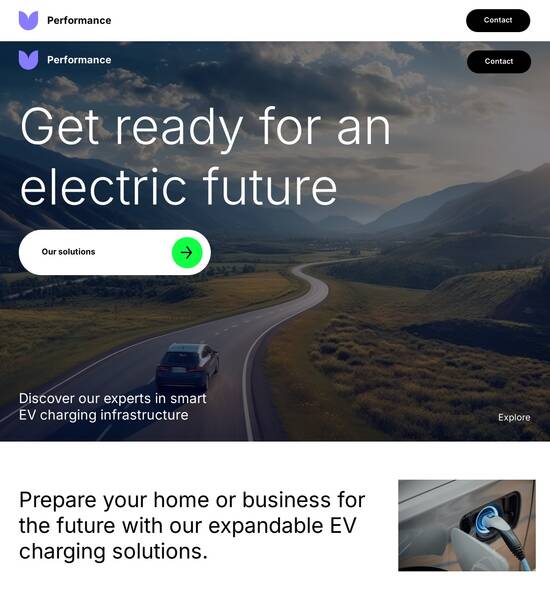
HTML page template for mobile phone companies
Use TemplateAbout template
Give your mobile phone companies a boost with our professional landing page templates. Ready to turn visitors into customers?
Recommended templates

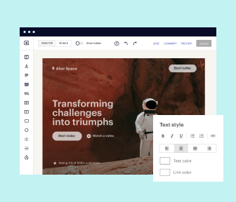
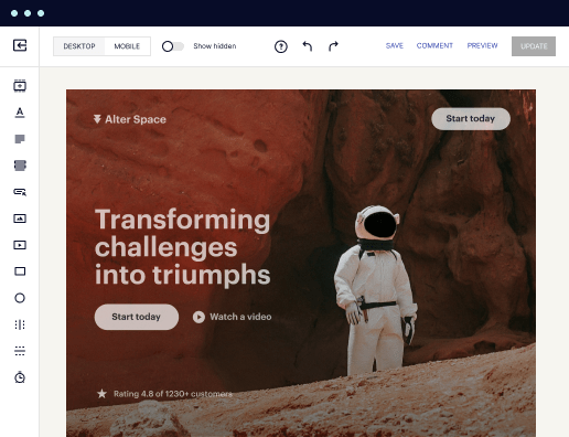
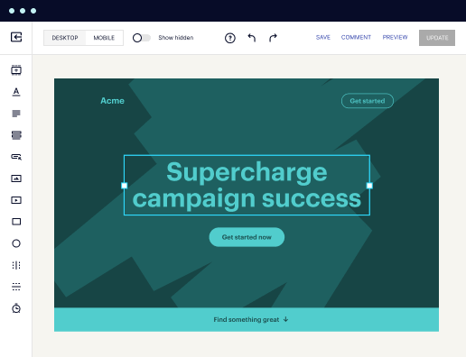
Easy to build without coding
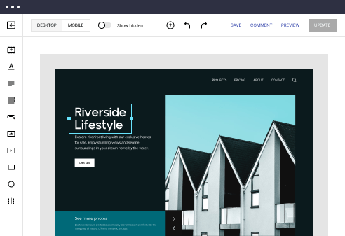
With the intuitive drag-and-drop builder, anyone on your team can create high-converting pages without any knowledge of code or design. Make enhancements to your landing page with custom widgets using Javascript, HTML/CSS, or third-party scripts.
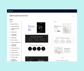
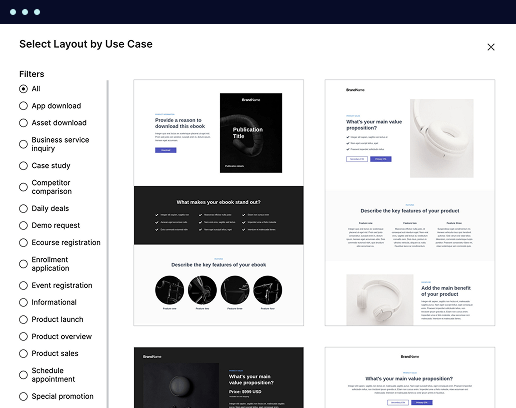
Multiple layouts for any industry and goal
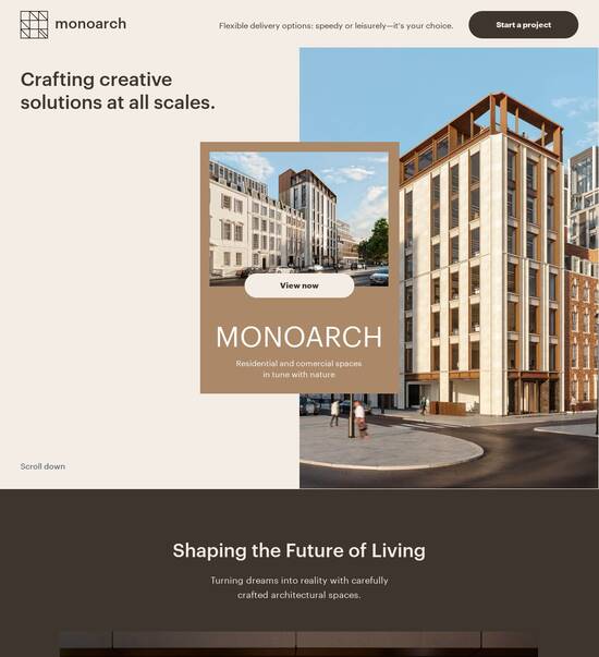
Select from 500+ landing page layouts built to boost conversions across industry-specific scenarios. Customize them by adjusting fonts, adding images, and generating on-brand content with the AI assistant. Quickly scale with Instablocks® and Global Blocks that you can save, reuse, and update globally.
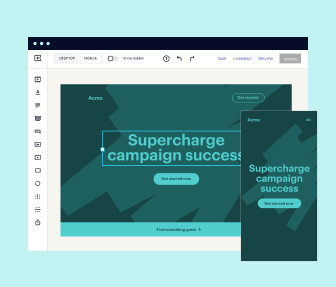
Loads fast and looks polished on any device
Every template is responsive, which means they present professionally on any device and load blazingly fast with our Thor Render Engine. You can also power them up with Google AMP technology to deliver an unparalleled mobile experience and drive higher conversions.
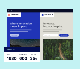
Robust analytics & experimentation
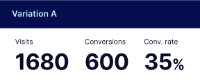
Get real-time updates and reporting across all your devices, showing the number of visitors, conversions, cost-per-visitor, and cost-per-lead. Launch AI-powered experiments, run A/B tests, and use heatmaps to analyze user behavior, then optimize your landing page to maximize conversions.

Easy to build without coding
With the intuitive drag-and-drop builder, anyone on your team can create high-converting pages without any knowledge of code or design. Make enhancements to your landing page with custom widgets using Javascript, HTML/CSS, or third-party scripts.
Multiple layouts for any industry and goal
Select from 500+ landing page layouts built to boost conversions across industry-specific scenarios. Customize them by adjusting fonts, adding images, and generating on-brand content with the AI assistant. Quickly scale with Instablocks® and Global Blocks that you can save, reuse, and update globally.
Loads fast and looks polished on any device
Every template is responsive, which means they present professionally on any device and load blazingly fast with our Thor Render Engine.
Robust analytics & experimentation
Get real-time updates and reporting across all your devices, showing the number of visitors, conversions, cost-per-visitor, and cost-per-lead. Launch AI-powered experiments, run A/B tests, and use heatmaps to analyze user behavior, then optimize your landing page to maximize conversions.
All the features you need to build html mobile template

Landing page builder
Easily create landing pages with the intuitive drag-and-drop page builder that features contextual element editing, over 500 page layouts, and 33 million images.

Visual on-page collaboration
Invite teammates and clients to collaborate on page design in real time to get your pages created, reviewed, and launched faster.

AI content generation
Instantly generate audience-focused content with AI-crafted headlines, paragraphs, and CTAs directly within the Instapage builder.

500+ customizable layouts
Choose from a range of professionally tailored page layouts, specifically designed to enhance conversion rates across numerous industry-specific scenarios.
Instablocks
Quickly build personalized landing pages using individual page blocks that you can customize, save, and reuse.
Thor Render Engine
Our back-end technology ensures that your landing pages load quickly to increase conversions, SEO rankings, and enhance the overall user experience.
Analytics
Seamlessly connect to Google Analytics to get real-time updates on cost-per-visitor and cost-per-lead metrics directly in the Instapage platform.
Learn how to build simple mobile site template
Frequently asked questions about mobile html template
“Instapage gives us the ability to tailor our landing page content and layout to tell a unique story for each geographical target. The platform also enables us to create different variations with content that performs well for each unique channel. Every marketing team needs this!”

"Instapage has truly maximized our digital advertising performance by enabling us to offer matching, personalized experiences for every ad and audience. Now we can scale our landing page experiences as efficiently and effectively as we scale the ads themselves."

"If we have to wait on a developer, our creative velocity plummets. But Instapage has made it possible for us to exponentially grow our advertising programs and convert more customers"

Leading the way in building high-performing landing pages


Mobile template html: Your ultimate how-to guide
Optimizing your landing pages is crucial for maximizing the success of your digital marketing efforts. With Instapage, you can harness the power of a robust landing page and CRO platform to effectively boost conversion rates and ROI. This step-by-step guide will walk you through the effective use of Instapage's features tailored for your specific marketing needs.
Understanding landing pages and their significance
Landing pages play a pivotal role in any marketing campaign. They serve as targeted, focused web pages designed to convert visitors into leads or customers. By using Instapage’s extensive library of customizable templates, marketers can ensure their landing pages are not only visually appealing but also strategically optimized to drive conversions.
- High-converting templates: Utilize over 100 templates designed for various industries to save time and maintain quality.
- Intuitive builders: The drag-and-drop functionality allows for quick edits without the need for coding skills.
- Lead generation elements: Instapage provides pre-built lead generation components that can be integrated seamlessly into your landing pages.
Creating your landing page in Instapage
To create an effective landing page, follow these streamlined steps:
- Choose a template: Start by selecting a template that aligns with your campaign goals and audience.
- Customize content: Use dynamic text replacement to personalize your message for different audience segments.
- Add leads capture features: Incorporate forms and CTAs to make it easy for visitors to engage.
Optimizing for conversions
Once your landing page is live, it's crucial to monitor its performance and optimize for conversions. Instapage provides various tools to make this process efficient.
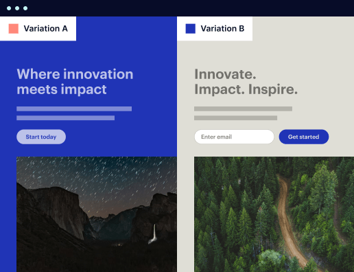
- Conduct A/B testing: Experiment with different versions of your landing page to identify which elements perform best.
- Analyze heatmaps: Use heatmaps to understand visitor behavior on your page and adjust accordingly.
- Leverage analytics: Track the performance of your landing pages with real-time analytics to ensure you're meeting your KPIs.
Each of these optimization steps is vital for nurturing your leads and enhancing your conversion rates. Instapage gives you the tools you need to make data-driven decisions.
In conclusion, leveraging the comprehensive features of Instapage can significantly enhance your landing page performance and user engagement.
Ready to enhance your digital marketing campaigns? Start using Instapage today to maximize your ROI and optimize your landing pages.
Unveiling the dynamic world of HTML page templates for mobile phone companies
Defining HTML page templates in the mobile landscape
HTML (HyperText Markup Language) forms the backbone of web content, defining the structure and layout we see online. It serves as a fundamental building block for web pages, enabling developers to craft engaging experiences for users. With the surge of mobile device usage, understanding the role of HTML in responsive design has become crucial. Responsive design ensures that web content adapts seamlessly to different screen sizes and orientations, making websites accessible and user-friendly across devices.
For mobile phone companies, utilizing tailored HTML page templates is vital. These templates not only enhance aesthetic appeal but also improve functionality, directly influencing user engagement and retention. Mobile-first design is an approach that prioritizes the mobile experience, ensuring that users accessing the site via smartphones or tablets have an optimized experience. This strategic focus can significantly affect the overall success of mobile marketing efforts.
Customizing user experience through innovative interface designs
An effective user interface (UI) is the cornerstone of a positive mobile experience. Essential UI elements like buttons, forms, and menus should be designed to engage users effectively. Consideration must be given to touch interactions, as users navigate by tapping rather than clicking. This adaptation requires larger buttons and touch-sensitive areas that enhance usability, accommodating the natural behavior of mobile users.
Adapting layouts for various screen sizes is also integral to mobile interface design. The goal is to create an experience where users can interact with the content smoothly, regardless of their device’s specifications. Techniques like fluid grids, flexible images, and media queries help optimize interfaces, ensuring they look and function well, whether on a smartphone, tablet, or phablet. This responsiveness not only enhances customer interaction but also improves overall satisfaction.
Essential features of mobile phone company templates
Interactions drive engagement, making it essential to incorporate interactive elements into mobile page templates. Features such as buttons that animate on clicks, dynamic content that refreshes, and engaging forms capture user attention. Following best practices, such as offering feedback on user actions (like confirmation messages for submitted forms), can significantly enhance user interactions and build a more engaging experience.
Navigational structures play a crucial role in user exploration. An intuitive navigation bar should guide users effortlessly through the site. Incorporating breadcrumb trails not only helps users understand their current location within the website but also allows them to retrace their steps easily. Creating a navigational hierarchy that prioritizes essential pages will facilitate better user journeys and drive conversions.
Designing for diverse screen sizes: understanding user behavior
Responsive layouts are essential for ensuring that users remain engaged across various devices. With the ever-increasing range of screen sizes, understanding user behavior is integral. Responsive design minimizes friction and optimizes experiences based on the device being used. This factor significantly impacts user retention, as users are more likely to return to websites that are formatted correctly for their devices.
Catering to various user interactions is also essential in mobile design. Establishing clear touchpoints allows users to navigate the website smoothly. Mobile templates should accommodate the thumb-friendly design principle, focusing on where the user’s thumb naturally falls while holding a device. This customization drastically influences user experience, making it easier for users to interact with the content effectively.
Leveraging AI for enhanced user experience and personalization
Artificial intelligence (AI) can transform user experiences within mobile templates. AI applications, like chatbots and recommendation engines, cater to user needs in real time, providing instant assistance and tailored recommendations based on user behavior. This flow of information enables companies to serve highly relevant content, enhancing user satisfaction and conversion rates.
Moreover, AI-driven analytics offer insights into user preferences, enabling companies to personalize content delivery. By analyzing data such as previous purchases, browsing history, and interactions, businesses can create highly customized experiences that resonate with users. Noteworthy case studies reveal how companies adapting these AI technologies not only improved user interactions but also heightened customer loyalty.
The aesthetic appeal: creating templates that captivate
A website’s look and feel have profound effects on brand perception. Color theory, for instance, can evoke particular emotions and responses, making it essential for mobile phone companies to choose palettes that reflect their brand message. Effective use of color can attract and retain customers’ attention, making it a critical design consideration.
Typography also plays a critical role in mobile design. Selecting the right fonts can enhance readability and ensure that content is accessible even on smaller screens. Thoughtful visual hierarchy, where the importance of elements is made clear through size and placement, guides users effectively through the content. Balancing text and visuals will create a more engaging experience without overwhelming the user.
Essential security measures in mobile HTML page templates
The security of mobile web pages cannot be overlooked, especially given the numerous threats online. Understanding basic security protocols can help mitigate risks such as data breaches and unauthorized access. Solutions include encryption, management of sensitive data, and regularly updated security features to safeguard user information.
Building user trust through secure navigation is crucial. Displaying SSL certificates clearly and providing privacy policy details fosters transparency. This transparency reassures users that their data is handled responsibly, significantly enhancing trust and encouraging interactions with the website.
Optimizing load times for exceptional user experience
Page speed is a critical factor that influences user engagement. Studies show that increased load times correlate strongly with soaring bounce rates; for instance, even a one-second delay can lead to a noticeable drop in user satisfaction. Strategies such as optimizing images, minimizing HTTP requests, and using content delivery networks (CDNs) are effective ways to reduce load times.
Utilizing performance monitoring tools can help businesses regularly assess and optimize their website’s speed. Tools like Google PageSpeed Insights and GTmetrix provide actionable insights to enhance performance. Additionally, understanding user access patterns allows companies to tailor their websites better, ensuring faster loading times during peak usage.
Future-proofing templates for evolving technology trends
Keeping pace with technological advancement is crucial for mobile phone companies. Anticipating changes in device capabilities and user behaviors ensures that templates remain relevant. For example, incorporating emerging interfaces, like augmented reality (AR) and virtual reality (VR), can differentiate companies in a competitive market by offering innovative customer experiences.
Maintaining regular updates and optimizations is equally important. Introducing new features based on user feedback can help keep content appealing. Creating benchmarks for ongoing optimization will ensure templates respond adequately to user needs and preferences, thus sustaining long-term engagement and loyalty.
Engaging case studies: successful template implementations
Analyzing pioneering mobile phone companies reveals key insights into effective HTML template design. For instance, companies like Apple and Samsung have excelled by creating templates that prioritize user experience, seamless navigation, and responsive layouts. These industry leaders emphasize the importance of maintaining intuitive designs that adapt to user preferences, setting benchmarks for emerging competitors.
User feedback is a critical component of template evolution. Companies that actively solicit and act on user input regarding their experiences, preferences, and frustrations can dramatically enhance their offerings. Case studies showcase instances where refined templates led to increased user engagement and satisfaction, highlighting the power of iterative improvement based on real user insights.
Ready to skyrocket conversions?
Supercharge your ad campaigns with high-performing landing pages
Get started