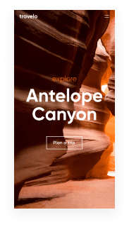
Get a starting point with the Bootstrap optimized video gallery page template
Supercharge your video gallery page with Bootstrap for outstanding performance! Learn more today.
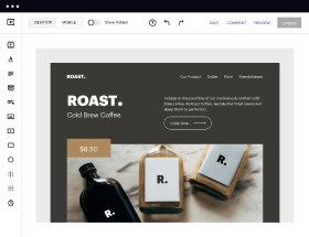
Easy to build without coding
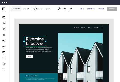
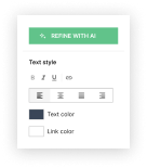
With the intuitive drag-and-drop builder, anyone on your team can create high-converting pages without any knowledge of code or design. Make enhancements to your landing page with custom widgets using Javascript, HTML/CSS, or third-party scripts.
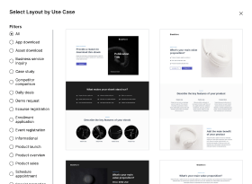
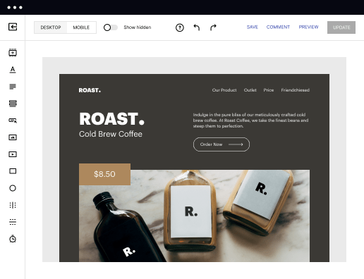
Multiple layouts for any industry and goal
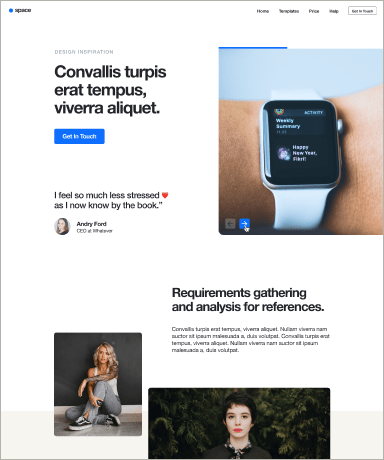
Select from 500+ landing page layouts built to boost conversions across industry-specific scenarios. Customize them by adjusting fonts, adding images, and generating on-brand content with the AI assistant. Quickly scale with Instablocks® and Global Blocks that you can save, reuse, and update globally.
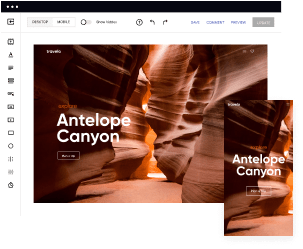
Loads fast and looks polished on any device
Every template is responsive, which means they present professionally on any device and load blazingly fast with our Thor Render Engine. You can also power them up with Google AMP technology to deliver an unparalleled mobile experience and drive higher conversions.
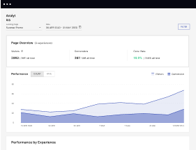
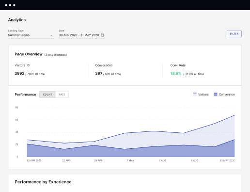
Robust analytics & experimentation
Get real-time updates and reporting across all your devices, showing the number of visitors, conversions, cost-per-visitor, and cost-per-lead. Launch AI-powered experiments, run A/B tests, and use heatmaps to analyze user behavior, then optimize your landing page to maximize conversions.
Easy to build without coding
With the intuitive drag-and-drop builder, anyone on your team can create high-converting pages without any knowledge of code or design. Make enhancements to your landing page with custom widgets using Javascript, HTML/CSS, or third-party scripts.
Multiple layouts for any industry and goal
Select from 500+ landing page layouts built to boost conversions across industry-specific scenarios. Customize them by adjusting fonts, adding images, and generating on-brand content with the AI assistant. Quickly scale with Instablocks® and Global Blocks that you can save, reuse, and update globally.
Loads fast and looks polished on any device
Every template is responsive, which means they present professionally on any device and load blazingly fast with our Thor Render Engine. You can also power them up with Google AMP technology to deliver an unparalleled mobile experience and drive higher conversions.
Robust analytics & experimentation
Get real-time updates and reporting across all your devices, showing the number of visitors, conversions, cost-per-visitor, and cost-per-lead. Launch AI-powered experiments, run A/B tests, and use heatmaps to analyze user behavior, then optimize your landing page to maximize conversions.
All the features you need to build bootstrap video gallery

Landing page builder
Easily create landing pages with the intuitive drag-and-drop page builder that features contextual element editing, over 500 page layouts, and 33 million images.

Visual on-page collaboration
Invite teammates and clients to collaborate on page design in real time to get your pages created, reviewed, and launched faster.

AI content generation
Instantly generate audience-focused content with AI-crafted headlines, paragraphs, and CTAs directly within the Instapage builder.

500+ customizable layouts
Choose from a range of professionally tailored page layouts, specifically designed to enhance conversion rates across numerous industry-specific scenarios.
Instablocks
Quickly build personalized landing pages using individual page blocks that you can customize, save, and reuse.
Thor Render Engine
Our back-end technology ensures that your landing pages load quickly to increase conversions, SEO rankings, and enhance the overall user experience.
AMP
Use Google AMP framework to build and A/B test mobile-responsive pages that load fast and drive more conversions.
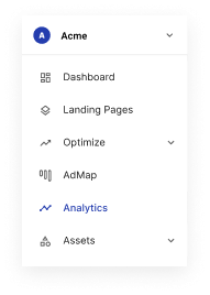
Analytics
Seamlessly connect to Google Analytics to get real-time updates on cost-per-visitor and cost-per-lead metrics directly in the Instapage platform.
Learn how to build top-performing landing pages for any goal
FAQs
“Instapage gives us the ability to tailor our landing page content and layout to tell a unique story for each geographical target. The platform also enables us to create different variations with content that performs well for each unique channel. Every marketing team needs this!”

"Instapage has truly maximized our digital advertising performance by enabling us to offer matching, personalized experiences for every ad and audience. Now we can scale our landing page experiences as efficiently and effectively as we scale the ads themselves."

"If we have to wait on a developer, our creative velocity plummets. But Instapage has made it possible for us to exponentially grow our advertising programs and convert more customers"

Leading the way in building high-performing landing pages


A step-by-step guide to using Instapage for landing page optimization
Elevate your digital marketing campaigns with Instapage, the ultimate landing page and conversion rate optimization (CRO) platform. As marketers strive to maximize ROI, utilizing Instapage's extensive features can be the game-changer your business needs. This guide will provide you with a structured approach to optimizing your landing pages and drive meaningful results for your business services, tech, education, and other sectors across the USA.
Understanding Instapage and its benefits
Instapage is designed for professionals in various verticals, providing the tools necessary to create high-converting landing pages efficiently. With access to over 100 templates and essential lead generation elements, you can design pages that attract and convert without needing coding skills. The platform's user-friendly interface helps to speed up page production while ensuring high-quality outcomes.
- Flexibility: Build tailored landing pages quickly with diverse layouts.
- Collaboration: Facilitate team reviews and edits in real-time.
- Optimization: Leverage analytics and A/B tests to continuously enhance performance.
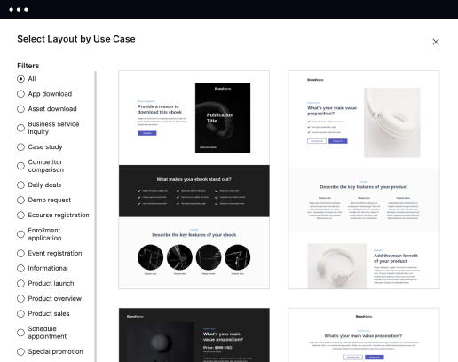
Step 1: Select the Right Template
Choosing the appropriate template is crucial for campaign success. Instapage offers more than 100 ready-to-use templates customized for various industries, ensuring you can find a design that resonates with your audience.
- Select templates based on industry focus to enhance relevance.
- Use lead generation elements integrated in templates for better performance.
- Ensure your choice aligns with campaign goals and audience expectations.
Step 2: Customize Your Landing Page
After selecting a template, it's time to personalize it to reflect your brand's identity. Use Instablocks to replace content and images easily, aligning your messages with customer expectations.
- Adjust the header and subheader to reflect your unique value propositions.
- Incorporate visuals that resonate with your target audience's tastes.
- Utilize dynamic text replacement for personalized messaging in campaigns.
Step 3: Optimize for Performance
Optimization is ongoing. Utilize built-in experimentation features that Instapage provides to test different versions of your landing page. Analyze user behavior with heatmaps to see what draws attention and what might be improved.
- Implement A/B testing to compare variations of your landing pages.
- Review analytics to assess traffic sources and conversions clearly.
- Adjust marketing strategies based on performance insights to maximize ROI.
By following these steps, marketers can significantly enhance their campaign outcomes and drive higher conversion rates.
Ready to start transforming your digital marketing campaigns? Explore Instapage today and unlock the full potential of your marketing strategies.
Bootstrap optimized video gallery page template
Understanding Bootstrap optimized video gallery page template
The concept of Bootstrap optimized video gallery page template combines the powerful capabilities of the Bootstrap framework with the necessity for visually engaging video presentations. Bootstrap provides developers and designers a flexible toolkit for creating responsive, aesthetically pleasing web pages tailored to a variety of content types.
The essence of Bootstrap: A framework for all
Bootstrap is an open-source front-end framework designed to simplify the development of responsive websites and applications. Originally launched in 2011, Bootstrap has evolved significantly, adapting to the ever-changing web landscape. It remains relevant today, serving as a foundational tool for modern developers aiming to streamline their design processes.
The framework is built with a mobile-first approach, ensuring that your designs look great on any device—be it a desktop or smartphone. This approach not only enhances user experience but also aligns well with current web standards that prioritize mobile functionality.
Responsive grid system that allows for fluid layout designs.
Pre-designed components that save time on development.
Utility classes that offer extensive customization options without much effort.
The video gallery template: A visual experience
A video gallery page template serves as a central hub for displaying video content in an organized and visually appealing manner. This type of template is especially crucial for content creators, marketers, and educators looking to showcase their video assets effectively. By utilizing a Bootstrap optimized template, users can focus on content delivery while ensuring a smooth browsing experience for their audience.
Video content has gained tremendous traction over the past decade. As users increasingly favor video over static content, the importance of a well-structured video gallery becomes apparent. Such templates help enhance brand storytelling and engagement, making them essential in any digital marketing strategy.
Provides a platform for displaying multiple videos in a coherent layout.
Enhances visual appeal, encouraging users to interact with the content.
Leveraging Bootstrap for video galleries
Bootstrap ensures that your video gallery page is accessible and aesthetically pleasing across a variety of device types. The framework’s responsive design principles automatically adjust layouts based on screen size, preserving functionality and usability. This adaptability is particularly vital as mobile internet access continues to grow, making it essential for video galleries to seamlessly accommodate users on phones, tablets, and desktops.
Bootstrap achieves responsiveness through its grid system, which allows developers to specify how many columns a video should span across different viewports. Additionally, media queries within Bootstrap’s CSS files help keep video content proportionate and viewable without forcing users to scroll excessively or zoom in.
Each video can easily adapt in size depending on the screen it is viewed on, improving user experience.
Content remains accessible and organized, regardless of device.
Optimized performance and speed
Performance is another critical aspect of a Bootstrap optimized video gallery template. Bootstrap is designed to be lightweight, which helps decrease page load times. Faster load times not only improve user satisfaction but also positively impact search rankings, giving an additional layer of importance to speed optimization.
When users have to wait for videos to load, they are more likely to abandon your page. Therefore, embedding videos from platforms like YouTube or Vimeo can be beneficial since these services handle video delivery efficiently. With Bootstrap, you can integrate such video embedding seamlessly, ensuring quick load times and smooth playback.
Leverages external video services to minimize bandwidth usage.
Improves page loading times, increasing the likelihood of user retention.
Deep diving into features of a Bootstrap video gallery template
One of the most compelling aspects of a Bootstrap video gallery template is its potential for deep customization. Users can modify layouts, colors, and fonts to ensure that the template aligns well with their brand identity. Whether it's choosing a light theme, a dark theme, or a color palette that complements a visual campaign, Bootstrap enables marketers to tailor the appearance to their liking.
Furthermore, video embedding has become increasingly flexible. Bootstrap supports embedding videos from various platforms, including YouTube, Vimeo, and self-hosted solutions. This flexibility means that you can choose the best fit for your content strategy while maintaining control over how your videos are displayed.
Customization allows for the tailoring of templates to individual branding needs.
Support for various embedding methods increases versatility.
Integrated controls enhance user interaction with audio and video.
Elegant showcase capabilities
The visual layout capabilities of Bootstrap enable you to showcase videos elegantly. The grid layout, which is central to the Bootstrap framework, allows for a structured presentation that helps viewers scan through video options quickly. By arranging videos in a visually appealing grid, users can easily find and select content that interests them.
Moreover, incorporating lightbox features can elevate user experience by providing an immersive viewing environment. Instead of redirecting users to different pages, lightbox modals allow videos to open within the same window, making transitions smooth and keeping users engaged in the gallery.
Grid layouts offer visual clarity and easy scanning.
Lightbox features enhance user engagement through immersive viewing.
Enhancing user engagement through design
Effective navigation is a cornerstone of any web page, and this holds true for video gallery templates as well. Intuitive menus and pagination enable users to navigate seamlessly through content, reducing frustration and increasing satisfaction. Including search functionality provides an essential tool, allowing users to directly find specific videos or topics they are interested in.
In addition to navigation, incorporating interactive elements can draw attention to your video gallery. Utilizing vivid thumbnails, hover effects, and other interactive features encourages users to engage with the content. These attention-grabbing elements not only enhance visual appeal but also contribute to overall user interaction.
Clear menus and pagination enhance user navigation.
Interactive elements boost engagement and attract attention.
Importance of usability and accessibility
Usability and accessibility are vital not only for maintaining compliance with guidelines but also for providing an inclusive experience for all users. A Bootstrap optimized video gallery template should perform smoothly across various major web browsers, ensuring that all visitors have access to your content regardless of their preferred platform.
In addition to cross-browser compatibility, integrating accessibility features is essential for users with disabilities. This includes the use of ALT text for videos and ensuring that the gallery can be navigated using keyboard shortcuts. Prioritizing these aspects not only broadens your audience but also enhances the overall quality of the user experience.
Cross-browser compatibility ensures a wider reach.
Accessibility considerations improve usability for all users.
Customization for enhanced coherence
Customization is crucial in making sure that your video gallery aligns with your brand's overall aesthetics. Elements such as colors, fonts, and imagery should remain consistent across your entire website to reinforce brand identity. Utilizing a Bootstrap template enables developers to implement these elements easily, ensuring that the video gallery feels like a seamless part of the broader digital ecosystem.
Beyond aesthetics, thoughtful content organization enhances user experience. Strategically arranging videos can guide the viewer through specific narratives or themes. Categorization options can also help tailor the experience, allowing users to explore content based on their preferences and interests.
Consistent branding across the website enhances identity.
Well-organized content aids user navigation and exploration.
Future-proofing the video gallery experience
As technology evolves, so too should your Bootstrap optimized video gallery template. Adapting to emerging technologies, such as augmented reality (AR) and virtual reality (VR), can significantly enhance interaction with video content. While this may seem advanced, future-proofing your gallery ensures that your content remains relevant as user preferences change.
Moreover, staying attuned to shifts in video consumption trends will inform how you present your galleries. For instance, you might observe an increasing demand for shorter-form content on platforms like TikTok and Instagram. By tailoring your template to accommodate these shifts, you ensure your gallery aligns with what users are increasingly drawn to.
Integrating new technologies expands user interaction potential.
Adapting to video consumption trends keeps content relevant.
Conclusion without concluding: The ongoing journey
A Bootstrap optimized video gallery page template represents a significant advancement in how video content can be showcased. With a focus on responsiveness, engagement, and usability, these templates offer creators and marketers the tools needed to deliver rich video experiences that captivate audiences. As the landscape of digital content continues to evolve, staying ahead with flexible, optimized design will be paramount for creators aiming to leave a lasting impression.
The potential developments in video gallery templates signal an exciting future in web design, where creativity and functionality intertwine to offer even more engaging platforms for video content. This ongoing journey underscores the importance of continuously optimizing and evolving our approaches to video presentation.
Ready to skyrocket conversions?
Supercharge your ad campaigns with high-performing landing pages
Get started