
Bootstrap optimized article page template
Explore Similar TemplatesAbout template
Supercharge your article page with Bootstrap for outstanding performance! Learn more today.
Recommended templates
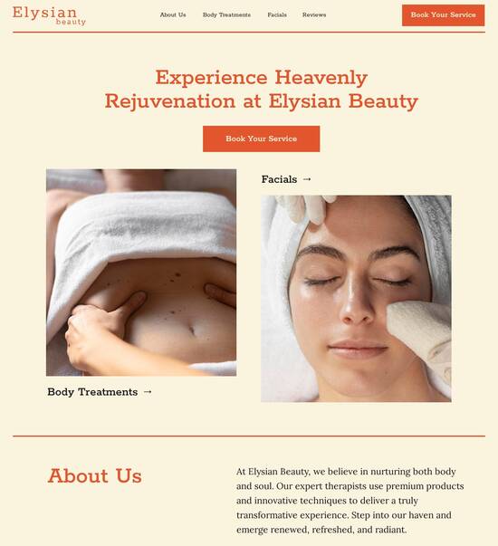
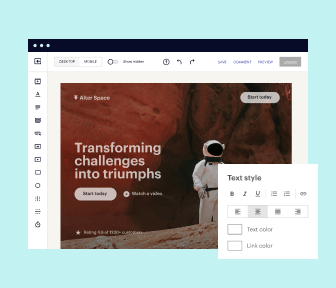
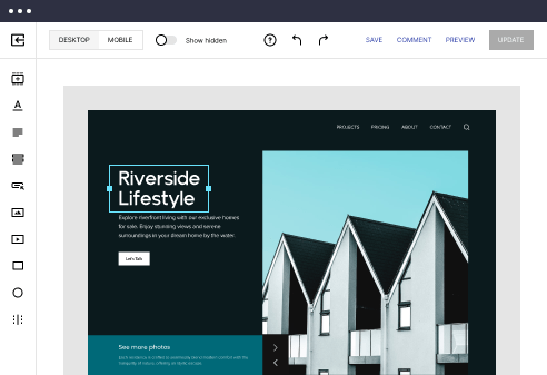
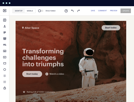
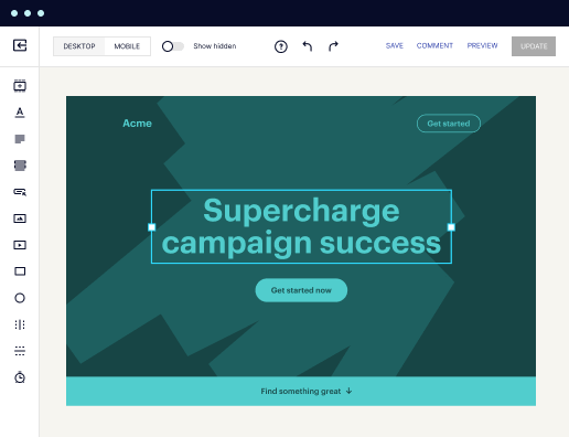
Easy to build without coding
With the intuitive drag-and-drop builder, anyone on your team can create high-converting pages without any knowledge of code or design. Make enhancements to your landing page with custom widgets using Javascript, HTML/CSS, or third-party scripts.
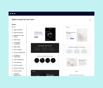
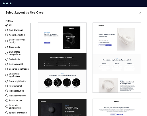
Multiple layouts for any industry and goal
Select from 500+ landing page layouts built to boost conversions across industry-specific scenarios. Customize them by adjusting fonts, adding images, and generating on-brand content with the AI assistant. Quickly scale with Instablocks® and Global Blocks that you can save, reuse, and update globally.
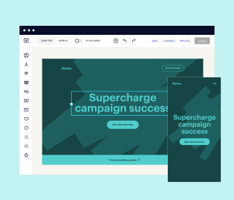
Loads fast and looks polished on any device
Every template is responsive, which means they present professionally on any device and load blazingly fast with our Thor Render Engine. You can also power them up with Google AMP technology to deliver an unparalleled mobile experience and drive higher conversions.
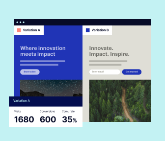
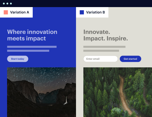
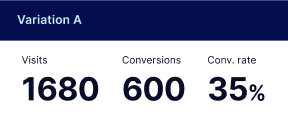
Robust analytics & experimentation
Get real-time updates and reporting across all your devices, showing the number of visitors, conversions, cost-per-visitor, and cost-per-lead. Launch AI-powered experiments, run A/B tests, and use heatmaps to analyze user behavior, then optimize your landing page to maximize conversions.

Easy to build without coding
With the intuitive drag-and-drop builder, anyone on your team can create high-converting pages without any knowledge of code or design. Make enhancements to your landing page with custom widgets using Javascript, HTML/CSS, or third-party scripts.
Multiple layouts for any industry and goal
Select from 500+ landing page layouts built to boost conversions across industry-specific scenarios. Customize them by adjusting fonts, adding images, and generating on-brand content with the AI assistant. Quickly scale with Instablocks® and Global Blocks that you can save, reuse, and update globally.
Loads fast and looks polished on any device
Every template is responsive, which means they present professionally on any device and load blazingly fast with our Thor Render Engine.
Robust analytics & experimentation
Get real-time updates and reporting across all your devices, showing the number of visitors, conversions, cost-per-visitor, and cost-per-lead. Launch AI-powered experiments, run A/B tests, and use heatmaps to analyze user behavior, then optimize your landing page to maximize conversions.
All the features you need to build bootstrap article template

Landing page builder
Easily create landing pages with the intuitive drag-and-drop page builder that features contextual element editing, over 500 page layouts, and 33 million images.

Visual on-page collaboration
Invite teammates and clients to collaborate on page design in real time to get your pages created, reviewed, and launched faster.

AI content generation
Instantly generate audience-focused content with AI-crafted headlines, paragraphs, and CTAs directly within the Instapage builder.

500+ customizable layouts
Choose from a range of professionally tailored page layouts, specifically designed to enhance conversion rates across numerous industry-specific scenarios.
Instablocks
Quickly build personalized landing pages using individual page blocks that you can customize, save, and reuse.
Thor Render Engine
Our back-end technology ensures that your landing pages load quickly to increase conversions, SEO rankings, and enhance the overall user experience.
Analytics
Seamlessly connect to Google Analytics to get real-time updates on cost-per-visitor and cost-per-lead metrics directly in the Instapage platform.
Learn how to build top-performing landing pages for any goal
FAQs
“Instapage gives us the ability to tailor our landing page content and layout to tell a unique story for each geographical target. The platform also enables us to create different variations with content that performs well for each unique channel. Every marketing team needs this!”

"Instapage has truly maximized our digital advertising performance by enabling us to offer matching, personalized experiences for every ad and audience. Now we can scale our landing page experiences as efficiently and effectively as we scale the ads themselves."

"If we have to wait on a developer, our creative velocity plummets. But Instapage has made it possible for us to exponentially grow our advertising programs and convert more customers"

Leading the way in building high-performing landing pages


A step-by-step guide to mastering Instapage's powerful landing page capabilities
Instapage is designed to be the most potent landing page and conversion rate optimization (CRO) platform available, specifically tailored to marketers seeking to maximize the return on investment (ROI) of their digital campaigns. With comprehensive features ranging from templates to optimization tools, Instapage simplifies the landing page creation process, allowing users to focus on achieving results.
Understanding the Importance of a Landing Page
A well-crafted landing page is crucial for turning visitors into leads and ultimately, paying customers. It serves as a focused space for your audience to engage with your content, where every element works towards guiding them to take a specific action. Here are some reasons why landing pages are indispensable:
- High conversion rates: Landing pages are designed with specific goals in mind, streamlining the visitor's path to conversion.
- Targeted messaging: Tailoring content to fit the needs of a specific audience enhances engagement and improves conversion rates.
- Data collection ease: Dedicated landing pages simplify lead capture, allowing for better data management and analytics.
Step 1: Define Your Campaign Goals
Before designing your landing page, it's imperative to clarify your campaign’s objectives. Establishing clear goals not only guides the design but also influences the choice of templates and the call-to-action (CTA) strategies you implement. Consider the following:
- Identify your target audience: Know who you want to convert to tailor your messaging effectively.
- Set measurable objectives: Whether it's lead generation, sales, or user registrations, specify what success looks like.
- Determine your CTA: What action do you want your visitors to take? Make this clear and enticing.
Step 2: Leverage Instapage’s Templates and Design Options
With Instapage, creating a visually compelling landing page is straightforward. Utilize their extensive library of over 100 high-converting templates that cater to various industries and objectives. Here’s how to make the most of them:
- Select a relevant template: Choose a design that resonates with your campaign purpose and audience.
- Customize without coding: Use the intuitive builder to adjust text, images, and layout to match your branding.
- Integrate lead generation elements: Add forms or CTA buttons that stand out to capture visitor information effortlessly.
Step 3: Optimize for Performance and Conversion
With your landing page in place, the next step is to ensure it operates at maximum efficiency. Instapage's built-in tools aid in optimization, allowing you to measure effectiveness and make data-driven decisions. Key actions include:
- Conduct A/B testing: Experiment with different headlines, images, and CTAs to identify what resonates best with your audience.
- Utilize heatmaps: Analyze user interactions to understand areas of interest and optimize layout accordingly.
- Monitor analytics: Leverage the analytics dashboard to track performance metrics and adjust strategies as needed.
In summary, by clearly defining your goals, utilizing customizable templates, and optimizing for conversions, you can harness the full potential of Instapage to elevate your marketing campaigns.
Ready to transform your digital marketing approach? Explore Instapage today and unlock the tools you need to create compelling landing pages that drive results.
People also ask about Bootstrap optimized article page template
Revolutionizing article presentation: A deep dive into bootstrap optimized article page templates
Understanding bootstrap: The foundation of modern web design
Bootstrap, originally developed by Twitter, has revolutionized the approach to web design, enabling developers to create responsive, mobile-first web applications. Launched in 2011, it emerged from the need for consistency in internal tools within Twitter, transitioning into an open-source framework that facilitates rapid building of responsive websites. Over the years, Bootstrap has evolved through various versions, incorporating Flexbox and grid layout systems, enhancing the responsiveness and quality of web design.
Bootstrap's widespread adoption reflects its impact on web design standards. As businesses increasingly prioritize mobile optimization, this framework provides developers with the tools needed to ensure their websites function seamlessly across all devices. By incorporating Bootstrap, teams can maintain design consistency while accelerating their development processes.
Mobile-first design: Prioritizing functionality on mobile devices.
Customizable components: Easy integration and modification of UI elements.
Rapid development: Reducing the amount of code required.
The anatomy of an optimized article page template
An optimized article page template is structured to enhance readability and user engagement. The header typically includes a compelling title and a succinct subtitle, setting the tone for the content. Following the header, the body of the article is divided into sections including an introduction, the main content, and a conclusion. This structure creates a logical flow that guides readers effortlessly through the article, maximizing their understanding and retention.
In addition, sidebars can play a critical role in optimizing the user experience. They allow for the inclusion of related articles, advertisements, or calls to action that encourage further engagement. This placement leverages the space on the article page to keep visitors interested without overwhelming them with too much information.
Header: Engaging title and subtitle.
Body: Clear introduction, content layout, and conclusion.
Sidebar: Related content, ads, or engagement options.
Utilizing Bootstrap's grid system allows for a more fluid layout, adapting seamlessly to different screen sizes. This framework works on a 12-column grid concept which simplifies the alignment of elements on the page, ensuring a balanced design that's both functional and visually appealing.
Enhancing user engagement with aesthetic qualities
Visual appeal is crucial when presenting articles online. The right color schemes and themes can significantly enhance user experience, making the content more appealing and easier to digest. To complement the design, choosing appropriate typography plays an essential role in improving readability. Fonts should not only align with the brand image but also be easy on the eyes for prolonged reading sessions.
Moreover, creating an intuitive reading experience is pivotal. Whitespace should be strategically utilized to avoid clutter, allowing the reader's eyes to flow smoothly across the page. Incorporating multimedia elements, such as images and videos, can enrich the content, providing visual breaks and further engagement opportunities.
Color schemes: Aligning with branding and audience preferences.
Typography: Choosing fonts for optimal legibility.
Whitespace: Preventing clutter for a cleaner look.
Multimedia: Enhancing engagement with relevant graphics.
Streamlining development efforts with bootstrap templates
Pre-built templates can substantially simplify the development process. By selecting a bootstrap optimized article page template, developers save time and reduce code complexity. These templates often come with a variety of customizations that allow for alignment with specific branding strategies, ensuring they maintain a consistent look and feel across the organization’s web presence. Additionally, their intrinsic adaptability ensures that even complex designs can be adapted easily and efficiently.
The bootstrap community contributes significantly to the enhancement of this framework. Numerous resources, themes, and plugins created by fellow developers can be leveraged to expand functionality and improve overall design. Engaging with these open-source offerings can unlock new features and maintain up-to-date standards in design practices.
Pre-built templates: Accelerating the design process.
Customization: Aligning templates with specific branding.
Community resources: Accessing a wealth of themes and plugins.
Optimizing content for maximum SEO impact
To achieve better visibility in search engines, structuring content effectively is essential. Best practices dictate the use of appropriate headings, tags, and metadata that provide search engines with critical context about the article. Additionally, implementing schema markup can help search engines understand the content, thereby improving its chances of ranking higher.
Crafting SEO-friendly URLs also holds significant importance. Clean, concise URLs enhance user experience, making it easier for readers to navigate. Internal linking structures should be thoughtfully arranged to facilitate easy access to related content, fostering a deeper connection to the website. Furthermore, using alt text for images not only aids in SEO but also ensures accessibility for users using screen readers.
Headings and tags: Structuring content for clarity.
Schema markup: Enhancing search engine understanding.
SEO-friendly URLs: Improving user navigation.
Alt text: Supporting both SEO and accessibility.
Responsive design: Ensuring accessibility across devices
Device fragmentation is a significant consideration in modern web design. Current statistics reveal that a large portion of web traffic originates from mobile devices, making it critical for articles to be accessible and functional across various screens. Testing designs across different devices can lead to a better understanding of user behavior and preferences, ultimately dictating design adjustments.
Bootstrap’s responsive features equip developers with the ability to create layouts that automatically adjust for different screen sizes. Media queries can be employed alongside Bootstrap’s fluid grid adjustments to ensure that layouts maintain their integrity regardless of the device. Including flexible images and modular content that scales effectively is key to providing a seamless user experience.
Device statistics: Understanding user behavior across screens.
Media queries: Ensuring adaptivity in design.
Flexible images: Enhancing visual integrity on any device.
Real-world applications: Case studies of successful implementations
Examining successful article pages can provide valuable insights for developers and marketers alike. Brands with optimized templates often experience improvements in key metrics such as user engagement and SEO rankings. For instance, an education technology company integrated a bootstrap optimized template that resulted in a 30% increase in time spent on page due to improved design and usability.
By analyzing these high-performing article pages, developers can identify best practices and apply them to their designs. It’s essential to not only understand what works but also to be aware of common pitfalls to avoid, such as neglecting mobile optimization or overwhelming readers with excessive information. Learning from others’ successes can streamline the development process and lead to more effective outcomes.
Brand profiles: Success stories of optimized templates.
Metric analysis: Understanding engagement and SEO improvement.
Best practices: Key takeaways for developers.
Common pitfalls: Design mistakes to avoid.
Future trends in article template design
The web design landscape continues to evolve, with a clear shift towards enhancing user experience. Future trends are likely to see a greater emphasis on interactivity and personalization, as users expect more tailored content. Innovations in UI/UX design will prioritize user engagement, driving the need for more adaptive designs that respond quickly to user actions.
Furthermore, emerging technologies will play a significant role in shaping the template design of the future. With the incorporation of AI and machine learning, content personalization will reach new heights. Predictive analytics will enable developers to create user-centric designs that respond to audience behavior. Anticipating future bootstrap developments will empower marketers and developers alike to stay ahead in the game.
User experience: Anticipating shifts in design focus.
Interactivity: Emphasizing engagement through design.
AI in design: Using machine learning for tailored content.
The bottom line: Strategic importance of bootstrap optimized article pages
Ultimately, balancing aesthetics with functionality is vital in creating impactful article pages. An optimized article page not only elevates user experience but also aligns with business objectives, driving engagement and conversions. By embracing bootstrap templates, marketers can achieve a polished and professional look that captures their audience's attention without compromising on usability.
Investing in high-quality templates pays off in the long run. It helps businesses maintain optimal web standards and stay competitive. The return on investment from using bootstrap for article pages can be substantial, translating into higher traffic, improved user retention, and increased conversion rates, all essential metrics for success in today's digital marketing landscape.
Aesthetic and functionality: Critical design considerations.
Investment value: Justifying the use of bootstrap.
Long-term benefits: Enhancing web presence over time.
Ready to skyrocket conversions?
Supercharge your ad campaigns with high-performing landing pages
Get started