
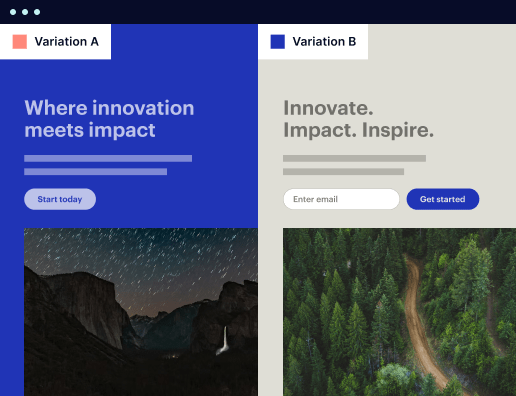
Archive page template optimized for MacBook
Explore Similar TemplatesAbout template
Design using a responsive archive page template that delivers a flawless experience on MacBook. Try Instapage today!
Recommended templates

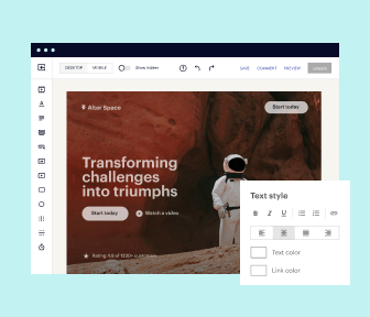
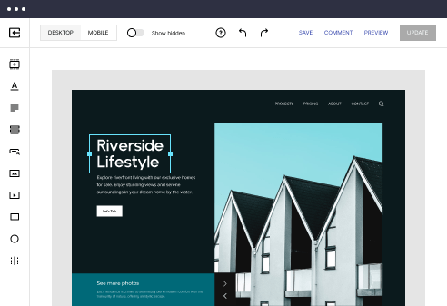
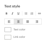
Easy to build without coding
With the intuitive drag-and-drop builder, anyone on your team can create high-converting pages without any knowledge of code or design. Make enhancements to your landing page with custom widgets using Javascript, HTML/CSS, or third-party scripts.
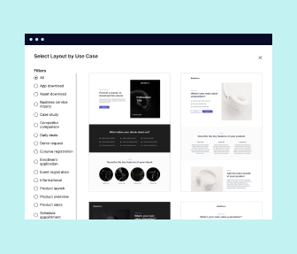
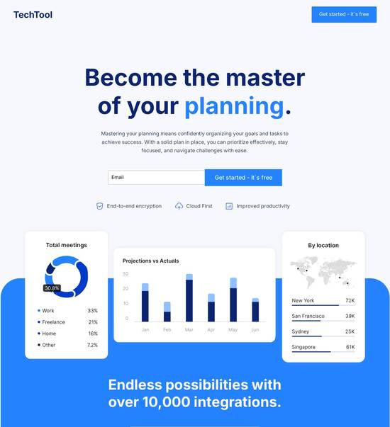
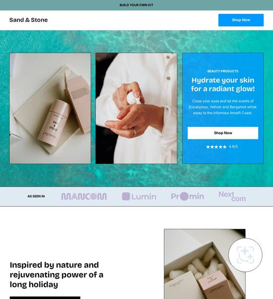
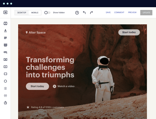
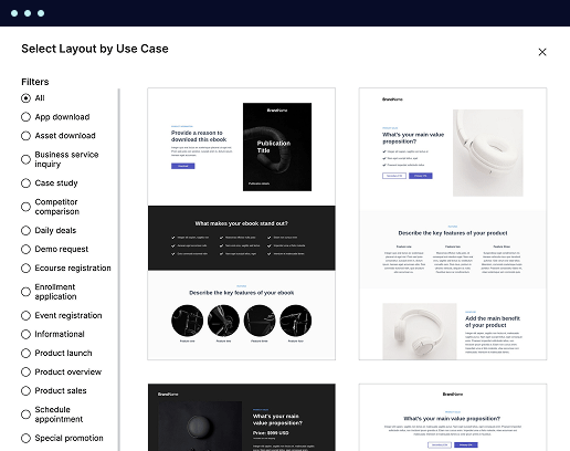
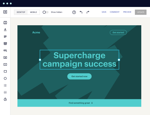
Multiple layouts for any industry and goal
Select from 500+ landing page layouts built to boost conversions across industry-specific scenarios. Customize them by adjusting fonts, adding images, and generating on-brand content with the AI assistant. Quickly scale with Instablocks® and Global Blocks that you can save, reuse, and update globally.
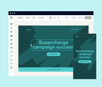
Loads fast and looks polished on any device
Every template is responsive, which means they present professionally on any device and load blazingly fast with our Thor Render Engine. You can also power them up with Google AMP technology to deliver an unparalleled mobile experience and drive higher conversions.
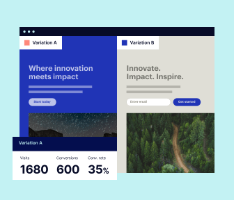
Robust analytics & experimentation
Get real-time updates and reporting across all your devices, showing the number of visitors, conversions, cost-per-visitor, and cost-per-lead. Launch AI-powered experiments, run A/B tests, and use heatmaps to analyze user behavior, then optimize your landing page to maximize conversions.


Easy to build without coding
With the intuitive drag-and-drop builder, anyone on your team can create high-converting pages without any knowledge of code or design. Make enhancements to your landing page with custom widgets using Javascript, HTML/CSS, or third-party scripts.
Multiple layouts for any industry and goal
Select from 500+ landing page layouts built to boost conversions across industry-specific scenarios. Customize them by adjusting fonts, adding images, and generating on-brand content with the AI assistant. Quickly scale with Instablocks® and Global Blocks that you can save, reuse, and update globally.
Loads fast and looks polished on any device
Every template is responsive, which means they present professionally on any device and load blazingly fast with our Thor Render Engine.
Robust analytics & experimentation
Get real-time updates and reporting across all your devices, showing the number of visitors, conversions, cost-per-visitor, and cost-per-lead. Launch AI-powered experiments, run A/B tests, and use heatmaps to analyze user behavior, then optimize your landing page to maximize conversions.
All the features you need to build lead-generating landing pages

Landing page builder
Easily create landing pages with the intuitive drag-and-drop page builder that features contextual element editing, over 500 page layouts, and 33 million images.

Visual on-page collaboration
Invite teammates and clients to collaborate on page design in real time to get your pages created, reviewed, and launched faster.

AI content generation
Instantly generate audience-focused content with AI-crafted headlines, paragraphs, and CTAs directly within the Instapage builder.

500+ customizable layouts
Choose from a range of professionally tailored page layouts, specifically designed to enhance conversion rates across numerous industry-specific scenarios.
Instablocks
Quickly build personalized landing pages using individual page blocks that you can customize, save, and reuse.
Thor Render Engine
Our back-end technology ensures that your landing pages load quickly to increase conversions, SEO rankings, and enhance the overall user experience.
Analytics
Seamlessly connect to Google Analytics to get real-time updates on cost-per-visitor and cost-per-lead metrics directly in the Instapage platform.
Learn how to build top-performing landing pages for any goal
FAQs
“Instapage gives us the ability to tailor our landing page content and layout to tell a unique story for each geographical target. The platform also enables us to create different variations with content that performs well for each unique channel. Every marketing team needs this!”

"Instapage has truly maximized our digital advertising performance by enabling us to offer matching, personalized experiences for every ad and audience. Now we can scale our landing page experiences as efficiently and effectively as we scale the ads themselves."

"If we have to wait on a developer, our creative velocity plummets. But Instapage has made it possible for us to exponentially grow our advertising programs and convert more customers"

Leading the way in building high-performing landing pages


An actionable guide to using Instapage for powerful landing page optimization
Effective landing page creation is paramount in maximizing your digital marketing success. Instapage, renowned as the most powerful landing page and CRO platform, empowers marketers to accelerate and optimize their campaigns effortlessly. In this guide, we'll explore the tools and strategies offered by Instapage to elevate your marketing efforts.
Step 1: Understanding the fundamentals of landing pages
Landing pages serve as dedicated online spaces designed to convert visitors into leads or customers. A well-optimized landing page focuses on specific offers and aligns with audience expectations, enhancing conversion rates. Instapage provides over 100 high-converting templates that simplify the process of creating these pages.
- High-converting templates: Choose from a wide array of pre-designed templates that cater to various industries including business services and tech.
- Lead generation components: Use built-in forms and calls-to-action that are proven to capture leads effectively.
- No coding required: Instapage's intuitive visual builder allows users of all tech levels to create stunning landing pages.
Step 2: Crafting tailored content for your audience
Personalization is key in digital marketing. Instapage enables you to create distinctive experiences for different audience segments by utilizing dynamic text replacement. This feature ensures your message resonates with each visitor. Additionally, with AdMaps, you can connect specific ads with corresponding landing pages seamlessly.
Step 3: Optimizing for maximum conversions
Continuous optimization is a crucial part of landing page success. Leverage Instapage's built-in experimentation tools to monitor performance and conduct A/B testing. These features allow marketers to iterate on content to find what works best.
- Heatmaps: Analyze user interaction on your pages to identify areas needing improvement.
- A/B testing: Experiment with different headlines, images, and layouts to determine the highest converting options.
- Detailed analytics: Access comprehensive reporting that provides insights into traffic sources and user behavior.
Step 4: Collaborating with your team
Using Instapage's collaboration features aids in speeding up the page production process. Teams can provide feedback in real-time, which simplifies the review process and ensures pages are updated quickly.
- Live comments: Team members can leave comments directly on the page, streamlining feedback.
- Version history: Instapage keeps track of all changes, allowing your team to roll back to previous versions if needed.
- Secure sharing: Effortlessly share your pages with stakeholders for review and approval.
By taking these steps and fully utilizing the capabilities of Instapage, you can create landing pages that not only attract visitors but also convert them into valuable leads.
Ready to supercharge your landing page strategy? Sign up for Instapage today and see how its powerful features can transform your marketing campaigns.
People also ask about Archive page template optimized for MacBook
Archive page template optimized for MacBook
The impact of archive page templates on MacBook optimization
With the rise of digital platforms, the need for well-structured archive page templates has never been more crucial, especially for MacBook users. Archive pages serve as a centralized location for information, allowing visitors to access a plethora of content efficiently. For marketers engaged in sectors such as business services, education, and financial services, optimizing these templates for MacBook can enhance user experience and improve site navigation.
Understanding how archive page templates can directly impact MacBook usage hinges on their design, functionality, and the unique features tailored for Apple's hardware. MacBooks are designed with cutting-edge technology, and incorporating templates that leverage these features greatly enhances performance, making navigation smoother and visually appealing.
Understanding archive page templates
Archive page templates are predefined layouts that organize and display archived content, making it easier for users to access past articles, posts, or materials. These templates can provide a cohesive design, often featuring categories, tags, and search functionalities, thus enhancing the overall user experience. Importantly, they help in website organization and user navigation, ensuring visitors find what they are looking for quickly.
For MacBook users, these templates can be tailored to take full advantage of features like Retina display, providing high-resolution visuals that enhance readability. Furthermore, the interface can be optimized to support trackpad gestures, enabling smoother navigation through tabs and content areas. Adapting templates to this unique environment ensures an inviting user experience.
MacBook compatibility: A seamless integration
MacBooks are equipped with a powerful combination of hardware and software that enhances template performance remarkably. The Retina display offers stunning visuals, allowing for rich images and sharp text that captivates readers. When archive page templates leverage high-resolution graphics, they provide an appealing aesthetic that encourages users to explore content further.
Furthermore, the trackpad gestures unique to MacBook provide an easy way for users to navigate through templates. Actions such as swiping between screens and pinch-to-zoom can make browsing through numerous articles intuitive and effortless. Ensuring that archive templates are tested and optimized for these features will help in creating a more engaging user experience.
Retina display for stunning visuals.
Trackpad gestures for intuitive navigation.
High performance requirements for smooth operation.
Powerful design templates built for MacBook users
Creating a successful archive page requires selecting powerful design templates tailored for MacBook users. Various design options exist, including pre-built layouts that prioritize minimalist design and offer streamlined navigation. These layouts often minimize clutter, ensuring that users can focus on content without distractions.
On the other hand, modular templates allow for more diverse content types, offering the flexibility to showcase various multimedia formats seamlessly. Using curated design templates can enhance user experience significantly, making it easier for visitors to absorb information and navigate the archive.
Pre-built layouts for a clean, minimalist approach.
Modular templates for varied content types.
Curated designs for improved user interactions.
Harnessing the power of icon production templates
Icons play a crucial role in web design, indicating functionality and guiding user navigation. Using icon production templates can streamline the design process by offering pre-designed icons that can easily be integrated into archive pages. By using consistent iconography, users can quickly interpret different sections of the page.
For MacBook users, several tools are recommended for effective icon creation. Tools like IconFinder, Noun Project, and Adobe Illustrator provide extensive libraries of icons and design flexibility. Visually engaging icons can uplift the overall aesthetic of an archive page, improving user experience and engagement.
IconFinder for a vast library of icons.
Noun Project for vector icons.
Adobe Illustrator for custom icon design.
The role of color guides in template customization
Color choices significantly impact user engagement on archive pages. Using a well-developed color guide can enhance the visual coherence of the template, aligning it with branding practices. Color theory basics such as hue, saturation, and value play a vital role in this process. By incorporating appropriate colors, designers can evoke emotions that enhance user experience.
It's vital to test color combinations to ensure readability and appeal, especially on high-resolution MacBook displays. Tools like Adobe Color and Coolors can help designers assess color palettes and create harmonious combinations, resulting in a cohesive aesthetic across archive pages.
Color theory basics: hue, saturation, value.
Tools for testing colors: Adobe Color, Coolors.
Ensuring aesthetic cohesion across the page.
Collaborative design sessions: Fostering creativity within teams
Conducting collaborative design sessions on MacBook can greatly enhance the creative process. With various tools available, teams can work together in real time, enabling instant feedback and iterative improvements. Applications like Figma, Sketch, and InVision facilitate collaborative efforts, ensuring all team members can contribute visually and verbally during the design process.
Utilizing these tools allows for sharing not only ideas but also tangible design elements. The ability to visualize changes instantly improves workflow and fosters creativity, resulting in superior archive page templates that cater to overall marketing objectives.
Figma for real-time collaboration.
Sketch for prototyping interfaces.
InVision for design sharing.
Comprehensive documentation: Ensuring accessibility and clarity
Effective documentation is essential for ensuring users can properly navigate and utilize template features. Elements of good documentation include step-by-step guides that outline processes for using templates and addressing common questions. Providing clear, comprehensive documentation fosters confidence among users and minimizes confusion.
Utilizing markdown format can enhance clarity in documentation, allowing for better organization of design insights and instructions. A structured approach ensures all team members and users can easily access relevant information and tools, creating a seamless development lifecycle.
Step-by-step guides for template usage.
FAQs to tackle common user queries.
Utilizing markdown format for clarity.
Accelerating development: Sample code for developers
Including sample code within template documentation provides developers with quick resources for customization and extends functionality. MacBook users can benefit from using commonly utilized frameworks and libraries, such as React, Vue.js, and Bootstrap, to bring responsive designs to life. Sample snippets can save time and streamline development efforts.
By ensuring templates are compatible with these frameworks, developers can implement powerful designs that enhance user engagement. Moreover, these code snippets can serve as building blocks, guiding developers through integration processes across various platforms, ensuring optimal performance.
React for building user interfaces.
Vue.js for progressive framework design.
Bootstrap for responsive layouts.
Leveraging design apps for optimal functionality
Utilizing essential design applications on MacBook can significantly enhance archive page template creation. Program choices like Sketch, Figma, and Adobe XD provide features tailored to rapid prototyping and user interface design. Each of these design applications offers unique functionalities that help marketers create visually compelling templates.
When comparing these design apps, it becomes evident that some are better suited for team collaborations, while others excel in prototyping. By understanding the strengths of each tool, marketers can select an app that aligns with their specific project needs, ensuring optimal functionality in building archive page templates.
Sketch for advanced design capabilities.
Figma for cloud-based collaboration.
Adobe XD for cohesive design workflows.
Note-taking and sketching: Capturing ideas effectively
In the design process, capturing thoughts and sketches plays an integral role in developing effective archive page templates. Utilizing note-taking apps on MacBook, such as Notion, Evernote, and Apple Notes, enables designers to organize their ideas coherently. These tools allow designers to jot down concepts and store references efficiently.
Integrating sketches within the digital design process ensures that initial concepts translate seamlessly into final designs. By systematically documenting ideas and visualizing changes, designers can foster a more structured creative process that enhances template sophistication.
Notion for organized project management.
Evernote for comprehensive note-taking.
Apple Notes for quick jotting down of ideas.
The role of symbols and sizes in template design
Incorporating symbols and managing sizes properly within design is vital when creating archive pages. Understanding design symbols and their applications helps clarify functionality for users, leading to improved navigation and usability. Symbols can act as focal points, drawing attention to important content while guiding user actions.
Managing sizes and proportions within the archive page design is also critical for achieving visual balance. Standard dimensions for web elements like buttons and images should be adhered to while considering responsive designs across various screen sizes. This balance ensures that all users, regardless of the device used, experience a well-structured and aesthetically pleasing interface.
Symbols to improve user navigation.
Standard dimensions for web elements.
Responsive design considerations.
Optimizing font choices: System and custom fonts
Choosing the right font plays a significant role in overall design aesthetics. Font styles must align seamlessly with the desired brand messaging while ensuring readability across various archive page templates. MacBook users can take advantage of system fonts which are optimized for performance. This approach keeps loading times at a minimum while allowing for an attractive presentation.
Moreover, integrating custom web fonts into the design further enriches the aesthetic landscape. The select customizations can enhance branding, allowing businesses to stand out in competitive markets. Balancing aesthetic appeal with performance will yield impactful results for the user experience.
Choosing fonts for readability and branding.
Recommended system fonts optimized for performance.
Integrating web fonts for customization.
Platform compatibility and performance considerations
Ensuring that archive page templates function well across multiple platforms is essential for meeting user expectations. It’s essential to assess both desktop and mobile experiences, as users often switch devices. Templates must not only be visually appealing but also maintain functionality and speed, regardless of the device.
Boosting performance involves techniques like image optimizations, lazy loading, and caching mechanisms, significantly enhancing user experience. Regular testing across different devices will help identify any performance issues, ensuring that all users experience a responsive and fast interface.
Desktop vs. mobile user experience.
Techniques for image optimization and lazy loading.
Testing for responsiveness across devices.
Proportional design: Achieving harmony in archive pages
Achieving harmony in design is paramount for an effective archive page. Proportional design principles, such as the golden ratio and the rule of thirds, help define visual balance. Employing these principles adds a professional touch and increases the likelihood that users will remain engaged.
Harmony can be achieved through tools that measure and align design elements effectively. By managing visual weight within a template, designers can create engaging layouts that guide user attention precisely where it’s needed.
Golden ratio for visual balance.
Rule of thirds to guide visual composition.
Tools for measuring and aligning elements.
Potential challenges and solutions
While creating archive page templates optimized for MacBook, challenges can arise. Common pitfalls include neglecting mobile optimization, mismanaging content layout, and underestimating the importance of user feedback. Recognizing these issues early in the design process can help mitigate risks and streamline production timelines.
In order to optimize time and resources, employing project management strategies can keep the team on track. User feedback should be prioritized, allowing insightful assessments to inform ongoing designs and enhance overall user satisfaction.
Avoid neglecting mobile optimization.
Ensure proper content layout management.
Prioritize user feedback for continuous improvement.
Ready to skyrocket conversions?
Supercharge your ad campaigns with high-performing landing pages
Get started