Optimize mobile user experience on your website with ease
Drive higher traffic and increase sales with tailored, fast-loading website. Enhance your customer journey seamlessly.

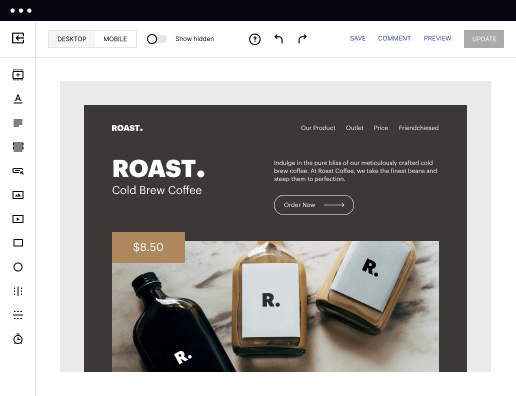
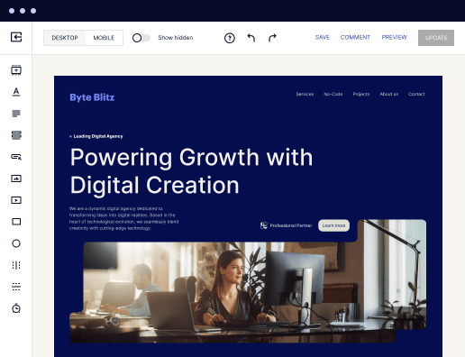
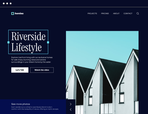
 Build landing pages at scale without coding
With Instapage’s intuitive drag-and-drop page builder with diverse design features, over 5,000 fonts, and 33 million images, anyone can easily create professional-looking, top-performing landing pages without technical or design skills.

 Increase conversions with fast-loading pages
Reduce bounce rates and increase engagement with lightning-fast landing pages. Our Thor Render Engine™, back-end technology delivers 3x faster-loading landing pages so you won't lose a single lead.

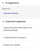
 Boost productivity with AI content generation
Scale page creation and overcome writer’s block or generate copy variations for A/B tests with the AI Content Generator. Create high-quality and engaging content for each audience and ad group, including paragraphs, CTAs, or entire copies directly in the Instapage builder.

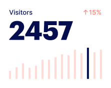
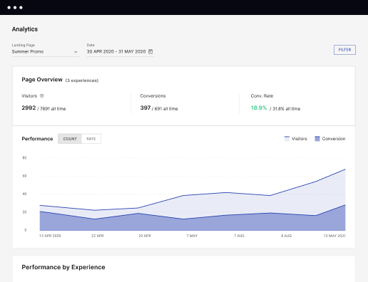
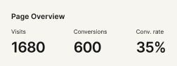
 Make the most of analytic insights
Get data-backed insights about your campaigns and page performance so you can test and optimize for higher ROI. Track visitors, conversions, conversion rates, cost-per-visitor, and cost-per-lead in real time. View heatmaps to understand user behavior - all without leaving Instapage.

 Optimize traffic with AI experiments
Improve page performance fast with an AI-powered experimentation tool. It tracks your ongoing experiments and directs traffic to top-performing page variations, no matter how many versions you have. Achieve faster optimization insights without sacrificing the quality of your results.

 Secure your business data
Instapage safeguards business data and your customer's privacy with enterprise-grade security measures, including SSL certification, two-factor authentication, SSO, and more. Instapage also maintains compliance with GDPR, SOC 2, and CCPA regulations.


 Build landing pages at scale without codingIncrease conversions with fast-loading pagesBoost productivity with AI content generationMake the most of analytic insightsOptimize traffic with AI experimentsBuild landing pages at scale without coding
How to optimize mobile user experience on your website with Instapage
In the evolving digital landscape, optimizing mobile user experience on your website has become essential for success. Mobile visitors demand swift, engaging, and intuitive interfaces. Instapage addresses these challenges head-on, enabling businesses across various sectors to create landing pages that resonate with mobile audiences.
Key benefits of using Instapage
Harnessing the power of Instapage allows companies to focus on enhancing their mobile user experience effectively. Here’s why Instapage stands out:
- Flexible and user-friendly page building for rapid deployment of landing pages.
- Built-in optimization tools such as A/B testing and detailed heatmaps to enhance conversions.
- Dynamic content delivery, allowing you to customize experiences based on audience segments.
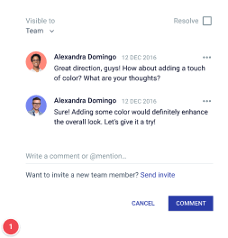
- Real-time collaboration features that make team projects more efficient.
How Instapage works to optimize mobile user experience on your website
Instapage streamlines the landing page creation process, making it accessible to both tech-savvy and non-technical users. Its intuitive design facilitates the efficient crafting of tailored landing pages that meet the unique needs of mobile users.
- Get a free Instapage account and sign up for a free 14-day trial.
- Configure your account and provide your company details.
- In your Dashboard, click CREATE NEW PAGE.
- Develop your landing page using a template or create from scratch and customize it to your preference.
- Utilize the AI content generator to produce engaging copy on your page.
- Conduct A/B tests on AI-generated content tailored for specific audiences and ad groups.
- Launch pages swiftly with expert recommendations for titles, CTA buttons, and more.
Features highlight to optimize mobile user experience on your website
Instapage offers a suite of powerful features specifically designed to overcome digital marketing hurdles. These include:
- A library containing over 500 conversion-focused templates for quick customization.
- Advanced analytics dashboards that track performance and user behavior.
- Dynamic text replacement that personalizes messages for different audience segments.
- Collaboration tools that allow multiple stakeholders to provide instant feedback and edits.
Transform your landing pages and enhance their mobile user experience today. Start your journey with Instapage by signing up for a free trial or requesting a demo now!
Get more out of optimize mobile user experience on your website
Improve your Quality Score with quick load technology for landing pages
Increase conversions with content that aligns with your ads and audiences
Achieve maximum ROI by scaling your marketing initiatives
“Instapage gives us the ability to tailor our landing page content and layout to tell a unique story for each geographical target. The platform also enables us to create different variations with content that performs well for each unique channel. Every marketing team needs this!”

"Instapage has truly maximized our digital advertising performance by enabling us to offer matching, personalized experiences for every ad and audience. Now we can scale our landing page experiences as efficiently and effectively as we scale the ads themselves."

"If we have to wait on a developer, our creative velocity plummets. But Instapage has made it possible for us to exponentially grow our advertising programs and convert more customers"

Leading the way in building high-performing landing pages


FAQs
Ready to skyrocket conversions?
Supercharge your ad campaigns with high-performing landing pages.
Get started