Optimize mobile user experience on your archive website with ease
Drive higher traffic and increase sales with tailored, fast-loading archive website. Enhance your customer journey seamlessly.

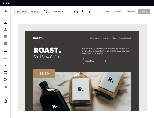
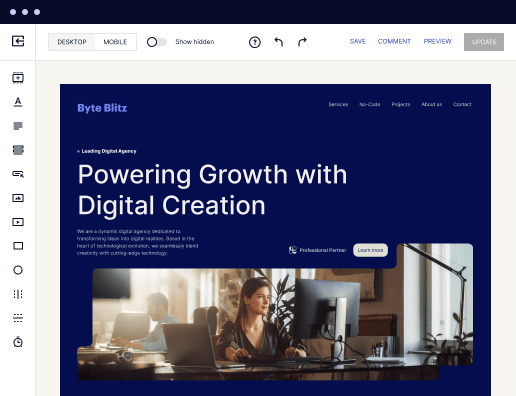
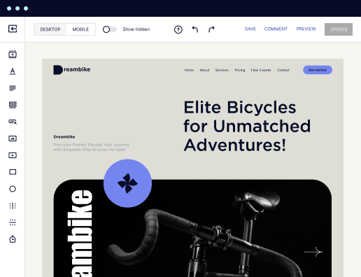
 500+ customizable layouts
Get your campaigns up and running faster with conversion-focused landing page layouts designed for every industry and business type. Easily scale landing page generation with Instablocks® and Global Blocks that you can save, reuse, and update globally.

 Mobile responsiveness
All Instapage landing pages are optimized for responsiveness. They adapt to any screen size, ensuring a consistent user experience across all devices.

 A/B split testing
Make data-driven decisions to optimize conversions with A/B testing capabilities. Experiment with different landing page variations, separate elements, layouts, and content that you can instantly generate with AI.

 Seamless ad mapping
Boost conversions and lower your CPA by personalizing your landing pages. With AdMap®, you can effortlessly visualize your ad campaigns, link them to relevant landing pages, or create new personalized pages. Then, synchronize updates of ads and landing pages without any back-and-forth.

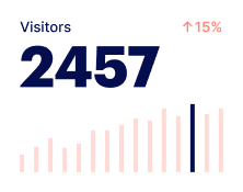
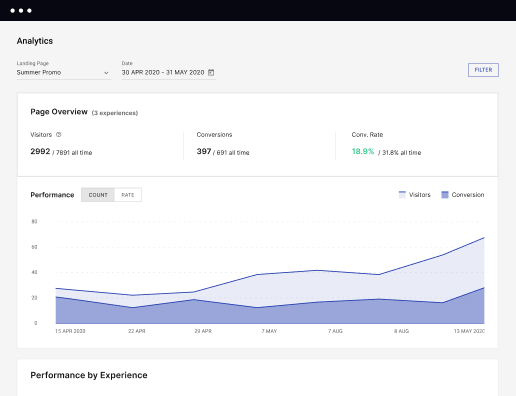
 Detailed reporting
Instapage provides detailed real-time reports over any period of time and across all your devices. To help you better understand your audience and optimize your marketing strategy, check conversion analytics that you can view directly from Instapage.

 Integrations with 120+ marketing tools
Instapage seamlessly connects with popular marketing tools and platforms, including CRMs, e-commerce, analytics tools, marketing automation platforms, email marketing software, and more. Everything you need to drive conversions and grow your business is at your fingertips.

 500+ customizable layoutsMobile responsivenessA/B split testingSeamless ad mappingDetailed reporting500+ customizable layouts
How to optimize mobile user experience on your archive website
In today’s digital landscape, optimizing mobile user experience on your archive website is essential for keeping visitors engaged and converting them into loyal customers. With the proliferation of mobile usage, businesses must face the challenge of creating seamless experiences that cater to mobile visitors. Instapage offers solutions to these challenges through its user-friendly platform for creating high-impact landing pages.
Key benefits of using Instapage for mobile user experience
Instapage harnesses the power of landing page optimization to enhance user experience, drive conversions, and build customer loyalty.
- Flexible and easy-to-use platform for rapid landing page creation
- Built-in optimization features to enhance conversion rates
- Personalization tools to tailor content for specific audiences
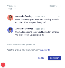
- Collaboration features that facilitate real-time edits and feedback
How it works to optimize mobile user experience on your archive website
Setting up and optimizing landing pages is straightforward with Instapage. The platform offers a structured approach that simplifies the process for marketers and business professionals.
- Get a free Instapage account and sign up for a free 14-day trial.
- Configure your account and provide your company details.
- When in your Dashboard, click CREATE NEW PAGE.
- Create your landing page from scratch or use a template and customize it to your needs.
- Generate content on your page using the powerful AI content generator.
- Easily A/B test AI-generated content for different audiences and ad groups.
- Launch pages faster with recommendations for headlines, buttons, and more.
Features highlight to optimize mobile user experience on your archive website
Instapage is packed with features designed specifically to address common digital marketing challenges. These capabilities enhance the overall user experience, particularly for mobile visitors.
- Over 500 conversion-focused layouts and Instablocks for quick setup
- Detailed heatmaps to analyze on-page behavior and fine-tune content
- A/B testing functionality to iterate and improve page performance
- Dynamic text replacement for personalized visitor experiences
Embrace the future of digital marketing by optimizing mobile user experience on your archive website. Sign up for a free trial with Instapage today and discover how easy it is to create engaging, high-converting landing pages tailored for your diverse audience.
Get more out of optimize mobile user experience on your archive website
Improve your Quality Score with quick load technology for landing pages
Increase conversions with content that aligns with your ads and audiences
Achieve maximum ROI by scaling your marketing initiatives
“Instapage gives us the ability to tailor our landing page content and layout to tell a unique story for each geographical target. The platform also enables us to create different variations with content that performs well for each unique channel. Every marketing team needs this!”

"Instapage has truly maximized our digital advertising performance by enabling us to offer matching, personalized experiences for every ad and audience. Now we can scale our landing page experiences as efficiently and effectively as we scale the ads themselves."

"If we have to wait on a developer, our creative velocity plummets. But Instapage has made it possible for us to exponentially grow our advertising programs and convert more customers"

Leading the way in building high-performing landing pages


FAQs
Ready to skyrocket conversions?
Supercharge your ad campaigns with high-performing landing pages.
Get started