8 Landing Page Design Best Practices That Help You Achieve Higher Conversions
by Fahad Muhammad

The success of your digital marketing campaigns hinges on the effectiveness of your landing pages. A well-designed landing page captures visitors’ attention, engages them with your message, and converts them into leads, paying customers, or reservations. The key to achieving successful conversions often comes down to implementing a few fundamental landing page best practices.
In this blog post, we explore the most important of these best practices, along with examples of brands that are doing it right.
A landing pages is a dedicated web page that’s designed to guide visitors toward a specific action, such as providing contact information, requesting a demo, or making a purchase. Unlike a website’s homepage , which serves as a gateway to various pages and content, a landing page is focused on a single goal, such as capturing leads or making sales.
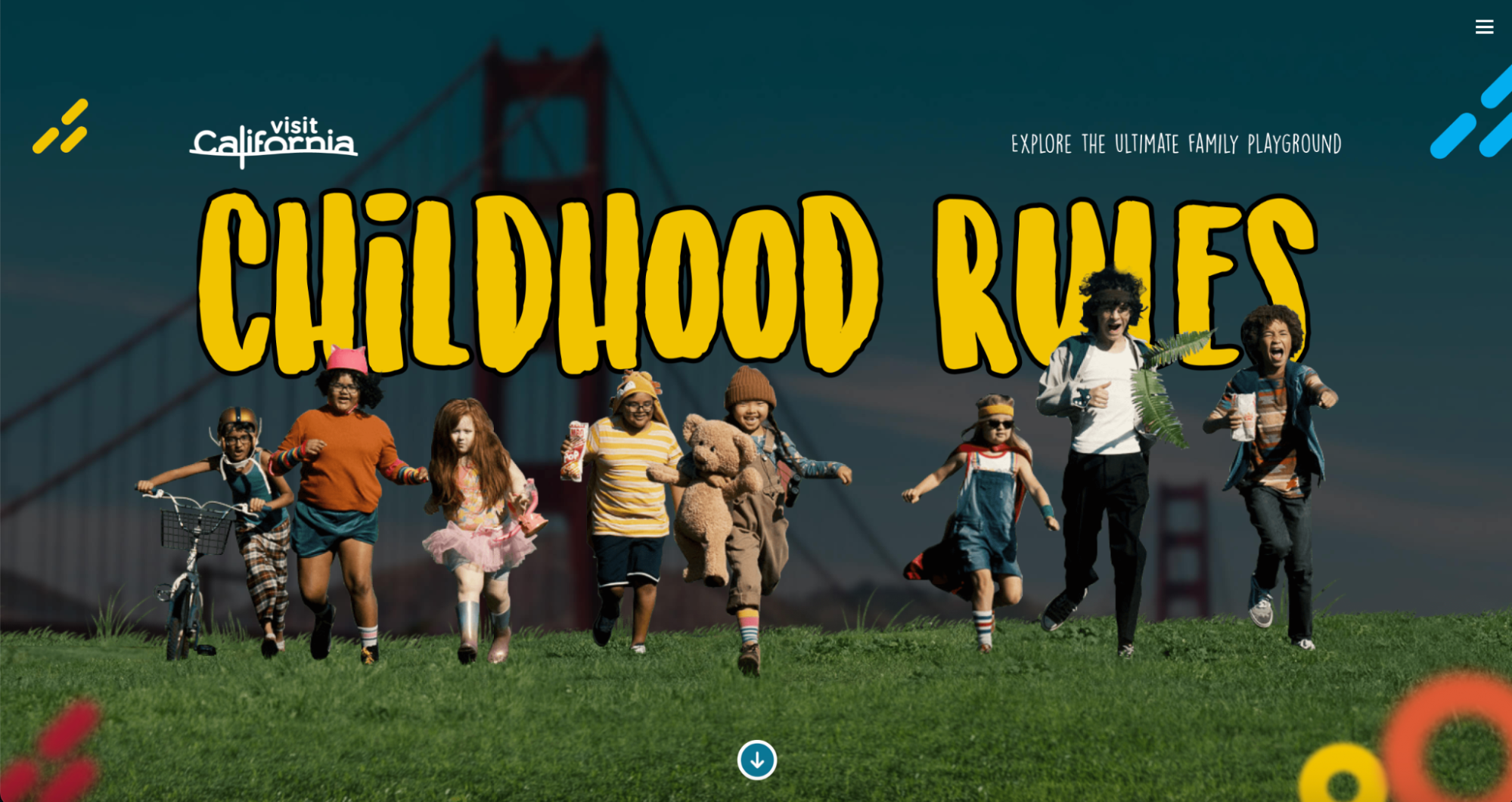
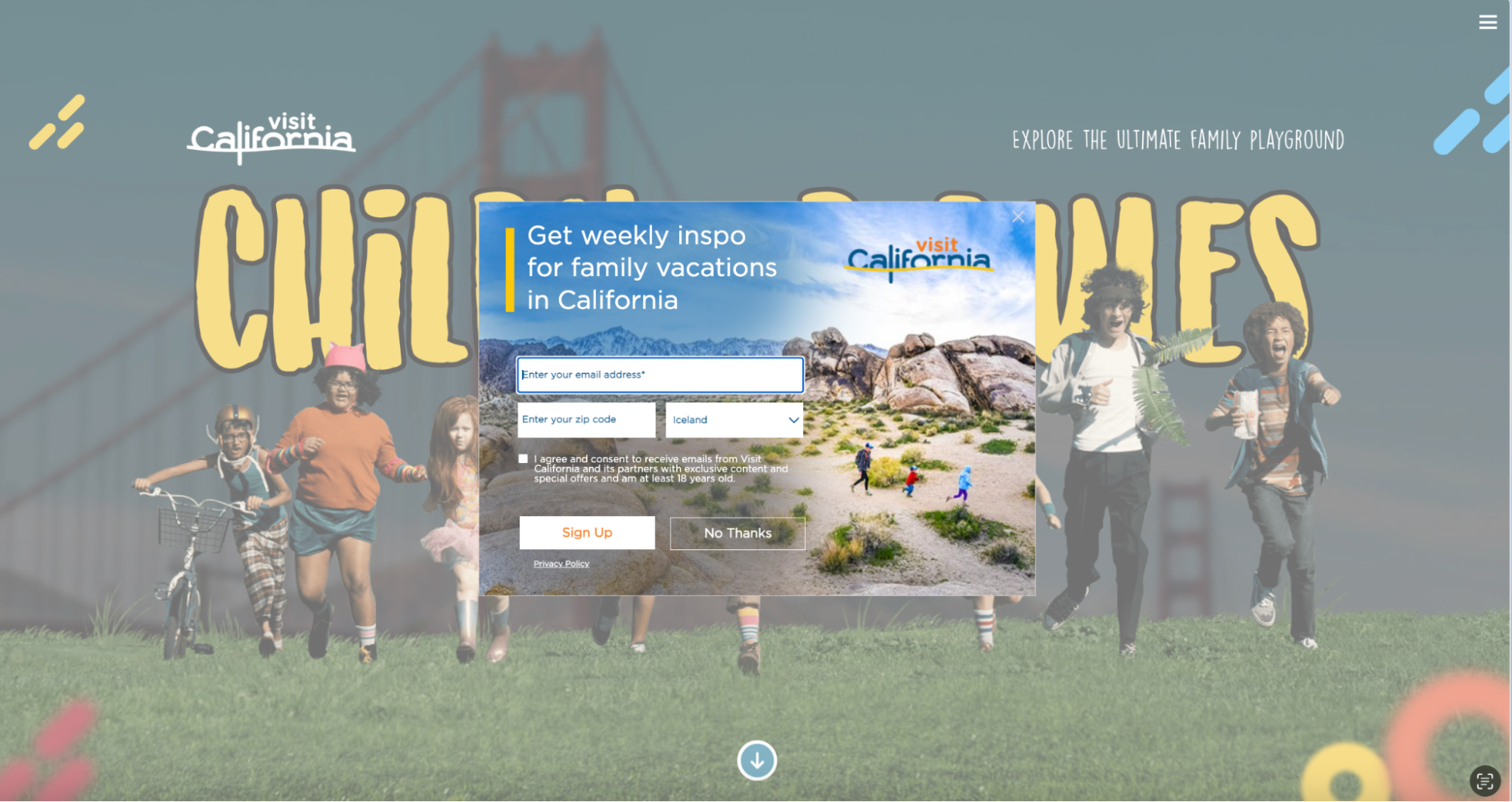
Compare, for example, Visit California’s landing page to their website homepage. The landing page is directly targeted to a specific audience (parents seeking family-friendly vacations) using audience insights to create an emotional connection, and a popup with single call-to-action to subscribe to a weekly email for inspiration.
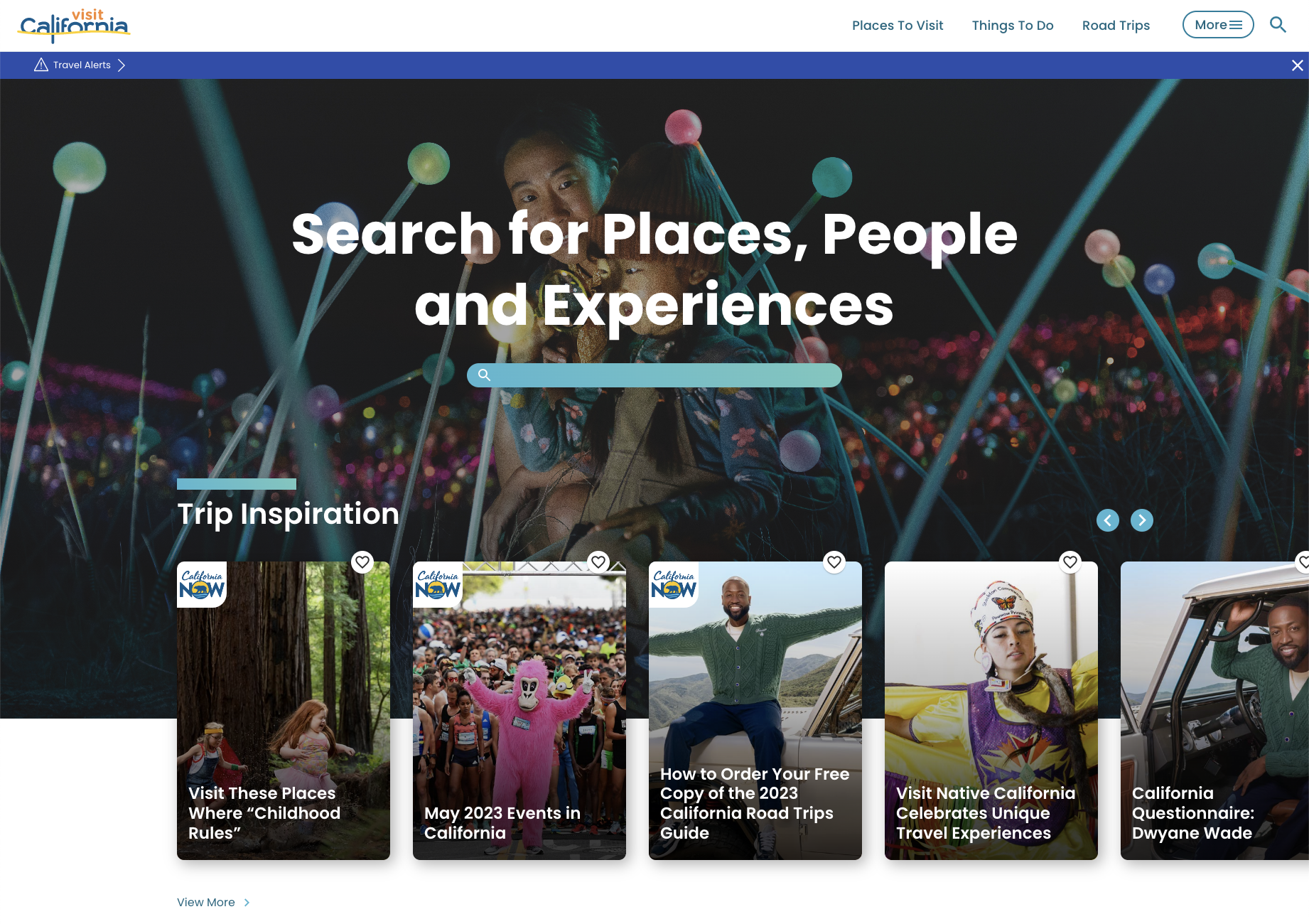
The website homepage, on the other hand, has a much broader purpose, serving as an entry point to a variety of audience segments and user flows, as well as multiple calls-to-action.
A good landing page experience is shaped by several key design attributes that work harmoniously to create a compelling and effective user journey. Your landing page’s overall visual appeal plays a vital role in capturing users’ attention and making a positive first impression.
One of the fundamental design attributes of a good landing page is a clear and focused layout. The page layout should be well-structured, organized, and easy to navigate. It should guide users’ attention to the most important elements, such as the headline, copy, and call-to-action (CTA). By keeping the layout clean and uncluttered, you ensure that users easily digest the information and take the desired action.
Persuasive elements are crucial in driving conversions. These include strategically placed and well-designed CTAs that clearly communicate the desired action and compel users to take it. Additionally, incorporating social proof, such as customer testimonials, ratings, or case studies, can build trust and credibility, reassuring visitors that your offering is reliable and worthwhile.
Attention-grabbing visuals play a crucial role in capturing users’ attention and creating an engaging landing page experience. Well-chosen, high-quality images, videos, or graphics can help convey your message, evoke emotions, and enhance the overall visual appeal of the page. However, it’s important to use visuals that are relevant to your offering and align with your brand identity to maintain consistency and authenticity.
Strategic use of color and typography is another key design attribute for a good landing page experience. Colors can evoke specific emotions and influence user perceptions, so choosing a color scheme that aligns with your brand and supports the desired message is crucial. Similarly, typography should be legible, consistent, and reflect the overall tone and personality of your brand. Attention should be given to font sizes, spacing, and hierarchy to ensure that important information stands out.
With a significant portion of users accessing the internet through mobile devices, it’s crucial to design landing pages that adapt and display properly across various screen sizes and orientations. Responsive design ensures that your landing page is accessible and visually appealing regardless of the device used, allowing you to reach a wider audience and maximize engagement.
Fast loading times are a critical design attribute that greatly impacts the user experience on landing pages and splash pages. Studies have shown that users have little patience for slow-loading pages, and even a few seconds of delay can significantly increase bounce rates. Optimizing your landing page for fast loading times involves minimizing file sizes, leveraging browser caching, and optimizing code and scripts. By prioritizing speed, you can keep users engaged and prevent them from abandoning your page.
The heart of any landing page is the offer it presents — landing pages should always start with a benefit that compels visitors to act. This can be anything from offering a discount or free product sample to providing access to exclusive content or services.
To grab visitors’ attention and entice them to take action, your offer should be clear, valuable, and relevant to your target audience. Whether it’s a limited-time discount, a free trial, or an exclusive resource, make sure your offer is compelling and aligns with your campaign’s objective.
Headspace’s mother’s day promotion is a good example of a strong, singular offer.
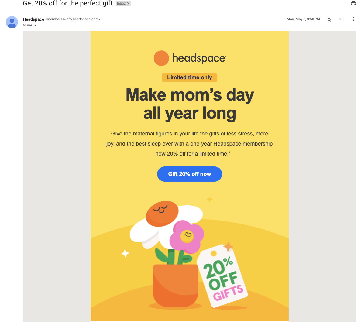
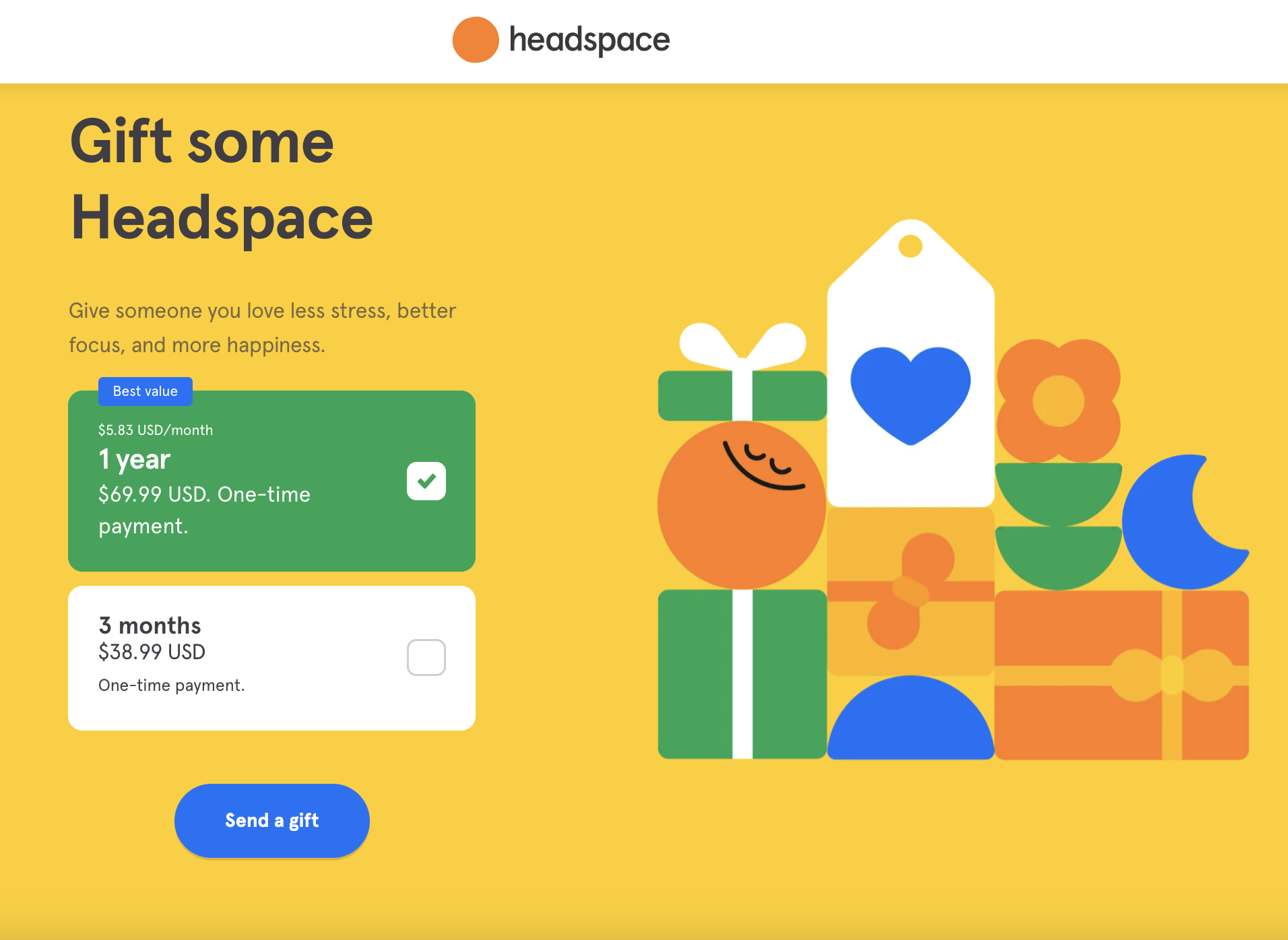
When users click on an ad or promotional link in an email, they expect the landing page to deliver what was promised. Maintain a strong messaging correlation between your ad copy and the landing page content to avoid confusing or misleading your visitors. Message match consistency builds credibility, trust, and improves the user experience, increasing the likelihood of conversions.
Purdy & Figg’s ad promotes the non-toxic cleaner’s limited time 15% off offer.
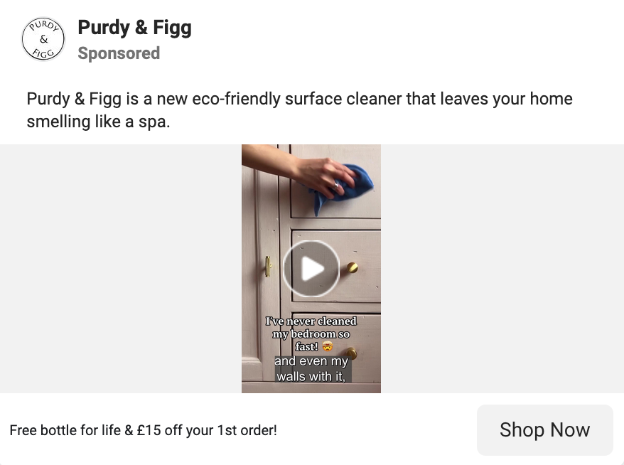
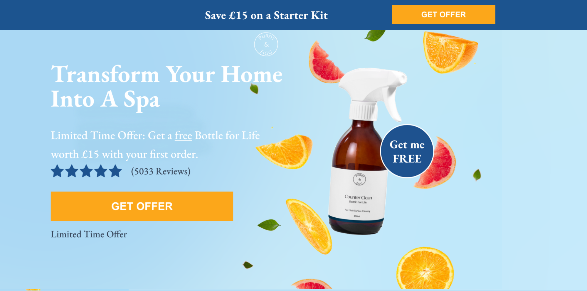
The landing page connected to the ad reiterates the “makes your home smell like a spa” messaging and promotes the 15% discount—ensuring ad-to-page relevance.
The landing page headline should grab visitors’ attention and convince them that your offer is worth their time and attention. A captivating headline is crucial to hook visitors and communicate the value proposition of your offer.
But to be effective, it needs to be more than just clever—it should lead with benefits. Concisely communicate how your product or service addresses your audience’s pain points. Use strong and persuasive language that resonates with your target audience.
A strong call-to-action (CTA) is the driving force behind conversions. Make sure your CTA stands out and clearly communicates the desired action. Use action verbs and provide a sense of urgency or exclusivity to motivate users to take the next step.
Make sure your CTA button copy aligns with the main purpose of the page—whether it’s asking users to sign up or buy something. To make your CTA more noticeable, design the button color so that it contrasts with the page background. Place your CTA prominently on the page, preferably above the fold, where it is easily visible without scrolling.
Social proof is a powerful tool to build trust and credibility and to establish the validity of your offer. Incorporate elements like testimonials, customer badges, trust seals, and user-generated content on your landing page to demonstrate that others have had positive experiences with your product or service. Highlight specific benefits or results that customers have achieved to positively influence potential customers’ decisions.
The aspirational goal of a landing page is to achieve as close to a 1:1 conversion ratio as possible, with the number of conversions equal to the number of visitors. A good landing page has a singular focus: guiding visitors towards your desired conversion. You want visitors to focus solely on taking action on your page.
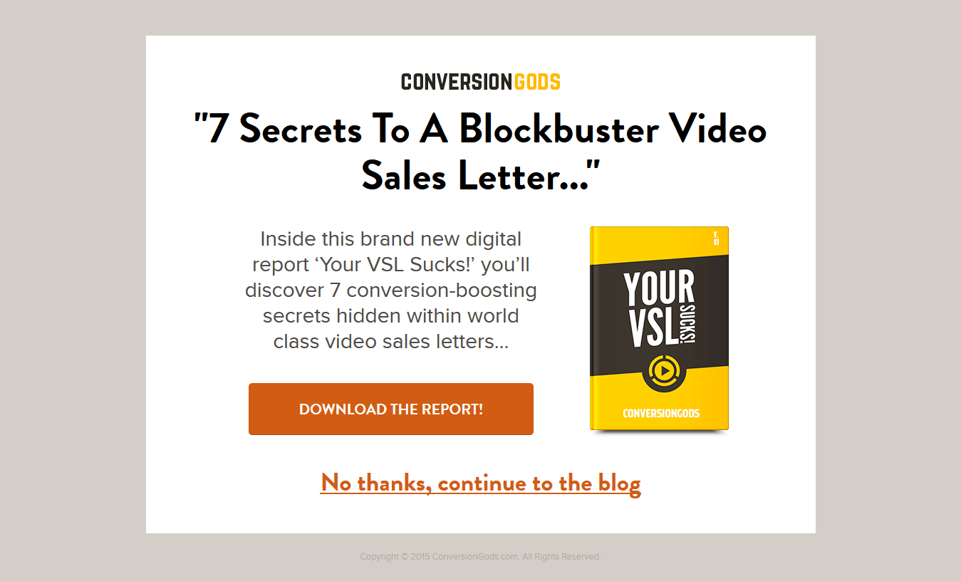
Eliminate any distractions that could divert their attention or encourage them to leave the page prematurely. Remove navigation menus, sidebar links, and any exit links that may lead visitors away from your offer. This keeps the user engaged and focused on completing the desired action. On your splash pages, however, make sure your exit link is clearly displayed so visitors can easily go to the main website.
The Conversion Gods splash page is a great example of this:
When it comes to landing pages, even a few seconds delay can cause visitors to abandon their session before reaching the end goal. Page load speed is a crucial factor in user experience and can significantly impact conversion rates.
Optimize your landing page to make sure it loads quickly by compressing images, minifying code, leveraging browser caching, and using a reliable hosting provider. Conduct regular speed tests and make necessary adjustments to enhance the speed of your landing page.
Continuous testing is key to optimizing your landing page’s performance. Conduct A/B tests to compare different variations of your landing page elements, such as headlines, CTAs, layouts, and color schemes, to identify the most effective combination.
Utilize heat maps to gain insights into user behavior, including where they click, scroll, and spend the most time. Use the data collected to make informed design decisions that improve conversions.
All the pages featured in this section make use of the landing page design best practices that empower you to convince users to become leads and customers, including social proof, action-oriented CTA buttons, and much more.
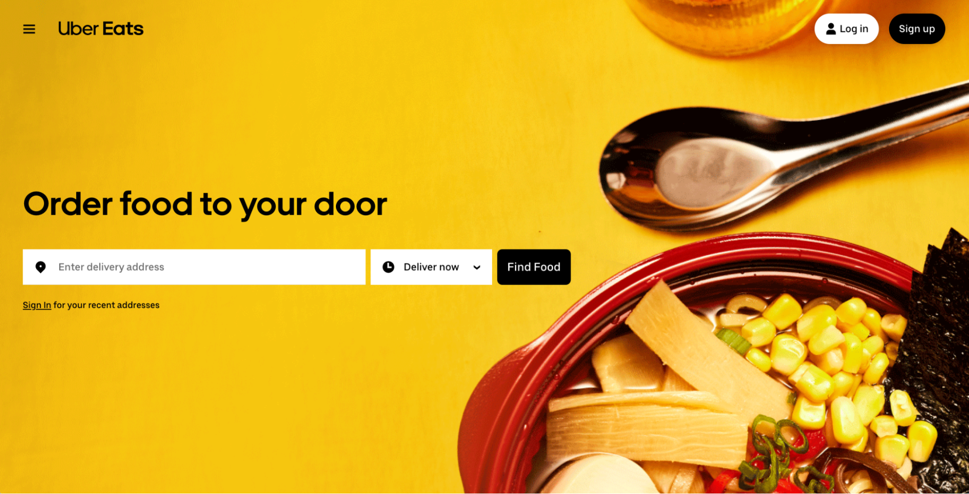
Consumers looking for restaurant delivery options are likely to come across this Uber Eats’ landing page. This is a great example that hits on all of the landing page design best practices discussed above.

When targeting prospective drivers, Uber Eats serves up a separate landing page specifically tailored to attract and onboard potential delivery partners.
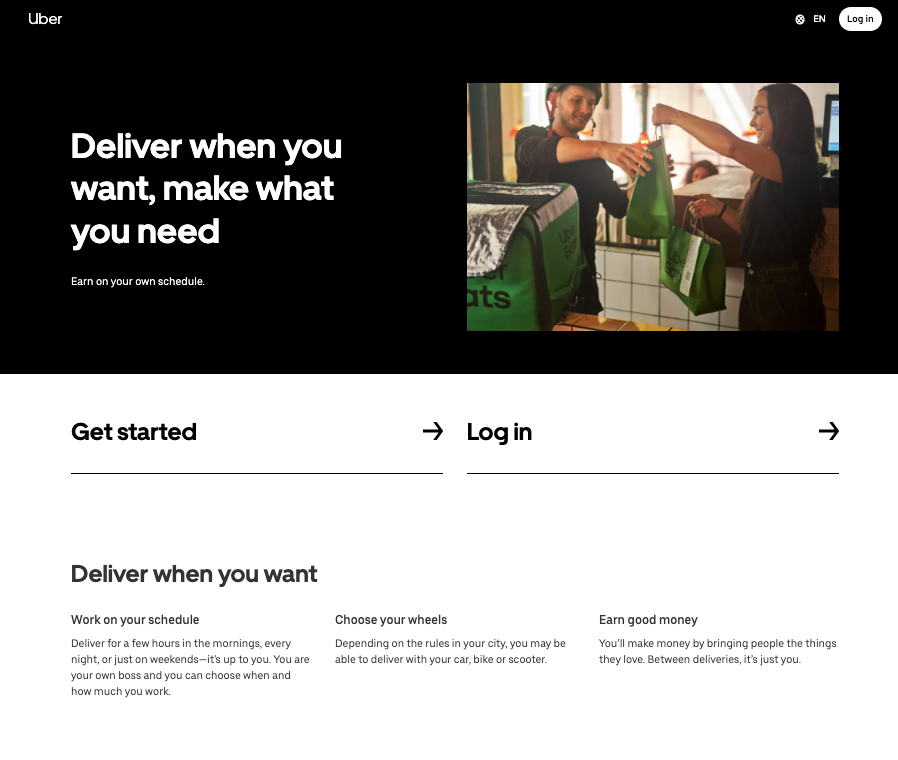
In addition to adhering to many of the same fundamental best practices as the consumer-facing landing page, the driver-focused landing page focuses on the specific needs and motivations of the target audience.
When targeting prospective drivers, Uber Eats serves up a separate landing page specifically tailored to attract and onboard potential delivery partners.
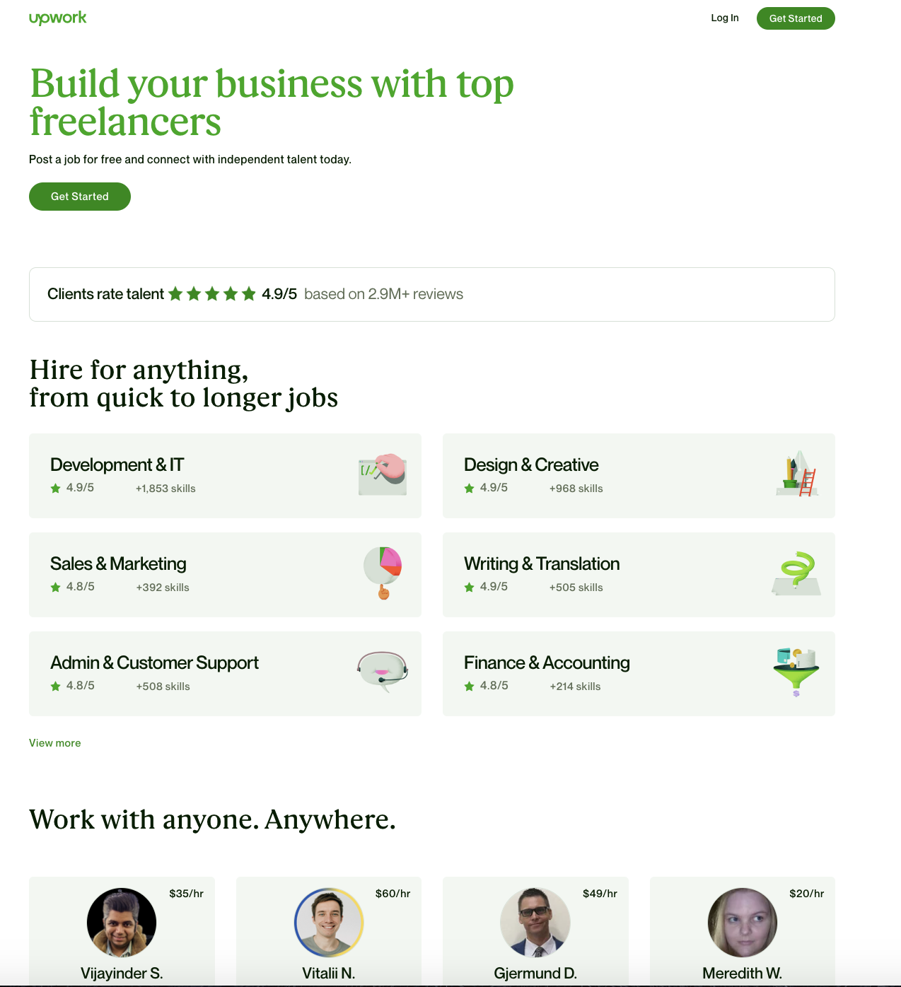
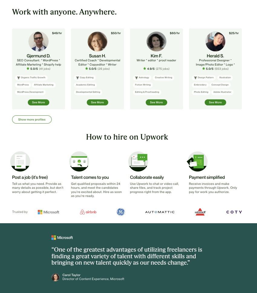
Upwork’s business landing page, targeted at hiring managers and recruiters, follows several landing page design best practices that can help increase engagement and conversions. Similar to the previous examples, Upwork uses a clean layout and simple color scheme, a benefit-driven headline, relevant imagery, and a strong call-to-action. It also employs one additional key best practice:
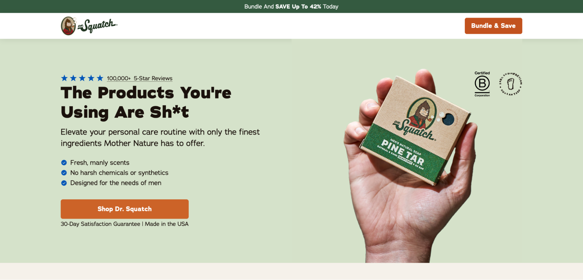
The Dr. Sasquatch landing page stays true to its brand name and features humor on the page, in addition to explaining what the product does. The social badges, user videos, and testimonials add credibility to the offer. The competitive grid showcases exactly why visitors should shop the Dr. Sasquatch soaps to “smell like a champion.”
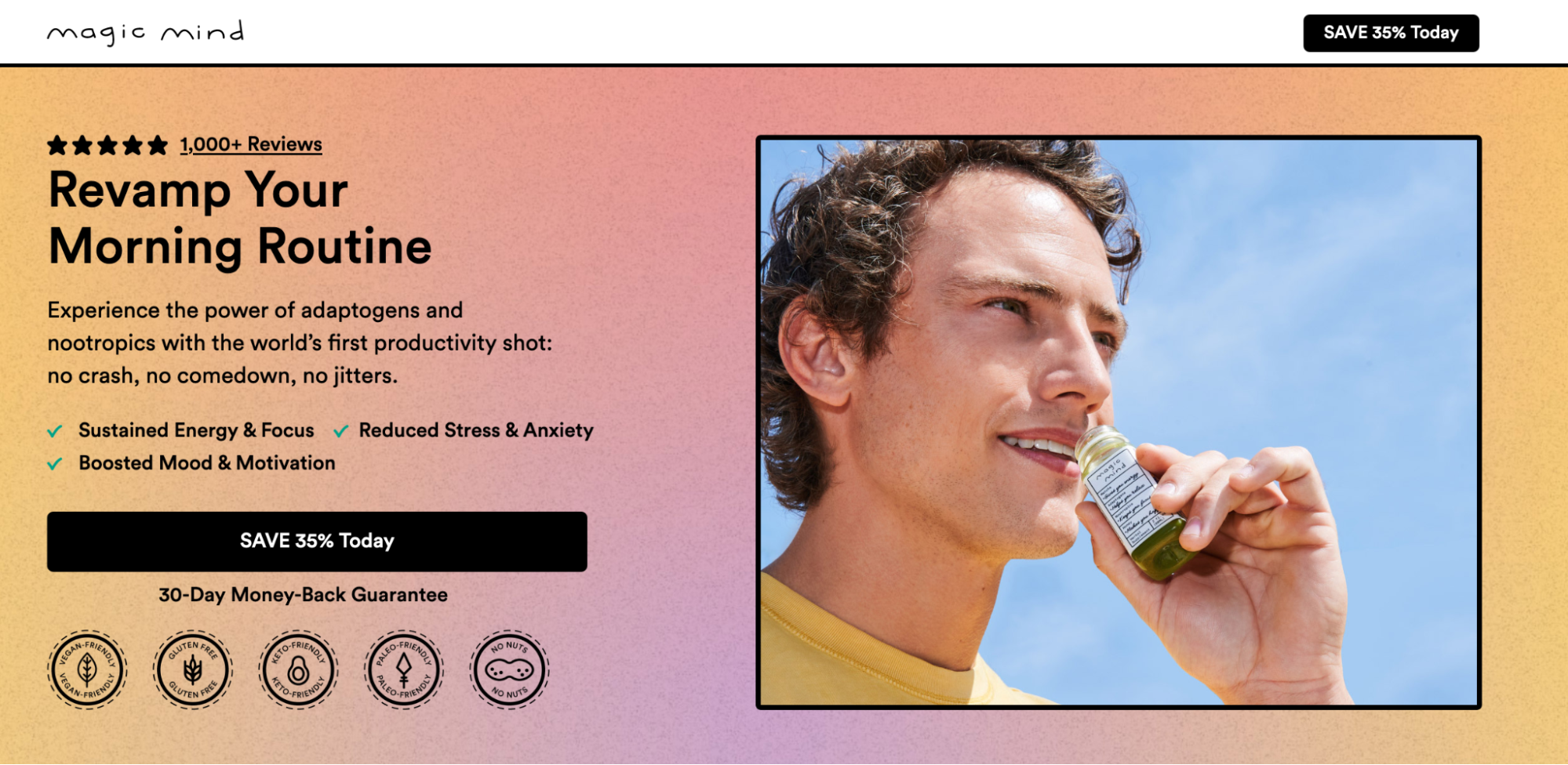
Magic Mind’s landing page introduces the product with a succinct headline and descriptive text. The bullet points above the fold tell users all they need to know about the benefits of taking the “world’s first productivity shot.” The CTA button has a direct action on it, “Save 35%,” and the 30-day money-back guarantee badge reassures the visitor that the offer and brand are credible.
Below the fold, the page also has customer badges, user-generated content, customer testimonials, and an FAQ section.
The Cometeer landing page features its UVP—“Earth’s Best Coffee Comes From the Freezer.” The sub-headline gives more details, and the background video explains how Cometeer coffee works. The page also includes customer testimonials, an expert section, product features, and user benefits—page elements that persuade the user to commit to the flash-frozen coffee.
By utilizing landing page best practices you can create landing pages that are highly effective at engaging your audience and driving conversions. And using prebuilt templates helps accelerate the landing page creation process.
Need help getting started? The team at Instapage are here to help.
Instapage offers customers 500+ customizable layouts by industry and use case. Sign up for a 14-day free trial and you’ll have a highly effective, well-designed landing page up in no time.
Try the most advanced landing page and CRO platform.