Make your mobile friendly HTML page: The future of marketing
Create your mobile friendly HTML page and effortlessly optimize your web pages for diverse ads and audiences. Transform visitors into leads and sales while bolstering brand trust and nurturing customer loyalty.

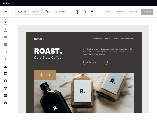
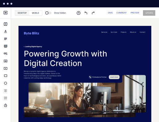
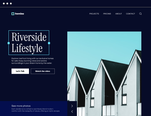
 500+ customizable layouts
Get your campaigns up and running faster with conversion-focused landing page layouts designed for every industry and business type. Easily scale landing page generation with Instablocks® and Global Blocks that you can save, reuse, and update globally.

 Mobile responsiveness
All Instapage landing pages are optimized for responsiveness. They adapt to any screen size, ensuring a consistent user experience across all devices.

 A/B split testing
Make data-driven decisions to optimize conversions with A/B testing capabilities. Experiment with different landing page variations, separate elements, layouts, and content that you can instantly generate with AI.

 Seamless ad mapping
Boost conversions and lower your CPA by personalizing your landing pages. With AdMap®, you can effortlessly visualize your ad campaigns, link them to relevant landing pages, or create new personalized pages. Then, synchronize updates of ads and landing pages without any back-and-forth.

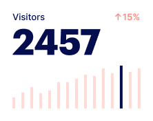
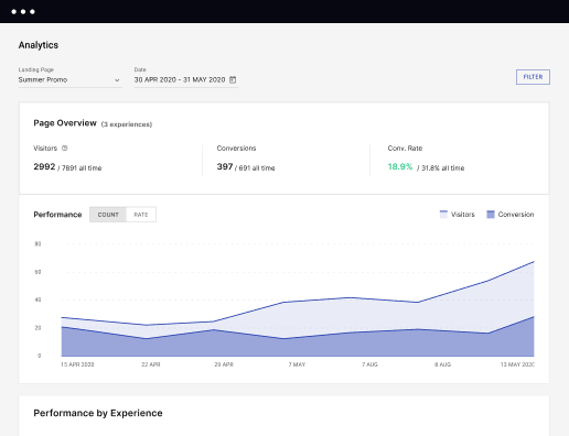
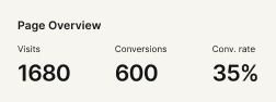
 Detailed reporting
Instapage provides detailed real-time reports over any period of time and across all your devices. To help you better understand your audience and optimize your marketing strategy, check conversion analytics that you can view directly from Instapage.

 Integrations with 120+ marketing tools
Instapage seamlessly connects with popular marketing tools and platforms, including CRMs, e-commerce, analytics tools, marketing automation platforms, email marketing software, and more. Everything you need to drive conversions and grow your business is at your fingertips.


 500+ customizable layoutsMobile responsivenessA/B split testingSeamless ad mappingDetailed reporting500+ customizable layouts
Create a mobile-friendly HTML page with Instapage
Making your HTML page mobile-friendly is critical for enhancing user experience and maximizing conversion rates. Instapage provides a flexible platform that allows marketers to design responsive landing pages without needing coding skills. The library of over 100 conversion-focused templates simplifies the process, ensuring a swift and efficient workflow tailored to your audience's needs.
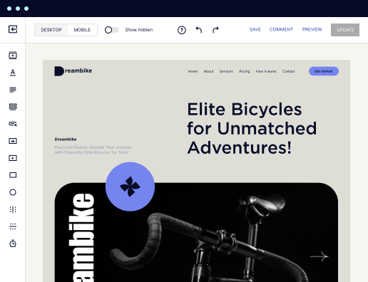
Step 1: Choose the Right Template
The journey to crafting a mobile-friendly HTML page starts with selecting an appropriate template. Instapage’s extensive collection allows you to quickly access layouts that align with your objectives. Look for templates designed for responsiveness, guaranteeing that your pages adapt seamlessly to various devices.
- Conversion-focused designs: Templates are built to encourage user actions, increasing your chances of higher conversion rates.
- Customizability: Easily adjust elements to fit your brand’s aesthetics without requiring any coding skills.
- Mobile responsiveness: Each template is designed to adapt to mobile displays, ensuring an optimal viewing experience.
Step 2: Optimize with Experimentation Features
Once your template is selected, it's time to optimize it for mobile use. Leverage Instapage's built-in experimentation tools to examine how users interact with your landing page.
- Utilize heatmaps: Heatmaps provide insights into user behavior, helping you identify where users click and which sections need improvement.
- Conduct A/B tests: Test different variations of your page to see which designs perform better with your audience.
- Analytics dashboard: Monitor key metrics such as bounce rate and conversion rate to assess overall page performance.
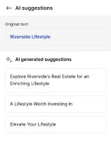
Step 3: Personalize Your Content
Creating personalized content is crucial for engaging your audience. Use Instapage’s dynamic text replacement to tailor the page’s messaging to align with specific campaigns or user segments.
- Dynamic text replacement: Automatically swap keywords based on user search terms to increase relevance.
- AdMaps integration: Link specific ads to dedicated landing pages to maintain continuity in messaging.
- Audience-level metrics: Track performance data according to different audience segments for targeted optimization.
By following these steps, you can create a mobile-friendly HTML page that resonates with your audience, boosts engagement, and ultimately drives conversions.
In a digital landscape that demands mobile optimization, Instapage stands out as a powerful ally for marketers seeking efficiency and effectiveness.
Ready to create your first mobile-friendly HTML page? Sign up for Instapage today and transform your landing page creation experience!
Get more out of Make your mobile friendly HTML page
Improve your Quality Score with quick load technology for landing pages
Increase conversions with content that aligns with your ads and audiences
Achieve maximum ROI by scaling your marketing initiatives
“Instapage gives us the ability to tailor our landing page content and layout to tell a unique story for each geographical target. The platform also enables us to create different variations with content that performs well for each unique channel. Every marketing team needs this!”

"Instapage has truly maximized our digital advertising performance by enabling us to offer matching, personalized experiences for every ad and audience. Now we can scale our landing page experiences as efficiently and effectively as we scale the ads themselves."

"If we have to wait on a developer, our creative velocity plummets. But Instapage has made it possible for us to exponentially grow our advertising programs and convert more customers"

Leading the way in building high-performing landing pages


FAQs
Ready to skyrocket conversions?
Supercharge your ad campaigns with high-performing landing pages.
Get started