Make your responsive mobile page: The future of marketing
Create your responsive mobile page and effortlessly optimize your web pages for diverse ads and audiences. Transform visitors into leads and sales while bolstering brand trust and nurturing customer loyalty.

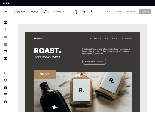
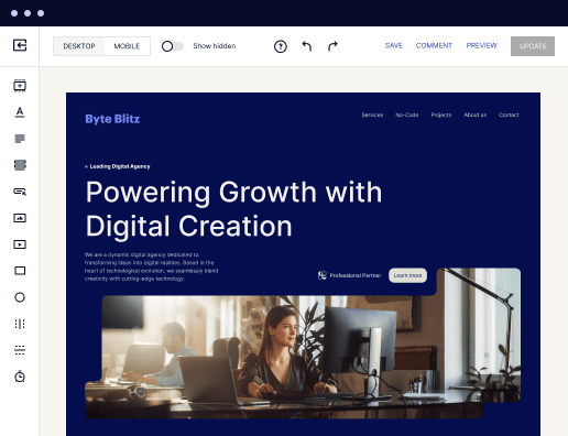
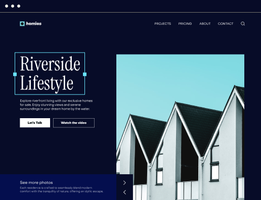
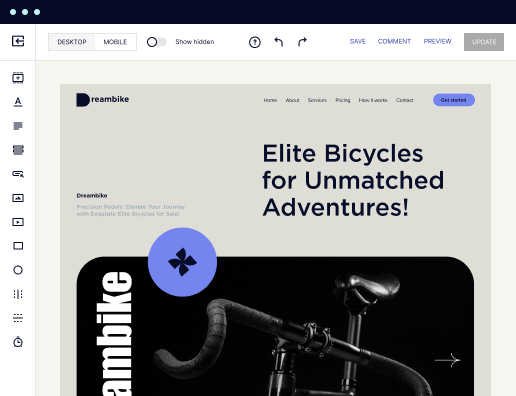
 Build landing pages at scale without coding
With Instapage’s intuitive drag-and-drop page builder with diverse design features, over 5,000 fonts, and 33 million images, anyone can easily create professional-looking, top-performing landing pages without technical or design skills.

 Increase conversions with fast-loading pages
Reduce bounce rates and increase engagement with lightning-fast landing pages. Our Thor Render Engine™, back-end technology delivers 3x faster-loading landing pages so you won't lose a single lead.

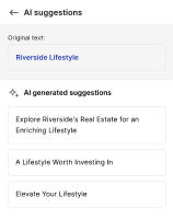
 Boost productivity with AI content generation
Scale page creation and overcome writer’s block or generate copy variations for A/B tests with the AI Content Generator. Create high-quality and engaging content for each audience and ad group, including paragraphs, CTAs, or entire copies directly in the Instapage builder.

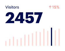
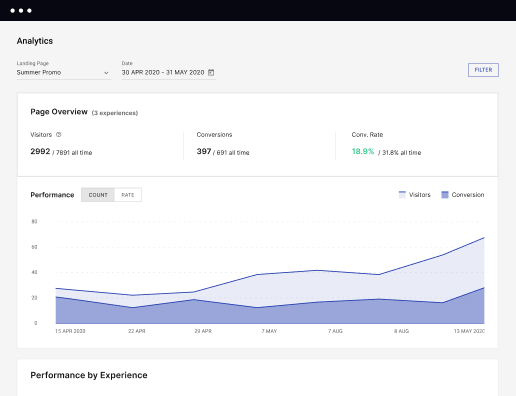
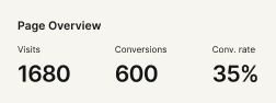
 Make the most of analytic insights
Get data-backed insights about your campaigns and page performance so you can test and optimize for higher ROI. Track visitors, conversions, conversion rates, cost-per-visitor, and cost-per-lead in real time. View heatmaps to understand user behavior - all without leaving Instapage.

 Optimize traffic with AI experiments
Improve page performance fast with an AI-powered experimentation tool. It tracks your ongoing experiments and directs traffic to top-performing page variations, no matter how many versions you have. Achieve faster optimization insights without sacrificing the quality of your results.

 Secure your business data
Instapage safeguards business data and your customer's privacy with enterprise-grade security measures, including SSL certification, two-factor authentication, SSO, and more. Instapage also maintains compliance with GDPR, SOC 2, and CCPA regulations.


 Build landing pages at scale without codingIncrease conversions with fast-loading pagesBoost productivity with AI content generationMake the most of analytic insightsOptimize traffic with AI experimentsBuild landing pages at scale without coding
Create your responsive mobile page with Instapage
Creating a responsive mobile landing page is crucial for maximizing conversions in today’s digital marketing landscape. Instapage provides a robust yet straightforward platform that enables marketers to design targeted landing pages quickly without the need for coding. Leveraging over 100 conversion-focused layouts and specialized tools, Instapage sets the stage for reduced costs and higher brand trust through personalized user experiences.
Understanding responsive mobile design
Responsive mobile design adapts your landing page layout to fit various screen sizes seamlessly. This is essential for optimizing user experience on mobile devices, which account for a significant portion of web traffic. Key aspects of responsive mobile design include:
- Fluid grids: These allow layout elements to resize proportionally across different devices, ensuring consistent viewing experiences.
- Flexible images: Images are optimized to scale accordingly, maintaining quality while preventing distortion.
- Media queries: CSS techniques are used to apply different styles based on device characteristics, enhancing the usability of your landing pages.
Step 1: Choose the right template
Start by selecting a responsive template from Instapage's extensive library. With over 100 pre-designed templates tailored for various marketing verticals, you can find the perfect starting point. Each template is optimized for conversion and mobile performance.
- Choose templates that align with your campaign goals to ensure relevancy.
- Use templates designed for educational content if targeting the education sector.
- Select templates focused on lead generation for financial services campaigns.
Step 2: Customize your landing page
Next, use the drag-and-drop builder to customize your landing page. Incorporate your brand’s messaging and visuals that resonate with your target audience. Consider the following:
- Dynamic text replacement: This allows you to tailor content based on keywords users searched for, enhancing relevancy.
- AdMaps: Align specific ads to unique pages for a cohesive user journey.
- Call-to-action buttons: Place attention-grabbing buttons strategically to guide users toward desired actions.
Step 3: Optimize and publish your page
Before publishing, leverage Instapage's built-in A/B testing and heatmaps. This enables you to analyze user behavior and tweak designs or content accordingly. Metrics provide insights into performance, helping to refine your approach effectively.
In conclusion, creating a responsive mobile page with Instapage not only fosters customer loyalty but also significantly increases conversion rates. By following these steps, marketers can efficiently create tailored experiences that resonate with target audiences in sectors such as Tech/SaaS, Business Services, and beyond.
Get started with Instapage today and discover how easy it can be to create effective landing pages that drive results for your business!
Get more out of Create your responsive mobile page
Improve your Quality Score with quick load technology for landing pages
Increase conversions with content that aligns with your ads and audiences
Achieve maximum ROI by scaling your marketing initiatives
“Instapage gives us the ability to tailor our landing page content and layout to tell a unique story for each geographical target. The platform also enables us to create different variations with content that performs well for each unique channel. Every marketing team needs this!”

"Instapage has truly maximized our digital advertising performance by enabling us to offer matching, personalized experiences for every ad and audience. Now we can scale our landing page experiences as efficiently and effectively as we scale the ads themselves."

"If we have to wait on a developer, our creative velocity plummets. But Instapage has made it possible for us to exponentially grow our advertising programs and convert more customers"

Leading the way in building high-performing landing pages


FAQs
Ready to skyrocket conversions?
Supercharge your ad campaigns with high-performing landing pages.
Get started