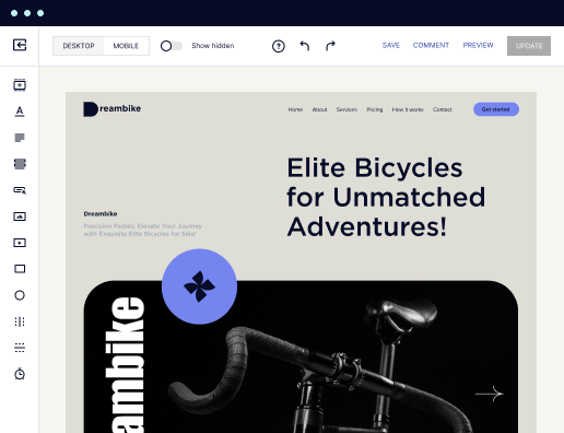
Make your grid-based mobile page: The future of marketing
Create your grid-based mobile page and effortlessly optimize your web pages for diverse ads and audiences. Transform visitors into leads and sales while bolstering brand trust and nurturing customer loyalty.

 Build landing pages that get results
Drive ad campaign performance using targeted landing pages. With over 500+ layouts, AI-content generation, built-in collaboration, Instablocks®, and quick page load technology, you can easily create landing pages that deliver an unparalleled user experience that gets more people buying.

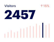
 Boost results through landing page optimization
Optimize your landing pages using Instapage’s variety of testing tools. Track and analyze user behavior with heatmaps, run A/B testing to single-out the best performing version, or launch AI-assisted experiments that automatically analyze ad traffic and route it to best-performing.

 Personalize experiences for higher engagement and ROI
Craft unique and high-performing landing pages that align with your ad messaging and resonate with your target audience. By crafting a landing page experience that resonates with your audience, you'll engage more visitors, maximize conversions, and reduce acquisition costs.

 Maximize campaign efficiency with ad mapping
Efficiently manage campaigns by visualizing your ads and mapping them to corresponding landing pages in one place. Define what campaigns need a personalized experience and connect them with relevant ads to increase conversion rates and decrease CPA.

 Power up landing pages with AI
Instantly create high-performing content for each audience segment and separate ad campaigns with the AI assistant. From catchy headlines to converting CTAs for A/B tests – access and use AI directly on your Instapage. No more writer’s block or workflow interruptions.

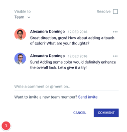
 Improve alignment across your creative team
Get your campaigns off the ground faster with efficient teamwork that happens in real time. Empower your team members to provide immediate feedback, make edits to page versions, and securely share information with outside stakeholders all from a single secure space.

 Build landing pages that get resultsBoost results through landing page optimizationPersonalize experiences for higher engagement and ROIMaximize campaign efficiency with ad mappingPower up landing pages with AIBuild landing pages that get results
Create your grid-based mobile page effectively with Instapage
With the rise of mobile device usage, marketers need to ensure their landing pages are not just appealing but also effective in driving conversions. Instapage empowers marketers to create grid-based mobile pages that are fast, flexible, and tailored to specific audience needs. By utilizing over 100 conversion-focused layouts and Instablocks, you can engage your visitors and optimize for success without requiring a developer.
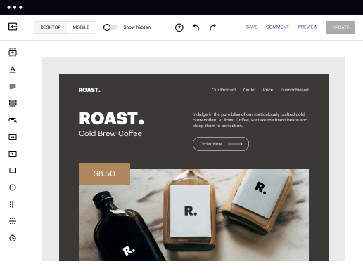
Step 1: Choose a template that suits your goals
The first step in creating your grid-based mobile page is selecting the right template. Instapage offers a diverse library that caters to various industries like Business Services, Financial Services, and Education. Finding the appropriate design not only saves time but also sets the tone for your content.
- Select from 100+ templates designed for high conversion rates: Choose a layout that has been tested and proven to convert visitors in your specific industry.
- Utilize Instablocks for reusable design elements: Save time by creating sections that can be reused across multiple pages, maintaining design consistency.
- Consider mobile responsiveness: Ensure the chosen template adapts effectively across different screen sizes, maximizing reach and user experience.
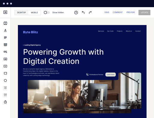
Step 2: Customize your content for targeted audiences
Once a template is selected, the next step involves personalization. Instapage allows marketers to create tailored messaging that resonates with different audience segments. You can utilize features such as dynamic text replacement to align the content specifically to the user's interests.
- Incorporate targeted headlines relevant to different audiences: This personalization increases engagement by addressing user-specific pain points.
- Utilize AdMaps to match ads with audience-specific pages: This ensures users arriving on your page have a consistent and relevant experience.
- Leverage high-quality images and videos: Visuals can significantly enhance the effectiveness of your messaging and capture user attention.
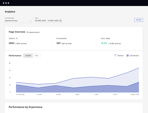
Step 3: Optimize and test your grid-based mobile page
After customizing your content, optimizing the page for conversions is crucial. Instapage comes equipped with built-in experimentation features including A/B testing and heatmaps to better understand user behavior.
- Conduct A/B tests: Experiment with different headlines, images, or calls-to-action to see which version resonates better with your audience.
- Utilize heatmaps to analyze user interactions: Understanding where users click and engage can help refine your design.
- Monitor analytics dashboards for performance metrics: Track your conversion rates and make data-driven adjustments as needed.
By following these steps, your grid-based mobile pages will not only attract traffic but also convert visitors effectively.
Engaging with Instapage for your landing page needs allows for a seamless transition from visitor to customer, strengthening your brand's credibility and loyalty.
Ready to enhance your marketing strategy? Start creating your grid-based mobile page with Instapage today and leverage our powerful features for maximum conversions.
Get more out of Create your grid-based mobile page
Improve your Quality Score with quick load technology for landing pages
Increase conversions with content that aligns with your ads and audiences
Achieve maximum ROI by scaling your marketing initiatives
“Instapage gives us the ability to tailor our landing page content and layout to tell a unique story for each geographical target. The platform also enables us to create different variations with content that performs well for each unique channel. Every marketing team needs this!”

"Instapage has truly maximized our digital advertising performance by enabling us to offer matching, personalized experiences for every ad and audience. Now we can scale our landing page experiences as efficiently and effectively as we scale the ads themselves."

"If we have to wait on a developer, our creative velocity plummets. But Instapage has made it possible for us to exponentially grow our advertising programs and convert more customers"

Leading the way in building high-performing landing pages


FAQs
Ready to skyrocket conversions?
Supercharge your ad campaigns with high-performing landing pages.
Get started