What's trending

Instapage Updates
Unlock More Flexibility & Custom Integrations With the Newly Launched…
Marketing teams and agencies have specialized needs. Whether that’s syncing…
Landing pages
6 Ecommerce Landing Page Best Practices to Inspire You
Your ecommerce website has one job to do: make the sale. But here’s the…
Advertising
70 Personalization Statistics Every Marketer Should Know in 2025
We have moved on from the era of simple personalization to hyperpersonalization.…
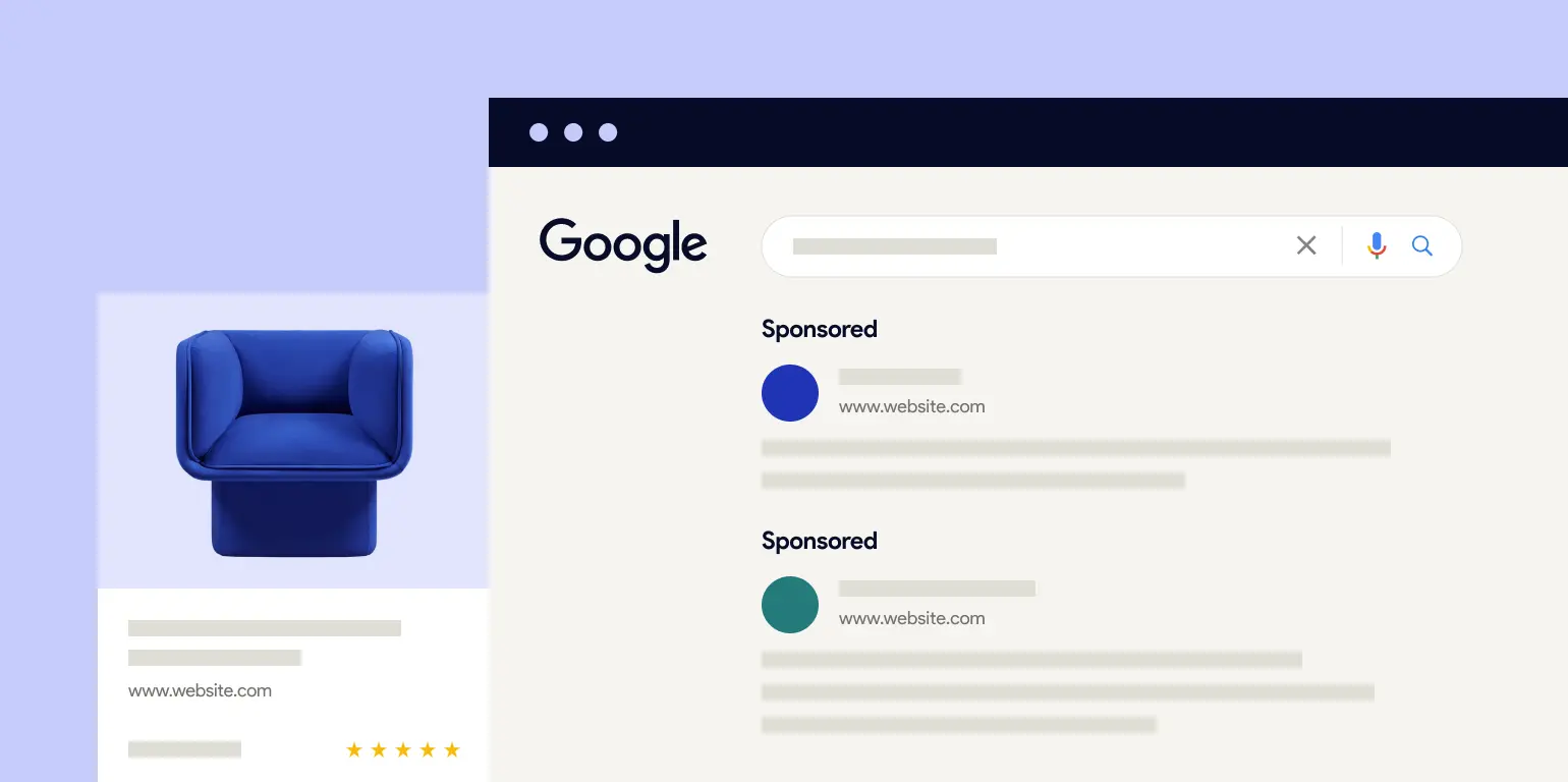
Google Ads
7 Reasons Why You Should Use Google Ads
Though Meta and TikTok Ads may have the shiny new object phenomenon going for…
Conversion Optimization
How to Use Heatmaps to Improve Campaign Results
With drag-and-drop landing page builders like Instapage, creating a landing page…

Landing pages
100-Point Landing Page Audit Checklist for Creating Pages in 2025
Is your landing page not converting as well as it should be? Is the bounce rate…

