You’re paying $5 per click to drive traffic to your job postings. Candidates click your ad, land on your careers page, and leave. No application. No lead. Just wasted budget.
The problem isn’t your ad creative or even the job that’s on offer. It’s what happens after the click.
Most companies send paid traffic to generic career sites with dozens of job listings, complex navigation, and no clear path to apply. Candidates can’t find the role they clicked on. They get overwhelmed. They bounce.
A recruitment landing page stops this from happening.
What is a recruitment landing page?
A recruitment landing page solves this. It’s a standalone page built for one goal: convert visitors into applicants. No distractions. No navigation menu. Just the role, the benefits, and a short application form.
This article shows you recruitment landing page examples from Uber, Lyft, DoorDash, Writers Work, and Instacart, plus the best practices recruitment landing pages need to reduce cost per applicant and increase completed applications.
Whether you’re building your first hiring landing page or optimizing existing pages, you’ll learn what works, what to test, and how to scale.
And you can build all these pages using Instapage recruitment landing page templates.
Key Takeaways
- Dedicated recruitment landing pages improve message match between ads and post-click experience, reducing bounce rates.
- Short application forms (3-5 fields) reduce drop-off; candidates abandon long forms.
- Mobile page speed is non-negotiable—1-second delays can reduce conversions by up to 20%.
- Social proof (employee testimonials, ratings, company stats) increases trust and application rates.
- A/B testing compounds over time; small improvements in conversion rate significantly lower the cost per applicant.
- Templates and governance enable teams to scale landing pages across roles, locations, and campaigns.
Recruitment landing page best practices
These are the principles that separate high-converting recruitment landing pages from generic career sites and hiring landing pages. We’ll use these criteria to evaluate the examples later in this article.
Match your ad to your headline
Your ad sets the expectation for the role, compensation, and working conditions. If a candidate clicks an ad that says “Remote Software Engineer | $120K–$150K | Flexible Hours,” the landing page headline should repeat that same promise.
When messaging doesn’t match, candidates assume the job isn’t what they expected and leave. Mirror the ad headline language and keep the CTA consistent so the transition feels seamless.
Show everything above the fold
Candidates decide within a few seconds whether the opportunity is worth their time. The first screen should clearly communicate the role, the most compelling benefit, and why the job matters.
Include 3–4 key benefits (such as compensation, flexibility, or career growth), a prominent “Apply Now” button, and at least one trust signal like company size, a recognizable logo, or a rating.
Keep forms short
Application friction is one of the biggest causes of candidate drop-off. Limit the form to 3–5 fields—typically name, email, phone, and resume upload.
If you need more information, consider a two-step form where candidates submit their email first and complete the rest afterward. Each additional field increases abandonment risk.
Add social proof
Candidates want signals that the company is legitimate and a good place to work. Include short employee testimonials with real names and photos, or highlight ratings and recognitions (for example, awards or workplace rankings).
Even simple credibility markers can increase trust.
Optimize for mobile speed
Most recruitment traffic now comes from mobile devices, so page speed directly affects application completion. Compress images, reduce unnecessary scripts, and use a CDN to keep load times under three seconds on mobile whenever possible.
Remove exit links
Navigation menus and extra links create distractions that pull candidates away from the application flow. Keep the page focused on a single action: applying. Limit footer links to essentials like the privacy policy or EEO statement.
Track conversions
Measure page views, form starts, completed applications, and drop-off points to understand performance. Calculate conversion rate using: Completed applications ÷ Page views × 100. Review this regularly and test changes when conversion rates decline.
5 recruitment landing page examples (what works + what to test)
We evaluated these recruitment landing pages based on: message match, clarity, trust signals, form friction, mobile optimization, and exit reduction.
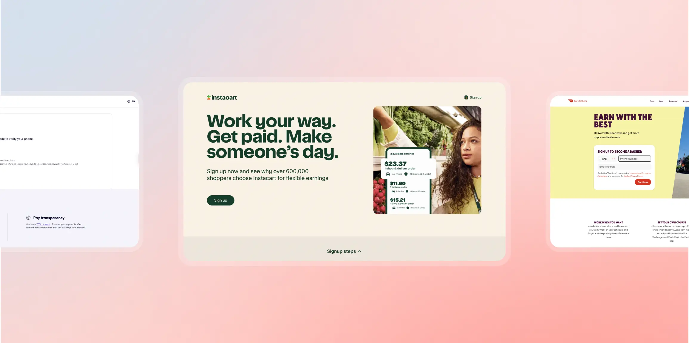
1. Uber – Driver and delivery signup
Best for: Gig economy platforms recruiting drivers or delivery workers
What it does well:
- Unlinked logo: Shows whose page you’re on without creating an exit
- Clear headline and subheadline: “What” and “why” are immediately clear
- Strong CTA button: Prominent “Get started” button stands out with color contrast
- Car option transparency: “Have or need a car” lets prospects know they don’t need their own vehicle
- Scannable content: Icons, short text blocks, and lists make it easy to read
- Mobile-optimized: Clean experience on smartphones
What to test:
- Remove “Ride with Uber” link: Creates unnecessary exit point
- Improve CTA button copy: “Next” doesn’t indicate how many steps remain; try “Start Application”
- Stronger button color: Greenish-blue doesn’t stand out; test orange or red
- Add social proof: Employee testimonials about earnings and flexibility
What to borrow:
- Uber’s transparency about car requirements. If your role has prerequisites, address them immediately. Don’t wait for candidates to apply and then disqualify them.
2. Lyft – Driver recruitment
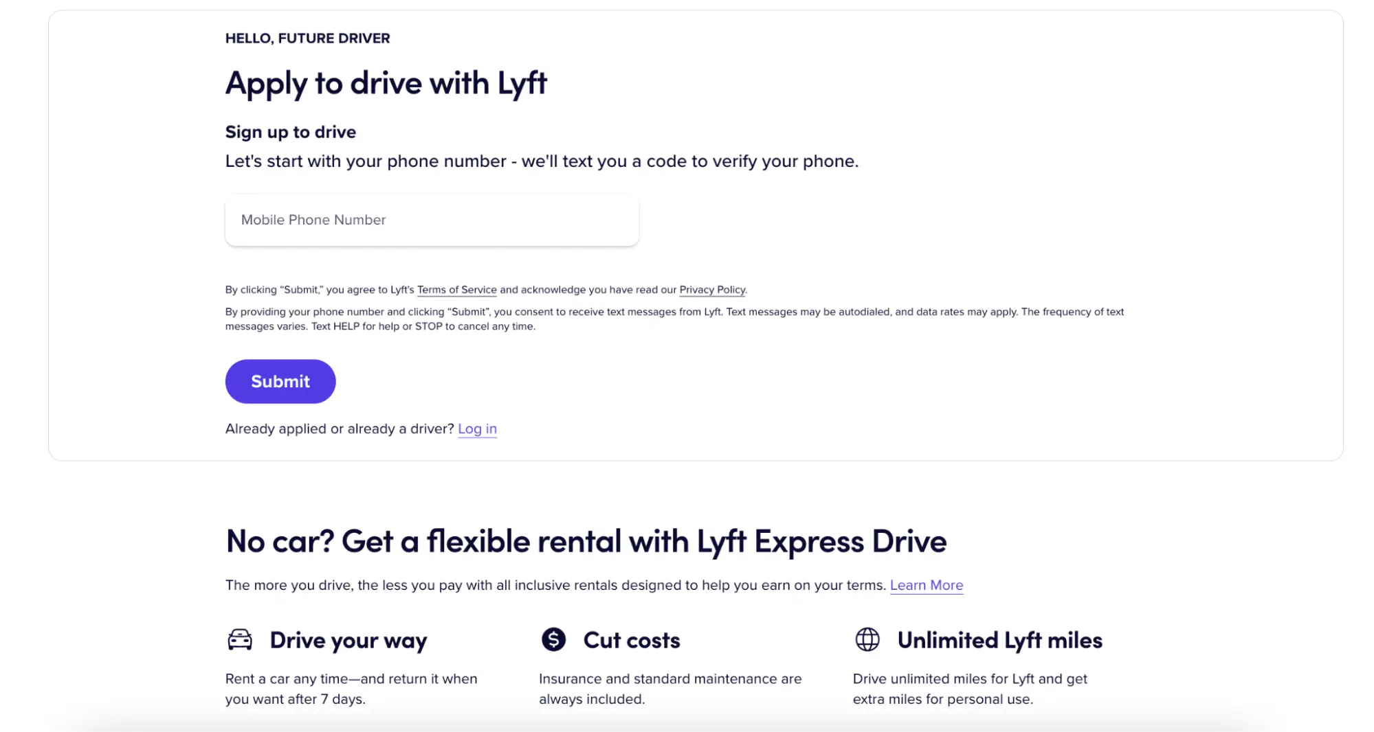
Best for: Rideshare and delivery platforms emphasizing earnings and flexibility
What it does well:
- Earnings transparency: Shows earning potential with tips (“You keep 70% or more”)
- Car rental option: Prospects know they don’t need to own a vehicle
- Multiple CTA buttons: Buttons appear throughout page to capture interest at different stages
- Clear process: Step-by-step explanation of how driving works
- Safety messaging: Addresses common driver concerns upfront
What to test:
- Remove hyperlinked logo: Creates easy exit without applying
- Change CTA button color: Pink button doesn’t draw maximum attention; test high-contrast color like orange or green
- Remove footer links: Too many exit opportunities at bottom of page
What to borrow:
- Lyft’s focus on tips and earnings transparency. If compensation varies, give candidates realistic ranges. Transparency builds trust.
3. DoorDash – Dasher (delivery driver) signup

Best for: Food delivery and gig economy platforms
What the landing page does well:
- Message match: The page headline “Earn with the best” connects to the ad’s earning promises
- Flexibility messaging: “You’re the boss” reinforces the ad promise of control
- Earnings transparency: Addresses “what you’ll earn” from the ad copy
- Clear signup path: Simple process to begin application
- Benefit focus: Emphasizes key selling points from the ad (tips, flexibility, ease)
What to test:
- Remove hyperlinked logo: Provides immediate exit before applying
- More persuasive CTA copy: “Start earning today” instead of generic “Get started”
- Add social proof: Include Dasher testimonials about flexibility and earnings
- Remove footer links: Too many links create exit opportunities
What to borrow:
- DoorDash’s numbered signup process. Showing candidates exactly what to expect (“Step 1, 2, 3…”) reduces uncertainty and increases completion rates. Also notice how the landing page reinforces the ad promises: “Work when you want,” “Earn all tips,” and “Easy signup” all appear on both the ad and the page.
4. Writers Work – Freelance writer platform

Best for: Freelance platforms and skill-based gig marketplaces
What it does well:
- Live signup notifications: Pop-up shows recent signups as social proof
- Multiple CTA buttons: Orange buttons stand out and appear throughout page
- 2-step opt-in form: Learn about offer first, then show form (reduces intimidation)
- Text formatting variety: Bullets and bold text highlight key information
- Product screenshots: Help prospects visualize the platform
What to test:
- Remove Writers Work logo link: Creates exit opportunity
- Reduce footer links: Too many distractions at page bottom
- Add white space: Break up text-heavy sections with more breathing room
- More images: Visual breaks would improve scannability
What to borrow:
- Writers Work’s “recently signed up” social proof widget. Showing real-time activity creates urgency and validates that others are taking action.
5. Instacart – Shopper recruitment

Best for: Gig economy platforms recruiting flexible workers
What it does well:
- Flexibility messaging: “Set your own schedule” is front and center
- Earnings transparency: Shows potential earnings upfront
- Simple value prop: “Get paid to shop” is immediately clear
- Benefit callouts: “Be a household hero, and earn money quickly”
- Mobile-optimized: Landing page works seamlessly on smartphones (where most gig workers apply)
- Quick application start: Minimal friction to begin signup process
What to test:
- Add social proof: Include testimonials from current shoppers about flexibility and earnings
- Show earnings examples: “Shoppers in [city] earn $15-$25/hour” could increase applications
- 2-step form: Collect email first, then full application details
- Add urgency: “We’re hiring in your area now” or “Start earning this week”
What to borrow:
- Instacart’s clarity on flexibility and earnings. If you’re hiring for gig or flexible roles, lead with schedule control and earning potential. Don’t bury these benefits below the fold.
How to A/B test recruitment landing pages
Testing improves conversion rate over time. A 1% improvement in conversion rate can reduce cost per applicant by 10% over thousands of clicks.
What to test (priority order):
- Page speed: Compress images, remove unnecessary scripts
- Headline clarity: Test “Software Engineer” vs “Remote Software Engineer | $120K-$150K”
- Form length: Test 5 fields vs 3 fields, or try a 2-step form
- CTA button placement and copy: Test “Apply Now” vs “Start Application” vs “Join Our Team”
- Social proof: Test pages with employee testimonials vs without
- Benefits emphasis: Test leading with salary vs remote work vs mission
A/B testing your recruitment landing pages with Instapage
Instapage makes testing recruitment landing pages faster with built-in experimentation tools. Here’s how it works:
Set up your experiment: Go to the Optimize tab, click Experiments, and create a new test. Name your experiment and write your hypothesis (e.g., “Adding employee testimonials will increase applications by 15%”). Select your published recruitment landing page and create variations.
Create variations: Build 2-3 variations of your page. Test one element at a time—headline, form length, or CTA button. Instapage recommends a maximum of 2-5 variations. More variations increase the risk of false positives.
Traffic split: Set how traffic divides between variations. For example, 50/50 for two variations or 33/33/33 for three. All variations serve from a single URL—visitors see different versions randomly based on your traffic split.
AI Experiments: Instapage’s AI-powered testing automatically allocates more traffic to better-performing variations. During a warmup period (minimum 5 days + 250 visitors per variation), the AI gathers data. After warmup, it identifies the LEADER (best performer), TIE (no clear winner), or CONTESTANT (still testing). The AI can automatically end the experiment after 90 days and make the winner your live page.
Track results: View conversion rate, visitors, and conversions for each variation. Instapage shows which version reduces your cost per applicant. Don’t make changes during a running experiment—it affects results. End the test, make edits, then restart if needed.
Best practices: Test one change at a time. Wait for at least 100 conversions per variation before declaring a winner. Use Instapage’s drag-and-drop builder to launch tests in minutes without developers.

Turn ad clicks into applications with recruitment landing pages
Recruitment landing pages work because they remove friction between your ad and a completed application. The companies in this article—Uber, Lyft, DoorDash, Writers Work, and Instacart—match their ads, remove distractions, add trust signals, and make applying simple.
If you’re running paid recruiting campaigns, Instapage helps you build, personalize, and test recruitment landing pages faster, with message match, experimentation tools, and integrations with your ad platforms. Start your 14-day free trial today.
Frequently Asked Questions
What is a recruitment landing page?
A standalone web page designed to convert visitors into job applicants. Unlike career sites that list multiple jobs, recruitment landing pages focus on one role or campaign with a clear headline, benefits, short form, and no distractions.
What’s the difference between a job landing page and a hiring landing page?
Job landing pages target specific roles (“Software Engineer in Austin”). Hiring landing pages are broader campaigns (“Join Our Summer Team”). Use job pages for targeted ads. Use hiring pages for high-volume recruiting or talent pipeline building.
What should a recruitment landing page include to increase applications?
Match your headline to the ad, show 3-4 benefits, add employee testimonials, use a short form (3-5 fields), remove navigation menus, and optimize for mobile speed (under 3 seconds).
How long should an application form be on a recruitment landing page?
3-5 fields maximum: name, email, phone, and resume upload. Every additional field reduces conversion by 5-10%. Consider a 2-step form: email first, then remaining fields.
Should recruitment landing pages have navigation menus?
No. Navigation gives candidates an easy exit. For paid traffic, remove header navigation and keep only required footer links (privacy policy, EEO statement).
How do you measure recruitment landing page performance?
Track conversion rate (completed applications ÷ page views × 100) and cost per applicant (ad spend ÷ completed applications). Use Google Analytics for page views and event tracking for form submissions. Test one change at a time.
Try the world's most advanced landing page platform with a risk-free trial.
