Would you sell a car the same way you’d sell a windshield ice scraper?
Of course not. They’re two completely different products that, while related, come with a whole different set of benefits and objections. To emphasize those benefits and overcome those objections, you’d use a different vocabulary for each.
To sell the car you might use words like “guarantee,” “affordable,” and “comfortable,” while you’d use “durable,” “effective,” and “easy-to-use” to sell the scraper. Your post-click landing page offers work the same way.
To convince someone to buy your product, you should use different phrasing than you would if you were persuading them to download an ebook or tip sheet. From post-click landing page to post-click landing page, you’ll need to choose your words carefully. Just one misused phrase can send prospects scrambling for the “X” in the corner of their browser because the unfortunate truth is…
Nobody wants to read your post-click landing page copy.
Ask famed usability researcher Jakob Nielson how people read on web pages, and he’ll tell you the same thing we will:

Your visitors aren’t leisure reading — they’re scanning your post-click landing page for particular words and phrases that will help them determine whether your offer is worth claiming. So before you dive headfirst into writing copy for your offer, you should know how to make your page skimmable.
Different post-click landing page types should feature different phrasing, but those words should always be set up the same, regardless of whether you’re offering an ebook or a demo. That setup is called a “visual hierarchy.”
Creating a visual hierarchy with text
Not all words on your post-click landing page are equally important to your readers. They want to know what your offer is, so the headline is crucial. They want to know how your product will make their lives better, so benefits are make-or-break. They want to know how to claim your resource, so your call-to-action needs to be stellar.
These page elements form the textual skeleton of your post-click landing page. So when it comes to formatting your content, they should all command attention and be arranged in a way that appears familiar to readers.
Early eye-tracking studies show that people read by “entering” a page through the headline, then scanning for bold or italicized text, and saving body copy for last. Here’s what those results mean for your post-click landing page’s skeleton…
The post-click landing page headline
The words in your headline are the most important on your post-click landing page because they’re what convince your visitor to stick around. Without a hook that gets people to read the remaining content, they won’t even see the benefits of your product or learn how to claim it.
Appeal to your visitors’ sense of self-interest by conveying your USP. Let them know, in big bold letters at the top of the page, why your offer is better than your competitors’. What’s the biggest way they’ll benefit from it?
The benefits of your offer
A lot of post-click landing page creators boast about the features of their offer. Unbeknownst to them, features have little to do with whether the offer gets claimed. Instead, it’s the benefits those features provide that get people to follow a call-to-action.
Make those benefits stand out among your body copy by writing them in a bulleted list, and consider bolding them to make them even harder to miss. Be careful, though, studies have shown that overly stylizing your text will get it ignored. Stick to bullets and bold, and stay away from underline and italics.
The call-to-action
This will probably be the shortest phrase on your post-click landing page — but make no mistake, it’s incredibly important. Some businesses have skyrocketed conversions simply by changing one word in the call-to-action.
Instead of going the traditional route by making yours action-oriented with words like “sign up” and “download,” consider using words that emphasize the benefits of claiming your offer. What will signing up help your visitor do? After downloading your resource, what will your prospect become? Learn more about how to pick the best call-to-action here.
post-click landing page copywriting tips for every part of the funnel
Some post-click landing pages will dedicate copy to testimonials and some won’t. Some will incorporate scarcity and on other pages it’ll be absent. However, the textual skeleton should be present on every page. Outside of those three elements, the copy you use, its length, and its focus depend on which kind of page you’re creating.
Squeeze page
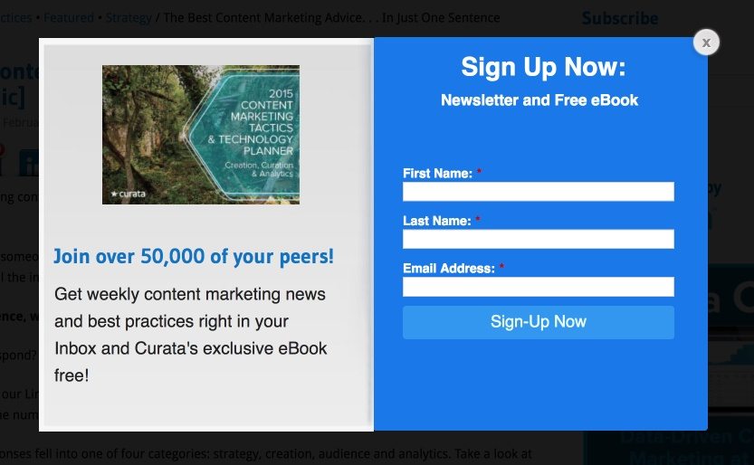
Of all the post-click landing page varieties, the squeeze page is the easiest to write up. It’s short, it’s simple, and it only requests name and email address from the visitor. So with the few words you use, what should you focus on?
The focus of your copy: Emphasize what the visitor gets in return for submitting such little personal information, and justify taking their email address. Why do you need it? What are you sending to their inbox? For an added persuasive boost, create social proof by sharing how many people are on your subscriber list (but only if it’s over 200 — that way you can say “hundreds”).
Key words and phrases: Exclusive, free, members only, get (resource) delivered to you free by entering your email below, join (hundreds, 1,000+, thousands) of other subscribers
Copy length: Short
Where to use it in your funnel: Top
Example: Curata
Splash page
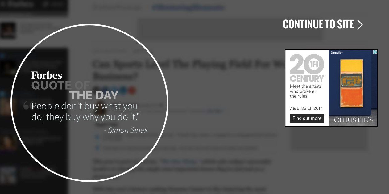
A splash page is unlike any other post-click landing page in one key way: visitors don’t expect to land on it. When an internet user clicks a link in your ad, they anticipate reaching a post-click landing page on which they can evaluate your offer. However, splash pages are a surprise stopover on your prospects’ way to another page. They might’ve clicked a link to a blog post or punched in the URL for your website — whatever it is, they’ve been redirected to a splash page, and you need to let them know why.
The focus of your copy: Do you need to make an announcement? Are you making one last push to advertise a limited-time promotion? Let visitors know why they’re on your splash page and how to continue to their destination.
Key words and phrases: You’ve been directed here because…, welcome to (your website name), continue, access, you’ll be redirected in a moment, based on your interest in (destination) we thought you might be interested in, before you visit (destination)…
Copy length: Short
Where to use it in your funnel: Top, middle, bottom
Example: Forbes
Lead capture post-click landing page
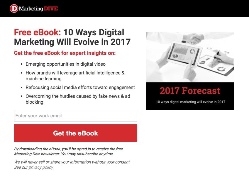
Lead capture post-click landing pages can feature countless offers: ebooks, reports, demos, trials, etc. But to claim whatever it happens to be, every visitor will need to complete a form. As a result, on top of writing copy specific to whatever’s being offered, you’ll need to help your prospects overcome the fear of privacy invasion.
The focus of your copy: Focus on writing for your specific offer, but also on relieving your prospects’ fear of spam. By filling out this form, they’re letting you into their inbox and maybe giving you access to their phone. Will you access them respectfully?
Key words and phrases: We respect your privacy, we’ll never sell your information to third parties, fill out the form to claim your (resource)
Copy length: Short to medium
Where to use it in your funnel: Top, middle, bottom
Example: MarketingDive
Ebook, report, white paper, case study post-click landing page
You’d think creating a post-click landing page for a free resource would be easy because, after all, it’s free. Why wouldn’t your visitor download it? What do they have to lose?
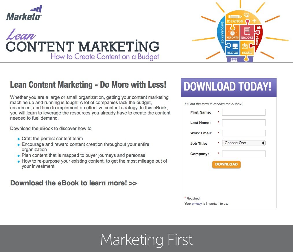
It may not be money, but they stand to lose time and privacy (since they’re giving you their personal information) when they download an ebook filled with worthless content. So the post-click landing page for your downloadable resource needs to convey its value without divulging too much information… but how?
The focus of your copy: Let visitors know why your ebook, report, or case study is valuable. They’ve been duped into downloading too much recycled content. Emphasize which well-known companies use your resources to inform business decisions, and give them an idea of what to expect inside with specific references to your content. If industry influencers helped you put this together, say so. If you surveyed thousands of marketers across the world, let the know.
Key words and phrases: Comprehensive, step-by-step, replicable, all-inclusive, expert, ultimate resource, here’s what to expect inside, get insights from, learn how to, the quick and easy guide to…
Copy length: Short to medium
Where to use it in your funnel: Top and middle
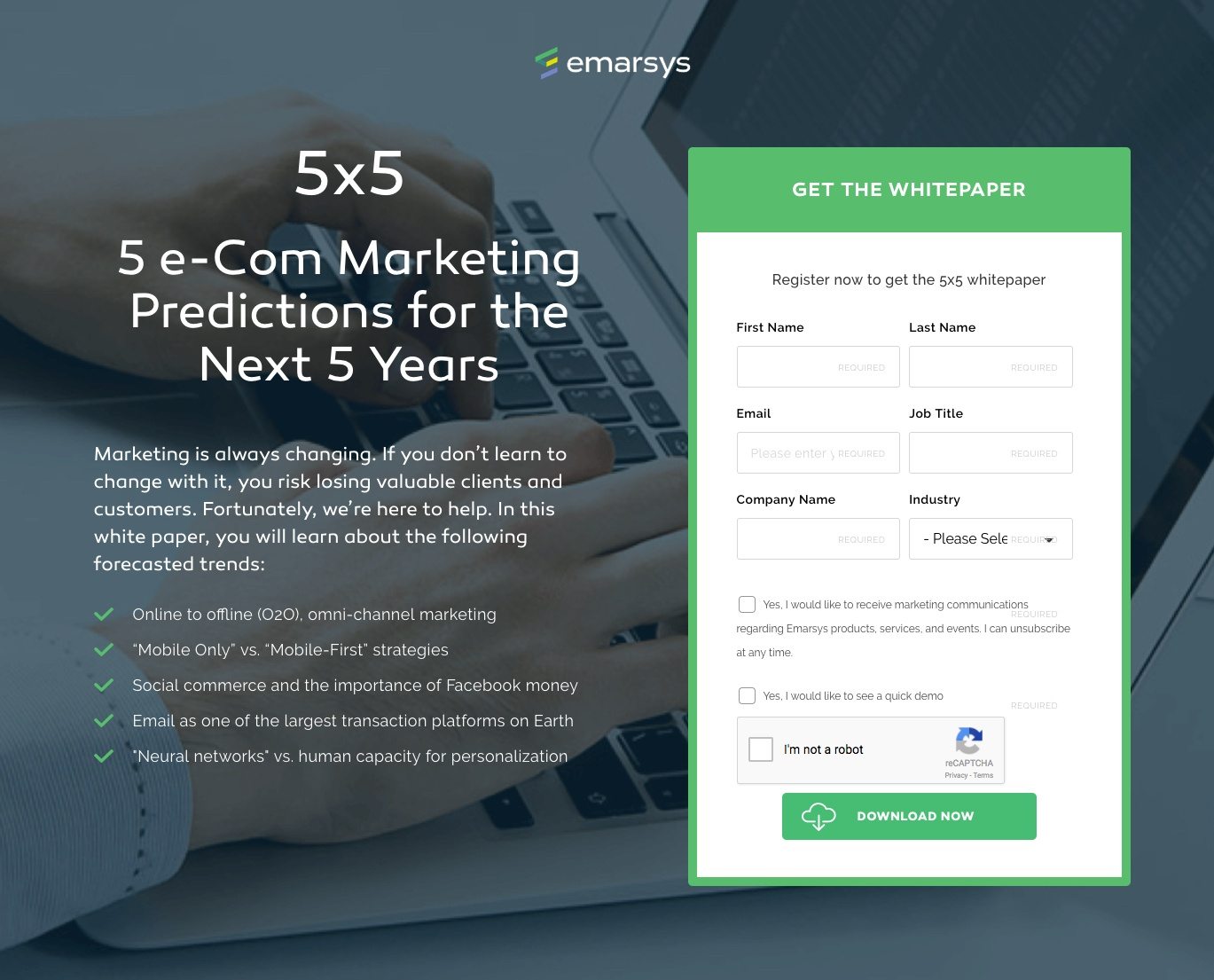
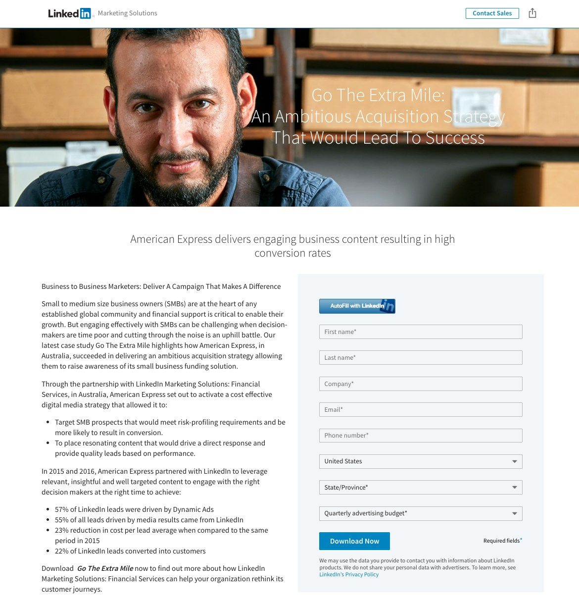
Examples: Marketo, Emarsys, LinkedIn
Webinar post-click landing page
Today, webinars might be the most valuable form of content in a marketer’s arsenal. According to Bizibl, 148 attendees remained engaged for 50 minutes during the average webinar last year.
But to reap the benefits of this mesmerizing medium, you’ll need to convince visitors your webinar is worth attending with some key inclusions you won’t find on every post-click landing page.
The focus of your copy: There are two things that make a webinar worth attending. The first is the topic and takeaways. The title “Twitter Marketing Webinar” won’t do much to convince your prospects to attend without an explanation of the lesson’s content. Make sure you let your visitors know exactly what they’re going to learn after spending an hour on your webinar and how they can apply it to their lives.
The second thing that makes webinars worth signing up for is the speaker. A Twitter marketing webinar run by your neighbor, the self-proclaimed “social media expert,” won’t draw nearly as big of a crowd as one run by Jeff Bullas, a Forbes top 20 influencer. Why should people take time of their day to watch you or your speaker educate? Tell them with a colorful bio that features the name, position, and achievements of your speaker.
Key words and phrases: Limited-time offer, save my spot, reserve my seat, available only for a limited time, spaces are limited, seats are limited, top takeaways, here’s what you’ll learn, estimated length, webinar date, scheduled start time
Copy length: Short to medium
Where to use it in your funnel: Top, middle, bottom
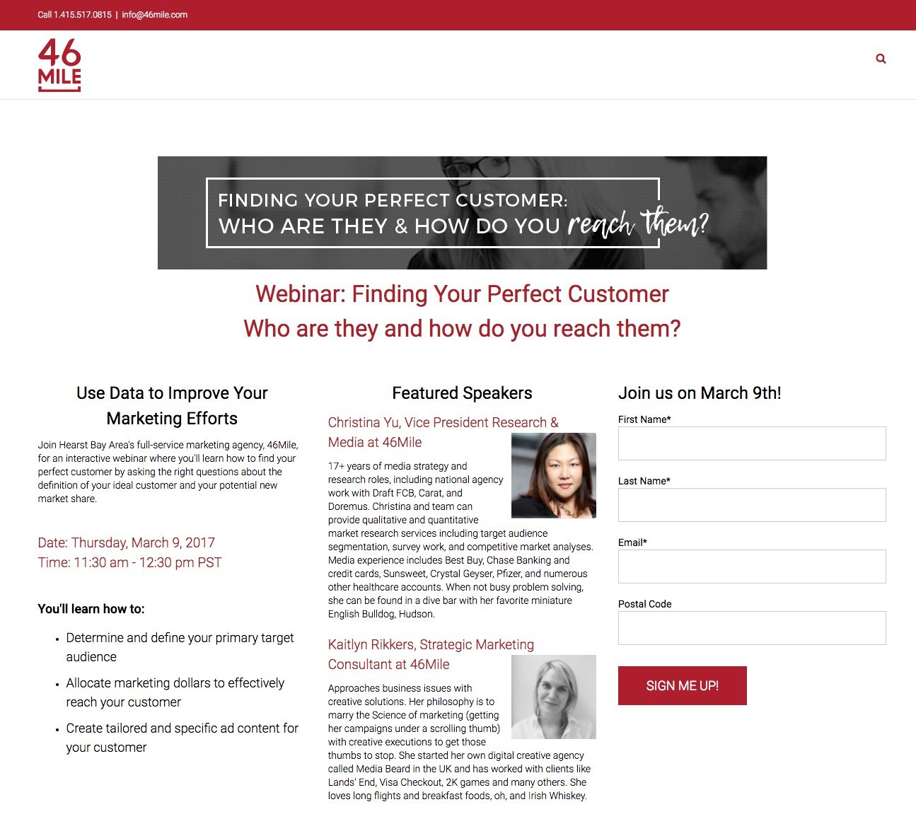
Example: 46 Mile
Demo, free trial post-click landing page
Testimonials and case studies are great, but before your visitors buy, they’ll want to make sure your product or service can solve problems specific to their business. The best way to find out is with a demo or free trial.
The focus of your copy: On a demo post-click landing page, your visitors will want to know whether they’ll have to schedule a tour or if they can watch one immediately. If it’s being scheduled, who will lead it? How long will it take?
On a free trial post-click landing page, your visitors will have these questions: Will I need to input a credit card? If so, will it be charged after the trial is over? How long does this trial last? Will I get to use all the features of the product for the length of the trial, or will they be limited? Make sure your copy has answers to all of them.
Key words and phrases: Try risk-free, no credit card required, free, free for (X) days, get started now, enjoy all the benefits of (X product) free for (X) days, begin now for free, start free, schedule a demo with our experts, see the power of (X product) in action, discover how (X) can change your business, get a free demo from our product experts, view demo now
Copy length: Short to medium
Where to use it in your funnel: Bottom
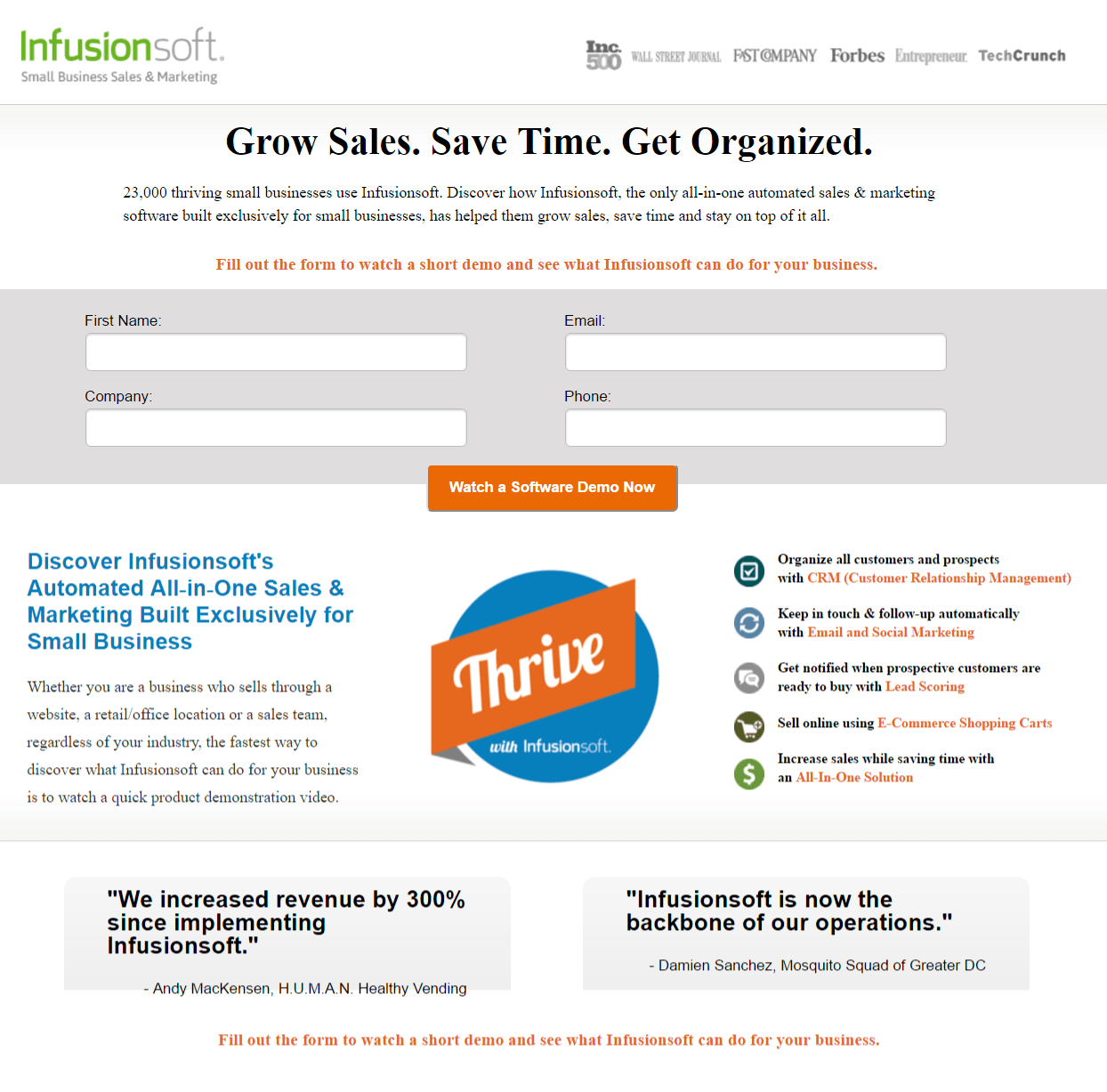
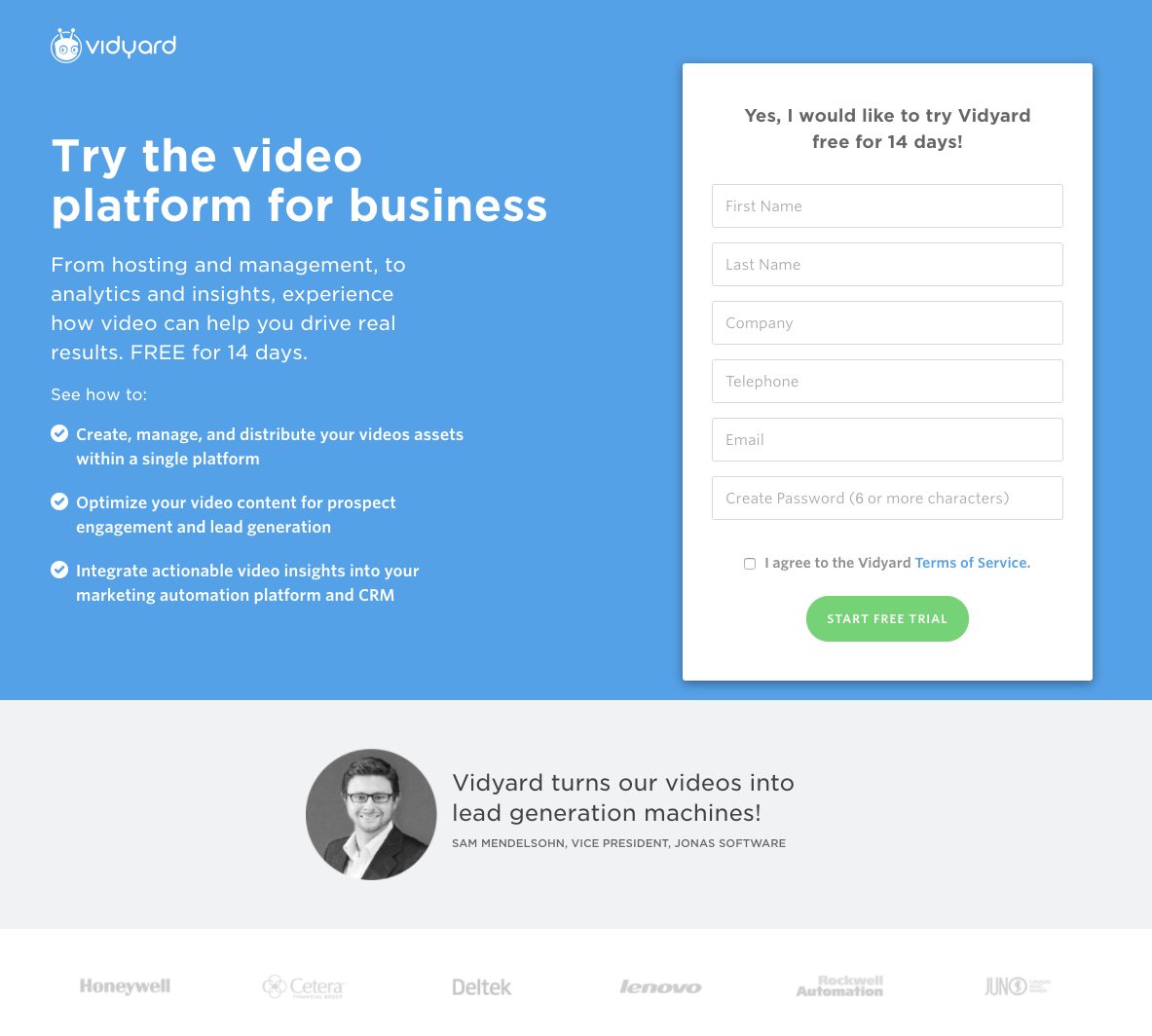
Examples: Infusionsoft, Vidyard
Sales page
The sales page is a copywriter’s ultimate test. Here, you’ll need more than a juicy headline, a list of benefits, and a compelling call-to-action. To get your visitors to loosen the grip on their wallets, you’ll have to overcome all their objections with carefully worded phrases that resonate with them. You’ll need to build authority and trust with specific examples of customer relationships. And in some cases, you’ll even need to channel your inner storyteller.
The focus of your copy: Your copy’s focus here is to relieve doubts. Make a list of your prospects’ biggest objections and overcome them one-by-one with detailed examples from past relationships. Is your product too expensive? Is it complicated? Use a testimonial to explain how quickly it pays for itself in ROI, and a numbered list to show how easy it is to set up. Boost trustworthiness with a satisfaction guarantee and social proof that counts how many people have claimed your offer. Increase authority by making references to well-known customers and awards your business has won.
If your product is straightforward and inexpensive, you can get away with writing less copy. However, if it’s complicated, new, or pricey, you’ll need to make a more compelling argument with extensive text. If your copy extends below the fold, make sure to separate it into small, readable chunks with bold subheadings. The less overwhelming your page looks, the easier it will be to read.
Key words and phrases: (Hundreds, thousands) of satisfied customers, check out our reviews, what our customers are saying, trusted by (thousands of customers, well-known brands), award-winning, money-back guarantee, satisfaction guaranteed
Copy length: Medium to long
Where to use it in your funnel: Bottom
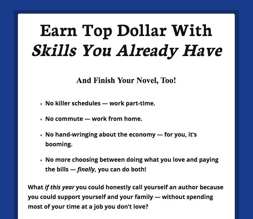
Example: AWAI (click through to see the 5,300-word page)
“Thank you” page
Visitors only land on a “thank you” page after converting on an offer, at which point they become leads or customers. A great “thank you” page can boost brand sentiment and nurture your lead to the next stage of your funnel, but unfortunately, most aren’t very great. They read something like “Thank you for downloading,” and that’s it. If you’ve checked out our post, How to Create and A/B Test Thank You Pages, you’d know why this is bad form.
The focus of your copy: Your copy’s job is threefold — first, it should convey appreciation to your new lead. They just gave you their contact information. Let them know they’re in good hands with a sincere “thank you.” Lots of digital marketing is inhuman, so even something like “Thanks, you’re awesome!” can catch them pleasantly off-guard.
Second, it needs to let them know how they’ll get the offer they just converted on. Will it be shipped to their home in 5-7 business days? Will it be sent to their email?
Third, it should direct them to other content or products they might like. Help them help your bottom line by guiding them to the next step in the marketing funnel.
Key words and phrases: You’re awesome, we love you, thanks a million (name), you’re tops, we’re happy to have you, we’re excited to have you on board, keep an eye on your email, you can access your (resource) right here, you can expect your (resource) in the next 20 minutes, here’s some other stuff you might like…
Copy length: Short
Where to use it in your marketing funnel: Bottom
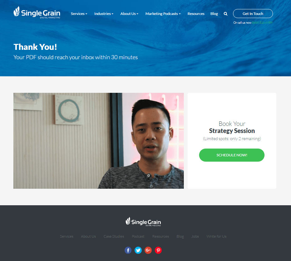
Example: Single Grain
Copywriting based on post-click landing page type will boost conversion rate
Like you wouldn’t use the same advertisement for all your business’s products, you shouldn’t use the same post-click landing page copy for all your offers.
Start with a marketing goal you want to accomplish. From that goal, develop an offer that will help you accomplish it. Then, build a persuasive post-click landing page around that offer. Sign up for an Instapage Enterprise Demo today.

See the Instapage Enterprise Plan in Action.
Demo includes AdMap™, Personalization, AMP,
Global Blocks, heatmaps & more.
