It feels a little like picking lottery numbers, doesn’t it?
When countless word, color, and shape combinations have the potential to send your business’s sales soaring, which one will you choose for your call-to-action? Which one will convince your audience to click their mouse and claim your offer?
There’s a lot that factors into the decision — from things like UX best practices and design principles, to pronouns and the people visiting your page.
We’re here to tell you that it’s not like picking lottery numbers. There are some ways to determine the best CTA placement for your offer, and not one of them involves guessing.
How to identify the best call-to-action for your offer
1. Does your CTA speak to your audience?
Your audience is a unique set of people that uses a unique vocabulary and tone to speak about the things they’re interested in. Is that vocabulary colloquial or formal? Is that tone “classroom academic,” “boardroom business,” or “coffee shop casual”?
To pick the right call-to-action, you need to know — because what speaks to one business won’t always speak to yours.
“Serious gains in conversions don’t come from psychological trickery, but from analyzing what your customers really need, the language that resonates with them and how they want to buy it.”
Offline, research has shown that we process language in two different areas of the brain. Groove’s Len Markidan shares a quick excerpt describing the findings:
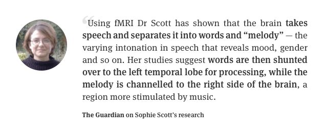
But online, that “melody” is non-existent. Your prospects can’t use the right side of their brain to determine how you mean to say what it is you’re saying. That means you need to work extra hard to convey your brand’s attitude and personality with just words and punctuation.
Daniel Dipiazza has an idea of who his target customer is. The founder of Rich20Something encourages young people to escape the 9-5 rat race and start businesses they’re passionate about. And he does it in their language. Take a look at the email call-to-action in this example:
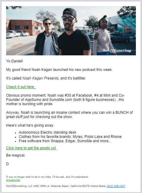
“Click here to get the goods yo!” is an email CTA that works for Daniel’s audience, but probably not yours. On the spectrum of casual to corporate, he’s off-the-charts casual. Here’s another example:
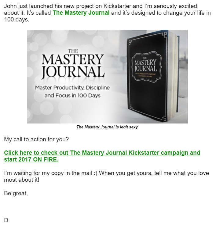
“Click here to check out The Mastery Journal Kickstarter campaign and start 2017 ON FIRE.”
Older generations might look at that and think, “On fire? That sounds painful.” Corporate audiences might think, “That’s no way to speak to a customer.”
But Daniel’s not sending these emails to older generations or corporate subscribers. He knows who he’s marketing to, and he knows phrases like “get the goods yo,” and “on fire” are two that are routinely used among his audience.
Also, notice how he capitalized “ON FIRE” in the email call-to-action. Use this technique sparingly if at all. In a casual tone it can be read as excitement and emphasis, but in most cases it comes across as pushy and in-your-face.
Here’s a quick example of exciting all-caps and unnecessary, in-your-face all-caps:
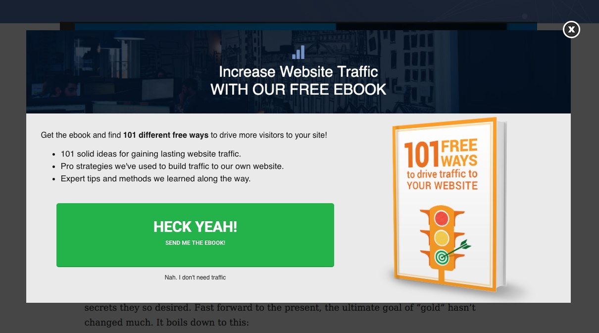
Look up at the top of the page. Why is “WITH OUR FREE EBOOK” capitalized? Look at the ebook cover. Why are “FREE WAYS” and “YOUR WEBSITE” written in all-caps? That’s loud, in-your-face, and unnecessary.
At the bottom, though, “HECK YEAH!” can be read as an enthusiastic proclamation.
If you’re on the fence about using all-caps, don’t. It’s better to come across calm and cool than risk scaring your prospect off with loud, salesy language. Only capitalize entire words if you’re confident your audience will respond to them well.
The same goes for exclamation points. They can make you seem overeager, and your product seem cheap and tacky. Take some valuable copywriting advice from Peep Laja: “Imagine you can only use 10 exclamation marks in your whole life. Use them sparingly.”
2. Does your CTA emphasize what your prospects get by clicking?
Recently we wrote a little about why the traditional post-click landing page call-to-action doesn’t fit in with all the elements around it.
What it comes down to is this: If everything else on your post-click landing page is benefit-oriented (copy, images, headline), why isn’t your call-to-action?
Words like “Register” and “Download” and “Order” put the emphasis on the action involved in claiming the offer, instead of the benefits of claiming it. Let’s take a look at a real-life example:
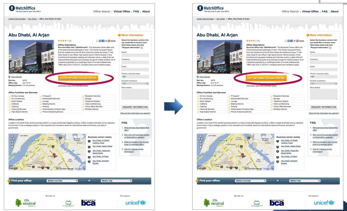
Above you’ll see a call-to-action from MatchOffice aimed at getting users to request information and prices.
On the left is the original page, featuring a CTA reading “Order information and prices.” On the right is the variation page, with a slightly different call-to-action reading “Get information and prices.”
Could a one-word change really make a difference? See for yourself:
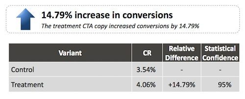
By shifting the emphasis from the action involved in claiming information to what visitors actually get by clicking the CTA button, the testers were able to boost conversions by nearly 15%.
You’ll see examples of this all over the web. Here are a few:
All those CTAs put the emphasis on what the user gets for pressing the button instead of what they have to do to get it. But, they could be even better by taking the process one step further…
3. Is your call-to-action tailored specifically to your offer?
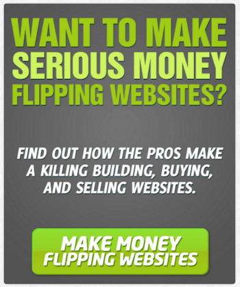
Every one of the above CTAs does a great job of offering a resource instead of making visitors claim it. But, none of them pass the forehead slap test.
Before you start re-reading them while smacking your own forehead, allow Clayton Makepeace to explain what the test entails with an example:
Balance Blood Sugar Levels Naturally!
That was a headline written by one of his copywriting students to sell a series of natural supplements. And while at first it may seem like it contains an action-inspiring benefit, it really doesn’t at all.
It was Clayton’s forehead slap test that revealed the headline was lacking:
“When was the last time you were jarred out of a deep sleep exclaiming ‘Jeez Louise – I need to balance my blood sugar levels naturally!’
Nobody really wants to balance their blood sugar levels. But anyone in his or her right mind DOES want to avoid the misery of blindness … cold, numb, painful limbs … amputation … and premature death that go along with diabetes.”
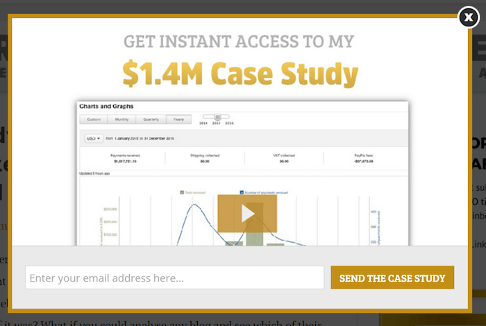
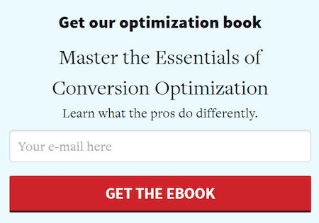
Now look back at the CTAs above. Do you want a case study, or do you want to learn how to generate $1.4 million?
Do you want an ebook, or do you want to become a conversion optimization pro?
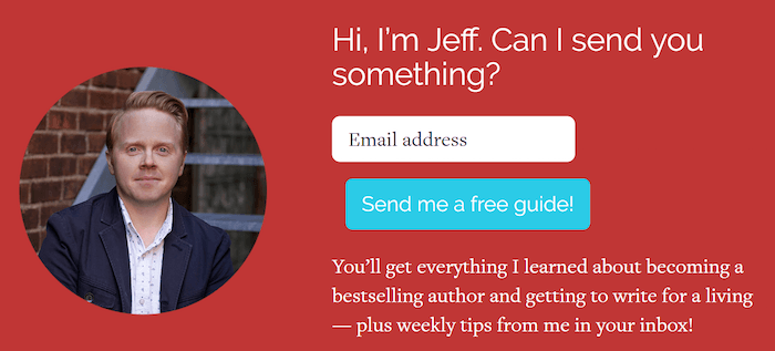
Do you want the free guide, or do you want to learn how to become a bestselling author?
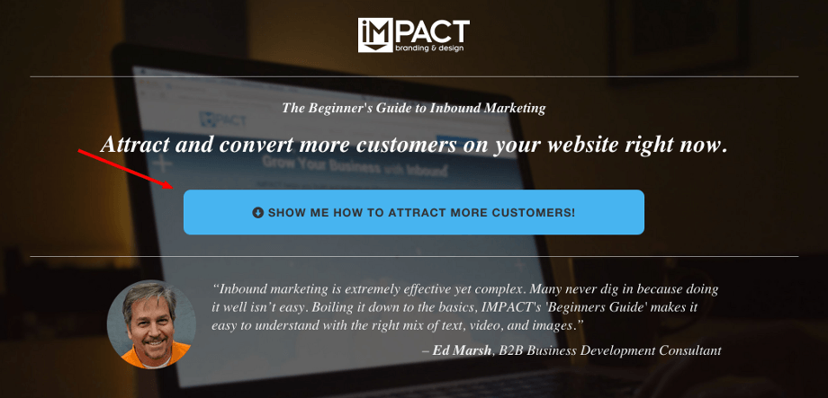
Both IMPACT Branding & Design and Empire Flippers applied the forehead slap test to their CTA (whether they realized it or not), and in both cases it boosted conversions.
When they changed their button copy from “Free download” to “Show me how to attract more customers,” IMPACT saw a 78% boost in clicks:
When Empire Flippers teased out the benefits of their memberships site, they realized that “Join us” wasn’t doing them justice. So, they changed their CTA to this:
IMPACT could’ve used “Get my ebook,” and Empire Flippers could’ve used “Give me access,” but instead they smacked their foreheads and used their CTA to offer visitors what they really wanted.
Below are a few standard CTAs and some better alternatives:
- Webinar, Course
- Basic call-to-action: Sign up, Register.
- Better call-to-action: Save my spot, Reserve my seat
- Best call-to-action: Tailored to your offer. What will your visitors learn or become by attending your webinar?
- Ebook, Whitepaper, Report, Case study (downloadable content)
- Basic call-to-action: Download, Submit
- Better call-to-action: Send my ebook, Deliver my whitepaper
- Best call-to-action: Tailored to your offer. What will visitors learn by downloading your ebook? What will you show them how to do? What will they become after reading it?
- Membership (community, newsletter)
- Basic call-to-action: Sign up, Subscribe
- Better call-to-action: Give me access, Send me tips (weekly digests, expert advice, etc.)
- Best call-to-action: Tailored to your offer. What will you transform your visitors into when they become members of your website? What will your expert advice get them?
Now keep in mind, this method of CTA-writing has the potential to interfere with the next best practice, which is why it’s always best to test, test, test to see what your visitors prefer.
4. Is your call-to-action clear?
In the process of turning your CTA button into a benefit-focused attention-grabber, you might find that you’ve confused your prospects. And here’s why…
These benefit-focused phrases, while working for IMPACT and Empire Flippers, might make your visitors wonder what pressing your button will do.
Does “Show me how to attract more customers” mean that clicking will get you the ebook? Or does it mean that you’ll get taken to another resource that will show you how to get more customers? Will you get signed up for a consultation during which IMPACT consultants will teach you how to attract more customers?
These phrases have the potential to interfere with the clarity of your button. And clarity, above all things, is what’s most important to your visitors.
The copy on your button or in your link is just one thing that affects your CTA’s clarity. Some other factors to keep in mind:
Location matters
Your CTA doesn’t always have to be above the fold. In fact, there are times including it too soon will hurt your conversion rate instead of improving it.
Such was the case for Crazy Egg and Investopedia. Both brands found that a longer, more comprehensive page was needed to convince visitors to claim their offer. And because those pages were longer, the CTAs were placed far below the fold. In both cases, that CTA button got clicked more than it did when it was higher up.
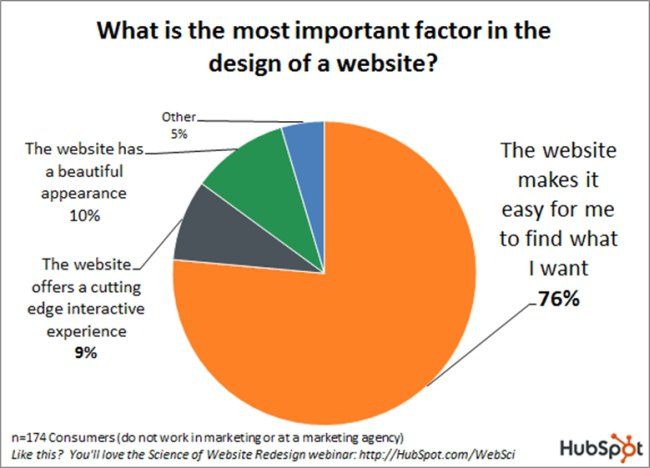
But if you do have a simple page, make sure your CTA is in a place that visitors will find it. Remember that people tend to read in an F-shape pattern:
The finding is in line with early eye-tracking studies that show people enter a written page through the biggest image or headline, then read bolded and italicized words, and body copy last.
That means you need to create what’s called a “visual hierarchy” on your page. You need to guide your readers to your call-to-action with images, headlines, and formatted text.
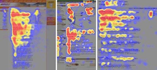
Look at this web page:
Can you find the call-to-action immediately?
Most of its visitors couldn’t. They entered the page through the biggest image, looked down at the headers and body copy, then continued down the page.
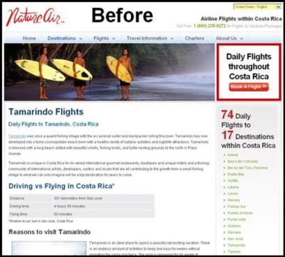
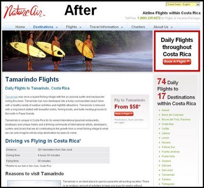
When that page was updated to move the CTA button in visitors’ line of sight, conversions grew by an astronomical 591%:
Where you put your CTA will depend on your offer (is it basic or complex/free or expensive?), and the length of your content (is it long-form or short-form?). Test different locations, but make sure it’s in your visitors’ line of sight.
Design matters
This is going to sound insultingly obvious, but it’s better to be safe than sorry. Your button should look like an actual button. If your CTA is a link, your link should look like a hyperlink.
- If it’s a button…
Make it look pressable. Make it look different than the badges or banners on your page. Try adding an effect that will darken it when a visitor’s cursor hovers over. Use shading to make it 3D.
- If it’s a hyperlink…
Make the text color different from the other text on your page. Blue is the most recognizable. Also consider underlining all your hyperlinks.
Your visitors have to click this CTA to get your offer. They can’t if they don’t know it’s clickable.
Just as important as designing for familiarity is designing for attention. Your button won’t shout “Press me” to visitors if it’s the same color as the rest of your page elements.
Choose a complementary, monochromatic, or analogous color scheme that will make your CTA stand out. If it’s not jumping out as the most prominent element on your page, your call-to-action needs to be redesigned.
Start creating irresistible CTAs that your audiences can’t miss. Also, don’t forget to provide every prospect with a personalized experience from start to finish. Sign up for an Instapage Enterprise demo today.

See the Instapage Enterprise Plan in Action.
Demo includes AdMap™, Personalization, AMP,
Global Blocks, heatmaps & more.
