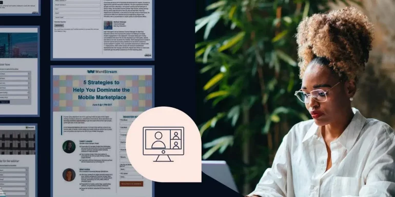
Webinars nurture prospects through every stage of the buyer’s journey — and they’re incredibly efficient at doing so. Today’s post is going to feature webinar landing page examples that will help give you inspiration for your next campaign.
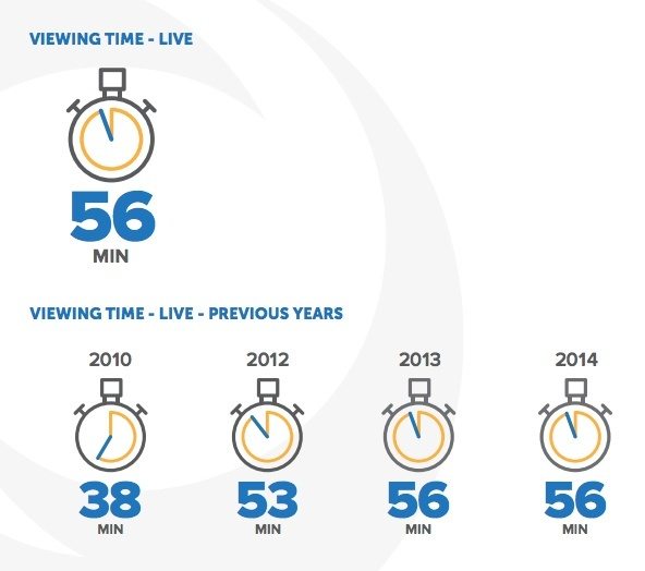
On24 reports that the average viewing time of a webinar is a staggering 56 minutes:
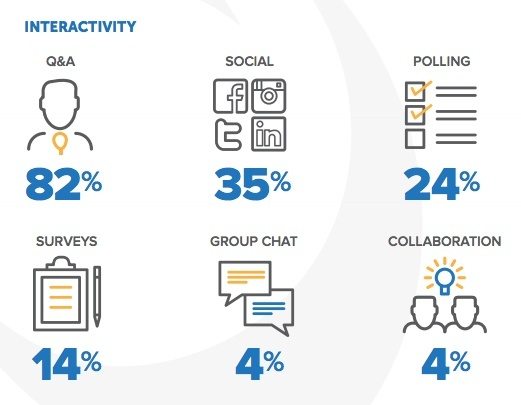
At a time when our attention span is less than ten seconds and engaging audiences is harder than ever before, webinars have succeeded in keeping us interested. Data shows that during live webinars, a shocking 82% of users participate in Q&A, 35% engage on social, 24% answer polls, and 22% collaborate, group chat, and respond to surveys:
As more and more businesses start to beef up their webinar marketing strategy with webinar software, it’s becoming increasingly important that they leverage the conversion power of a landing page platform to drive webinar signups.
Why?
While email is, according to On24, the most successful webinar promotion channel, it can’t succeed without a targeted page to convert interested prospects into registrants.
That’s where a webinar post-click landing page comes in handy. It’s designed to communicate the value of registering and attending your webinar using persuasive elements like benefit-oriented headlines, social proof, authority badges, and testimonials.
Learn what to do, and what not to do on yours from our critiques below.
20 Webinar landing page examples to model yours after
(Note: For shorter pages, we’ve shown the entire page. For longer pages, we only displayed above the fold. You may need to click through to the page to see some of the points we discuss. Additionally, many sites A/B test their pages, meaning you may see an alternate version.)
1. Kissmetrics
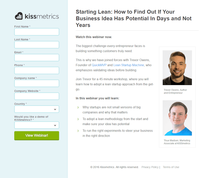
What they did well:
- The headline conveys a benefit to the visitor.
- Shorter paragraphs and bullet points make this text easier to read.
- Headlines, subheadlines, and bolded text create a visual hierarchy that’s easy to follow.
- This button color passes the squint test (squint and see if you can find the CTA button. If you can’t, it needs to be more attention-grabbing).
What to A/B test:
- Pictures of people staring at your visitors will cause them to stare back, interrupting the flow of their content consumption. Studies have shown that on post-click landing pages, if you’re going to use pictures of people’s faces, you should make sure they’re glancing toward important page elements. They’ll guide direct your prospects eyes to them.
- This long form asks a lot of prospects. Does Kissmetrics really need all that information?
2. IBM Watson
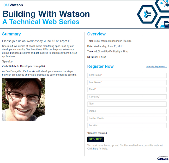
What they did well:
- No navigation means no readily available ways off this page.
- Headlines and subheadlines create an easy-to-follow visual hierarchy.
- A contrasting color CTA makes it easy for visitors to see it and convert on the form.
- A logo that’s not hyperlinked doesn’t allow people to leave the page through it.
What to A/B test:
- The photo of Zach staring back at the prospect interrupts the flow of content consumption.
- The copy is vague. How specifically is this webinar going to help me solve my business problems?
3. Microsoft

What they did well:
- The headline conveys a clear benefit: Learn how to handle the biggest security threats to your business.
- Bulleted copy tells people exactly what they’ll learn in the webinar.
- The page is very balanced because the page and copy are are almost in-line with each other. There is no glaring empty space on the page that would distract visitors’ attention away from the main goal of the page: register.
What to A/B test:
- These paragraphs should be in smaller chunks for better readability.
- This CTA button is pretty easily missable.
- A clickable logo takes prospects to the homepage whenever they want.
4. Microsoft Azure
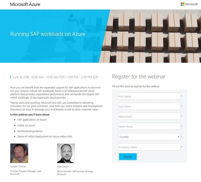
What they did well:
- Bulleted copy lets people know what they’ll learn in the webinar without overwhelming them with blocks of text.
- This page is responsive, which is a big plus for visitors who may view the page on tablet or mobile devices (with varying screen sizes).
What to A/B test:
- Three different hyperlinked logos serve as escape routes off the page.
- The headline “Running SAP Workloads On Azure” tells visitors what the webinar is about, but doesn’t convey a benefit. Why should people register for this webinar?
- Photos of people staring back at prospects interrupts the flow of content consumption.
- The call-to-action is boring. Surely Microsoft can do better than “Register.”
5. Best Buy
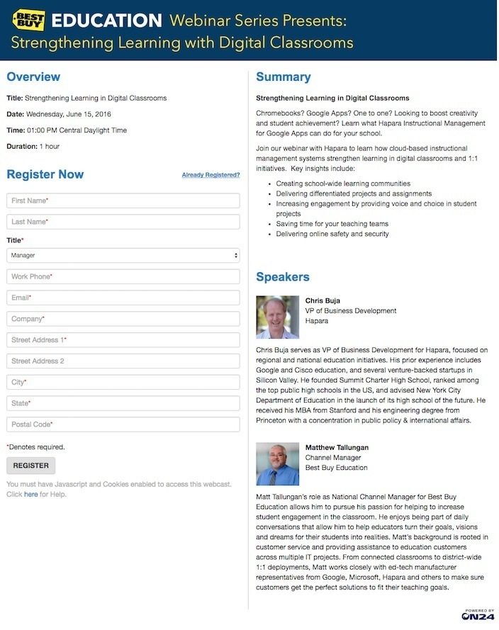
What they did well:
- This branded header reminds prospects they’re on a page created by Best Buy.
- Subheadlines create a recognizable visual hierarchy.
- Bulleted copy explains key insights that registrants will gain from joining the webinar.
What to A/B test:
- This 11-field form requires prospects divulge a lot of information that they might not be willing to give.
- The CTA “Register” is about as bland as it gets. For tips to write better CTA copy, check out this article.
- This CTA button is easily missable. Make it bigger, and make it a contrasting color to attract your visitors’ attention.
- Block text biographies look intimidating to read.
6. WordStream
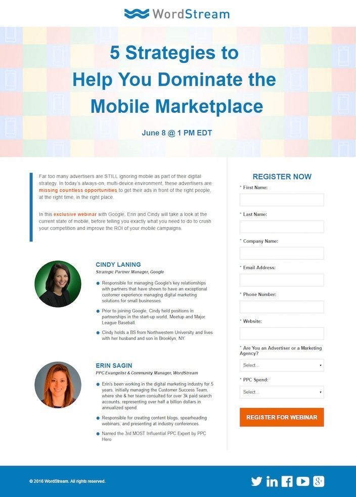
What they did well:
- The headline conveys a clear benefit.
- A bright button grabs the attention of visitors.
- Bulleted text make these biographies easy to read, and tout the authority of the speakers.
- Shortened paragraphs make copy easy to digest.
- Well-placed subheadlines and bolded text create a visual hierarchy.
What to A/B test:
- A hyperlinked logo serves as an escape route from the page.
- Social media buttons give people an “out” of this post-click landing page.
- Why are all form fields required? Remember to only ask for the information you really need. Otherwise, you risk intimidating your prospect into leaving your page.
7. Content Marketing Institute

What they did well:
- The big, branded header lets visitors know they’re on Content Marketing Institute’s page.
- Subheadlines create a visual hierarchy that’s easy to follow.
- The summary tells visitors exactly what they’ll gain by joining the webinar.
- The CMI logo isn’t linked to any other page, meaning visitors can’t escape through it.
- No navigation means that users will have a harder time leaving this page.
What to A/B test:
- Blocks of text make these biographies intimidating to read.
- This CTA button is tiny. Does it pass the squint test?
- This page is overly busy. Different logos and buttons distract the visitor from absorbing necessary information and clicking the CTA button.
- This long form asks a lot from prospects. Will this webinar be worth the information they’re required to give?
- The ON24 logo in the lower right is a hyperlinked escape route.
8. Nvidia

What they did well:
- Without navigation, there’s no immediately visible way off this page.
- The “privacy” link underneath the form helps reassure visitors their information is safe.
- The headshots and biographies give visitors an idea who is presenting and their respective backgrounds.
What to A/B test:
- The logo links to their homepage, making it easy for prospects to leave whenever they please.
- The headline doesn’t convey a benefit.
- The benefits of signing up for the webinar could be more clearly stated.
- The call-to-action “Submit” could be much better.
9. Kapost
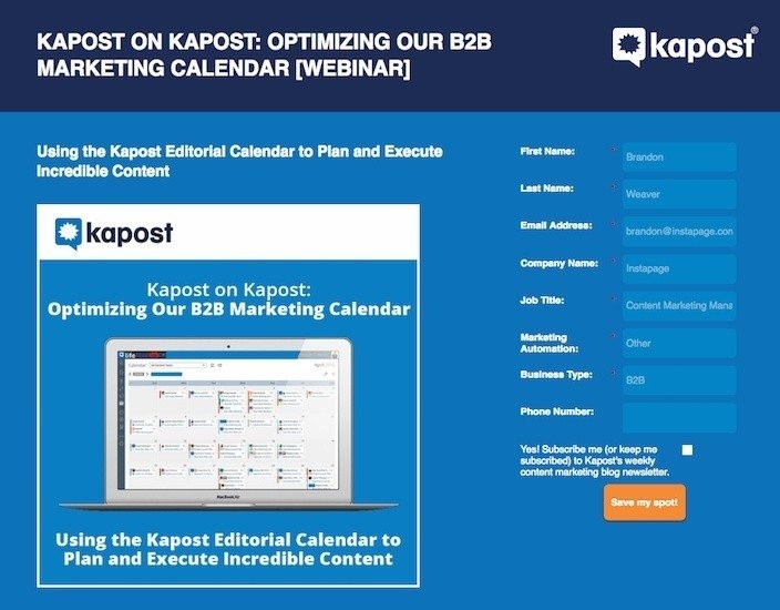
What they did well:
- This button pops off the blue background.
- The CTA is in first person. “Instead of “Save Your Spot” it reads “Save My Spot.”
- Paragraphs separated into small chunks make this text easier to read, and bullet points convey the exact benefits of registering for the webinar.
- The screenshot of the calendar gives visitors a peek into how Kapost can optimize your marketing calendar.
What to A/B test:
- A hyperlinked logo gives visitors a route off the page.
- This headline could be less egocentric. Right now it’s reading “Watch us analyze how we optimized our own marketing calendar.” Prospects don’t care about your calendar, they care about theirs. Instead it could read “Learn How To Optimize Your Kapost Marketing Calendar Step-By-Step.”
- An outbound link in the copy serves as another way off the page.
- A footer with a link to Kapost’s “About us” page is yet another hole in this post-click landing page.
10. Forrester
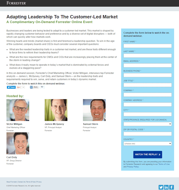
What they did well:
- Bite-sized paragraphs make the text on this page easier to read.
- Bulleted copy explains exactly what the webinar will cover.
- The terms of use and privacy policy links underneath the form provides reassurance visitor’s their information is safe and sound.
What to A/B test:
- This super-long, 11-field form is likely to scare prospects away.
- A hyperlinked logo gives visitors a way off the page.
- Social media icons in the page’s footer serve as more escape routes. If you want people to spread the word about your webinar via Facebook, Twitter, and LinkedIn, add social buttons to your webinar “thank you” page that allow them to share a link back to your post-click landing page.
11. Centers For Disease Control

What they did well:
- A bulleted itinerary breaks down the webinar schedule in 15-minute increments so visitors know exactly what to expect.
- This button color pops off the white page well, making the call-to-action easy to see.
- No navigation means no obvious ways off this post-click landing page.
What to A/B test:
- A logo linked to the homepage allows prospects to leave whenever they please.
- Big blocks of text intimidate readers.
- This headline can convey a stronger benefit: “How To Protect Your Patients And Your Practice”
12. Search Engine Journal

What they did well:
- This headline conveys a very strong benefit.
- Small paragraphs quickly convey the advantages of signing up for the webinar.
- The bright red button pops off the gray background prominently.
What to A/B test:
- This 9-form field is a little long. Will the content of this webinar be worth handing over all that sensitive information for?
- The link that reads “View other webinars hosted by Search Engine Journal” gives prospects a way off the page.
- The link to the homepage gives prospects yet another way off the page.
13. Groove
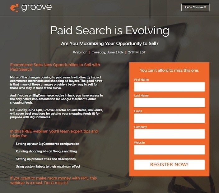
What they did well:
- The question subheadline engages the reader.
- This short form doesn’t ask for much from the visitor.
- The word “Free” takes advantage of our desire to get something valuable for nothing.
- Bite-sized paragraphs make this page easily digestible.
- Bulleted copy explains the benefits of joining the webinar.
- The headline above the form helps convince visitors to convert by leveraging our inherent fear of missing out on something valuable, commonly known as FOMO.
What to A/B test:
- The CTA button blends in with the form. Do the squint test. Doesn’t it look just like another form field?
- Numerous links serve as holes in Groove’s marketing funnel. Social media links, a “Let’s Connect” link, and a hyperlinked logo all let prospects off the page if they want.
- All the copy above the fold is bold. Is that really necessary? The section headlines kind of blend in with the rest because everything is bold. This detracts from having a visual hierarchy and makes it harder to read the page.
14. Upwork
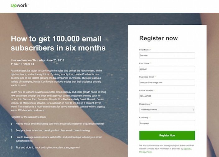
What they did well:
- The headline communicates a strong, tangible benefit. “How to get 100,000 email subscribers” is better than “How to get way more email subscribers.” Keep in mind, though, this implies you’re going to give your attendees a step-by-step plan to actually get those 100,000 subscribers. These headlines are more powerful, but only if you can deliver on your promise.
- Bulleted copy gets the benefits of attending this webinar across quickly.
- Small, bite-size paragraphs make this page easier to read.
- The green CTA button pops off the white form, attracting the visitor’s eye.
- Text below the fold highlights the authority of the speakers. The more well-known they are in their field, the more willing your prospects will be to join the webinar.
What to A/B test:
- A logo that’s hyperlinked to the homepage allows prospects to leave whenever they please.
- Social media buttons are holes on this page that allow visitors to escape.
15. Mastin Kipp
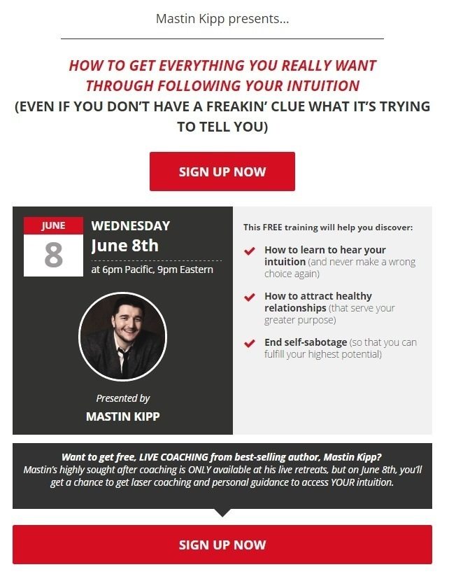
What they did well:
- The headline conveys a clear benefit.
- Multiple cooperative CTAs work together to convert the visitor.
- No navigation or outbound links, means that visitors have to either convert on this page or leave.
- The word “free” takes advantage of our desire to get something for nothing.
- Copy above the second CTA conveys scarcity. According to this page, Maston’s coaching is usually hard to come by.
- Bulleted copy explains the benefits of watching the webinar in an easy-to-digest way.
What to A/B test:
- The headline is sensationalized. “Get everything you really want” sounds a little unbelievable to us. How about you?
- Some of the copy sounds sensational, too. “Never make a wrong choice again”? You can’t expect people to believe that.
16. The Linux Foundation
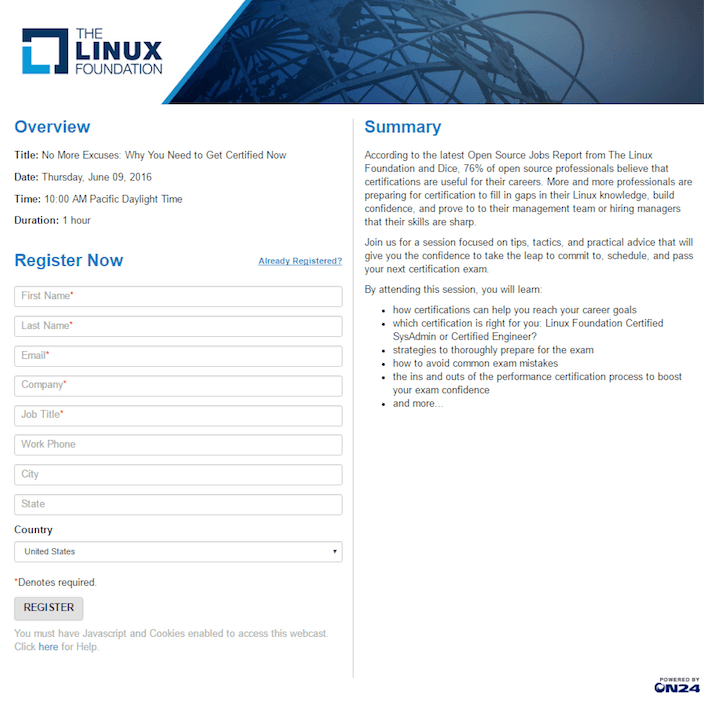
What they did well:
- Small paragraphs make this summary easy to read.
- Bulleted copy explains what visitors stand to gain by registering for the webinar.
- This logo isn’t hyperlinked, meaning no one can leave the page through it.
- Subheadlines create a easy-to-follow visual hierarchy.
What to A/B test:
- The headline doesn’t convey a benefit. “No More Excuses: Why You Need To Get Certified Now” relies purely on curiosity to get people to convert.
- This long form asks a lot of its prospects.
- The CTA button is easily missable with no contrasting color or personalized copy.
- The hyperlinked On24 logo is a way off the page for prospects.
17. Deluxe

What they did well:
- Minimal text makes this page easy to digest.
- A non-hyperlinked logo means visitors can’t escape through it.
- Without navigation there’s no readily visible way off this page.
- Bulleted copy quickly conveys the benefit of registering for the webinar.
- This CTA button pops off the white background. It would pop even more without that red border.
What to A/B test:
- This form asks for phone number. Prospects are much less likely to give up information when they don’t feel it’s needed. Is the phone field really needed?
- The CTA copy “Register” is too generic. Your button deserves better.
18. HCL Tech
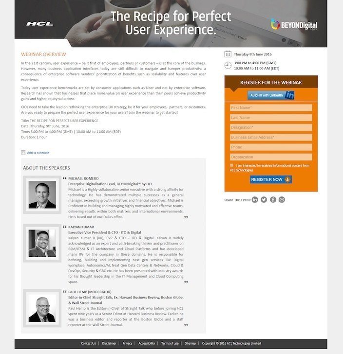
What they did well:
- Short paragraphs make the text on this page more readable.
- The “Autofill with LinkedIn” button allows users to complete the form in just a few clicks.
- This blue button jumps off the orange form.
What to A/B test:
- Block text makes reading these biographies intimidating.
- The copy could be written more plainly. This sentence: “However, many business application interfaces today are still difficult to navigate and hamper productivity: a consequence of enterprise software vendors’ prioritization of benefits such as scalability and features over user experience,” could be written as: “However, enterprise software is still hard to use because developers put an emphasis on scalability over user experience. As a result, your productivity suffers.” Stop using big words to sound smart and explain what you mean simply.
19. The Marketing Scope

What they did well:
- This results-based headline conveys a very strong benefit. Remember: numbers speak louder than hyperbolic words. “Boost Conversions By 500%” is way better than “Boost Conversions Enormously” or “Boost Conversions By A Ton.”Just make sure you can back up your stats.
- Bite-sized paragraphs make this page more readable.
- Bulleted copy quickly explains the content of the webinar and the benefits of joining.
What to A/B test:
- Multiple hyperlinked logos give prospects numerous ways off the page.
- This super-long, 12-field form could very well intimidate prospects into leaving. Not only that, but almost every field is required. Why?
- This CTA button could easily go unnoticed.
20. Network Marketing Pro

What they did well:
- The word “FREE” adds persuasiveness to this webinar post-click landing page.
- The “How To” headline conveys an obvious benefit.
- The video takes advantage of our bias towards visual content.
- Two cooperative CTAs work together to convey prospects.
What to A/B test:
- The video is a little long. At nearly 4 and a half minutes, it could get to the point much quicker. Aim for 2 minutes max. 1 minute is even better.
- These CTA buttons are the same color as a large portion of the page, making them easy to miss.
Create your own webinar post-click landing page
Now that you’ve learned by example from some of the world’s biggest brands, it’s time to build your own optimized webinar post-click page. Sign up for an Instapage 14-day free trial today.

Try the world's most advanced landing page platform with a risk-free trial.
