There are plenty of lead gen landing pages on the web to help you create the perfect page. There’s even lead gen landing page templates to help you speed up the process. But, how do you know which elements are appropriate for your page and conversion goal?
Follow some of the best high-converting landing page examples.
Today we’re going to help you heed Picasso’s advice by critiquing 30 lead gen pages from which you can steal great ideas, and eliminate bad ones. But, before we jump in, let’s define the term.
What are lead gen landing pages?
Lead gen landing pages are designed specifically for the purpose of capturing personal information about a prospect such as name, email address, phone number, company size, etc. to then use to nurture that prospect down your marketing funnel.
Without leads, you’ll never be able to generate customers. If you never have customers, then you won’t earn any revenue. And without revenue… we all know what happens next.
So without further ado…
1. Salesforce
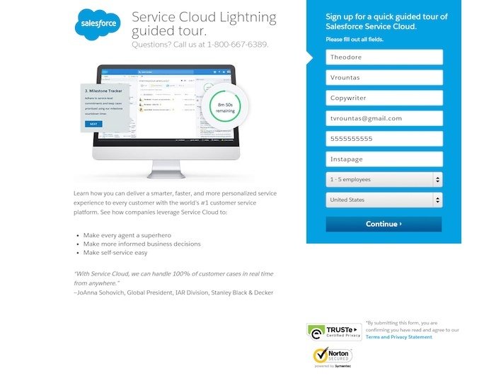
The good stuff:
- Minimal copy and a bulleted list do not clutter the page.
- Security badges below this lead gen landing page form lets people know their personal information is safe.
- The form and CTA button contrast with the rest of the page.
Room for improvement:
- The headline is unremarkable, and doesn’t convey a benefit at all. The first sentence of the landing page copy would actually be a better headline than the one already there: “Learn how to deliver a smarter, faster, and more personalized service experience.”
- The phone number isn’t click-to-call. Changing that would make mobile visitors’ lives so much easier.
2. HubSpot

The good stuff:
- “How-To” headlines like this one imply that the reader will gain valuable knowledge by claiming the offer on the landing page.
- The free offer makes it hard for people to turn it down. Whenever you’re offering something for free, emphasize it throughout your page.
- The pre-populated form makes completing it easy, relieving any friction involved with filling out so many fields.
- Limited copy broken up into sub-heads makes this page a breeze to get through.
Room for improvement:
- This long form is meant to generate high-quality leads. And while a company like HubSpot can probably afford to turn away the people who aren’t willing to fill out all 12 of their form fields, most businesses can’t. Use a longer form to generate higher quality leads, but don’t get excessive with 12.
- The image on this landing page doesn’t add any value. Is that a real screenshot of their analytics dashboard, or is it simply a placeholder? Either way, it’s not persuasive, so it shouldn’t be here.
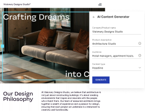
3. Digital Marketer
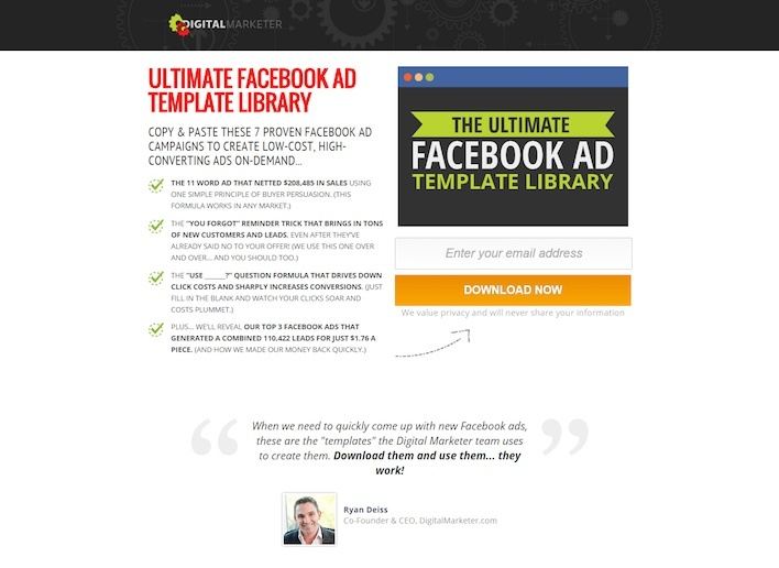
The good stuff:
- This bold headline/sub-head combo convey the powerful, quick, and easy solution to digital marketers’ problems: an “ultimate” template library that they can simply “copy & paste.”
- Bullet-point copy geared toward the prospect makes it easy for readers to get through.
- The visual cue (arrow) pointing to the CTA button as the most important action to take on the page.
- The message under the CTA button makes it clear that the business values the privacy of its leads, making it all the more likely readers will feel comfortable handing over their information.
Room for improvement:
- The testimonial is from the business that’s advertising the product.
- The image on this page doesn’t add value at all. So why is it here? Images can boost conversions, but only if they enhance the page.
4. Unmetric

The good stuff:
- The form and CTA are both color contrasting, which helps draw the visitor’s attention to that particular part of the page.
- The short blurb underneath the CTA button makes the reader more comfortable with signing up by reaffirming the fact that there are no obligations involved.
- Company badges at the bottom of the page establish trust and legitimacy.
Room for improvement:
- This boring CTA button is totally unremarkable. “Start trial” could be replaced by something more creative like “Leverage the power of analytics” or “Show me the power of Unmetric’s analytics.”
- The slider in the middle can be somewhat distracting — taking the attention away from the form and CTA.
5. Tableau

The good stuff:
- Multiple calls to action give prospects more than one chance to download this whitepaper. As long as they don’t combat each other, multiple CTA’s are ok to include on your page.
- Badges showcasing the company’s high-profile clients boost authority.
- Testimonials from credible sources establish trust.
- The free preview gives visitors an idea of how valuable the whitepaper will be to them. By getting a sneak peek at the first few pages, they can decide whether or not they want to enter their information.
Room for improvement:
- The logo in the upper left-hand corner of the page takes prospects to tableau’s homepage when clicked. It’s okay to include your logo on the page, but make sure prospects can’t use it to escape to your homepage.
- The footer contains links to several other pages on the site. Once your prospects have landed on your page, the chances they convert are much higher if they can’t escape other than by canceling out of their browser.
6. WalkMe
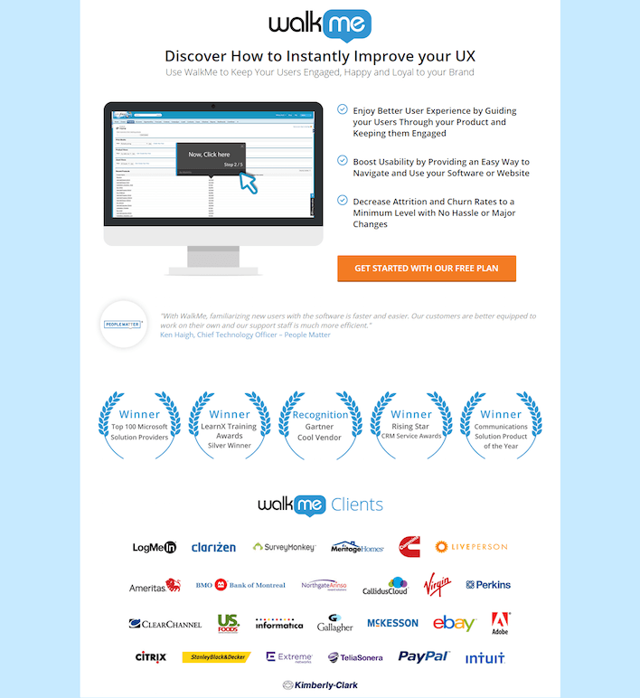
The good stuff:
- Client and award badges position WalkMe as an authority in their field.
- The testimonial on the page boosts trust.
- No points of exit can be found on this lead gen landing page at all. There’s no footer containing a navigation or social links that could take visitors off the page.
- The “free” aspect of the plan is emphasized on the CTA button
- The headline is clear, and benefit-oriented.
Room for improvement:
- The awkwardly capitalized copy is distracting. Capitalization like this is common in headlines and subheadings, but not in body copy. Stick to conventional grammar when composing your body copy, unless unconventional grammar enhances readability. In this case, it doesn’t.
7. Microsoft Small Business Academy

The good stuff:
- The CTA button color is bright, bold, and in your face. No chance of your eyes missing it here.
- Limited form fields are reasonable. They’re not asking for too much from you — simply your name, email, and home country.
- Guest photos here actually enhance this lead gen landing page. Putting a face to a name helps humanize the presenters of this webinar.
Room for improvement:
- Footer and social media links drive people away from the landing page when clicked. Including them is fine, but do it on your “thank you” page, not before the conversion.
- The CTA button copy is shockingly dull. Does “Register” actually make you want to click? How about something like, “Teach me how to boost profits”?
- The featured image could use more work. Does looking through the window at a tree inspire you to take action?
8. Traffic & Funnels
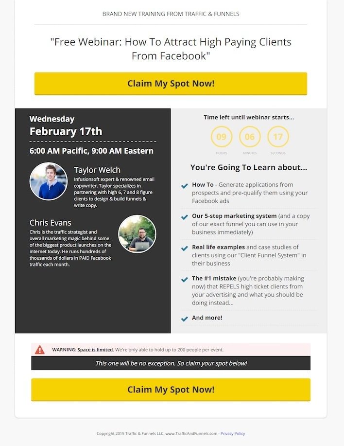
The good stuff:
- Two big, bold CTA buttons call out to readers to claim their spot.
- The warning message conveys scarcity. There are only 200 spots per event, and there will be no exceptions.
- The headline emphasizes “free” right off the bat.
- Short bios of the presenters help to establish authority quickly and effectively.
Room for improvement:
- The copyright notice on the bottom of the page says “2015.” Outdated information like that can make prospects ask questions like, “What else is outdated on this page? Is all this information accurate?”
- The countdown timer font color is hard to read. The bright yellow works well for the CTA, but not so much for the timer.
9. Likeable Local
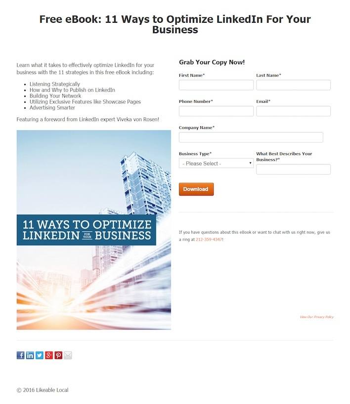
The good stuff:
- The headline mentions that the ebook is free. Who doesn’t love free stuff?
- The click-to-call phone number makes contacting the business accessible to people on their mobile phones.
Room for improvement:
- The awkward form field “What Best Describes Your Business?” is confusing. What does that even mean?
- The lack of information about LinkedIn “expert” Viveka von Rosen makes me question her authority. Why should I care about a foreword from her? Why is that valuable? What does she look like?
- Social share buttons before conversion aren’t a good idea. Your prospect needs to make sure your ebook is valuable before they recommend it to their friends and followers.
- Sparse copy is usually a good thing. But here, we could use a little more explanation about what we’re getting when we download. What is “Advertising Smarter?” How will my business benefit from “Listening Strategically?”
10. ReachLocal
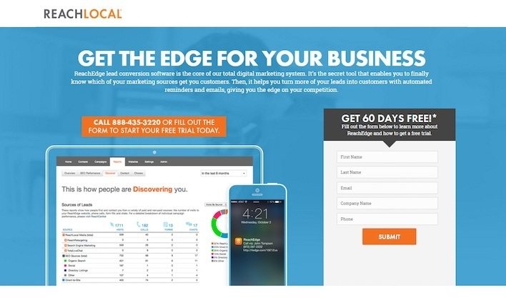
The good stuff:
- Images provide value on this lead generation page. They give an inside look at how the service works.
- Bullet-point copy is informational, but concise — letting visitors know what they need to do without boring them.
- The video on the bottom of the page demonstrates how the product will help customers’ business in an entertaining way.
Room for improvement:
- Competing calls-to-action cover this page. One wants me to download an info sheet, the other wants me to sign up for 60 days free, and the last wants me to take a tour. What’s the goal of this page?
- The phone number isn’t click-to-call. This is easy to fix, and a big draw for mobile browsers.
- “Submit” CTA button copy is a big friction word. Who wants to “submit” to anything?
11. Zillow Premier Agent

The good stuff:
- This page is short, sweet, and to the point. There’s minimal copy, but it powerfully displays all the benefits of becoming a Zillow Premier Agent.
- It uses data to back up its claims. You can get 26x more leads than non-premier agents, and engage with millions of home shoppers on the largest real estate network on the web.
- The headline is straightforward, and the benefit is clearly stated.
- The privacy policy underneath the CTA lets visitors read about Zillow’s terms if they are concerned about their information being shared.
Room for improvement:
- The phone number underneath the CTA is not clickable.
- The CTA button copy is very dull. Does it get any more cookie-cutter than “Learn more?” How about something like “Get more leads” instead.
- The headline and form could be moved down a little bit so they can “breathe” from the top of the page.
12. iPro Academy
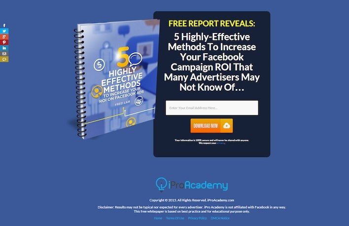
The good stuff:
- The headline indicates you’ll get powerful industry trade secrets that not even professional advertisers know.
- The copy underneath the CTA button indicates that your information is completely safe.
- It only has one form field that visitors need to fill out to claim the ebook. The fewer there are, the better chance an offer gets claimed.
Room for improvement:
- This page relies too much on the curiosity factor to get people to download the ebook. What are these highly-effective methods? How will I benefit? Are they relevant to me? These are all questions I have that aren’t answered on this lead gen landing page because it has too few words.
- iPro Academy is linked to the homepage, which acts as an exit point.
- The copyright is outdated. This is 2016, people. Let’s get with the program.
13. Yellow Pages Marketing Solutions

The good stuff:
- This first-person, action-oriented CTA button engages the reader and displays the benefits of clicking.
- The headline emphasizes the free offer.
- The photo to the right provides value by giving people an idea of what their listing might look like.
- The phone number is click-to-call, making it easy for mobile browsers to reach representatives at the company.
Room for improvement:
- The copyright is outdated. What else on this page could be incorrect?
- The page seems unbalanced with the bottom left corner of the page being empty. Why not move the CTA button and phone number below the window in the background? Doing this would help isolate the button and attract more attention.
14. Perkville

The good stuff:
- The copy is short, bulleted, and results-oriented.
- A mini case study of O2 Fitness is included on the page, complete with data to support the company’s claims on this lead generation landing page.
Room for improvement:
- The background image is not relevant to the headline. Where in the picture is anything related to bikes?
- The image also appears pixelated and blurry, and the bullet points are covering the woman.
- This CTA button is more like a “snooze” button. “Learn more” and “submit” are the most boring words you could in a call-to-action.
- Copyright information is yet again outdated.
- A footer is included, giving all visitors a way out.
15. Workable

The good stuff:
- The “free” status of the offer is emphasized in numerous places on the page.
- Badges of popular job boards help associate this company with some very well-known, and trustworthy businesses.
- Social media sign-in makes filling out forms non-existent. Click one button and watch all the form fields populate themselves.
- Screenshots on this lead generation landing page give the visitor an idea of how the software works.
Room for improvement:
- The Intercom logo at the bottom of the page is missing.
- The CTA button at the bottom of the page could be larger, encouraging visitors to sign up.
16. Litmus

The good stuff:
- There’s only one form field on this page, so I don’t have to give up too much to get the report in return.
- The copy is comprehensive, but concise — letting me know all the benefits of downloading the report.
Room for improvement:
- There’s only one form field… but what exactly does this form want from me? I assume it’s an email address — but I shouldn’t have to assume. This should be straightforward and easy to understand.
- There’s an exit point in the second paragraph, linked to the term “email analytics.” Don’t give people a chance to leave your landing page (without converting) like this text link.
17. Drop Ship Lifestyle
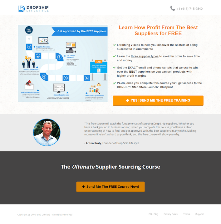
The good stuff:
- “Free” is mentioned in big bold letters in the headline.
- The photo serves as a visual guide to help people understand the benefits of the training.
- Copy is short, bulleted, and informational.
- The logo is not clickable – therefore, there’s no way for the prospect to escape to your homepage without converting.
Room for improvement:
- The phone number is not clickable.
- The text on the image is too small to read. What good is a visual aid if you can’t read what it says?
- The footer includes a handful of links off the page, increasing the chance your prospect leaves before entering their information.
18. Acquisio
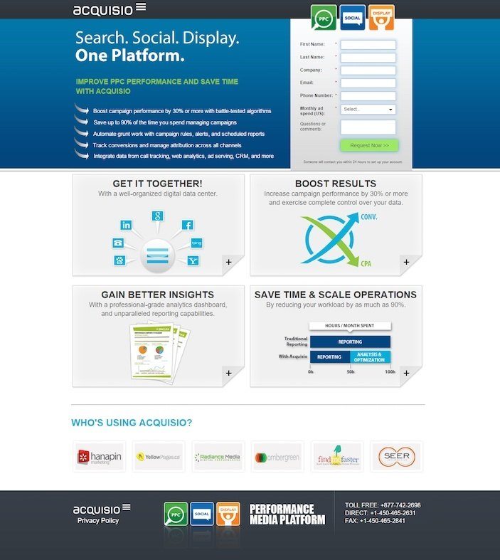
The good stuff:
- Great stats back up all their claims. Save up to 90% of time, and boost campaign performance by 30%. back up all their claims. Save up to 90% of time, and boost campaign performance by 30%.
- Company badges let visitors know that other big names are using their service.
- Interactive media on the page expands when clicked. If I want to learn more about how acquisio boosts results, or saves time, all I have to do is click the boxes in the center of the page.
- The copy below the CTA button lets prospects know what will happen after they convert on the form.
Room for improvement:
- Both Acquisio logos are linked to the homepage. Don’t let prospects run!
- “Request Now” is yet another example of boring button copy.
19. Megalytic

The good stuff:
- Concise copy gets across that this is a simple, quick Google Ads reporting solution.
- The CTA button copy mentions the free offer.
Room for improvement:
- This punny headline is confusing. What is the copywriter trying to say here? The reporting tool makes businesses pennies? Whatever it is, it distracts from the message they’re attempting to get across. Wordplay is better used elsewhere than a landing page.
- The email opt-out below the CTA with the box already checked is sneaky. If you want to generate a valuable email list, let people opt in instead of opting out.
- The cartoon image of a man holding a tablet is worthless. Replace it with some shots of your actual product in action to get more value from your image.
- There’s no proof that this is the industry’s favorite reporting tool. Show me some badges of your clients to convince me that it is.
20. Smart Cybernetics

The good stuff:
- The “Google Partner” badge aligns the business with one of the most recognized brands in internet marketing.
- The phone number in the upper right-hand corner is click-to-call.
- The copy briefly explains all the benefits of hiring the agency.
- The woman above the form acts as a visual cue to fill out the form fields.
Room for improvement:
- Logos in the featured image look pixelated and blurry.
- The world’s best designers, in all likelihood, do not work at Smart Cybernetics. So the business shouldn’t claim that they do.
- Copyright information is outdated.
21. WordStream

The good stuff:
- A unique service that allows people to get their Google Ads performance graded for free is a big draw.
- There’s only one form field on this page that the prospect needs to complete to get their Google Ads grade.
- The headline promises a grade in just one minute. You can’t compete with results that quick.
- The “Safe & Secure” message underneath the CTA button lets prospects know they won’t have to worry about their personal information ending up in the hands of anyone but WordStream.
- The Google AdWords “Premier SMB Partner” badge creates trust.
- Company badges showcase the media outlets that WordStream has been featured.
- Testimonials from industry thought leaders position WordStream as an authority in the space.
Room for improvement:
- The page is very copy heavy. The further you scroll, the more words you see and the more overwhelming the page gets.
- Too many links on the page take prospects from this lead generation landing page to dozens of other pages.
22. Portnox
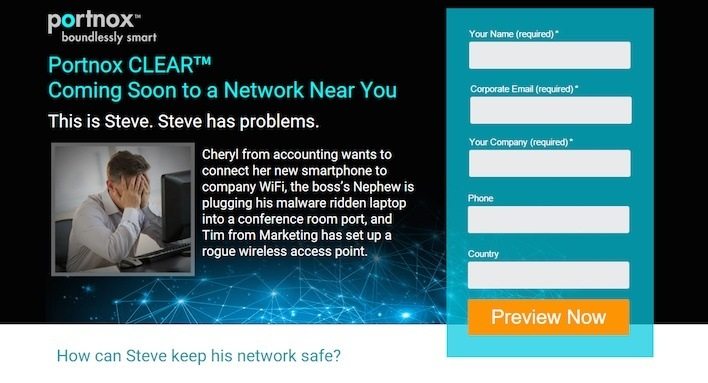
The good stuff:
- The business offers a preview of the software in exchange for your personal information.
- The copy is relatable. IT staff everywhere can probably relate to what Steve is going through.
- A testimonial showcases a happy Portnox customer.
Room for improvement:
- These colors hurt my eyes. You want your CTA button to be the most attention-grabbing thing on your page. In this case, it’s competing with a number of other elements.
- The headline, “Coming Soon To A Network Near You” does not convey a benefit. The copy is relatable, but the headline is unremarkable.
- Social media buttons at the bottom of the page could funnel prospects away from this lead gen landing page.
23. Playbuzz

The good stuff:
- The headline and sub-headline are powerful, leveraging social proof, then clearly stating the company’s value proposition.
- The screenshots below the fold showcase all of the different ways you can create and embed viral content with Playbuzz.
- Powerful statistics highlighted on the page point to positive results for their partner publishers.
- Company badges highlight some of the big-time partners that publish using Playbuzz, like HBO, Huffington Post, MTV, USA Today, Mashable, People Magazine, and Major League Baseball.
- Images contribute to the persuasiveness of the page. They’re more than just placeholder stock photos. They give the customer a preview of what content published through Playbuzz actually looks like.
Room for improvement:
- A testimonial or two from one of those well-known partners could potentially do wonders for Playbuzz’s conversion rate. That being said, there’s little else we could find wrong with this landing page. It’s easily one of the best on our list.
24. Infusionsoft
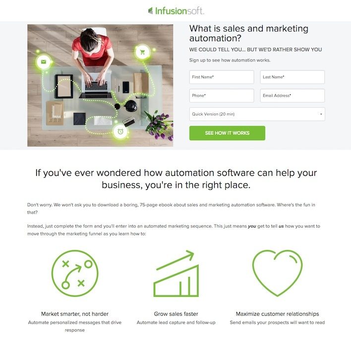
The good stuff:
- This unique approach puts prospects in the company’s marketing automation sequence to show them from a user standpoint how the service works, instead of just talking about it.
- Copy is super brief, displaying the benefits of using marketing automation in a sentence for each of the three bullet points.
- The lead gen form explains exactly what will happen after you convert.
- Badges of well-known companies create trust.
- No credit card required helps encourage more free demo signups
Room for improvement:
- The stock image and graphic combination can be a little misleading to visitors.
- The Infusionsoft logo is clickable, and leads prospects to the company’s homepage.
25. Expert Market

The good stuff:
- The form allows people to check boxes instead of having to fill out all their information manually, making it much easier to complete.
- Copy is very brief, but also powerfully conveys the benefits under “What are the benefits?” section.
- “It only takes a minute” lets visitors know that comparing phone systems won’t steal a chunk of valuable time from their day.
- Badges showcase where Expert Market has been featured, and who they have done business with to boost authority.
Room for improvement:
- “Compare Telephone Systems Prices” is a bad headline. Instead, they should’ve used the text in that blue arrow to create a headline that reads “Save Up To 60% By Comparing Telephone System Prices.”
26. Spiceworks
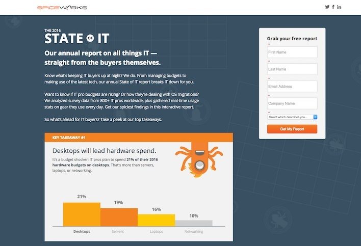
The good stuff:
- The key takeaways section gives people a preview of what the report contains.
- The CTA button copy is different, and unique. While “Let’s Go” wouldn’t be our first choice, it’s still better than “Submit” or “Download” or “Request Access.”
- The form scrolls with you. Nice touch, Spiceworks!
Room for improvement:
- The form is rather small compared to the takeaways. The takeaways are great, but most of the attention is on those three boxes and not the form.
- Social media share buttons are not as valuable before the conversion as they are afterward. Most people want to know how worthwhile your resource is before they share it on their social networks.
- Animated creatures: What value do they add to the page?
- The logo is linked to their homepage.
27. Vertical Measures
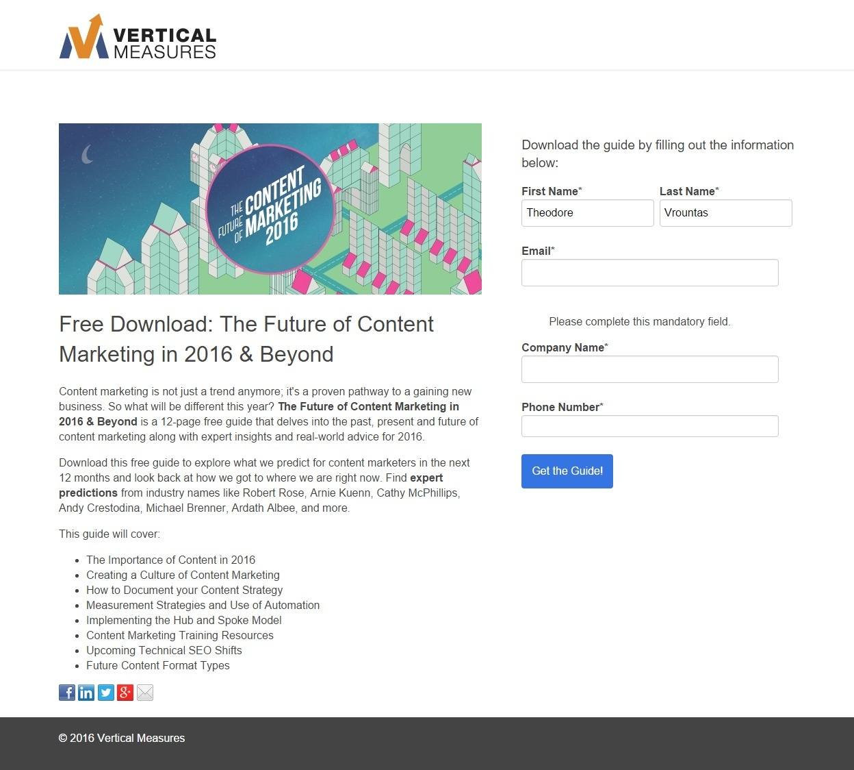
The good stuff:
- The page is not connected to the website’s main navigation.
- The copy outlines exactly what’s in the report, and mentions several industry thought leaders who contributed to it.
- The headline covers the fact that the report is free to download.
- Copyright information is up-to-date. You would think this would be the case on every landing page, but as you saw earlier, that’s not the case.
Room for improvement:
- CTA button should be larger so it’s not missed by anyone who visits this page.
- Social share buttons are more valuable on the “thank you” page than the lead gen landing page.
- The logo links to Vertical Measures’ homepage.
28. Varonis
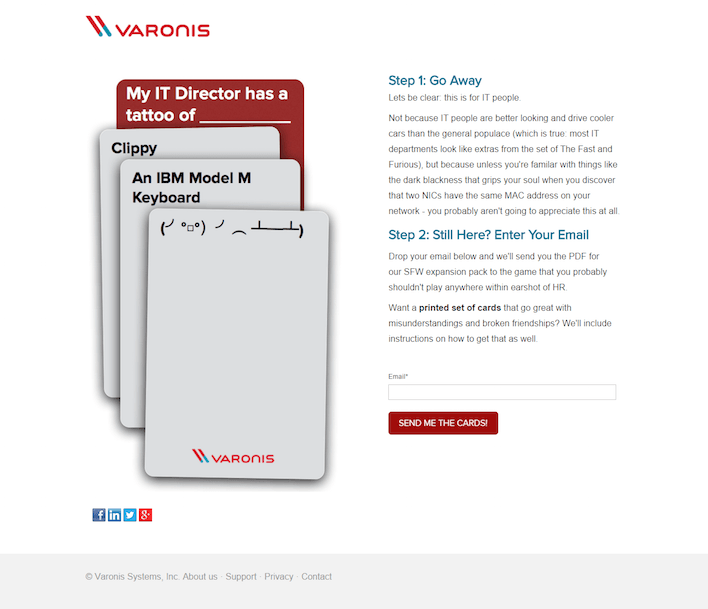
The good stuff:
- The CTA button copy may be the best in this whole list. Its written for the prospect and uses language relevant to the offer.
- They only ask for email, which means I’m more likely to give them what they want.
Room for improvement:
- The offer is pretty vague because it makes me wonder what Varonis is advertising here. This entire lead generation landing page seems to be geared toward the cards, but in the copy I’m told that I’ll get a game sent to me instead of the cards. But then the CTA button copy says “Send me the cards”?
- Also, what are these cards? Are they a variation of Cards Against Humanity for IT people? I don’t fully understand.
- Too much jargon makes this page nearly impossible to decipher. What’s an SFW? NIC? MAC address?
- Social share buttons are again included too early in the conversion funnel.
29. The Hoth

The good stuff:
- A strong headline clearly highlights the reasons to submit your information on this lead gen landing page.
- “Free” is mentioned in the headline and above the form.
- The CTA button contrasts the rest of the page very well. There’s little to no chance somebody skips over this button.
- The CTA button copy is written for the visitor, in first person. Instead of “Get access” or “Get Your Free Access,” it says “Give Me Access.”
Room for improvement:
- More white space would allow the headline, image, and form to all breathe more — encouraging more conversions.
- Footer links guide me away from the landing page — to The Hoth’s homepage and the contact page.
30. The Appointment Generator
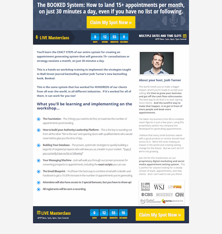
The good stuff:
- The headline conveys the quick and easy benefits of signing up for the webinar.
- A bright, bold button that contrasts the rest of the page and draws the attention of the user.
- The countdown timer creates a sense of scarcity in the mind of the visitor. When we know time is running out or supplies are limited, we’re more likely to take action to reserve our spot or claim our product.
- Bullet-point copy makes the landing page easier to read than if it were in the traditional block text format.
- Badges create a sense of trust by essentially saying “These big, important companies trust us, so you should too.”
Room for improvement:
- Too much text makes this page a chore to get through, even if it’s separated by bullet points to make it more digestible.
How can you create the perfect lead gen landing page?
Steal all the good stuff from these 30 examples, and leave out all the bad. Sign up for an Instapage 14-day free trial today.

Try the world's most advanced landing page platform with a risk-free trial.
