The sale — it’s a marketer’s most coveted conversion, and you get this on the sales page.
All of the free ebooks you’ve offered, squeeze pages you’ve created, and the social media campaigns you’ve run have led to this one transaction. If you’ve managed to complete one, pat yourself on the back. You must have a great product, and you must have marketed it well.
You see, getting a visitor to download a free ebook or sign up for your newsletter is much easier than soliciting a sale. They’re no-cost, low-commitment conversions.
But getting them to press the “buy” button? That’s a different story altogether.
It requires they part with money they worked hard for — that they commit, often with no promise of a refund if they’re unhappy, to your product or service, and the solutions you’ve guaranteed it will provide.
That means your offer is going to be highly scrutinized. And the more it’s scrutinized, the more persuasive you need to be.
That’s where sales pages come in.
What is a sales page?
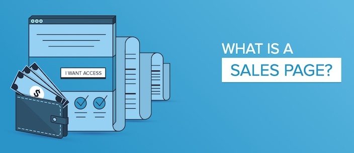
A sales page, like all landing pages, is designed with one purpose in mind: to convert. Unlike all landing pages, that purpose is specifically to convince visitors to buy.
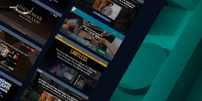
As such, they need to be extra convincing. That usually translates into longer pages, more social proof, a bunch of badges, and tons of testimonials. Take some tips from the following 20 sales pages to create a high-converting one of your own.
(Keep in mind, for shorter sales pages, we’ve shown the entire page. However, for longer pages, we only displayed above the fold. You may need to click through to the page to see some of the points we discuss and some examples may be A/B testing their page with an alternate version than is displayed below.)
1. Live Off Your Passion

What they did well:
- The short video gives an engaging overview of the service.
- The copy under the “Any of these sound familiar?” section empathizes with the readers.
- A strong guarantee allows buyers to get their money back if they’re not making a living doing something they love in 90 days.
- Several brief case studies of people who have turned their lives around reinforce the value of the program.
- Myriad detailed testimonials boost credibility.
- The FAQ section answers any questions prospects might have about the program.
- Multiple cooperative CTAs give the prospect a number of chances to convert.
- A bright call-to-action with unique copy draws readers to it.
What to test:
- The video autoplays. This can be a huge annoyance to anyone that lands on the page. If they want to watch, they’ll click play.
- The copyright is 2015. If this is page is old, is the offer still good? What else is out of date?
2. Copyblogger’s “Authority” Program
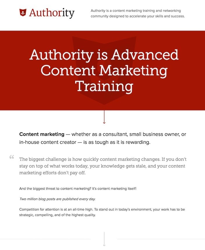
What they did well:
- Several CTA’s driving the same action work together to convince the reader to convert.
- Benefit-centric subheads break up the copy to make it easily readable.
- Testimonials from real people and their respective brands make for a persuasive addition to this sales page.
What to test:
- The headline doesn’t convey much of a benefit… unless you consider the tiny print above the red banner to be a headline. And even then “accelerate your skills and success” are vague benefits.
- Testimonials without photos are far less powerful than those with. Remember: the more information you include about someone vouching for your business, the more credible those people become to your reader.
3. Mobe Limitless
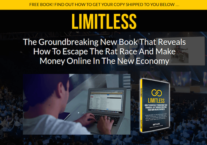
What they did well:
- The headline conveys a benefit that everyone desires: the ability to “escape the rat race and make money online.”
- The rags-to-riches story of the creator make the secrets to his success more valuable.
- Bulleted, benefit-oriented copy conveys the reasons to buy.
- The CTA button copy is written in first person.
- The call-to-action button color grabs the reader’s attention.
- The FAQ addresses any concerns or questions the prospect may have about the offer.
What to test:
- Cheesy stock photos hurt the credibility of the page.
- Testimonials — where are they? People who have changed their lives with the product would make the offer more persuasive.
4. The Renegade Diet
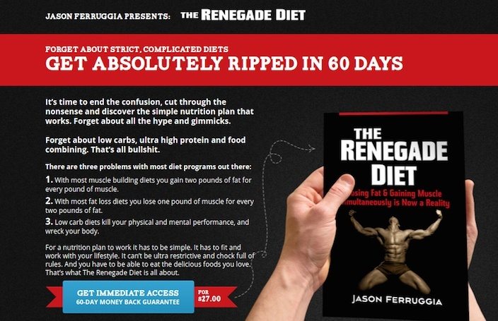
What they did well:
- The headline takes advantage of our desire for quick results: “Get Absolutely Ripped In 60 Days.”
- The 60-day money back guarantee makes prospects more comfortable with purchasing.
- Authority badges flaunt where the author has been featured.
- Bulleted copy makes the page easier to read.
- Case studies prove that the program works. Not only that, but the writer takes it to the next level by offering to put you in touch with them.
- Industry experts offer praise for the book as well, giving it even more credibility.
- No navigation makes this sales page impossible to leave without exiting the browser window or clicking a CTA.
What to test:
- The CTA button doesn’t look like a button at first glance. It’s not part of a red and blue banner?
- The arrow, instead of pointing back to the CTA, points to an image of the book itself. Use visual cues to get your reader to hit your CTA button, not draw them away from it.
5. Social Triggers

What they did well:
- A countdown timer to close of enrollment conveys scarcity.
- Without outbound links, this page offers no way out other than through or by exiting the window.
- Several short case studies highlight people whose lives have been changed by the program.
- Sub-headers and short paragraphs make the long page more easily readable.
What to test:
- The headline doesn’t convey any sort of benefit whatsoever.
- The countdown timer only appears after you scroll down the page. If you don’t scroll, you don’t see how much time remains.
- The page talks a lot about the author. Tell me more about what you’re going to do for me.
- The CTA button color is a derivative of a color already used on the page, making it less likely to stand out.
- There are no CTAs until ¾ of the way down the page. Why not give visitors a way to convert sooner on the page?
- The call-to-action button copy is cookie-cutter. Instead of “Get Instant Access,” why not “Teach Me How?”
6. AdEspresso University

What they did well:
- No navigation links means no immediate way off this page.
- Icons quickly convey the components of the course.
- CTA button color is a hue not used on the page.
- This is a simple, benefit-oriented headline. AdEspresso University makes social marketing easy. At the same time, be careful with superlatives like “best.” They’re only effective if you can back them up.
What to test:
- The cartoon man could be swapped out for a real customer who has used AdEspresso University to improve their social marketing.
- The CTA button copy is unremarkable.
7. Video Power Marketing

What they did well:
- The blue CTA button stands out on a grey background. Though, blue is used a few times throughout the page. When picking a CTA button color, opt for one that hasn’t been used.
- Testimonials complete with full names, titles, and photos are as believable as they get.
- The short video gives a brief overview of the benefits of purchasing.
- A 30-day money back guarantee makes prospects more comfortable buying.
- Bulleted copy boost readability on this page.
What to test:
- A navigation menu gives people a chance to leave the page.
- The page leads with a high price. Show your prospects the price after you get to all the benefits of buying.
8. Digital Marketer

What they did well:
- The headline and sub-headline convey value. The buyer will learn how to become a funnel optimization specialist, creating a profitable “customer-getting” campaign.
- Bulleted copy immediately conveys the benefits of purchasing the course.
- Images and sub-heads break up the copy to make it more digestible by the reader.
- Visual cues like arrows point to the CTA buttons.
- Multiple CTA buttons work cooperatively to produce conversions.
- The FAQ section preemptively answers any questions a prospect may have about the course.
- No navigation means there’s no escape for any prospect seeking a way out.
What to test:
- CTA button colors are less than attention-grabbing.
- Call-to-action copy is cookie cutter. “Order now” could be replaced by something like “Make Me A Specialist!”
- The “About the Instructor” section is missing an image. Visitors will want to know who Ryan Deiss is, but without his headshot, we’ll never know.
9. Mari Smith

What she did well:
- Facts and relevant research set the stage for a persuasive page.
- Mentions of big brands the author has worked with, like Facebook, give her more authority.
- Bulleted copy conveys the benefits of purchase.
- Social share buttons make it easier for readers to send this page to their friends.
- Testimonials featuring names, titles, and photos make them very believable.
What to test:
- These CTA button colors are used all over this page. Thus, they’re less likely to grab prospect attention. Remember the rules of color theory here: If your two main hues are blue and orange, then you should pick a complementary color for your CTA button to make it more attention-grabbing… like red-purple or yellow-green (square color theme).
- The benefit in the headline is expressed, but it’s not as clear as it could be. What does “winning” Facebook’s updates mean? What will knowing internet trends that affect my business help me do?
10. Brightpeak Financial
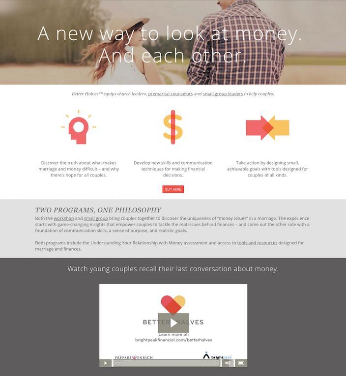
What they did well:
- A video demonstrates the power of the course by combining testimonials and case studies from real customers.
- Social media share buttons make this page easy to pass on.
- Icons quickly display the benefits of the program.
What to test:
- Several links throughout the page give readers the opportunity to leave.
- The headline doesn’t convey a benefit. What does “A New Way To Look At Money And Each Other” mean?
- The CTA button is tiny, and it’s the same color as many of the elements already on the page, which means it won’t stand out nearly as well.
11. Living Language

What they did well:
- The CTA button colors aren’t used anywhere else on the page — making them easier to see.
- Authority badges from HBO and critically acclaimed show Game of Thrones, along with features on big websites align this course with well-known brands.
What to test:
- There are too many CTAs on this page: several to buy different products, one to subscribe to an email newsletter, and one that takes the visitor back to Living Language’s homepage. Pick one action you want your prospect to take.
- The CTAs are very small so they’re not as easily noticeable as they could be.
- Social media icons drive visitors off the sales page to the brand’s Facebook and Twitter account.
- The logo is clickable, adding yet another hole to an already less than air-tight sales page.
12. Dr. Hyman’s Eat Fat, Get Thin

What they did well:
- The headline, while not displaying a benefit, invokes curiosity and intrigue. Forget everything I’ve been told about fat? Tell me more…
- The “As seen on” section associates this offer with big brands like PBS, CBS, The View, and more.
- Well-written subheads capitalize on our desire to be in shape without working for it: “Eat fat, get thin.”
- “Our results” presents real, positive data from participants of the program.
- Several testimonials from people who have completed the challenge boost the credibility of the offer.
- Bulleted copy displays the benefits of Dr. Hyman’s program, and empathizes with the reader.
- The “What’s included” section offers a glimpse into the offer before the purchase.
What to test:
- The “Learn More” button takes visitors directly past all the persuasive parts of this page, all the way down to the CTA. Only problem is, they’re probably not ready to buy yet.
- A clickable logo at the top of the page draws readers away to a different landing page.
- A second, combating call-to-action in the upper right-hand corner of the page drives the visitor to an Amazon or Barnes & Noble store.
13. Player by Keith Urban
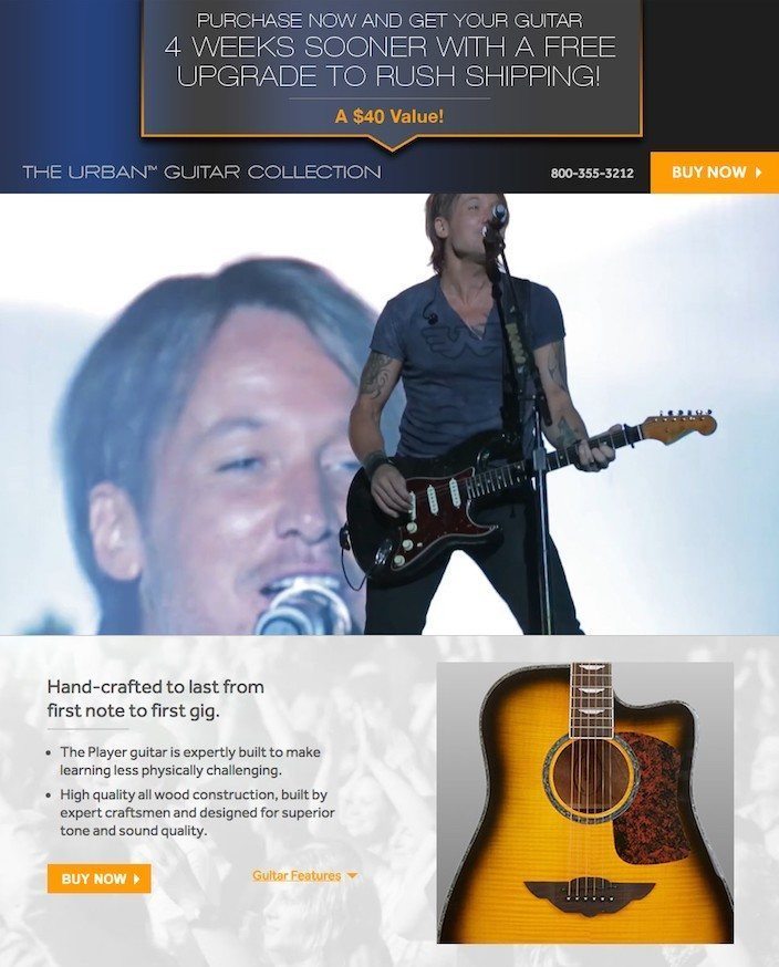
What they did well:
- The two-minute video introduces the benefits of the offer, and interviews several satisfied customers.
- Drop-down links allow the reader to get an inside look at the program before they buy: guitar features, playlists, lesson previews, etc.
- The CTA button color pops against the dull background of the page.
- Numerous cooperative CTAs give prospects several chances to convert.
What to test:
- The CTA button copy could be more compelling than “Buy now” and “Order now.” What about “Make me a guitarist”?
- The headline emphasizes free shipping, but not the benefit of the program. What will the reader become by claiming this offer?
14. Beach Body 21-Day Fix

What they did well:
- No top navigation means there’s no immediate way off this page.
- The photo of the creator of the program with a celebrity client aligns the offer with a high-profile brand.
- The headline let’s you know what to expect from the program: Simple fitness, Simple eating, Fast results (the benefit).
- Several engaging videos tout the benefits of the program.
- Useful images give readers an inside look into the components of the 21-day fix.
- The 30-day money-back guarantee makes prospects more comfortable with pulling out their wallet.
- The CTA button is big, bold, and its color stands out from the rest of the page.
- Several cooperative CTA buttons give prospects more than one place to convert.
- The call-to-action is written engagingly in first person.
- Case studies show the positive results users have experienced after 21 days.
- Testimonials complete with photos and names add credibility to the offer.
- The “like” counter/button in the upper right-hand corner adds to social proof (438k people like this), and other social buttons make this page easily shareable.
What to test:
- There are too many outbound links in the footer of this sales page. Don’t let your prospects access your homepage, “about us,” or site map.
- The 2015 copyright makes me wonder if the offer is still available.
15. Foodbabe Sugar Detox

What they did well:
- A question headline that you know a reader will answer “yes” to in their heads will help them relate to your offer. Obviously you’ve been eating too much sugar lately. That’s why you clicked through to this sugar detox program.
- Without a top navigation, visitors have to either exit the browser window or hit the back button to leave this page immediately.
- Social buttons make this page more shareable.
- The copy educates — destroying preconceived notions we have about our diets by revealing we eat more sugar than we think.
- Images give the reader an inside look into the program.
- Bulleted text outlines the benefits of the detox program.
- The 100% money-back guarantee should quell any anxiety a prospect has about buying.
What to test:
- The overuse of cues like underlines and bolded letters make this page very busy and confusing. These are used to create a visual hierarchy. If everything is bolded and underlined, then how do I know which information is the most important? Keep in mind, the more cues you use like this, the less meaningful they become.
- Links in the footer allow the prospect to leave the page after scrolling to the bottom.
- These CTA buttons are easily missable with their slight design and colors that are already used on the page.
16. Tai Lopez

What they did well:
- There’s no top navigation on this page, which means the only way to leave is by exiting the browser or hitting the back button.
- The headline is compelling, but a little on the sensational side. Get anything I want? Yes, please. Make sure if you use a headline like this, your offer can deliver on it.
- The phone number at the top is click-to-call, meaning it will be easy to call from mobile with the tap of a button.
- The video introduces the offer and its benefits, as well as the rags-to-riches story of the creator, making him more relatable to the reader.
- A counter of program members adds social proof, along with social badges with follower and fan numbers.
- Authority badges from Bravo, TEDx, USC, and NBC align Tai with powerful brands.
- Photos show Tai speaking at big events, adding to his credibility.
- A money back guarantee squashes reader anxieties related to the program’s price point.
What to test:
- The CTA button color is used numerous times on the page already, making it less noticeable to the eye.
- The video is a little on the long side. When introducing your offer, try to keep it under three minutes.
17. Intentional Blog

What they did well:
- The headline promises value — and end to the frustrations of building a popular blog.
- The video is short and gets to the point — quickly explaining the benefits of buying the course.
- Bulleted copy promises to divulge secrets learned by Jeff, the author, after eight years of blogging.
- The CTA button color pops against a gray background.
- Several CTA buttons give readers multiple chances to convert.
- Top navigation normally translates to an exit from the page — but, these links just bring readers deeper into the sales page, not off it.
What to test:
- Testimonials are powerful, but not if they seem like they could potentially be fake. Surely Andrew Z., Joe B., and Sheila L. are all real people who may want to remain anonymous, but the less details you provide about someone vouching for your business, the more prospects wonder “Is this person real?”
- The call-to-action could be stronger. “Sign up,” along with “Subscribe” and “Submit,” is one of the most overused CTA’s out there. It’s better to make yours unique — something people have never seen before — tailored specifically to your offer. What about “Teach Me To Build A Popular (Or Powerful) Blog!” or “Show Me The Secrets To Successful Blogging?”
18. AWAI
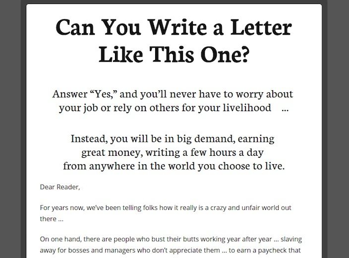
What they did well:
- The question headline engages the reader, then the sub-headline conveys a number of benefits: earn great money by writing a few hours a day, be in high demand, never rely on anyone again, work from anywhere in the world.
- Multiple cooperative calls-to-action give the reader more than one chance to convert on the offer.
- Sub-heads and short paragraphs make the copy easier to digest.
- No navigation means the only way off this sales page is through it (or by exiting the browser window or hitting the back button).
- Testimonials from people who have gone from knowing nothing about writing to living “the life they’ve always dreamed of” make readers think “If he can do this, so can I.”
What to test:
- This letter is unbelievably long. While it’s certainly written in a compelling way, 11,000+ words is really pushing the limits of our sub-ten-second attention span.
- The CTAs are more than ¾ of the way down the page. Since the page is very long, make it easier for people to convert on the offer by including at least one CTA further up the page.
- The CTA button copy reads “Order Today.” After reading such well-crafted copy, we know AWAI can think of a better call-to-action.
19. Write With Influence
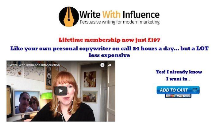
What they did well:
- A short video explains the value of the program quickly.
- Bulleted lists break up the copy so it’s easier to read.
- Sub-headers convey the benefits of buying, like “No ‘sales speak’ templates: the materials are tailored to your business and personality (and grow with you)”
- Numerous testimonials make Amy’s offer more credible. Though, some photos would make them even more powerful.
What to test:
- The page kicks off with a price. Never start your sales page with the price of your product if it’s expensive — even if your prospects are getting a bargain. Why? Because it has the potential to drive away your reader before they get to all the benefits of buying in. “197 pounds (286 dollars)? I can’t afford that. No way.” Then in one click, they’re gone.
- The sub-head fonts are quite thick. In some cases, so much so that text is difficult to read. Remember — readability is crucial for a positive user experience. So make sure your letters are easily discernable from one another.
20. Empower Network
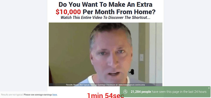
What they did well:
- The video is short, to the point, and uses actual customers to boost its credibility.
- The disclaimer fosters a sense of transparency. “Results are not typical” is not something you’re used to seeing on pages like this one.
What to test:
- The headline is sensationalized. Few sane people are going to believe they can make “an extra $10,000 a month” from home.
- The video autoplays. Don’t force your video on visitors. If they want to watch it, they’ll click play.
Find out how you can create sales pages that boost conversions and increase business growth by signing up for an Instapage 14-day free trial today.

Try the world's most advanced landing page platform with a risk-free trial.
