
In today’s digital age, it’s more important than ever to be readily available to your customers. Luckily, it’s also more possible than ever with live chat post-click landing pages.
Businesses are making themselves available on a wide variety of platforms at multiple touch points throughout the marketing and sales funnel. There’s automated text messaging, live chat on Facebook pages, live chat web pages — the list is endless.
That’s because having relationships with your website visitors, leads, and customers are more critical than many people realize. The importance of personally connecting with potential and existing customers wherever they are and whenever they reach out is a fundamental part of the business process. Building a relationship or connection with a website visitor can provide them with the trust and encouragement needed to become a valuable lead or customer.
Using live chat software on your post-click landing pages, in particular, provides you with even more opportunities to capture leads. On these pages, where first impressions are pivotal and visitors evaluate your brand and offer within seconds, having a support representative readily available to answer questions can make all the difference.
In short, live chat integrations allow you to connect with people faster and in real-time, to answer questions and persuade them to convert.
It’s important to note that live chat shouldn’t be exclusive on your post-click landing pages. This feature doesn’t replace your lead capture form or any other element on your page. post-click landing pages should still be created with a compelling headline, engaging visuals, and the long form story to gather basic info — live chat simply adds a connection, personalization, and convenience to help convert prospects more quickly.
In this article, we showcase 12 brands that have incorporated live chat into their post-click landing pages. Let’s take a look at how each one uses the feature to engage visitors and make the conversion process more efficient.
11 live chat post-click landing page examples
1. Home Chef
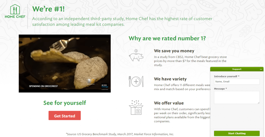
This live chat post-click landing page includes many of the most important post-click landing page design best practices.
It has an enticing headline with a supportive, explanatory subheadline. The video serves as an excellent way to convey information without making visitors spend a lot of time reading. The red CTA button contrasts well with the rest of the colors on the page, making it stand out to visitors (although the copy on it could be improved). Plus, the click-through design provides a more frictionless conversion process since visitors aren’t faced with a lead capture form right from the start.
The live chat, powered by Zendesk, acts as a catalyst for the conversion process as well.
Notice how when visitors click the chat feature in the bottom right corner, they aren’t immediately asked questions by a support representative. Instead, it’s up to the visitor to decide how to interact. They insert their name, email address, and their own personal message, and only then do they receive a response. Requesting an email address also helps Home Chef increase lead generation.
As far as improving the effectiveness of the widget, Home Chef may want to consider A/B testing it in a more contrasting color that stands out better, since the green blends in with the rest of the page.
2. Intercom
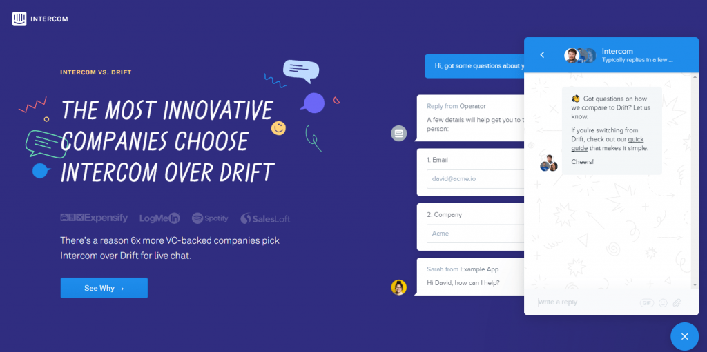
Here’s a post-click landing page on which Intercom promotes its own live chat software in comparison to Drift — one of its main competitors.
Although the page is easy on the eyes and aesthetically pleasing due to the monochromatic color scheme, this technique isn’t great for making the CTA buttons stand out, and is likely to decrease conversion rates.
Header and footer navigations, as well as exit links throughout the rest of the page, are also likely to reduce conversions because visitors tend to become distracted and leave the page sooner.
On the plus side, there’s a plethora of social proof and trust signals — company logos, numerical statistics, customer testimonials, privacy policy, etc. — that help to increase the chances that visitors will feel safe, secure, and compelled to convert on the offer.
The live chat further increases these chances, because it helps to build an even stronger relationship between the company and the potential customer.
Since this post-click landing page was built to compare Intercom to Drift, this message is delivered via the live chat, as well. Notice how it asks, “Got questions on how we compare to Drift?” and then offers a guide specifically to those who are switching from Drift.
An interesting component of this live chat is that it stores all previous conversations on your browser. Here’s an image of the widget when I returned to the post-click landing page three days later:
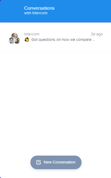
My previous conversation is still available, but I also have the option to start a new conversation. When visitors click the “New Conversation” button, they’re presented with a welcoming invitation to start a new conversation:
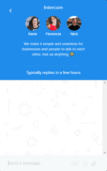
Along with the invitation, visitors see the names and headshots of who they might speak to, as well as an indication of how long it will take someone to reply.
3. MarketingProfs
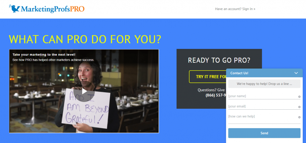
From the engaging video above the fold to the iconography with minimal copy to explain the benefits, to the ample social proof throughout the page, MarketingProfs does an excellent job at presenting its free trial offer with this post-click landing page.
The Olark-powered live chat is just another great component that supplements the rest of the powerful elements on the page. Similar to the first example, visitors aren’t immediately bombarded with questions by a support representative as is the case on some other live chat pages.
Again, the visitor initiates the interaction by entering their name, email address, and personal message, which helps increase lead generation. Plus, “We’re happy to help!” lets prospects know that the representatives are welcoming and friendly.
To make the live chat even more effective, MarketingProfs might want to consider A/B testing it in a color that better contrasts and stands out on the page so people notice it faster.
4. Freshchat
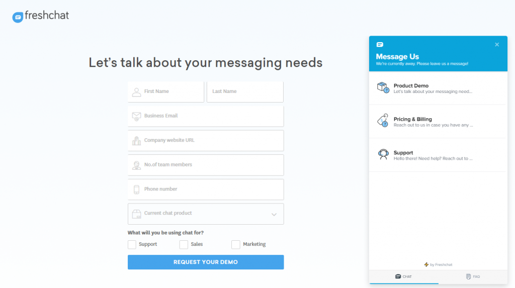
This Freshworks post-click landing page only includes a logo, headline, lead capture form, and CTA button. It doesn’t provide any valuable information about the offer whatsoever and could leave people wondering what’s even being offered.
It’s a good thing there’s a live chat here because it’s likely that visitors will have questions before they convert.
An interesting aspect of this example is that there are three specific categories on the chat that filter the visitor’s message to the right representative so they can get the most appropriate answer.
Another unique component is the ability to toggle between “Chat” and “FAQ”. By having an FAQ section (with categories and a search function), visitors may be able to find their answers more quickly than waiting for a response.
5. 3Q Digital
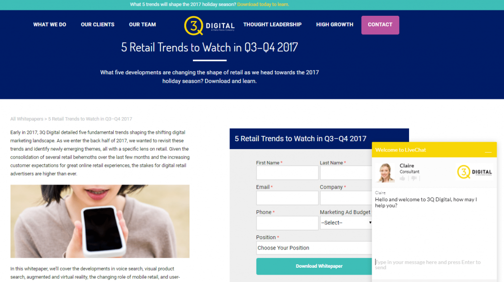
This post-click landing page could use some improvements, starting with the abundance of exit links, including header and footer navigations, links to many other white papers, and social media links at the bottom of the page. Also, the second form at the bottom of the page, and the purple “Contact” CTA button at the top of the page are both for different offers and could distract visitors from the main offer.
Conversely, the headline and subheadline are specific, informative, and work well together to provide prospects with just enough information to make them want more.
The form stands out because it’s encapsulated with color contrast and surrounded by sufficient white space — but the form could be more attention-grabbing. Currently, the “Contact” CTA button stands out more than the “Download whitepaper” CTA button because the color is more contrasting.
The yellow live chat on this page stands out well, though. Unlike the other examples we’ve seen so far, this one, powered by Greechat, contrasts with the rest of the page colors.
The consultant’s name and headshot are a nice touch as well because it’s nice to know who you’re talking to when building a relationship with someone.
In this case, no email address is required to start a conversation, which might result in less immediate lead generation, but more people reaching out and stronger connections being formed.
6. LivePerson
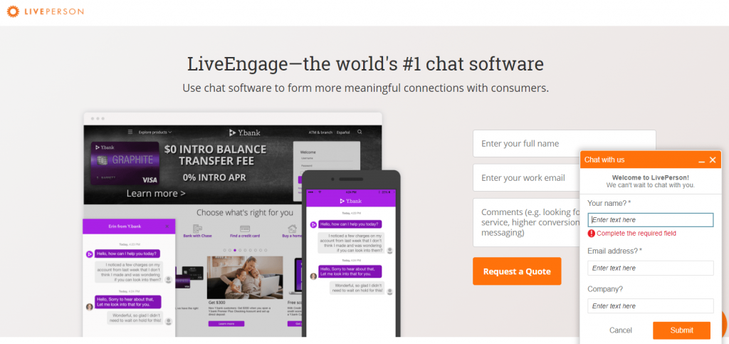
Aside from a hyperlinked company logo at the top of the page, and an outdated copyright date at the bottom of the page, LivePerson did a great job with this live chat post-click landing page. The images are clear and engaging; the form is short and easy to complete; the CTA buttons are optimized; the copy is broken up into small chunks, there’s a good amount of white space, and there’s a wide variety of social proof.
The orange live chat is likely to attract visitors’ attention quickly, just like the orange CTA buttons on the main post-click landing page.
Although the chat acts as a lead gen technique, it seems somewhat pushy and intrusive. People might be put off by the fact that there isn’t even a field to enter their question, and that they have to provide three pieces of information before sending their main message.
7. NICE inContact
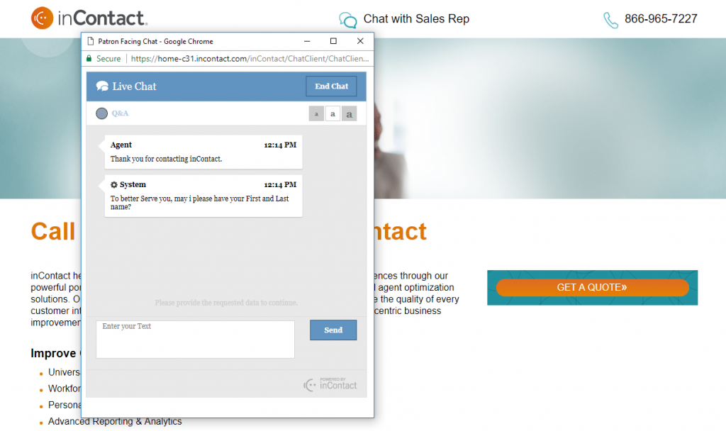
NICE InContact created this post-click landing page to promote their cloud-based call center software — the headline and the copy on the page make this clear. The video is an effective piece of social proof, letting prospects know that big-name companies, like New Balance, enjoy using NICE inContact.
Since this is a two-step opt-in page without an on-page form, the CTA button should really stand out more. Changing the colors to more contrasting ones, enlarging it, and redirecting the employees’ eye gaze to the button would all be great post-click landing page ideas to consider.
This example doesn’t have a typical chat widget. Instead, there’s a link at the top (and another at the bottom) that opens a separate live chat page. Since you want visitors to be able to engage in live chat while still browsing your post-click landing page, this isn’t the best design technique. Using a small overlay chat instead — as to not disrupt the user’s experience — is a better option.
Also, the nameless agent/system sent 7 messages in the 1-2 minutes I was on the page before it ended the conversation completely.
8. iland
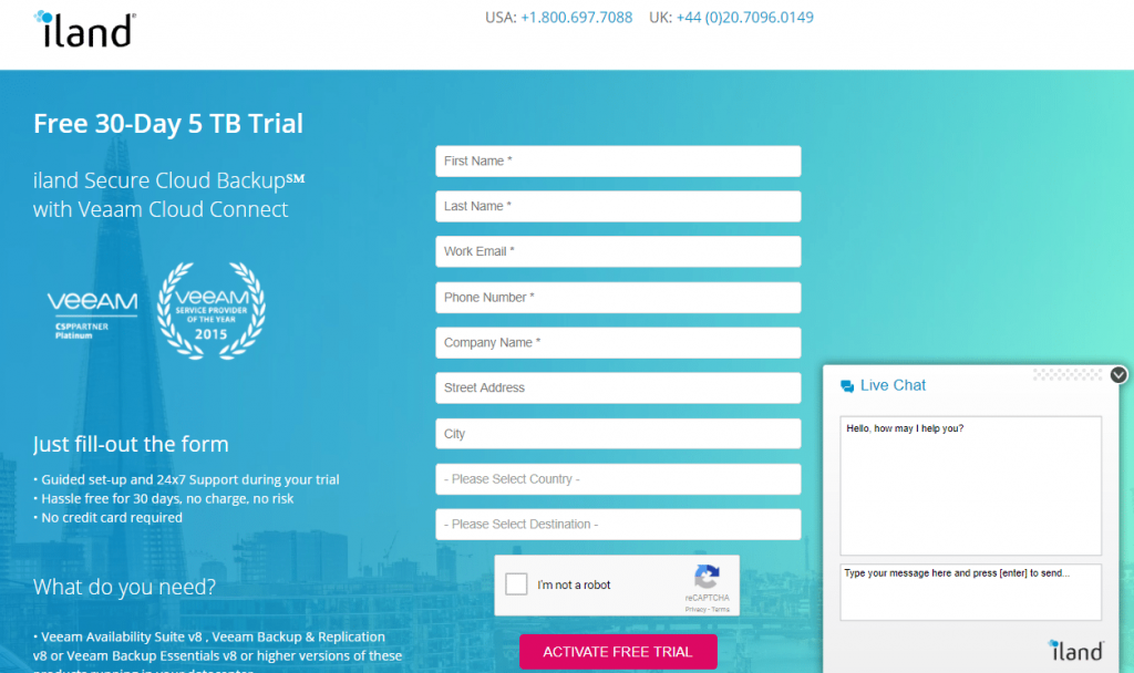
Here’s a free trial live chat post-click landing page from iland, and it’s a good one overall.
Click-to-call phone numbers improve user experience; the red CTA button pops off the page; clear images and interactive gifs help deliver content, and there’s plenty of trust signals and social proof (awards won, brand logos, privacy policy, a customer testimonial, etc.).
As far as elements to A/B test — 9 form fields could be intimidating, so a 2-step opt-in form or multi-step form might be a better idea. Also, removing all exit links (iland logo, the “complete hosted cloud solutions” section, and the website link in the footer) would likely keep visitors on the page longer.
This live chat started as a small tab on the right-hand side of the page. After a few seconds on the page, the chat window opened automatically.
An interesting characteristic of this example is that visitors can move the window wherever they want on the page to allow for a better UX.
Although iland might not get as many leads with their chat, the fact that it simply states “Hello, how may I help you?” is great for letting prospects know that they can ask/say whatever they want with no personal information required.
9. Lucky Orange
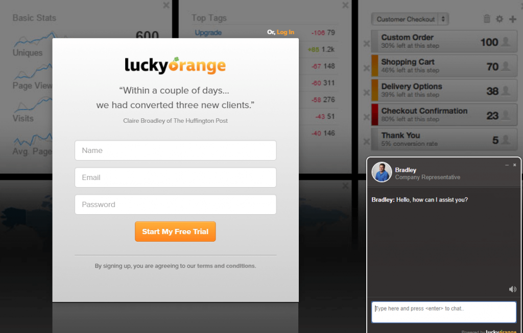
Here’s another post-click landing page, from Lucky Orange, that hardly provides any valuable information about the offer — only a customer testimonial, 3 form fields, a CTA button, and a preview of the software in the background.
Again, visitors are likely to have questions about this offer before they decide to convert, so it’s a good thing they included a live chat on the page.
The name and headshot of the support representative are nice inclusions, because they’re great for making people feel more connected to, and comfortable with, who they’re talking to.
Having a sound option provides a better user experience and adds to the level of comfort/connection as well.
To make the live chat better stand out, and probably be utilized more, contrasting colors could be added to the widget.
10. Velaro
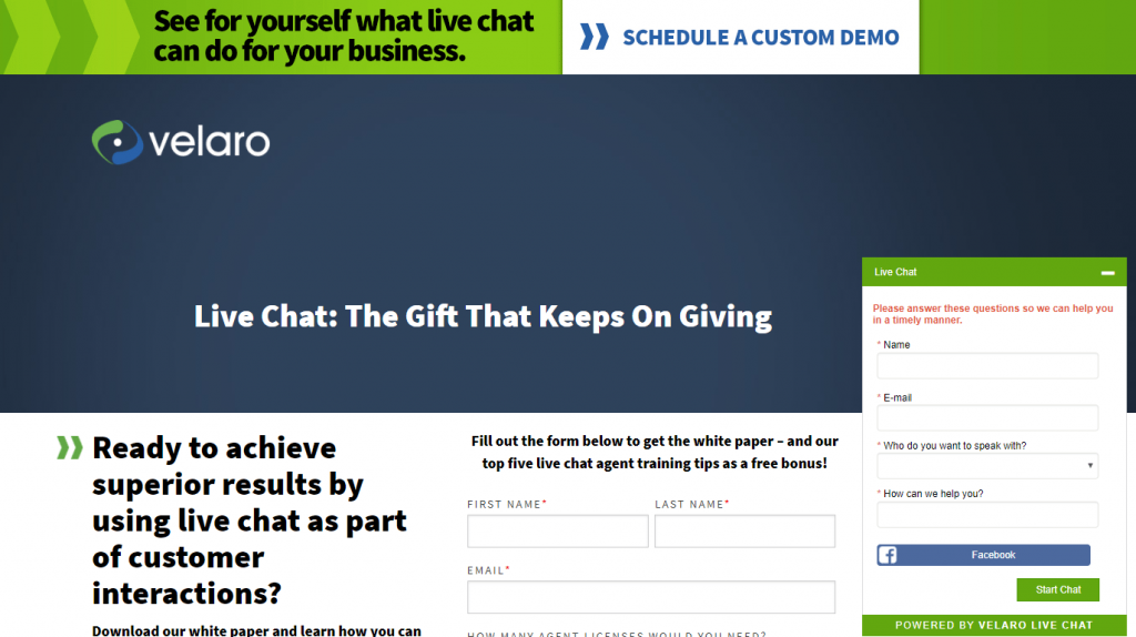
Velaro created this post-click landing page to advertise their live chat white paper. They do a decent job with this overall — a headline that tells exactly what the offer is, bullet points with minimal copy to describe the white paper, a short 4-field lead capture form that’s easy to complete, a privacy policy to increase trust, etc.
But there are also some elements they could A/B test for better conversion results.
For example, there are actually three different offers on this page: a demo (the banner across the top of the page), the white paper (the main offer), and a free trial (the green “free trial” CTA button at the bottom of the page). post-click landing pages should only include one offer, so if you have more than one offer, then create a separate post-click landing page for each one.
Additionally, there are multiple exit links that could distract visitors — the Velaro logos, “Guides”, “Whitepapers”, and “Support” links, social media buttons, and several other links in the footer.
Velaro’s live chat likely captures a lot of attention because of the visual cue above it:
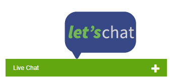
The large “Let’s Chat” bubble stemming directly from the live chat is sure to make most visitors direct their attention there.
Once clicked, the chat immediately assures customers that they will receive help in a timely manner. The company even integrates with Facebook to allow quicker and easier completion of the live chat form. For more added convenience, the drop-down menu ensures that a prospect’s message is directed to the right department (sales or support) to get the most appropriate response.
Again, the colors on the live chat could contrast more with the rest of the post-click landing page to make the chat better stand out and encourage more visitors to engage.
11. Performance Auto Group
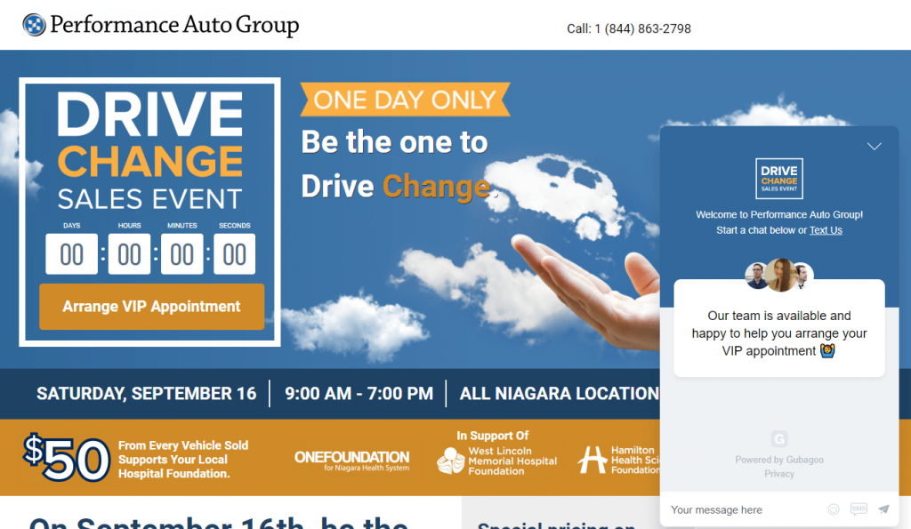
Performance Auto Group used this post-click landing page to promote their one-day-only Drive Change Sales Event. It contains multiple post-click landing page elements that are critical for driving conversions with event marketing.
Notice the countdown timer (which is now expired since the event has ended), the date and time of the event, and the orange “One day only” banner. All of these elements help to add urgency to the offer.
Also take note of the hand and the car acting as an explicit visual cue, pointing directly at, and drawing attention to, the headline.
The company logos are a great form of social proof, instilling trust in visitors and compelling them to sign up.
One component they should add to the page is some white space to make it look less cluttered and easier to navigate. They could also remove all of the exit links to make it less likely that visitors will escape the page without converting first.
Powered by Gubagoo, the live chat on this page lets prospects know exactly what its purpose is: to assist people with scheduling their VIP appointments at the Drive Change Sales Event.
The three headshots on the chat help build a stronger connection between customers and representatives. The ability to send the company a text message instead of a live chat message also helps create a closer relationship.
Use live chat on your post-click landing pages
Initiating relationships with your website visitors is key for nudging them into becoming leads. Building trust, and connecting with them emotionally, is essential for turning them into satisfied, life-long customers.
With Instapage, you can connect with your customers even easier with live chat integration using Intercom, Olark, and Zendesk. Utilizing these live chat tools in combination with our powerful Advertising Conversion Cloud helps you convert more ad clicks into conversions. Sign up for an Enterprise demo today.

See the Instapage Enterprise Plan in Action.
Demo includes AdMap™, Personalization, AMP,
Global Blocks, heatmaps & more.
