Social psychologist Harold Kelley had the power to control minds.
Well… kind of.
One morning in 1950, Kelley told two groups of students their regular professor was absent, and that the day’s lecture would be delivered by a guest.
That guest, Kelley described to group one, was a “very warm” person. To group two, however, he described the lecturer as “rather cold.”
When Kelley asked the unsuspecting students to evaluate the professor, who had given the same lecture to both groups, he got some astonishing responses.
Group one rated the guest professor much more favorably overall while group two labeled him as “cold and aloof.” Only 32% of people in group two wanted to participate in the lesson and interact with the lecturer, compared to 56% in group one.
So what can we learn from this experiment?
Your introduction matters.
In Kelley’s study, as is the case in marketing, one word can completely change your prospect’s perception of your offer.
And how do you make that introduction count?
With a click-through landing page.
What is a click-through landing page?
Taken directly from chapter six of our landing page guide:
Click-through landing pages are most valuable at the bottom of your funnel for warming up your leads to a particularly high-scrutiny offer...This landing page type allows visitors to read persuasive information about an offer without being distracted by the terrifying “buy” button.
How do you “warm them up”?
Intrigue them with your headline, promise to solve their problems with your copy, and help them imagine themselves as a hero with your images.
Below we’ve taken 20 landing pages from across the web to give you an idea of the best, and worst ways, to convince your prospects to click through.
(Keep in mind, for shorter pages, we’ve shown the entire page. However, for longer pages, we only displayed above the fold. You may need to click through to the page to see some of the points we discuss and some examples may be A/B testing their page with an alternate version than is displayed below.)
20 Click-through landing page examples
1. Google Cloud Platform
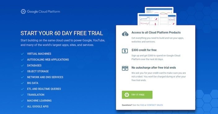
What they did well:
- The headline and CTA both include the word “free.”
- A testimonial from the creator of popular game, Angry Birds, aligns Google with well-known brands.
- Bulleted copy above the CTA quickly conveys the benefit of converting.
What could be tested:
- Blocks of text make this landing page seem a bit overwhelming at first glance.
- Social media icons serve as an escape route for prospects.
- Several links on the page make this one easily abandoned.
- A busy footer distracts prospects with way too many links.
2. Moz Pro
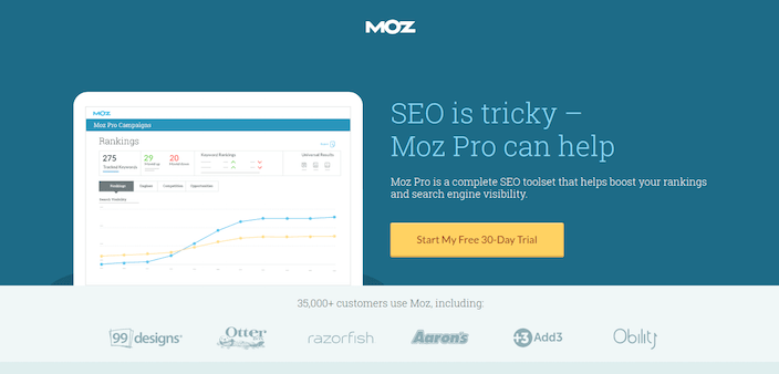
What they did well:
- The image gives prospects a sneak peek into what Moz dashboards look like.
- The yellow CTA button stands out against a dark blue background.
- The call-to-action is written in first person.
- Social proof reading “35,000 customers use razorfish” showcase Moz’s popularity.
- Authority badges align Moz with some powerful brands.
- Short paragraphs quickly explain the benefits of Moz’s software.
- A testimonial, complete with full name, position, and company name, is as credible and powerful as testimonials get.
- Two cooperative CTAs give prospects the opportunity to convert more than once.
What could be tested:
- The “Moz” logo is clickable, making it easy for a prospect to escape this landing page before converting.
3. Atlassian
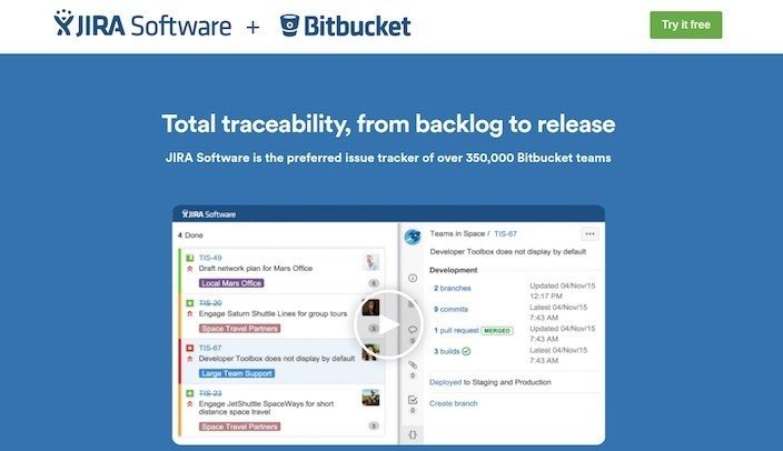
What they did well:
- Social proof below the headline displays how widely used JIRA is.
- The video quickly explains the benefit of using the software.
- Short paragraphs tout the benefits of using the software.
- Uber-short, benefit-centered videos take advantage of our visual nature.
- A testimonial that includes name, position, and company name adds credibility to Atlassian’s software.
- The call-to-action includes the word “Free.”
What could be tested:
- The clickable logo serves as a means of escape.
- The first 13 seconds of the video are unnecessary. On your landing page you need to get to the point. What’s in it for your prospect?
- A distracting footer gives prospects way too many exits off the page.
4. Animoto
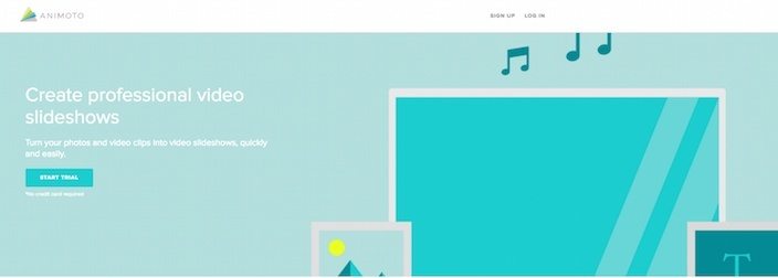
What they did well:
- The headline conveys a clear benefit: “Create professional video slideshows,” however, it could be better. What will creating professional video slideshows help prospects do? How about “‘Wow’ your audience with professional video slideshows.”
- The video samples show the versatility of the software without driving visitors off the page.
- Bulleted copy quickly conveys the benefits of using Animoto.
- The text “No credit card required” comforts prospects by ensuring the trial is actually free.
- The word “free” is used multiple times on the page.
What could be tested:
- This button color makes the CTA blend in with the rest of the page. Does it grab your attention? It doesn’t grab ours.
- The CTA button would draw more attention if it was bigger. Why is it so small?
5. Intuit
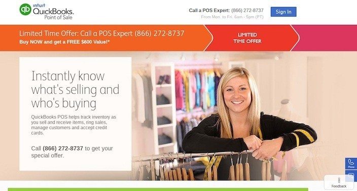
What they did well:
- The logo is not clickable, making it impossible to escape through.
- The headline conveys a clear benefit.
- The word “free” is mentioned in relation to the offer.
- The text “Limited time offer” creates scarcity.
What could be tested:
- Colors get a little too crazy on this page. This is an example of when visual elements get too distracting. Bright colors should highlight the most important information on a page. Not every landing page element is created equal.
6. Lumosity
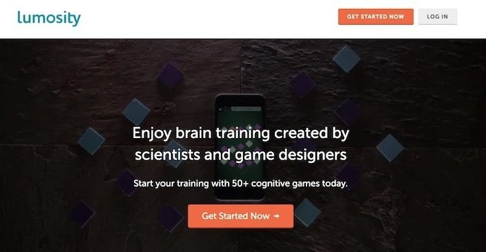
What they did well:
- The CTA button color “pops” off the page.
- Social proof in the text “70 million brain trainers in 182 countries…” highlights how many people use Lumosity.
- The text “100+ researchers worldwide” adds authority to the page, indicating that even leading scientists use the program to explore new areas of human cognition.
- The case study proves that Lumosity actually works.
What could be tested:
- This page is very egocentric, using the words “We” and “Our” way too many times. Always remember to frame things in a way that convey benefits to your prospects. Some changes that could be made:
- Instead of “We transform science into delightful games,” use “Play 50+ games designed by leading scientists.”
- Replace “Our scientists research the efficacy of Lumosity,” with “Scientifically proven to enhance cognitive performance.”
- Instead of “We collaborate with the scientific community,” use “100+ Scientists worldwide use Lumosity in their research.”
- Instead of “Join us on a mission to advance the understanding of human cognition,” use “Join 70 million people in 182 countries who exercise their brain with Lumosity daily.” People aren’t on this landing page to advance the understanding of human cognition; they’re here to improve their own mental functions.
- The call-to-action is boring. Instead of “Get Started Now” why not “Start My Training”?
- The background animations are fun and creative, but distracting. We found ourselves mesmerized by them more so than any other page element.
- A busy footeryeah allows visitors to escape to other parts of the Lumosity website.
7. Sallie Mae

What they did well:
- The model’s gaze is in the direction of the CTA button, serving as a visual cue leading us to it. Studies have shown that we tend to look where humans in images do.
- Bulleted copy below the image quickly conveys the benefits of taking out this loan.
- Two cooperative CTAs give users more than one chance to convert.
What could be tested:
- A clickable logo gives prospects an easy escape.
- This headline doesn’t convey a benefit
- The CTA copy could be more personalized. Instead of, “Get Started” why not try “Start My Loan Process”?
- The CTA button color is used already numerous times on the website. Because of that, the buttons don’t grab attention the way they should.
8. Nationwide Pet Insurance
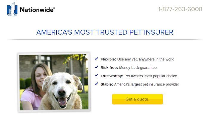
What they did well:
- This headline, while not conveying a benefit, does serve as social proof. If Nationwide is the most trusted pet insurer in the US, wouldn’t you be more likely to use them, too?
- Bulleted copy makes it easy to learn why Nationwide is flexible, risk-free, trustworthy, and stable.
- The yellow button contrasts the white background nicely, commanding visitor attention.
- The phone number is click-to-call, making it easy for viewers to contact Nationwide.
What could be tested:
- These models are staring into the camera. Studies show that when models in photos stare at us, we simply stare back at them. But when they’re staring at other important parts of the page, like a CTA button for instance, we tend to follow their gaze toward them.
- Social media buttons distract prospects from the task at hand.
- A busy footer gives visitors way too many routes off the page.
9. Norton Antivirus

What they did well:
- The copy offers a discount on the offer.
- One of the offers might actually be a decoy, used to convince buyers to upgrade to the deluxe package.
- Authority badges align Norton with some powerful brands, like PC Magazine.
What could be tested:
- The benefit of using Norton Antivirus is written in teeny-tiny text. “Defends against viruses, spyware, malware, and online threats.”
- The logo is clickable, making it easy for prospects to escape to the homepage.
10. McAfee
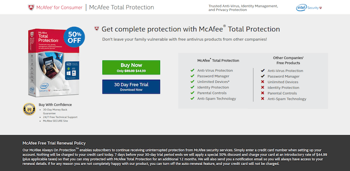
What they did well:
- This headline conveys a strong benefit.
- Short paragraphs and bulleted copy quickly convey the benefits of downloading.
- A money-back guarantee and 24/7 support strengthen this offer.
- The call-to-action includes the word “free.”
What could be tested:
- The PC Magazine testimonial could be stronger. Who said it?
- Authority badges are small and unreadable.
11. Kaspersky Antivirus
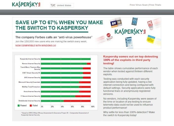
What they did well:
- The headline is benefit-oriented, conveying a 67% discount.
What could be tested:
- Links in the upper-right corner of the page allow prospects to leave this click-through page.
- The “Select” CTA button color and shape are already used a number of times on the page.
- The social proof could be phrased better. If 150,000 people sign up to use Kaspersky every week, then how many millions of people use it? That’d undoubtedly be much more convincing. By using the phrase “making the swtich,” the copywriter is implying the software was never anyone’s first choice to begin with.
- The big block of text on the right of the page makes it look rather intimidating.
- The graph is confusing. These numbers are based on the “MRG Effitas Efficacy Assessment & Assurance Project 30”… but what is that? Is the average person supposed to know what that is?
- Endless tables make this page look overwhelming.
12. Home Chef
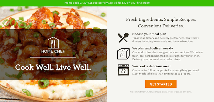
What they did well:
- This hero image makes the product look delicious
- The headline conveys why Home Chef food is so great.
- Bulleted copy quickly conveys the benefits of signing up for the service.
- The CTA button color stands out from the gray background.
- The green bar at the top of the website advertises a discount on the product.
What could be tested:
- More white space could really help improve readability and give the proper attention to the headline, three bullet points, and CTA.
- The CTA copy could be improved. “Get Started” is about as basic as it gets.
13. Sage
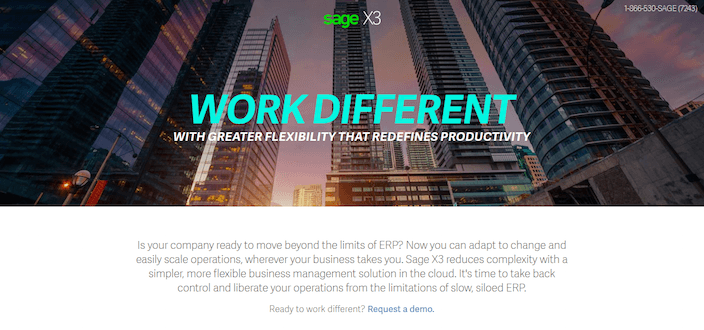
What they did well:
- The phone number is click-to-call.
- The CTA button color stands out from the dull page.
What could be tested:
- This copy is vague, and the benefits of the software are too.
- The logo is clickable, serving as an escape route for prospects.
- Social buttons serve as distractions on this click-through post-click landing page.
14. Promo Republic

What they did well:
- The 4-tile layout gives viewers a peek into the product.
- Testimonials align Promo Republic with powerful brands like Social Media Today. Though they’d be more convincing if we knew who said them.
- Counters serve as social proof to show how many clients Promo Republic has.
What could be tested:
- The CTA button color causes this button to be nearly invisible.
- A busy footer offers a number of distractions to prospects.
15. Strong Made Simple
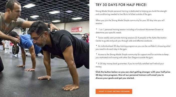
What they did well:
- The headline conveys a benefit.
- The CTA button color pops against the gray background.
- The call-to-action is written in first person.
- Bulleted copy quickly explains the benefit of joining the Strong Made Simple community.
What could be tested:
- This image could be better. Hero images are great for fitness. How about a before and after?
- The CTA could be a little larger. Since it’s the most important part of a click-through landing page, why not draw more attention to it?
16. College Ave
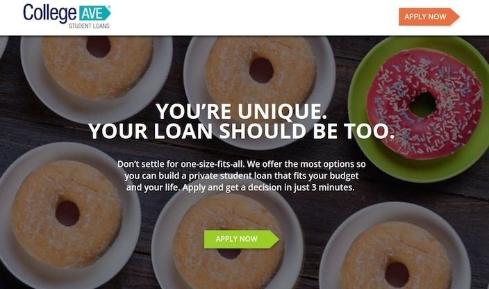
What they did well:
- The headline and sub-headline combo convey a benefit: personalization and quick results.
- Four cooperative CTAs work together to get visitors to convert.
- Short sentences and paragraphs quickly explain why prospects should click the CTA button.
- The CTA button color makes these buttons hard to miss.
What could be tested:
- This clickable logo makes leaving the page easy.
- Social media buttons serve as escape routes for prospects who haven’t converted.
- The CTA buttons could be a little bigger so they draw more attention.
17. Babbel
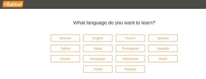
What they did well:
- The question headline directly engages the reader.
What could be tested:
- The page doesn’t mention anything about Babbel at all. Why should a user feel comfortable clicking through when they don’t know anything about the service?
- The logo is clickable, making it a way off this landing page.
18. ESET
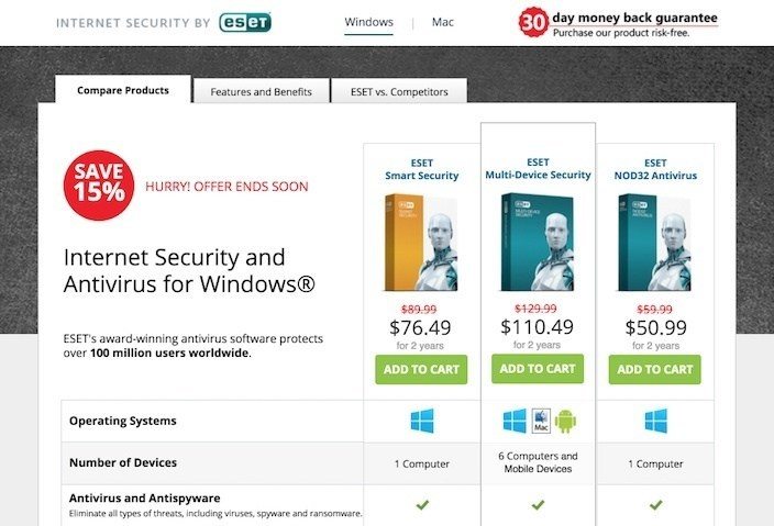
What they did well:
- A 30-day money-back guarantee makes visitors more likely to convert on this offer.
- A 15% discount coupled with the message “Hurry! Offer Ends Soon” conveys scarcity.
What could be tested:
- Too much text in the “features and benefits” section makes this page overwhelming.
- The “features” section is unnecessary. Instead, put all your focus on benefits.
- Testimonials look to be haphazardly thrown on the page.
- These graphs don’t mean much — even with the textual aid alongside them. Explain in plain language what they mean. “Maximum control to avoid exploits”? What is that?
19. Qudos
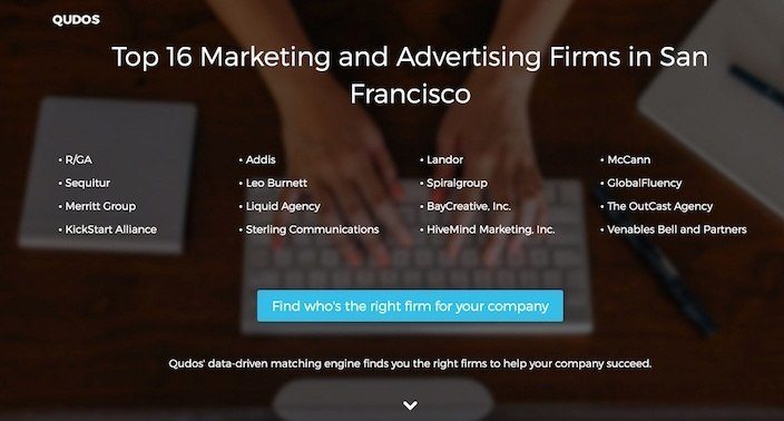
What they did well:
- The 16 firms are listed but not hyperlinked off this page. This keeps the visitor’s attention on the CTA button.
- Bulleted copy quickly conveys the benefit of using Qudos.
- The step-by-step explanation below shows prospects how easy using the service can be.
What could be tested:
- The footer gives prospects too many ways off the page.
- The CTA is too wordy… ”who’s” is unneeded here. “Find the right firm for your company” sounds better.
- The headline conveys no benefit. Here’s what it should say: “Hire San Francisco’s Best Marketing Agencies In Just 4 Easy Steps.”
20. Ruzzo
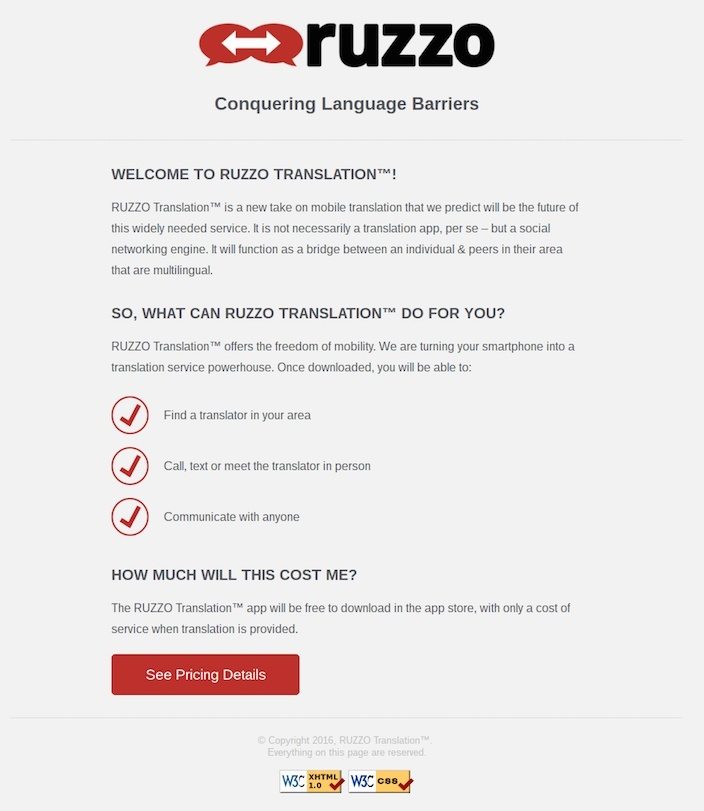
What they did well:
- Bulleted copy gives prospects an idea of what they’ll get by downloading the software.
- The red CTA button stands out on the dull gray background.
What could be tested:
- The headline is “me” focused. Ruzzo is the one conquering language barriers, but what does it help its owners do? Conquer language barriers. That should be the headline.
- The “Welcome to Ruzzo Translation” section isn’t needed. Get to the point already. What will this do for me?
- The “How Much Will This Cost Me” section is unnecessary. If the product is free to download, that should be mentioned in the headline of the landing page, and in the CTA button.
How will you introduce your offer?
A click-through landing page has the power to “warm up” your visitors to your offer, or to drive them away.
Take tips from great pages from Home Chef and Moz, and pick and choose from the others to make yours a persuasive page that compels visitors to convert. Start creating your dedicated pages by signing up for an Instapage Enterprise demo today.

Try the world's most advanced landing page platform with a risk-free trial.
