
Evidence suggests that when it comes to attention spans, you have a better chance of keeping my 10-month old engaged on a post-click landing page than your visitors.
Yep, you read that right.
The average web users’ attention span is about 6-8 seconds, a 10-month-old’s attention span, on the other hand, is around 60-120 seconds. That means my son will focus on his rattle longer than your visitors will focus on your post-click landing page.
What’s the point of this, you may ask? Keeping visitors’ attention on your post-click landing page long enough to convert is a challenge.
Conversions become increasingly challenging if your page is poorly designed as 94% of first impressions online are related to design. For example, an engaging headline would fall flat if the page is cluttered and visitors can’t distinguish one element from the other. The same holds true for all other page elements.
post-click landing page design plays a key role in keeping visitors engaged, of which white space and a contrasting CTA button are not the only design tools marketers can use to drive conversions.
Visual cues also help tremendously to drive more post-click landing page conversions.
What are visual cues?
Visual or directional cues are a UX design tool used to literally point your visitors in the direction of elements that are integral to your conversion goal (like your CTA). The cues help visitors navigate your page and maintain a visual hierarchy.
There are two basic types of visual cues:
Explicit visual cues
These kinds of cues are direct and can easily be pointed out on the page. Using arrows, lines, pointing fingers, and human line of sight are a few ways explicit visual cues can be used on post-click landing pages.
Implicit visual cues
These cues are subtle and often go unnoticed by visitors. However, they do their job of highlighting particular elements quite well. Some of the most commonly used implicit visual cues on post-click landing pages include white space, color contrast, and encapsulation.
Let’s see how you can use both types of visual cues on post-click landing pages to keep visitors focused on the page long enough to convert.
How to use explicit visual cues on post-click landing pages
Explicit visual cues quickly influence where a visitor looks on a page. You can use arrows as visual cues on your pages and guide visitors to where you want them to go on the page.
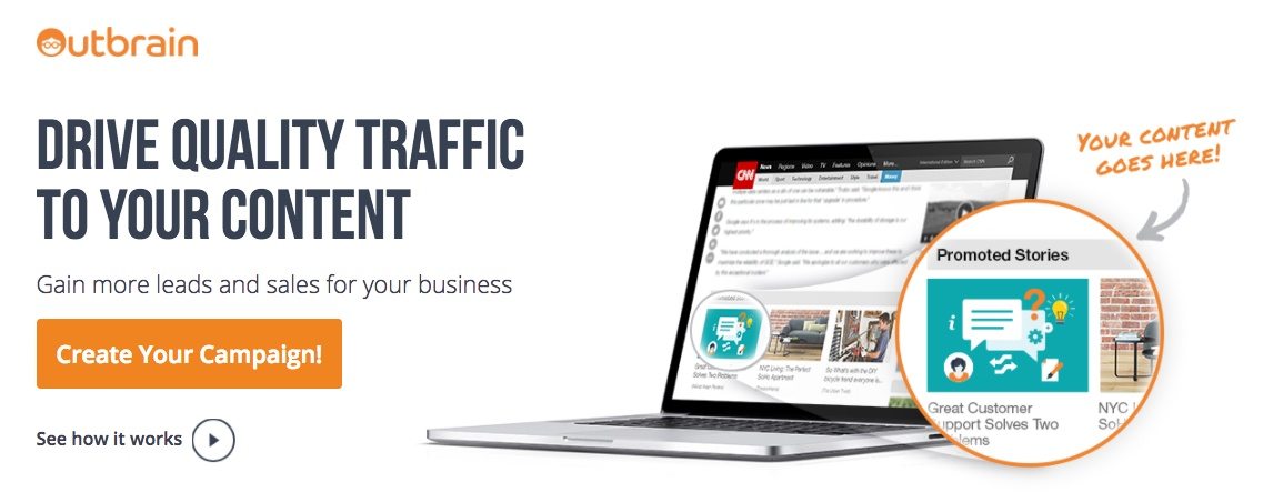
Outbrain uses an arrow and magnifying circle to bring visitors’ attention to the image of how the service promotes stories:
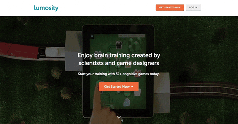
You can also design the directional cue arrows as an interactive page element and help visitors navigate to different sections of your page, like Lumosity does:
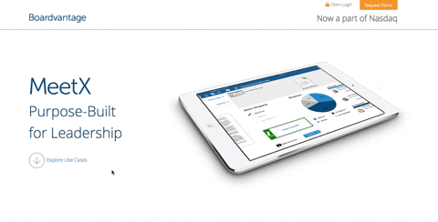
 And what Boardvantage does, too:
 Arrows can also be used to direct visitors below the page fold. Our Facebook Ads tip post-click landing page employs this technique:

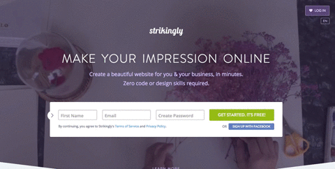
Strikingly uses an animated, directional arrow bouncing on the left side of their form to encourage visitors’ to pay more attention to it:
 Using line of sight also serves as a useful explicit directional cue because of the deictic gaze.
The deictic gaze is a cognitive bias that dictates that when we see someone looking at something, our brains act reflexively, and we start looking at that object as well. The cognitive bias enables you to influence where your visitors will focus on a page.
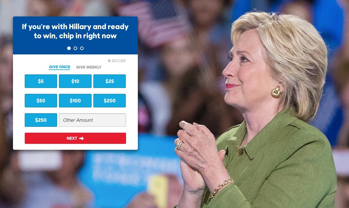
This particular visual cue not only gets a visitor to look where you want, but it also adds a human appeal to the page and attaches emotion to your offer. Visual cues are so influential and convincing that Presidential candidate Hillary Clinton uses a line of sight on her respective campaign pages.
Clinton’s eyes are brimming with emotion as she gazes at her donation page form:
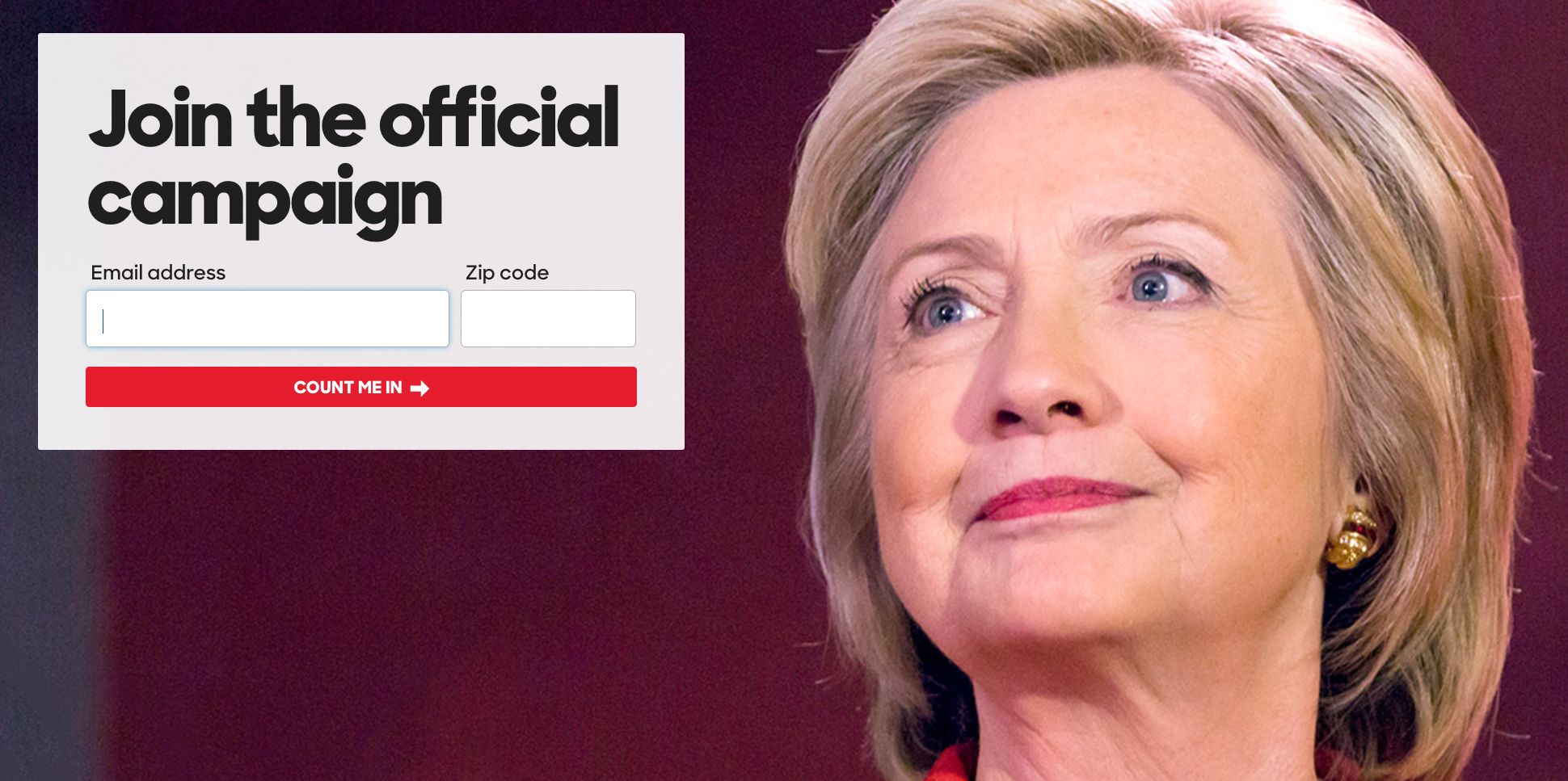
On this page, she eagerly looks at the form and urges you to join the official campaign:
iCIMS takes it a step further by doubling up on visual cues, using both line of sight and pointing to encourage visitors to convert:
![]()
So which visual cue performs better? Arrows, pointing, a line of sight?
Research conducted by CXL shows that when it comes to explicit visual cues, an arrow outperforms a human’s line of sight:
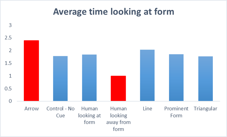
To produce those results, eye-tracking studies and heat maps were the primary sources of data collection:
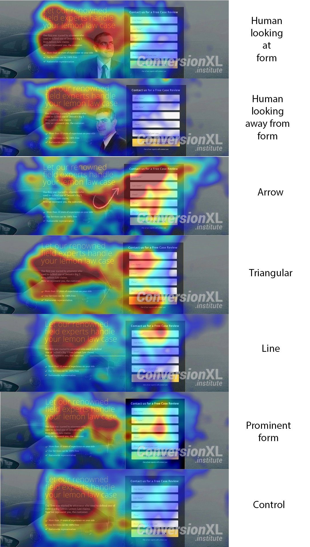
A word of caution, though. Just because an arrow performed better on this particular post-click landing page, does not mean arrows will always be the surefire way to maximize conversions. As with every other post-click landing page element, we recommend you A/B test visual cues to determine if this research holds true for your offers.
How to use implicit visual cues on post-click landing pages
Implicit visual cues are not straightforward like arrows and pointing. These design elements don’t directly point to a particular object. Rather, they rely on a more subtle approach to persuade visitors to fulfill the conversion goal.
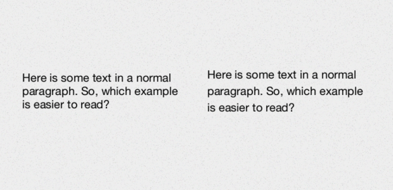
Using white space around an element is a great visual cue to get visitors to focus on that particular element. Notice the difference white space makes on the readability of the text on the right, versus the text on the left?
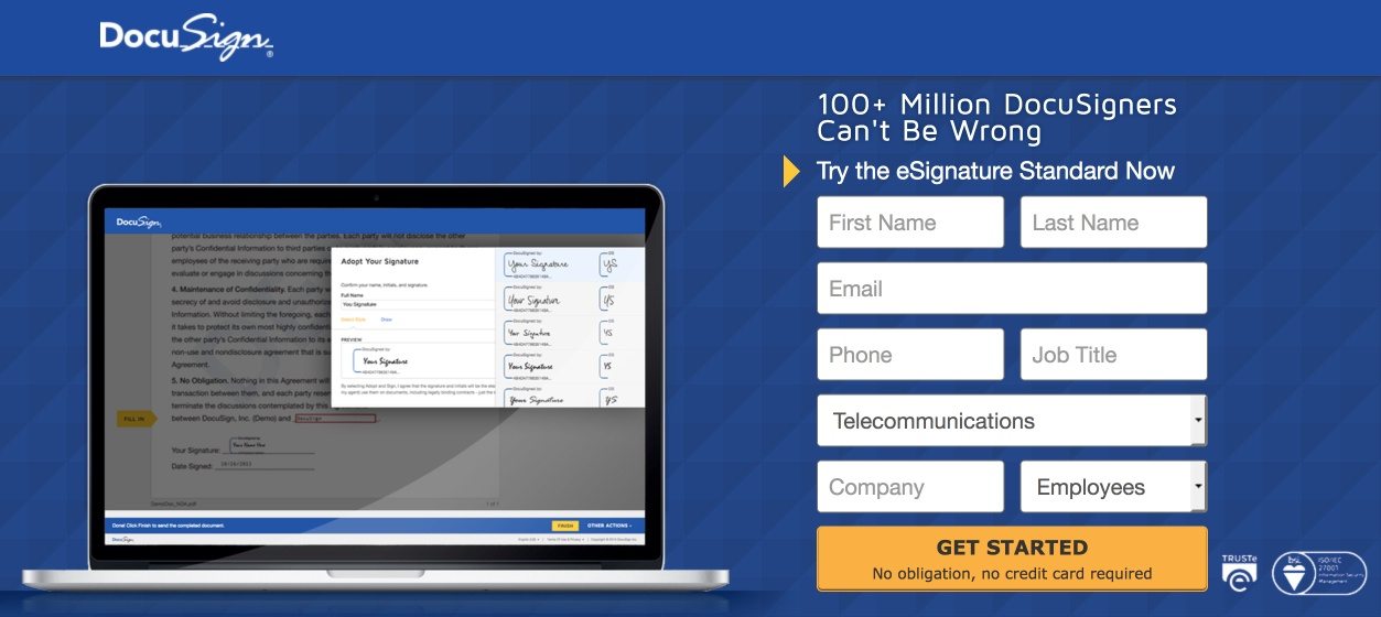
This “negative space” helps remove clutter from the page, automatically highlighting the important page elements. The DocuSign post-click landing page uses plenty of white space around elements to make it easier for visitors to focus on the laptop screenshot and the form. Plus, they include an arrow pointing toward the lead capture form:
Encapsulation allows you to frame your focus point on a page, i.e., use boxes or colors to encase any post-click landing page element and draw attention to it. The technique also helps you declutter the page and get visitors to focus on one particular element. This design technique also helps establish a visual hierarchy on the page and guides prospect’s line of sight to your desired goal.
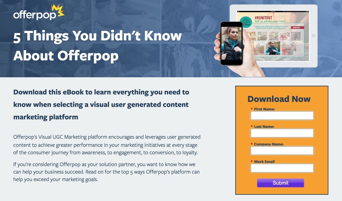
The form on Offerpop’s post-click landing page is encased in orange with a black outline, which helps it stand out on its own:
Using contrasting colors for post-click landing page elements also serves as a visual cue because the contrast draws visitors’ attention to a particular spot. The orange CTA button on the HelloFresh post-click landing page calls out to visitors:

How do you use visual marketing to drive conversions?
Visual marketing doesn’t just revolve around using videos and gifs on pages, using visual cues on post-click landing pages is an effective way to convince visitors to act.
Don’t rely on your visitors’ attention span to get you conversions. Take matters into your hands and guide visitors to the conversion goal with the help of visual cues — both explicit and implicit. You can create designer-friendly post-click landing pages with visual cues that command attention today. Simply sign-up for an Instapage Enterprise demo.

See the Instapage Enterprise Plan in Action.
Demo includes AdMap™, Personalization, AMP,
Global Blocks, heatmaps & more.
