
“Imitation is the sincerest form of flattery.”
That famous proverb holds true with a lot of things, and post-click landing pages are no different.
It’s completely normal (and recommended) to review other companies’ post-click landing page examples for inspiration to create your most conversion-ready page possible.
Understanding how people read online content is a critical component of this process. Especially when you know the average web users’ attention span is about 6-8 seconds and you need to keep visitors engaged on your page during those critical seconds.
There are hundreds of post-click landing page examples to get inspiration from. In fact, we have an entire blog category dedicated to the subject from some of the world’s most recognizable brands.
In today’s article, we’ll showcase several examples that highlight user experience tips, important elements of a post-click landing page framework, and other post-click landing page ideas to inspire your next design.
Best post-click landing page ideas
Add sufficient white space
There are plenty of web page design ideas in your arsenal, but white space (aka empty space or negative space) may be the most underutilized technique even though it serves multiple purposes. Not only does it make your page appear less cluttered and more aesthetically pleasing, it also:
- Increases readability
- Improves focus on important elements
- Allows greater comprehension of your offer
- Enhances user experience
Knowing that, let’s compare the white space design on two different pages.
Here’s one from Ashworth College that’s clearly lacking white space:
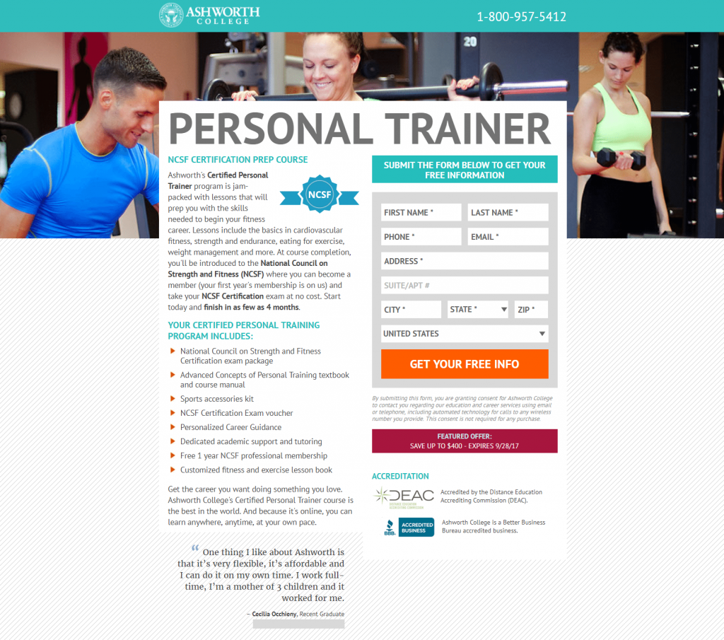
Notice how everything is crammed into the center of the page, making it difficult to decide where to begin navigating? This could make visitors feel overwhelmed, making them leave the page without even learning about the offer, let alone converting.
In contrast, this Mentor post-click landing page features plenty of white space:
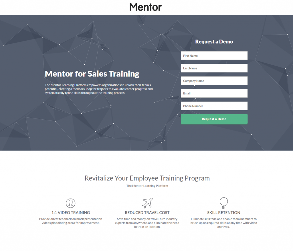
There’s sufficient space around the headline and small description, as well as the lead capture form. There’s even a good amount of space between the different sections, making it easy to navigate the page and comprehend the offer better. Every post-click landing page element attracts attention because they are not scrunched together like the Ashworth College page.
This example provides a more enjoyable user experience and likely produces better conversion results.
Incorporate explicit visual cues
Visual cues, or directional cues — both explicit and implicit — both assist post-click landing page conversions because they tell visitors exactly what they should pay attention to (like your form and CTA button).
First let’s look at explicit cues, which are more direct and can easily be recognized on a web page.
One of the primary ways to incorporate explicit visual cues into your post-click landing page design is to add arrows pointing to the most important page elements, like a form and/or CTA button.
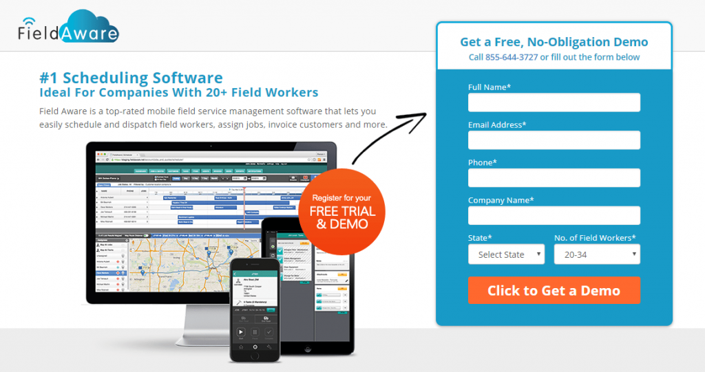
Sage Intacct makes it obvious what they want you to notice by including a bright orange arrow from their headline to the form:
![]()
Plus, the arrow on the CTA button indicates that there’s additional content beyond this page once prospects click the button.
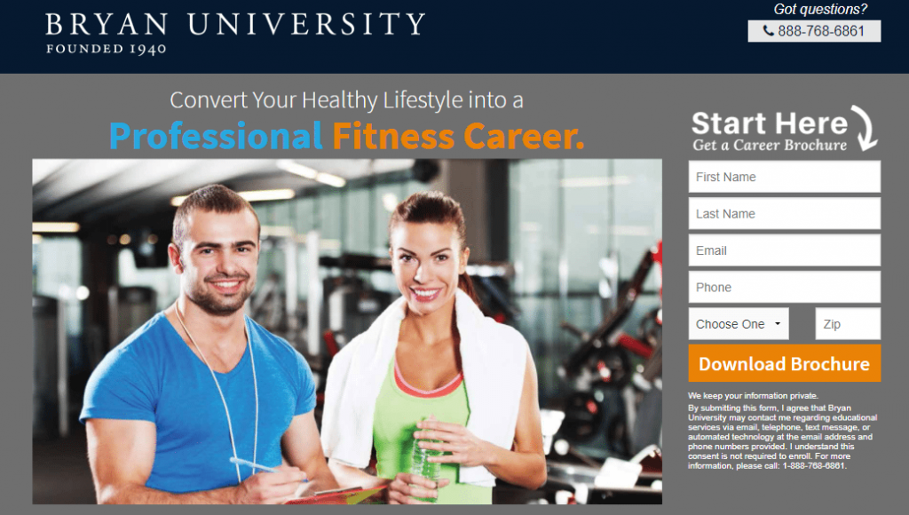
Here’s another example from TurnPro Properties, perfect for anyone looking for real estate post-click landing page ideas. It has an orange arrow pointing to the CTA button, and a blue circle around the button for the additional encouragement to click.
![]()
Eye gaze is another one of the best post-click landing page ideas for adding explicit visual cues to a post-click landing page. People tend to look at what others are looking at, so if someone on screen looks at a form or CTA button, the visitor is more likely to notice those elements too. This technique is also great for adding personal appeal to your pages.
Include implicit directional cues
Implicit directional cues are more subtle than explicit cues, often going unnoticed by visitors, but still just as effective. The most common implicit directional cues include white space, encapsulation, and color contrast.
Let’s examine an example from BigMarker that presents all three types of implicit cues:
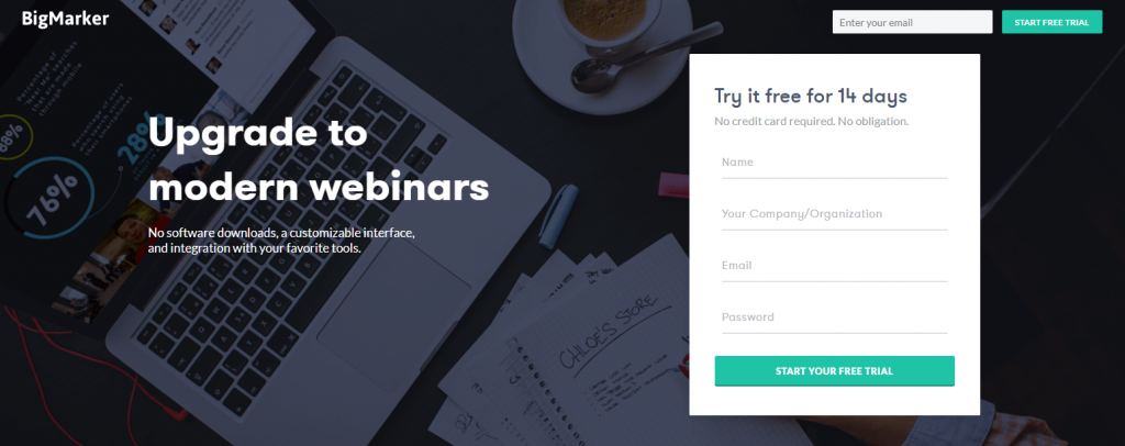
The white space surrounding each element on the page helps draw attention to those elements. That’s because, without anything else nearby focus on, visitors are forced to look at what you want them to. There’s also plenty of white space in between each section of the page, which again, makes for smoother navigation and better comprehension.
Encapsulating the form with color contrast makes it “pop” on the page, and is likely to lead to more conversions.
Finally, the color contrast between the dark background and the white form in particular — help draw increased attention to this specific area.
Create a two-step opt-in form
Persuading visitors to complete a lead capture form is one of digital marketers’ toughest challenges. Although, there are certain techniques to increase the chance of conversions.
One way is the two-step opt-in form, rather than a simple on-page form.
Two-step opt-in forms appear in a pop-up window, only after a prospect has clicked the CTA button. They’re effective because they break down the conversion process into two parts: an information phase (pre-form) and a commitment phase (post-form). With this separation, prospects aren’t intimidated by a form in the information phase, and they can simply focus on gathering information and learning about your offer. Then, once they’ve decided to proceed and click the CTA button, they see the form — and at this point, it’s much less intimidating.
Tableau understands this. Look how they designed their page with a two-step opt-in form:

Once visitors have reviewed the page and are committed to redeeming the offer, they click the orange “Get the whitepaper” CTA button, and are presented with this form:
Use multi-step forms
In addition to the two-step opt-in, you can also break up longer forms into multi-step forms, to make the completion process less daunting for prospects.
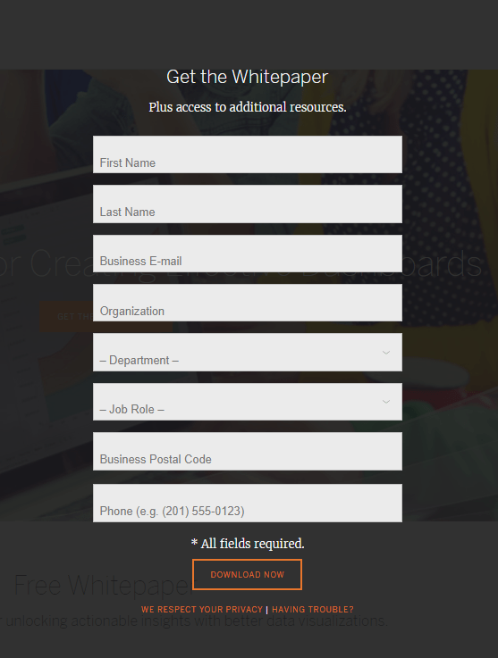
Take a look at this Qlik post-click landing page:
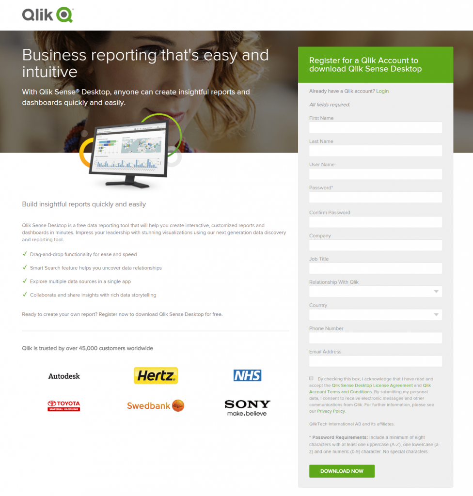
See how long the form is? It’s likely that nobody actually wants to complete all of those form fields, meaning Qlik could benefit from redesigning it as a multi-step form to reduce friction on the page.
AARP, on the other hand, has the right idea. They created a multi-step form on this page for prospects to request a free Decision Guide to AARP Medicare Supplement Insurance Plans. Also take note of the progress bar above the form. This is another smart post-click landing page idea because it lets prospects know how far along they are in the signup process:
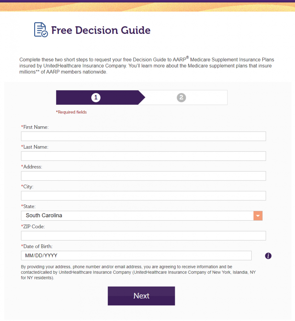
Breaking up the form into two steps helps make it less intimidating for prospects. When they arrive on this page, they’re only faced with 7 form fields, instead of everything at once.
Use CTA color contrast
Many marketers would argue that a call-to-action button is the most critical element on a post-click landing page because it’s where the conversion takes place. Design it properly and boost conversions; design it poorly and risk page abandonment.
One of the most important factors to consider when designing your CTA button is color. You want it to contrast with the other colors on the page so it “pops,” making it as easy as possible for visitors to convert.
Here are a few examples to demonstrate the idea.
This Salesforce post-click landing page uses a monochromatic color scheme:
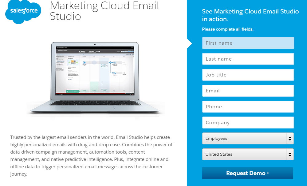
The blue color combination is natural on the eyes, but not great at allowing page elements to stand out. The button blends in with the form — the exact opposite of what you want for your CTA button.
Conversely, here are some pages with color-contrasting CTA buttons that are likely to grab visitors’ attention with no trouble:

Avoid using cheesy stock photos
You know the ones we’re talking about — the images you look at and can’t help but roll your eyes because they’re so obviously staged. Like this one:
Your ability to generate conversions relies heavily on how well you can create positive emotions in your visitors. That becomes more difficult with an unrealistic stock photo.
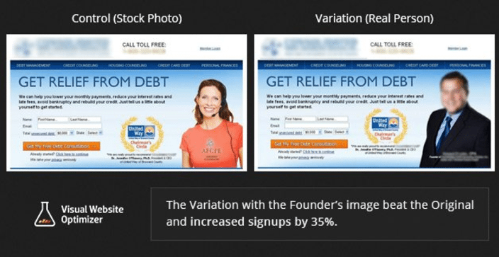
In fact, MarketingExperiments found that by replacing a stock image with an image of the company’s founder increased signups by 35%:
To that point, Discover included a more realistic and relatable image on their post-click landing page:

For more tips and tricks on selecting the best stock photos for your marketing campaigns, download this new guide.
Opt for video instead of text
Remember what we said in the introduction? The average attention span of web users is about 6-8 seconds.
Fortunately, adding video to your post-click landing pages can help immediately engage your visitors and hold their focus. By explaining your offer in a more compact and interactive way, videos have the potential to increase your total conversions by as much as 86%.
Videos are especially ideal for conveying your brand’s UVP because prospects would likely rather watch an engaging 1-minute video than scroll through a lengthy post-click landing page.
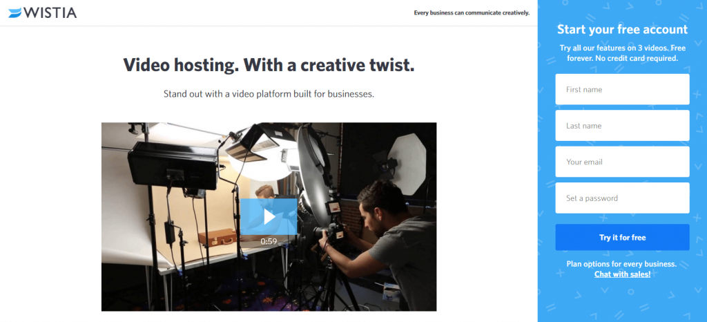
Wistia promotes it’s UVP and many of its other benefits in just one minute on this post-click landing page:
Intercom uses this effective post-click landing page idea too:
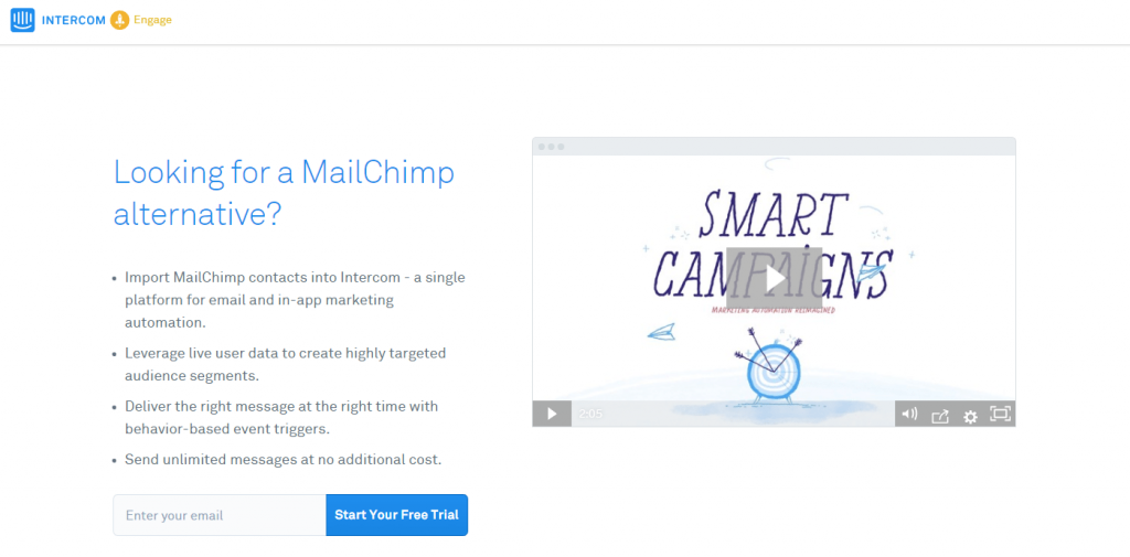
Their video presents common struggles that today’s marketers face and then explains how Intercom’s Smart Campaigns is a great solution to all of these problems.
Build trust
To persuade prospects you must first gain their trust. Three primary types of trust signals include company logos, security badges, and customer testimonials. Not coincidentally, adding trust signals has become one of the most common web page design ideas for any brand with an online presence.
This Smartsheet post-click landing page utilizes all three types throughout their post-click landing page. Let’s break it down top to bottom.
First, company logos highlight some of their best-known clients:

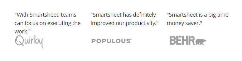
Then, quoted testimonials demonstrate how well-known companies use Smartsheet (with their logos displayed):
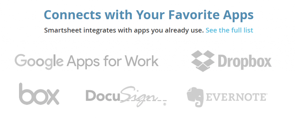
Additional logos show what popular apps they integrate with:
A customer testimonial — complete with headshot, full name, affiliation, and position — right above one of the CTA buttons on the page:

Another client testimonial with a brand logo attached:

Badges that showcase industry awards:
More logos to promote the positive press coverage and publicity:

Lastly, a trust seal to boost credibility and provide prospects with certainty that their personal information won’t be shared with any outside parties:

Which post-click landing page ideas will you emulate?
Coming up with post-click landing page design ideas that persuade visitors can be tough because even the smallest details can substantially impact your conversion rates. That’s why it’s perfectly acceptable — suggested, actually — to look at others for post-click landing page inspiration.
Take your favorite ideas from this article and start creating professional post-click landing pages with Instapage for every one of your offers. Sign up for an Instapage Enterprise demo today.

See the Instapage Enterprise Plan in Action.
Demo includes AdMap™, Personalization, AMP,
Global Blocks, heatmaps & more.
