You just finished designing your next post-click landing page. You crafted a killer headline and subheadline, written ultra persuasive copy, perfected your form, created the best CTA ever, and your page hierarchy is spot on. Every element is in the best place to convince visitors to convert.
So your post-click landing page is ready to publish, right? Not quite.
How will you make sure your visitors watch that video your team spent hours creating? Or that visitors click that perfect CTA button?
Don’t leave all of this up to chance; direct visitors exactly where you want them to go. Get them to look where you want them to focus (and take action on) your most critical post-click landing page elements.
Similar to the F-Pattern and Z-Pattern layout, using directional cues (aka visual cues) can influence your visitors to navigate your page with intention. All three of these post-click landing page design components use psychology to influence user actions and help compel them to take action.
Let’s take a closer look at how this works.
What are directional cues?
Directional cues are visual aids, like arrows or the eye gaze of a model, that point toward the most important elements of your post-click landing page, e.g. your lead capture form, CTA, video, testimonials, or information below the fold.
There are two basic types of directional cues: implicit and explicit directional cues.
Before we examine how both of these can intentionally focus visitors’ attention, let’s look at the psychology behind these visual aids.
The psychology behind visual cues
Visual cues can be thought of as signals or vibes, and subconsciously your brain can identify such signals. On a first date, for example, you can learn a lot about your date by the vibe he or she is sending — body language, eye contact, facial expressions — that show you whether the person is interested or not. Without even realizing it, you pick up these vibes from everyone.
You can convey and receive the same vibes in the context of digital marketing and with post-click landing pages. The visual cues on your post-click landing page give your visitors a subtle message, a vibe, a feeling.
With post-click landing pages, what determines how we translate these vibes or cues? Typically, it’s our past experiences and stored knowledge that tend to influence our perceptions. And as you’ll see below, a variety of signals that can help guide visitors to engage with your page and take action.
Implicit directional cues on post-click landing pages
Implicit directional cues are subtle, often going unnoticed by visitors. The most common types include white space, color contrast, and encapsulation. Here’s a look at each one:
White space
White space is the negative space or empty area of your post-click landing page that helps attract attention to specific elements. Adding white space can help simplify your page, improve user experience, and increase overall comprehension of your offer. That’s because, with fewer elements to focus on, visitors are forced to look at what you want them to.
Here is a post-click landing page from Percolate that uses substantial white space surrounding the headline, subheadline, and lead capture form:

Color contrast
Contrasting colors serve as a directional cue because the stark color differences make visitors pay attention to that area.
To demonstrate, Marketo offers a social media marketing guide on this post-click landing page, but the CTA gets lost because the color contrast is non-existent:

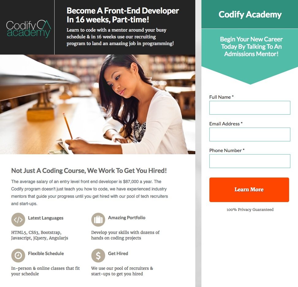
But on this Codify Academy post-click landing page, the CTA button jumps off the page because the red contrasts with every other color:
Encapsulation
Encapsulation, or the framing of elements, is another way to highlight what’s important on the page by creating an enclosed window of focus. Designers often do this with boxes, outlines, and/or contrasting colors to reduce page clutter and draw attention to specific elements.
Bellevue University uses this technique twice on the page below — in the header image and the form. The form, though, is even more encapsulated because it’s designed in a contrasting purple box to get post-click landing page visitors to submit their information:

Explicit directional cues on post-click landing pages
Explicit cues are glaringly obvious to the human eye compared to implicit cues so they can typically be spotted immediately. Eye gaze, pointing or gesturing, strategic object positioning, arrows, and lines all comprise this group. Let’s look closer at each type:
Eye gaze
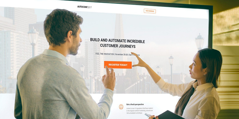
Using human eye gaze as a directional cue is especially effective on post-click landing pages. People tend to look at what others are looking at, so if someone on screen looks at a form, the visitor is more likely to take notice of the form as well. This technique subconsciously influences visitors to look where you want and adds personal appeal, too. Donald Trump and Hillary Clinton both understood the value of this technique — using it on their donation pages during the campaign season.
Here is a post-click landing page from Capella University, featuring a smiling student looking in the direction of the headline, subheadline, and form. Without even realizing it, visitors are likely to focus their attention here as well:

Social proof (e.g. testimonials) can also take advantage of eye gaze, as seen here on When I Work’s page:

Pointing or gesturing
Similar to eye gaze, having a model point or gesture toward an important element gets visitors to focus on that area. Since this technique isn’t as subtle as the eye gaze; there’s a chance the gesture may appear cheesy and unnatural. Therefore, be sure to A/B test your pages with different gestures to see what produces the best results.
Object positioning
Positioning images so that they’re pointed toward a particular focus area draws prospects’ attention and makes that particular element more noticeable.
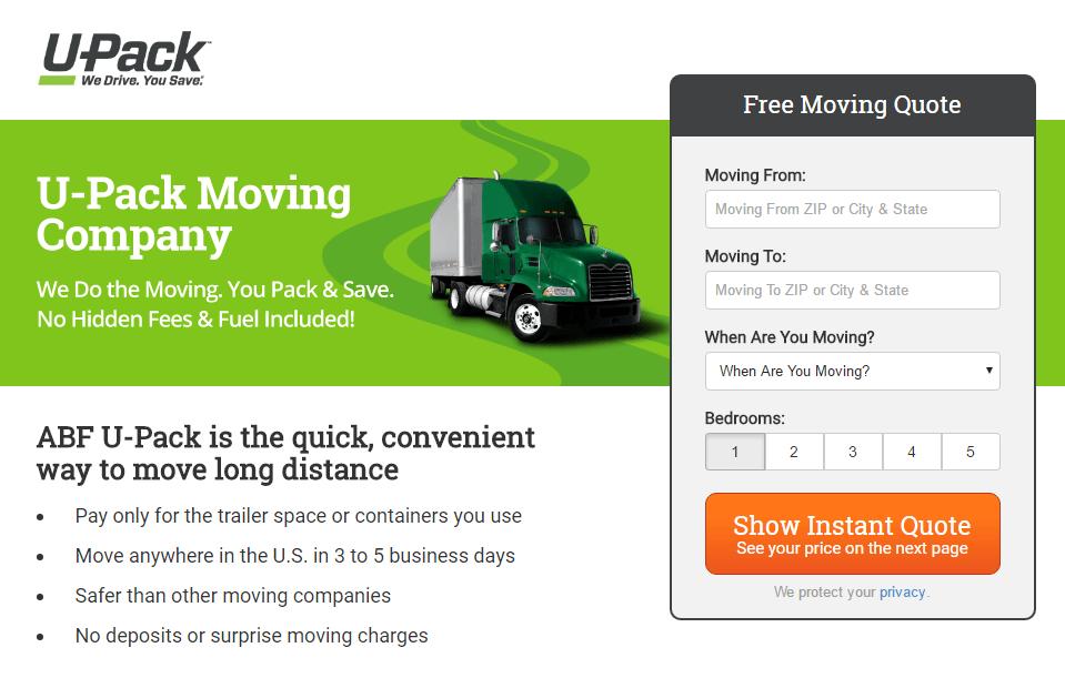
U-Pack made sure their post-click landing page form was noticeable to every visitor. Not only did they encapsulate it with a black border, but they positioned a moving truck facing the form so visitors can’t help but take notice:
Arrows
Whether it’s moving or stationary, arrows are one of the most commonly used explicit directional cues because they are simple and easily understood.
Loud Rumor uses a stationary, hand-drawn arrow on their two-step opt-in form to influence CTA button clicks:

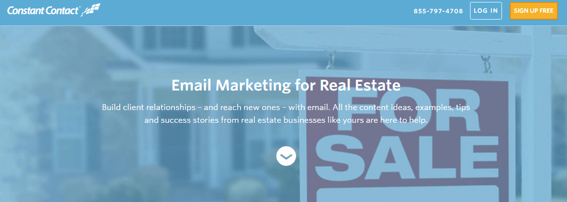
Even though web users are used to scrolling, arrows are also commonly placed to help visitors navigate below the fold. Check out how Constant Contact does this with a simple enclosed arrow:
Here is another from Boardvantage — in which the arrow is hyperlinked. Once clicked, the page scrolls below the fold and displays three different use cases:

Lines
Lines are one of the less obvious cues, but since humans tend to naturally follow paths, they can be quite useful on post-click landing pages. That’s because linear directional cues can guide visitors through different parts of your page or to help prospects stay focused on specific sections of the page.
For example, Datorama uses an upward-trending graph line to highlight the “Try it now” CTA button. When visitors click the button, they’re sent to the lead capture form at the bottom of the page where they can sign up for a free Datorama trial:

Influence visitors to convert with directional cues
Let’s readdress that nearly perfect post-click landing page we summarized at the beginning.
While your headline, copy, form, and CTA are paramount for driving conversions; these elements are only a portion of the visitor’s post-click landing page experience. Add some directional cues — both implicit and explicit — to ensure your prospects will focus their attention on what matters most to your conversion goal.
Which cues will you add to your next post-click landing page? No matter what you decide, create fully optimized post-click landing pages with Instapage in a matter of minutes. Sign up for an Instapage Enterprise demo today.

See the Instapage Enterprise Plan in Action.
Demo includes AdMap™, Personalization, AMP,
Global Blocks, heatmaps & more.
