As a company offering security services, prospects need to know they can trust what you have to offer. Their first impression of your company can ultimately win (or lose) you a sale. That is where a post-click landing page comes into play.
And regardless of the offer, it only makes sense that your post-click landing pages be as secure as the services you offer. Each page should include a variety of trust signals, so people are convinced their information will be kept safe. These trust signals can be a combination of any of the following: customer testimonials, brand logos, industry awards, secure payment logos, etc.
Before we review the security post-click landing pages below, let’s start with a fundamental reminder.
What is a post-click landing page?
A post-click landing page is a standalone web page that uses persuasive elements — such as compelling headlines, engaging media, valuable social proof, contrasting CTA buttons, etc. — to convince visitors to take action on a specific offer. That action could be signing up for an account or free trial, request a free quote, register for a webinar, schedule a demo, and more.
9 Security post-click landing page examples
(For shorter pages, we’ve displayed the entire page. For longer pages, we’ve only shown above the fold, so you’ll need to click through to the page to see some of the points we discuss. Also, keep in mind that some pages may be undergoing A/B testing with an alternate version than is displayed below.)
1. Oracle
As part of its suite of services, Oracle offers cloud security, and promotes it with this Google ad. First the ad, then its respective post-click landing page:

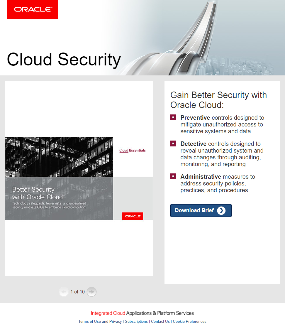
What the page does well:
- The “HTTPS” URL ensures visitors that Oracle’s site is safe and secure and that outsiders won’t be able to access their information.
- A privacy policy notifies prospects exactly how their personal information will be shared.
- Bullet points and bold copy allow visitors to scan the page and quickly determine the key takeaways of Oracle Cloud.
- The arrow on the CTA button serves as a visual cue, helping draw prospects attention and letting them know there’s more to see beyond this page.
What could be A/B tested:
- Adding testimonials from Oracle customers who have benefited from the brief would likely encourage visitors to download it as well.
- Showing the brief page by page might prevent visitors from downloading since they’ve already seen the brief in its entirety.
- The CTA button copy isn’t very compelling because it’s not benefit oriented or personalized.
- Links in the footer act as exit links and could easily distract visitors and remove them from the page without converting.
2. McAfee
McAfee is one of the industry leaders in antivirus software and internet security. To highlight their Total Protection™ package, they too use Google Ads. First is the ad with “Award-Winning” in the headline to convince prospects their software is highly-respected:

Then the sales post-click landing page:

What the page does well:
- HTTPS in the URL lets visitors know that the site is secure and that their information won’t be susceptible to outside attacks.
- The blue “Buy with Confidence” badge & satisfaction guarantee badge on both the post-click landing page and subsequent payments page ensures a 30-day money back guarantee, free customer support, and a virus protection pledge.
- The credit card logos on the payments page lets prospects know which payments are secure.
- The software image gives visitors a preview of what the Total Protection™ package looks like.
- The green CTA button draws attention really well enticing visitors to click.
- Including the price on the CTA button is a great sales page technique that reminds prospects that the software is on sale and likely won’t last forever.
- The comparison checklist highlights the many ways in which McAfee outperforms other companies.
- The click-through design removes friction by hiding the form until prospects have learned about the offer in its entirety.
What could be A/B tested:
- Including customer testimonials would highlight how current customers are satisfied with McAfee and their protection software.
- Showcasing industry awards would add even more credibility to the company, provided McAfee has earned any awards.
- The 30-day free trial could prevent people from purchasing the software. Better yet would be to promote this offer on its own dedicated post-click landing page.
- Exit links in the fine print are likely to remove visitors from the page before they convert.
- An expired copyright date might make visitors question the validity of the offer.
- Increasing white space would help the page look less cluttered and easier to navigate.
3. ADT

What the page does well:
- HTTPS in the URL ensures visitors that their private information is secure and won’t be flagged by Google.
- Company badges from BBB, Trustpilot, and Triple Certified Security Advisors increase the credibility of the company.
- Customer testimonials directly from Trustpilot allow visitors to see exactly what customers are saying about the company’s home security alarm systems. However, the company is only rated 5.8 out of 10, so this may not serve as well as planned.
- A money-back guarantee is likely to make prospects feel more compelled to request a free quote from Kaspersky.
- Click-to-call phone numbers make it quick and easy for visitors to contact customer service, providing a positive user experience.
- The security system image shows prospects what their order will include.
- “Free” is highlighted in multiple locations throughout the page, which is a proven way to get people to take action.
- Only 4 form fields make it fast and easy for prospects to request their free quote.
- The CTA button arrow serves as a directional cue, persuading prospects to proceed to the next page.
What could be A/B tested:
- Adding industry awards would likely make prospects feel more comfortable with the company and security system.
- Increasing white space would make the page easier to skim and evaluate the offer.
- The orange CTA button doesn’t stand out because it’s against another shade of orange, and this color is used elsewhere on the page.
- Too much copy is overwhelming and could cause visitors to leave the page.
4. Kaspersky
Kaspersky’s post-click landing page campaign features a click-through sales page with several elements to persuade visitors to click through t — a sale price, color contrasting CTA buttons, bulleted copy, a chart to demonstrate how Kaspersky compares to other Internet security solutions, and more:

The trust signals, through, are found primarily on the payments page:

What the page does well:
- The secure URL (HTTPS) means the site is secure and visitors’ private information isn’t at risk.
- A secure payments logo ensures prospects that their credit card information is safe, and won’t be accessed by anyone.
- A 30-day money-back guarantee lets customers know that Kaspersky backs its own product so much that they’re willing to refund those who have any issues.
- The BBB logo shows visitors that Kaspersky is an accredited business by the Better Business Bureau.
- The multi-step form breaks up the long purchase form into shorter, less daunting steps so it’s easier to complete.
- The down arrow on the right side is a directional cue, pointing visitors down the page to complete the form and click the “Next” button.
What could be A/B tested:
- Adding trust signals to the click-through page (customer testimonial or industry awards) would build trust earlier on, before prospects get to the payments page.
- Pre-selecting the opt-in checkbox could provide the company with uninterested email subscribers.
- The Kaspersky logo and footer links act as escape routes away from this page.
5. Forcepoint
Forcepoint uses this report post-click landing page to encourage people to register for their free Cloud Threat Assessment Report. Unfortunately, the page is lacking trust elements:

What the page does well:
- HTTPS in the URL informs visitors that all communications between their browser and the website are encrypted and secure.
- A privacy policy allows prospects to see how Forcepoint will use their personal information.
- “Free” highlighted multiple times throughout the copy likely makes it difficult for visitors to refuse this offer.
- Green bullet points with bold font allow visitors to scan the page and determine the key takeaways from the report.
- Encapsulating the form serves as a visual cue, drawing visitor’s attention to it.
- The arrow cutout at the top of the form is another visual cue, encouraging people to complete the form.
What could be A/B tested:
- Including a customer testimonial from someone who has already received their report would help prospects relate to the offer and encourage them to download the report.
- Showcasing industry awards would show visitors that Forcepoint has been publicly recognized and praised.
- Exit links — the Forcepoint logo, “Learn More” CTA button, FAQ guide, and footer links — provide visitors with escape routes from the page before they can convert.
- The “Submit” CTA copy is vague. “Send my free report!” would likely produce more conversions.
6. Dell

What the page does well:
- HTTPS in the URL lets users know that their confidential information is highly protected.
- A privacy policy informs prospects exactly how their personal information will be used.
- Encapsulating the form with color contrast makes it stand out on the page.
- The form description tells people how long it will take to receive their software download instructions.
What could be A/B tested:
- Adding trust signals like customer testimonials, brand logos, and industry awards, would help instill trust in visitors and make them more likely to convert.
- The Dell logo and footer navigation are exit links, allowing people to leave the page without submitting their evaluation request.
- The white CTA button blends in with the rest of the page so it is hard to find.
- The CTA button copy is vague and should be changed to something more personalized and enticing like, “Send my evaluation software!”
7. FireEye
FireEye created this security post-click landing page to generate downloads of their Security Predictions for 2018 paper:
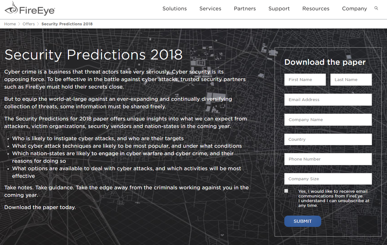
What the page does well:
- The HTTPS URL means that the visitor’s personal information will only be accessed by the website and no outside parties.
- A privacy policy and privacy shield let prospects know exactly how their private information will be retained and shared.
- Bulleted copy allows visitors to quickly find out what unique insights the paper offers.
- Framing the form helps draw attention to it.
- The unchecked opt-in box makes it so prospects opt-in if they want to receive emails from FireEye.
What could be A/B tested:
- Including customer testimonials may help generate more conversions by sharing others’ success stories with the company.
- Adding brand logos or industry awards would show visitors that FireEye has been recognized by other people in the industry.
- White text over this background makes this page more difficult to read. This could be detrimental to conversions.
- Showing a cover image of the paper would provide visitors with a preview and might make them more likely to download it.
- Exit links — header and footer navigations, the FireEye logo, Related Resources, etc. — provide visitors to leave the post-click landing page without downloading the paper.
- The CTA button copy is vague. Something more specific and personalized like “I want the Security Predictions Paper!” might produce better results.
8. Infoblox

What the page does well:
- Customer logos and total customer count show prospects that Infoblox is trusted by many other well-known companies.
- The shadow box around the form makes it stand out on the page, drawing more attention.
- Bold copy and bullet points draw attention to the five key points the ebook.
- The ebook’s cover image provides prospects with a preview of what they will download.
What could be A/B tested:
- No HTTPS in the URL means the connection is not secure and the visitor’s information could be compromised. Google Chrome will flag this type of page as of July 2018.
- Adding a customer testimonial from one of the the highlighted companies would add even more credibility to Infoblox.
- Showcasing industry awards would also help visitors feel more confident in their decision to use Infoblox as their SaaS security.
- Multiple exit links (the Infoblox logo, social media buttons, and footer links) are distracting and could easily remove visitors from the page without converting.
- Too much copy could be overwhelming for visitors. It also makes the page unbalanced and less aesthetically pleasing.
- A more contrasting CTA button, like orange, would make it stand out more and likely generate more conversions.
9. BetterCloud
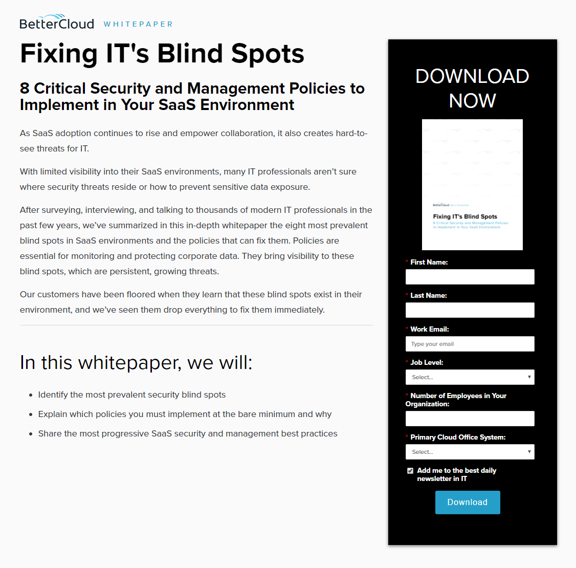
What the page does well:
- The URL with HTTPS follows best practices and won’t be flagged by Google Chrome as not secure.
- Minimal copy allows prospects to learn about the offer without being overwhelmed by text.
- Bullet points make it easy for visitors to scan the page and find some important details about the white paper.
- An encapsulated form helps it stand out so more people complete it.
- The white paper cover page provides a preview of the offer (even though it doesn’t show much except the title).
What could be A/B tested:
- Adding any trust signals would make BetterCloud appear more trustworthy.
- The blue CTA button doesn’t stand out as much as it would if it were orange, for example.
- The CTA button copy isn’t persuasive or personalized at all. Changing it to something like “Show me the white paper!” would likely produce more downloads.
- Checking the opt-in box might leave BetterCloud with uninterested people on their newsletter list.
- Exit links in the footer could send visitors away from the page before converting.
How will you design your page?
High-converting post-click landing pages must instill trust in visitors for them to feel safe in redeeming your offer. Without key components like HTTPS, customer testimonials, privacy policy, and industry awards, your conversion rate likely won’t be as high as you like. Building personalized, post-click landing pages is your best chance to earn a high conversion rate.
Turn ad clicks into conversions, create dedicated, fast-loading post-click pages for every offer. See how you can provide audiences with unique post-click landing pages by signing up for an Instapage Enterprise Demo today.

See the Instapage Enterprise Plan in Action.
Demo includes AdMap™, Personalization, AMP,
Global Blocks, heatmaps & more.
