Moz — a brand that traditionally focuses on SEO software and solving organic search rank formulas — ironically doesn’t often use post-click landing pages for organic purposes. Instead, Moz post-click landing pages are primarily connected with their paid ad campaigns: PPC, display, social media, etc.
After a quick definition, today we will analyze five Moz post-click landing pages that the company uses to generate conversions, highlighting what they do well and what could be A/B tested for potentially higher results.
What is a post-click landing page?
A post-click landing page is a standalone web page that uses persuasive elements, such as attention-grabbing headlines, engaging media, trustworthy social proof, and contrasting CTA buttons to convince visitors to take action on a specific offer. That action could be to download an ebook, sign up for an event, register for a webinar, start a free trial, request a demo, and more.
5 Moz post-click landing page examples
Moz’s primary goal is to generate account signups and to persuade into action, so the company offers a 30-day free trial. Although each post-click landing page example below promotes a different Moz feature or functionality, most lead to the same Moz Pro free trial signup page.
(For shorter post-click landing pages, we’ve displayed the entire page. For longer pages, we’ve only shown above the fold, so you’ll need to click through to the page to see some of the points we discuss. Also, some of the pages may be undergoing A/B testing with an alternate version than is displayed below.)
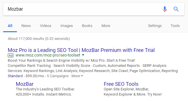
1. MozBar
A quick Google search for “Mozbar” produced this top search ad:
Clicking the “MozBar” sitelink extension leads to this post-click landing page:
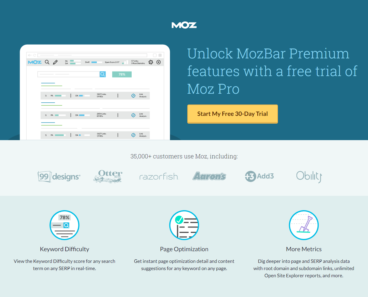
What the page does well:
- The large headline immediately lets visitors know exactly what they can do on this page: Unlock MozBar Premium features with a free trial of Moz Pro.
- The image provides a preview of MozBar without giving away too many details.
- The orange CTA buttons “pop” off the page, making it easy for prospects to fulfill the conversion goal.
- Personalized copy on the CTA buttons make the offer more relatable and compelling.
- A click-through design reduces post-click landing page friction by allowing visitors to learn about the offer without being intimidated by a form.
- Brand logos serve as trust signals, letting visitors know that other well-known brands have put their trust in Moz.
- The customer testimonial helps tell Moz’s story through someone else’s eyes. The headshot, full name, position, and affiliation increase credibility.
- Minimal copy (with iconography and bold formatting) makes the page easy to navigate and pull important information from.
What could be A/B tested:
- The Moz logo and iPullRank are hyperlinked and could remove visitors from the page without converting.
- No privacy policy might make visitors hesitant to click-through to the next page.
- Adding visual cues, such as an arrow pointing to the CTA button, would help visitors focus on the elements most important for conversions.
2. Keyword Explorer
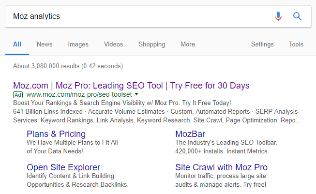
This top search result came from a Bing search for “Moz analytics”:
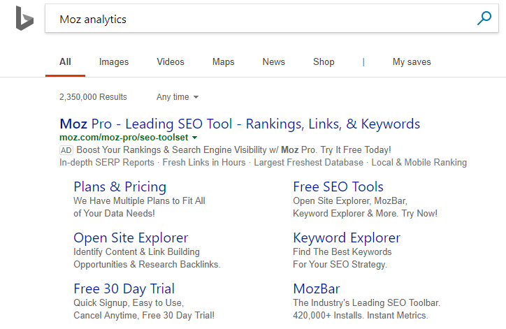
When searchers click the “Keyword Explorer” sitelink extension, they’re directed to this post-click landing page to learn more about Moz’s Keyword Explorer feature:
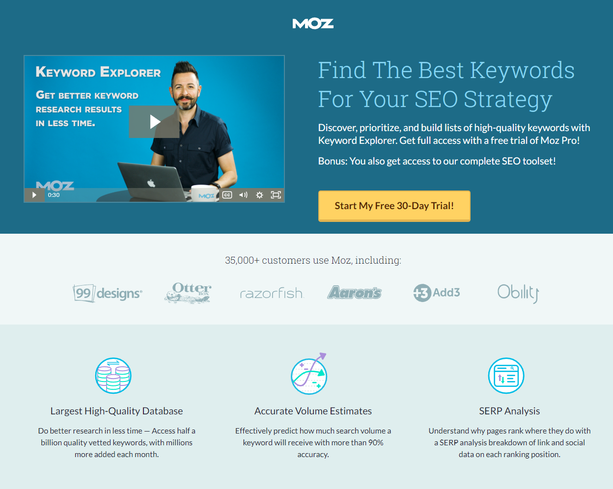
What the page does well:
- A 30-second video explains quickly and conveniently how users can learn about Keyword Explorer without having to read through copy.
- The coordinating headline and subheadline immediately tell visitors what the offer is and how it works.
- The contrasting orange CTA buttons are likely to capture visitors’ attention, making it easy for them to fulfil the conversion goal.
- The personalized CTA button copy tells prospects exactly what clicking will do for them.
- A click-through design removes the form from the page, allowing visitors to fully learn about the offer before converting.
- Company logos show visitors that other well-known brands are satisfied Moz customers.
- The 3 primary benefits of Keyword Explorer are highlighted with iconography and minimal copy.
- Jon Clark’s testimonial (complete with a headshot, full name, position, and affiliation) helps build brand and product credibility.
What could be A/B tested:
- Increasing white space would make the page more aesthetically pleasing, and would allow visitors to focus more on the most important elements, like the CTA button.
- Exit links — the Moz logo and the hyperlinked “NBCUniversal, Inc.” — could distract prospects and remove them from the page before converting.
- Adding a privacy policy would likely make prospects feel more comfortable with submitting their personal information on the next page.
- Including a live chat would allow visitors to ask questions they might have about the Keyword Explorer feature before deciding to sign up for a trial.
3. Site Crawl
The same “Moz analytics” search on Google provided these results:
This time, when prospects click “Site Crawl with Moz Pro”, they land here:
What the page does well:
- The headline and subheadline tell prospects what the offer is for and how it can benefit them.
- The image provides visitors with a preview of what they can learn from having their site crawled by Moz.
- Orange CTA buttons are great for capturing visitors’ attention because orange and blue are contrasting colors on the color wheel.
- The CTA button copy is very specific and written in first-person.
- The number of Moz customers (complete with logos) shows visitors that many other companies (including well-known brands) have worked with Moz.
- Iconography and bold font draw attention to the three main benefits of Moz’s site crawling feature, and minimal copy makes them easy to read through.
- Jason Dodge’s quote serves as a testimonial to how the Site Crawl feature helps other businesses.
What could be A/B tested:
- The hyperlinked Moz logo takes visitors to another page, likely reducing conversion rates on this page.
- Enlarging the CTA buttons (and copy) would make them more attention-grabbing.
- Adding a privacy policy to the footer would likely make visitors feel more comfortable clicking through to the next page to enter their information.
4. Link Explorer
Below is a Moz Facebook post that promotes a free trial with Link Explorer:
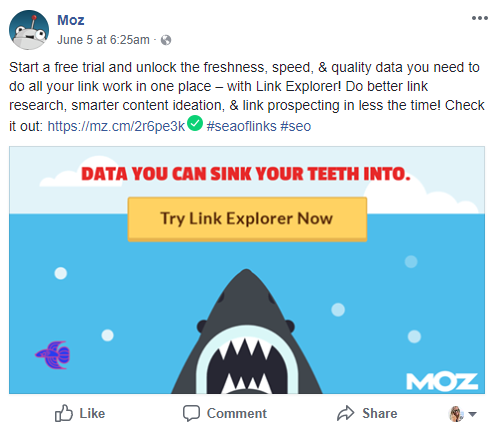
The post description includes the main benefits of Link Explorer, and provides a link to the post-click landing page:
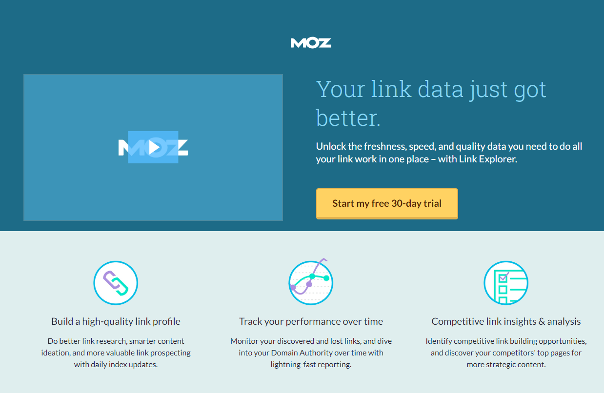
What the page does well:
- Message match from Facebook to post-click landing page reinforces the main message and lets prospects know that the Facebook post is relevant to the post-click landing page upon arriving.
- The headline lets prospects know what the page offers (better link data), and the subheadline tells them how.
- The 94-second video allows visitors to quickly learn about the offer and the product without having to read through text.
- The link index by the numbers section provides some quick details about the legitimacy of Link Explorer.
- Orange CTA buttons contrast well with the rest of the page because blue and orange are opposite each other on the color wheel.
- The CTA button copy is specific and personalized — two qualities that help persuade prospects to click.
- A click-through design lets visitors learn about the offer first, and then complete the form on the next page, instead of being faced with both at the same time.
- Iconography and bold formatting (with minimal copy) allow visitors to easily spot the three main benefits of Link Explorer.
- The customer testimonial provides more specific information about Link Explorer, and indicates that other customers are satisfied with Moz.
What could be A/B tested:
- The Moz logo and hyperlinked “beta launch” serve as escape routes from the page, which likely reduces the page’s conversion rate.
- Excluding a privacy policy could deter prospects from converting.
- Incorporating directional cues, like a bouncing arrow pointing down the page, would direct prospects further down the page to learn more.
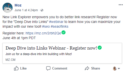
5. Deep Dive Into Links webinar
This last example is slightly different, simply because the click-through post-click landing page doesn’t lead to a free trial sign up page. Instead, it allows prospects to sign up for a webinar. Here’s another Facebook post that introduces users to the webinar and includes the post-click landing page link:
Post click, prospects land on this page:
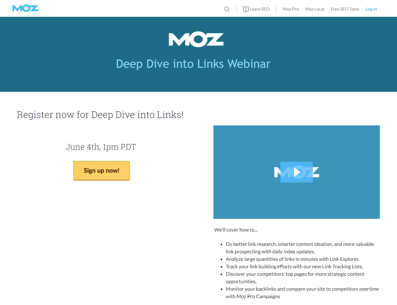
What the page does well:
- The orange CTA button contrasts well with the rest of the blue and white page.
- The video delivers information to prospects in an interactive way.
- The bulleted list allows visitors to scan the page to quickly learn the key takeaways.
- Melissa Brown’s headshot and title inform prospects of who they’ll be hearing from during the webinar.
What could be A/B tested:
- Header and footer navigations are likely to distract visitors, allowing them to leave the page without signing up for the webinar.
- The CTA button copy could be more persuasive. “Save my spot!” for example, is more personalized and compelling.
- Too much empty space under the CTA button makes the page unbalanced. Including a Moz customer testimonial here would add social proof and balance the page.
Create an optimized post-click landing page like Moz
These examples demonstrate how Moz uses post-click landing pages primarily to enhance their paid ad campaigns and to persuade people to sign up for their 30-day free trial. The last two Facebook examples, though, show how Moz also occasionally uses them for organic purposes.
No matter how you use your post-click landing pages, be sure to create an optimal visitor experience and achieve higher conversion rates by building 100% customizable post-click landing pages with Instapage. sign up for an Instapage Enterprise demo today.

See the Instapage Enterprise Plan in Action.
Demo includes AdMap™, Personalization, AMP,
Global Blocks, heatmaps & more.
