In 2023, the average time visitors spent on any given page was only 54 seconds. That’s eight seconds less than it was in 2019. When you consider how much more time people spend online, especially since the spread of the COVID-19 pandemic, this behavior indicates visitors expect to find the information they need more quickly than ever.
Maybe your landing pages have a slow load time to accommodate video files. Perhaps your heatmaps are telling you there’s a lot of activity at the top of the page, but nothing further down. Or any data you have is simply inconclusive.
Regardless of the issue, marketers only have a short window of time to capitalize on each ad click. When the follow-through—the conversion—isn’t happening after the click, the landing page lacks clarity, creates unnecessary friction, or both. If you’re noticing high bounce rates, dropoff, or lower conversion rates than you’d like, it’s time to adjust these five elements of your landing page.
Hierarchy of information
Hierarchy of information refers to the structure of your landing page content. Think of it as an outline that defines the purpose of each section of your landing page.
Many of us learned to write in an inverted pyramid style—meaning we give as much of the relevant, newsworthy information as possible up front. Then, we give details in order of most important to least important. This structure evolved from one of the earliest forms of print communication, the newspaper, where stories had to fit a
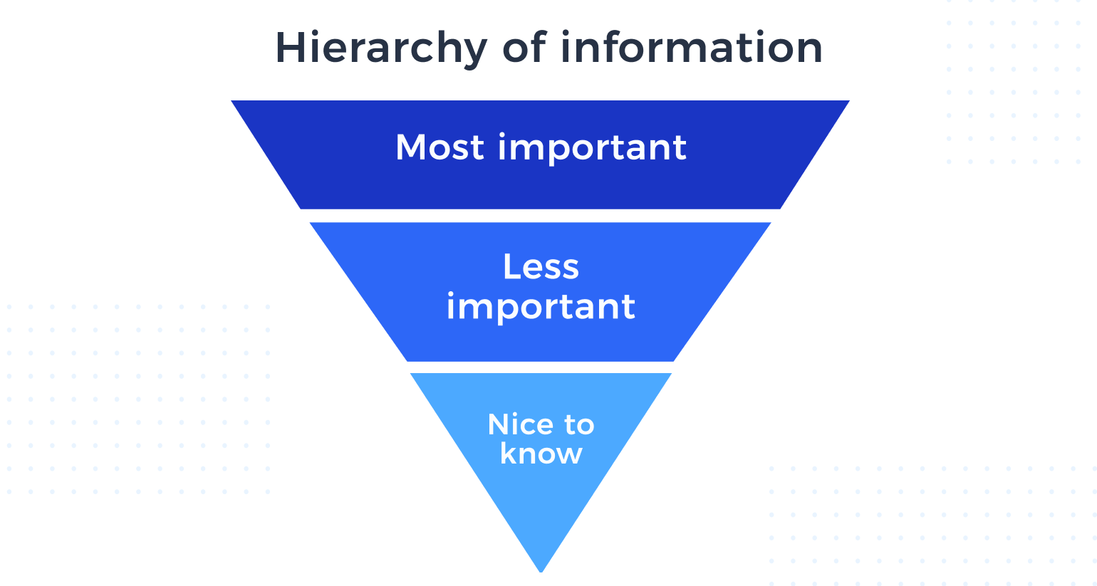
While the inverted pyramid has its merits, it doesn’t necessarily meet the needs of today’s audiences. The ultimate sticking point is that giving away all the valuable information up front overwhelms the visitor.
However, you still need to provide enough substance for the reader to want to read further or make a decision. Your page should not only fit within a strategic storyline—it should also tell a story itself. Each landing page can present information in a way that flows naturally from one point to the next based on the customer’s psychographic profile. We call this principle “conversion storytelling.”
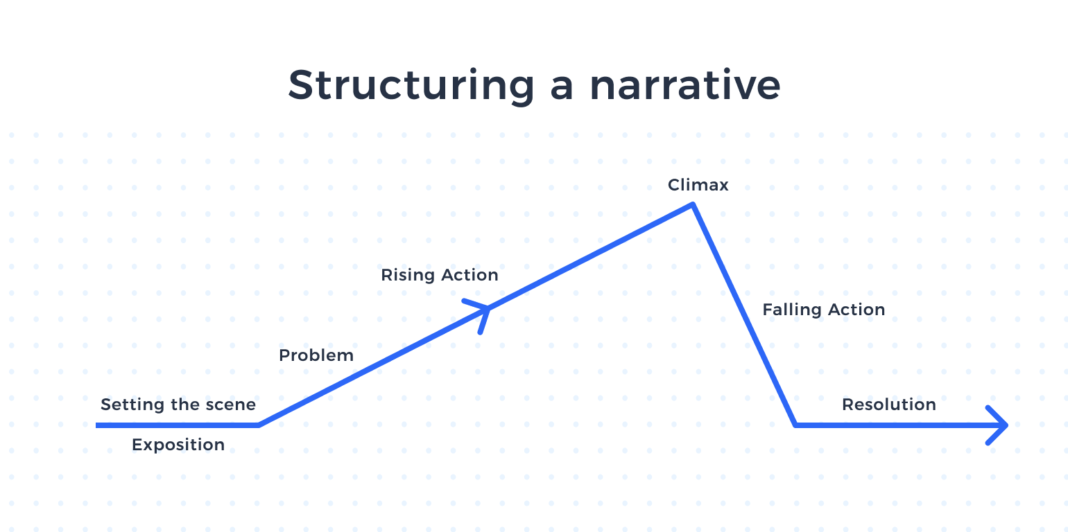
Conversion storytelling follows a consistent structure. Every piece of information should move your narrative further along the page. Your product or service is the hero of the story, and the climax is when the visitor decides to convert. When they start using the product or service, they achieve resolution and catharsis.
While you must hook your visitors in the header, there’s no point in continuing to provide information throughout the landing page if it doesn’t serve an additional storytelling goal that will drive them to convert. Review your landing pages to make sure every piece of your page builds tension and helps overcome any obstacles to conversion.
Headlines
A well-crafted headline accomplishes several goals at once. It should be engaging, highlight your brand, and offer a compelling reason to take action. It may also need a subheader for additional context, like a little more detail on a special offer.
While an enticing headline can highlight some elements of a campaign offer, it cannot and should not convey extensive detail. Otherwise, you risk losing your audience when they see a wall of text after clicking (or tapping) over to your landing page.
When you audit your headline, ask yourself:
Is my headline precise about my product, service, or special offer?
Your headline should have enough depth that it can’t apply to any generic product or service. It should be specific and personal to the journey the visitor has taken.
Is my headline under 10 words?
We try to keep our headlines under 50 characters, and the ideal length is around six words.
Does it offer a high-level peek into the product?
While it shouldn’t divulge too much detail, the headline and hero text should connect to the information further down the landing page.
Am I tempted to write a paragraph below my headline in the hero section?
If the answer is “yes,” consider how you can convey clarity with a hero image or video instead of text. Also, think about where else you can provide that information and space it out among your landing page sections.
All these questions will become much easier to answer once you’ve defined your hierarchy of messaging. You’ll know which details to expand on and what you can save for later on in the page. That will help you avoid overwhelming the visitor so much that they don’t want to scroll any further.
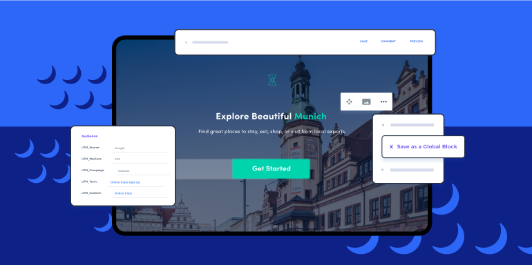
Hero image
Visuals are crucial. Anyone—whether they’re an experienced marketer or a casual internet user—knows when an image is eye-catching or off-putting.
Sure, you want to pick a stunning image. We don’t need to convince you of that. As we mentioned above, careful image selection can add clarity to your headline message. However, the image must also have all these other attributes.
Technical elements to audit:
- Ideal dimensions: 800 x 1200 pixels (landscape images usually work best)
- Mobile rendering: Mobile accounts for 55% of traffic, so pick an image where the details are easy to view on a small screen
- File size: Large enough for good image quality, but small enough that it loads quickly
- Image content: Test to see if human or product images perform better (some say pictures of people are more compelling, but it really depends on your brand and industry)
You may also consider video for your hero, but be mindful of how it impacts page speed.
Page speed
Put yourself in the visitor’s shoes. You see something you like on an ad, so you click. Then you wait… and wait… and you see the loading bar slowly creeping by.
In this scenario, it’s perfectly human to get annoyed with the slow loading speed and move on with your life. If said landing page takes more than 12 seconds to load, you will more than likely bounce. That’s why page speed matters.
If you have someone’s attention, of course you want to respect their time. But it’s also crucial for your search engine rankings. Google uses more than 200 factors to determine page rankings, including load speed.
Test your page speed using Google PageSpeed Insights to see how your performance stacks up. If it’s not up to par, start making changes.
Three common culprits of slow page speed:
- File sizes: Optimize your images and videos to balance smaller file sizes with acceptable quality.
- Plugins: Select these tools carefully, or they’ll end up hurting you more than they help you.
- Web hosting: Avoid sluggish load times when you have an uptick in traffic through a content delivery network, which spreads out the server load.
For more information on how to correct slow landing page speeds, make sure to check out our in-depth post on the subject. Google’s PageSpeed Insights tool can also offer tips on how to improve load times, though it’s time-consuming if you have multiple landing pages.
CTA placement
While you may be strategic about when and where to go into more detail on specific messaging points, keep in mind that visitors can decide to convert at any time. If you don’t have your call to action accessible as customers scroll down your page, you’re missing out on conversions.
Think about the last time you clicked on a Facebook ad for something you wanted to buy—let’s say a pair of sweatpants you saw at Target last week. You saw the perfectly timed ad and remembered how soft and comfortable the pants looked. So you clicked.
Now imagine if you had to hunt for that “Add to Cart” button and scroll through all the product details for it—past the technical specs of the fabric, past other reviews of these sweatpants. If you were in a hurry (which, let’s face it, most of us are), you’d probably get distracted and forget to complete the transaction.
People don’t always have the patience to scroll down a page. They convert when they feel they have enough information, and they expect an instant resolution.
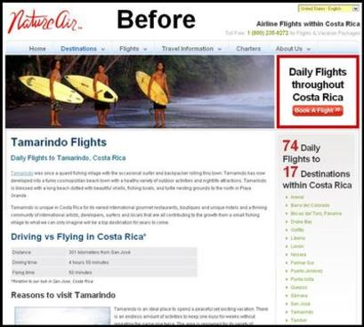
As another example, by adding an extra CTA button to this landing page, without other design adjustments, conversions increased by nearly 600%:
Don’t bury your CTA. Keep reading for more information on how to resurrect it.
We also recommend these additional tactics:
- Accommodate the F-pattern and Z-pattern styles of reading online.
- Do not overly stylize your button.
- Use contrasting colors to make the CTA button easy to spot.
- And don’t be afraid to test the location of your CTAs. In their research,
the Nielsen Norman Group found that the left side of the screen gets more attention than the right side.

The right plan for conversion success
If implementing edits to your landing pages to help improve performance seems like an overwhelming task, it doesn’t have to. Instapage can help. We offer three plans and different pricing options, so you can find the right path toward improved advertising success. See all Instapage plans here.
