
Creating your landing page to include all of the vital landing page elements is important, but equally as important, is their order and location — the layout of your landing page.
When designing your landing page layout, it’s essential to consider the way your visitors are most likely to view your page. Acknowledging our tendency to read from top to bottom is a good start to getting visitors to do focus on what you want them to do. By knowing where their eye gaze is likely to go, you can create a visual hierarchy and place your CTA in the best locations for them to convert.
There has also been extensive research to support this. In 2006, the Nielsen Norman Group conducted what is now one of the most useful and most cited eye-tracking studies to date. During the study, they examined how 232 users viewed thousands of different web pages. The findings concluded that users’ main reading behavior was relatively consistent across the various sites and tasks. Users read in an F-Pattern layout.
What is the F-Pattern?
The F-Pattern is the way our eyes move when we read content online. In a matter of seconds, our eyes move at outstanding speeds across website’ copy and other visual elements, scanning the page in this order:
- First, across the top of the page to read important headlines
- Then, down the left side of the page to view numerals or bullet points
- Lastly, across the page again to read bolded text or subheadlines
The three heat maps below are derived from user eye-tracking studies of three different websites. The color key is as follows:
- Red = most viewed and most fixated on
- Yellow = some views, but less fixation
- Blue = least viewed and hardly any fixations
- Gray = hardly any views and no fixations

Notice that the F-Reading pattern is more of a rough, generalized outline — not necessarily an exact F shape. Also, note that the F-Pattern design does not limit itself to two horizontal stems like a traditional F.
There will be times when users only read across one horizontal line, making the pattern look like an upside-down L. Other times they’ll read a third section of the page, making the design look more like an E than an F. And, if your Landing page is longer, you’ll want to include more than two stems in order to help create a visual hierarchy that people are more likely to follow.
How the F-Pattern applies to landing pages
It’s important to design web pages with an intentional flow. Without anything placed specifically to grab your viewers’ attention, their eyes will naturally move across a content-heavy page in the F-Pattern design.
The F-Pattern design works best for pages that are dense with text — like blog posts, search results pages, longer sales pages, etc. However, that doesn’t mean you can’t design short-form landing pages with the F-Pattern layout.
Using the findings from eye-tracking studies, you can strategically design any landing page so that the most important elements are exactly where your visitors are most likely to focus on them.
Keep in mind that viewers’ eyes will almost always start in the top left corner of the page before scanning the rest of the page. So, if your landing page is busy and you want visitors to notice a particular element right off the bat — like a countdown for your offer — be sure to place it in this top left section. Then, design the rest of your landing page with a clear visual hierarchy and a flow that leads your viewers to your CTA.
A landing page that ignores the F-Pattern
Pest Exterminator created this post-click landing page and it doesn’t follow the F-Layout. It lacks any visual hierarchy:

Where does your attention go first? The image? The discount? The one-form field? The three offers at the bottom?
Your eyes aren’t drawn to one specific place. There’s too much going on pulling your attention in several different directions. Each element has been formatted to draw as much attention as possible, which makes them all compete with one another. Therefore, it’s difficult for visitors to identify the primary goal of the page and Pest Exterminator will likely struggle in generating conversions.
Now let’s look at a few landing page examples that follow the F-Reading pattern.
Keep in mind, for shorter landing pages, we’ve shown the entire page. For longer pages, we only displayed above the fold. Additionally, some of the brands listed may be A/B testing their page with an alternate version than the one displayed below.
Landing pages that follow the F-Layout
Dovico

The Dovico landing page above employs F-Pattern web design best practices. Notice how each important component is located exactly along the F-Pattern route where visitors are naturally going to look when viewing this page:
- Viewers will first look in the top-left corner of the page, where they will spot the company logo.
- Moving along the first horizontal stem, they will then come to the woman’s smiling face. What’s particularly interesting here is that the F-Angle slopes downward toward her face and is not directly straight across to the phone numbers.
- Moving down the left side of the page to the next horizontal stem, viewers will focus their attention on the headline and subheadline.
- Finally, they’ll continue the F-Pattern down the vertical stem, where they’ll come to the CTA button, which is the main objective of the landing page.
Placing the most essential landing page elements along the F-Layout like this helps to optimize Dovico’s page and convince visitors to take action on the offer.
Dynamic Yield
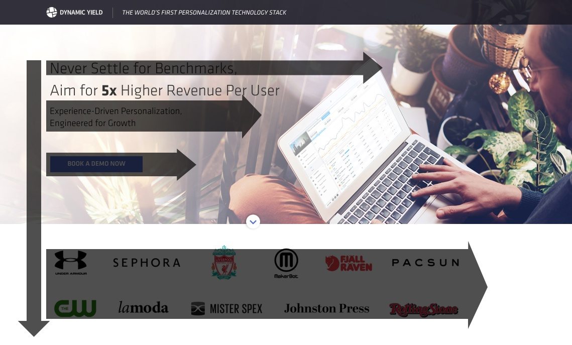
Dynamic Yield’s post-click landing page also follows the F-Pattern layout, but since their name and logo is the smallest thing above the fold, viewer’s eyes are likely to start in a different location:
- They will likely be attracted to the page headline first, since the font is bigger and a portion of it is bold.
- Next, they will move along the first stem to the image on the right, which completes the first horizontal stem.
- Scanning down the vertical stem, viewers will read the subheadline.
- Continuing down, the bright blue CTA button is likely to capture the visitor’s attention next.
- After the CTA button, the customer badges act as an addition stem and the page continues in a similar fashion below the fold.
The Joint Chiropractic

Since F-Pattern designs don’t always have to follow a traditional F-Shape, notice how The Joint Chiropractic landing page has quite a few horizontal stems:
- Similar to Dynamic Yield, the headline begins the F-Pattern (and continues to the right with the form).
- Second, the mission statement (in larger print than the rest of the copy) falls along the next stem.
- Finally, the iconography and bolded benefits of The Joint Chiropractic make up the final stems of the pattern.
Despite the higher number of stems, the page was created with F-Pattern web design best practices in mind — making it easy for visitors to follow along and focus on the most important parts of the landing page.
The Boston Globe
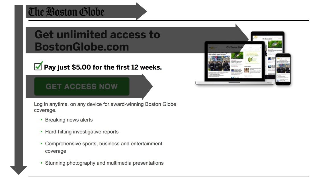
Boston Globe’s landing page doesn’t follow a typical F-Shape, which ultimately helps them persuade visitors to convert on the promotion:
- Starting in the top left corner, visitors spot the newspaper’s logo first.
- Directly underneath the logo is the headline, followed by the image along the same horizontal stem.
- Continuing down the vertical stem, visitors fixate on the bright green CTA button.
- If they choose to continue further down the vertical stem, they will learn what they can expect when signing up for unlimited access.
It’s your turn to use the F-Pattern
Including all of the necessary landing page elements is important for conversions, but their layout is just as important.
The F-Pattern design helps you establish a visual hierarchy and an intentional flow for getting visitors to focus on specific elements. If you can get them to follow the path you want, they’ll be less likely to bounce and instead be more engaged and take action on your page.
With these examples in mind, it’s your turn to put the F-Layout into practice. Create your own professional landing page with Instapage, sign up for an 14-day free trial today.

Try the world's most advanced landing page platform with a risk-free trial.
