Demo landing pages are typically included in the decision stage of the buyer’s journey, at the bottom of the marketing funnel. In the decision stage prospects already know they have a problem, they’ve evaluated all of their options, and are now deciding who to purchase from.
Lead capture forms tend to be longer on these pages because companies want to know more about the prospect for the sales process. With this in mind, let’s take a look at 10 landing pages to see what works well and what needs improvement.
(For shorter pages, we’ve shown the entire page. However, for longer pages, we only displayed above the fold. You may need to click through to each page to see some of the points we discuss. Also, keep in mind that some brands may be A/B testing their page with an alternate version.)
10 Demo landing page examples
1. Marketo
Conducting a Google search for “compare marketing automation,” the following results appear:

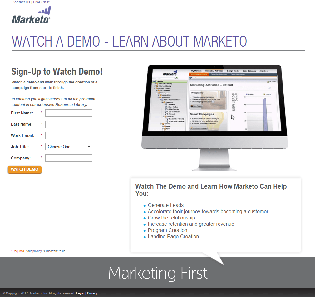
Upon clicking Marketo’s ad, search users land on this page:
What the page does well:
- “Demo” is in the headline, subheadline, multiple locations in the copy, and the CTA button, so there is no question that this page is offering a demo for Marketo software.
- The headline is straightforward and tells visitors exactly what the demo is about.
- The orange CTA button color stands out because orange isn’t used anywhere else on the page and it contrasts well with the rest of the color scheme.
- The image gives prospects a sneak peek into Marketo’s software.
- Minimal copy with bullet points let’s prospects know what they’ll learn by watching the demo, without overwhelming them with too much to read.
What could be A/B tested:
- Exit links at the top (“Contact Us,” “Live Chat,” logo) and bottom of the page (“Legal”) increase the likelihood that prospects will leave the page before completing the form.
- The CTA button size is too small to grab maximum attention. Orange will certainly draw some eyeballs, but why not make the button even more obvious to click?
- The CTA button copy could be more persuasive. “Watch Demo” is good, but may not generate as many conversions as “I Want a Demo” or “Schedule My Demo.”
- Adding social proof like Marketo customer testimonials or the total number of Marketo users would help convince prospects to watch a demo and potentially choose Marketo as their marketing automation platform.
- The bulleted copy needs improvement. First, the capitalization is inconsistent. Second, if the title of the section reads, “Learn How Marketo Can Help You,” then each of the following bullet points should be able to sensibly complete that sentence. “Learn How Marketo Can Help You Program Creation” does not make sense.
- Adding more information about whether the demo is immediate or if prospects must schedule it for another time would be helpful.
2. SharpSpring
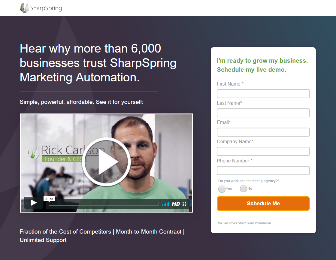
Using the same search query above, clicking the SharpSpring ad sends visitors to this demo post-click landing page in which prospects must schedule their demo, rather than watching it immediately:
What the page does well:
- The short video is professionally made and highlights some major benefits such as unlimited support and low fees, which likely makes prospects more eager to schedule a demo.
- The CTA button copy is in first-person, making it more personalized to the visitor.
- Various forms of social proof (company logos, industry ratings, testimonials with headshots) add trust value to SharpSpring and the offer.
- Iconography below the fold provides supporting information about SharpSpring and help entice visitors to schedule a demo.
What could be A/B tested:
- Adding white space above the fold would help this section look less cluttered.
- Exit links — the hyperlinked SharpSpring logo and the G2 Crowd badge – provide prospects an easy way off the page before scheduling a demo.
- Adding directional cues, such as arrows pointing down the page, would let prospects know that there is more information to learn below the fold.
- The secondary CTA button at the bottom directs prospects to a 404 page. This needs to change because CTA buttons are one of the most crucial elements of post-click landing pages.
3. Infusionsoft
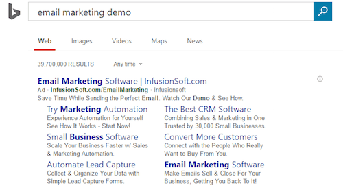
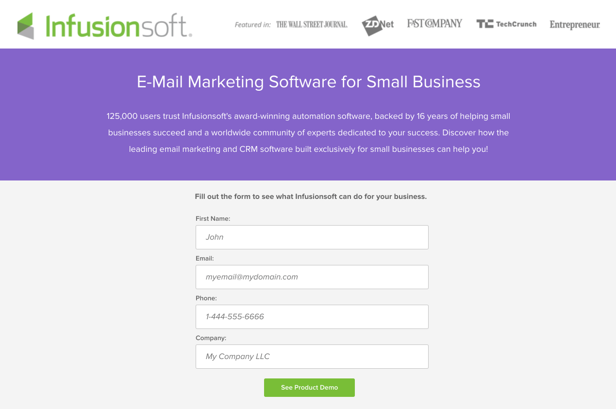
Searching on Bing for “email marketing demo” presents this ad at the top of the results and the following post-click landing page:
What the page does well:
- The Infusionsoft logo lets visitors know immediately who is offering email marketing software. Plus, the logo is not hyperlinked to the homepage so prospects can’t easily leave the page.
- Social proof (125,000 users) adds trust to Infusionsoft and their email marketing software.
- Personalized copy helps to make prospects feel highly connected to the offer, increasing their chances of converting.
- Bullet points (in the form of iconography) draw attention to the important pieces of information about Infusionsoft’s software.
- Customer testimonials — complete with organizations, headshots, and numerical evidence — help assure prospects that Infusionsoft is a viable solution for marketing automation.
- Sufficient white space throughout the entire page makes it well-balanced, organized, and easy to skim.
What could be A/B tested:
- The headline copy should be more benefit-centric to entice more visitors to sign up for the demo.
- The green CTA button should be in a more contrasting color to make it “pop” off the page more. Currently, it’s the same color as the iconography and doesn’t draw as much attention as it could.
- The CTA button copy could be more personalized like the rest of the copy. Something like, “Show Me the Demo,” might speak more to the prospect than, “See Product Demo.”
- Informing prospects of whether they’ll have to schedule their demo or if they can watch it immediately would be helpful in their decision-making process.
- Adding visual cues, like arrows pointing down the page, would be helpful since many of the persuasive elements are below the fold.
- Enlarging the image of the software would draw more attention to it and give prospects a better, clearer idea of what using the software is like.
- Removing links in the footer (“Legal” and “Sitemap”) would reduce distractions, potentially increasing conversions.
4. Pendo
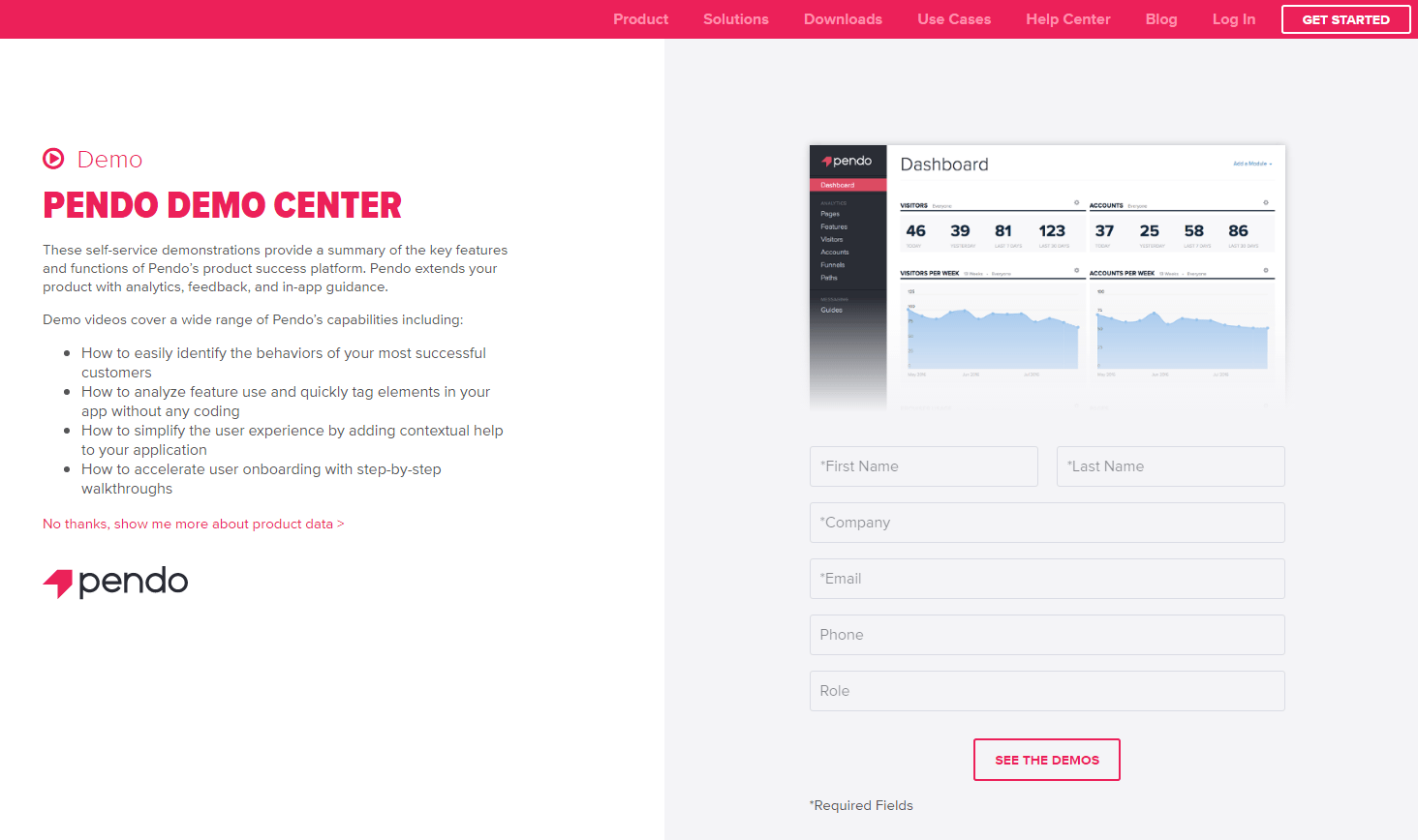
Searching for Pendo in Google shows this ad at the top of search results. Once clicked, search users go to the corresponding post-click landing page:

What the page does well:
- Bullet points explain the key takeaways of Pendo demonstrations without overwhelming visitors with too much copy.
- The image of the Pendo dashboard provides prospects with a preview of what the platform looks like prior to seeing the demo.
- Lots of white space helps draw attention to the bullet points, the dashboard screenshot, and the lead capture form.
What could be A/B tested:
- Navigation in the header and footer are distracting and could prevent visitors from staying on the page long enough to sign up for the demo.
- The headline copy “Pendo Demo Center” is weak and probably won’t persuade visitors to convert. Changing it to something more specific and benefit-centered would better compel visitors to stick around and watch any demo.
- The “No thanks” link underneath the bullet points provides visitors with an easy way off the page. The post-click landing page that this links to should be completely separate from this page.
- The CTA button doesn’t stand out as much as it could. While the frame around the button is good, testing the button in a more attention-grabbing color such as green or blue would likely get better results.
- The CTA button copy should be benefit-oriented, which would probably result in more conversions. “Show Me the Demo” is more enticing than “See the Demos.”
- Adding more details to the copy or CTA button about whether or not the demo can immediately could persuade more visitors to convert.
5. Hootsuite
Hootsuite also advertises with Google Ads on their brand name. Once a search user clicks the main ad headline, they arrive at the post-click landing page below:


What the page does well:
- The benefit-oriented headline is descriptive and encourages visitors to investigate the rest of the page.
- The body copy appears in digestible chunks which makes the page easier to scan and evaluate the offer.
- The CTA button copy uses the word “your” which makes it more personalized to the visitor.
- Customer badges instill a sense of trust and assurance in prospects, making them think, “If these well-known brands use Hootsuite, then they must be a good social media tool.”
- The option to change languages is convenient and likely results in a larger, more diverse customer base.
- “Over 15 million users” acts as social proof for Hootsuite.
- The page is aesthetically pleasing — organized and well-balanced — providing visitors with a more enjoyable experience.
What could be A/B tested:
- Adding engaging media, such as an image of the platform, would draw more people in and persuade them to book a demo.
- Exit links (the company logo and links in the footer) could distract visitors from the main goal of this page.
- The CTA button font should be more attention-grabbing.
6. Intacct
A Bing search for “accounting software” produced these top ad results:

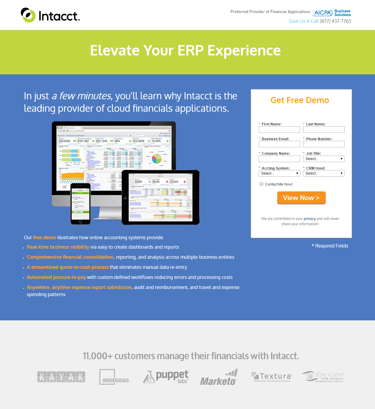
Clicking Intacct’s PPC ad sends people to this post-click landing page:
What the page does well:
- Contrasting colors act as a visual cue, drawing attention to the various parts of the page.
- Italicizing “a few minutes” let’s prospects know that watching the demo won’t require too much of their time.
- The image shows prospects that the company’s software is applicable on multiple devices.
- “Free” is in the copy and the form headline, which is a good use of persuasive copy because everybody likes free goods and services.
- The unchecked “Contact Me Now!” opt-in box won’t deter people from pursuing the offer, as it might if the box was pre-selected.
- The arrow on the CTA button is a directional cue that implies visitors should complete the form and click the CTA button.
- Bulleted and highlighted copy is attention-grabbing and makes it easy for prospects to scan the text to find the most important pieces of information.
- Social proof (11,000 customers) demonstrates that many companies already use Intacct to manage their financials.
- Customer badges highlight some well-known companies already using Intacct.
- The exit pop-up video is a final resort technique to capture visitor information. It provides one last way to engage visitors and persuade them to get a demo.
What could be A/B tested:
- The lack of message matching from ad to post-click landing page shows a disconnect. The ad promises “7 Features to Consider Before Buying” but the post-click landing page does not provide any of the 7 features.
- The headline “Elevate Your ERP Experience” is unclear. What is ERP? Making this more clear would provide a better post-click landing page experience.
- The hyperlinked company logo acts as an exit link, providing visitors an easy way off the page before converting.
- The CTA button copy is uninspiring. Changing it to something more personal and benefit-centered may encourage more people to sign up to watch the demo. “I Want an Intacct Demo” is more enticing than the current CTA copy.
7. Hatchbuck
Hatchbuck uses Facebook banner ads to send traffic to their demo post-click landing page:

What the page does well:
- The headline and subheadline complement each other because the headline let’s prospects know what Hatchbuck offers and the subheadline tells them how they can benefit from it.
- Eye gaze in the background image points down at the CTA button, discreetly making visitors look there as well.
- The encapsulated form is bright and attention-grabbing.
- The primary CTA button “pops” off the page because it contrasts well with the white form and red is not used anywhere else.
- Social proof throughout the page (the customer testimonial, embedded Tweet, trust badges) serve as endorsements of the company’s trustworthiness.
- The video is a nice inclusion because it adds more information to the page without overwhelming prospects with too much copy.
- The secondary CTA button at the bottom uses an anchor tag that sends prospects back to the top of the page to complete the form.
What could be A/B tested:
- The Hatchbuck logo and the embedded tweet also act as exit links away from the “demo” goal.
- The full footer provides way too many escape routes off this post-click landing page.
- The secondary CTA button is too small and doesn’t contrast with the page. To generate more clicks, it should be much larger and use more compelling copy.
8. Nextiva
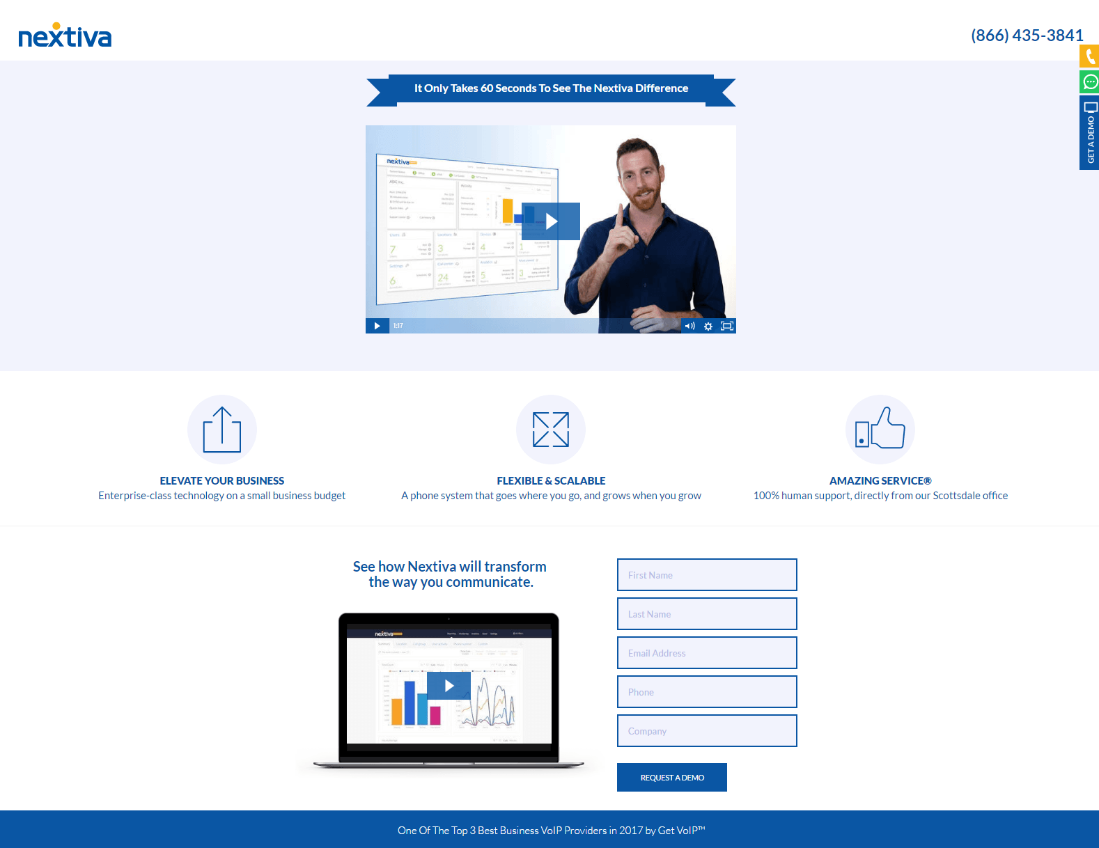
Nextiva advertises on LinkedIn using a Promoted Post to generate traffic to its demo post-click landing page:

What the page does well:
- Message matching between the LinkedIn ad and the post-click landing page (matching copy and media) shows consistency throughout the conversion process, and satisfies customers looking for something specific.
- No header or footer navigation keeps visitors focused on the demo offer.
- The headline is compelling because it let’s prospects know the demo is 60 seconds long.
- Iconography with minimal copy highlights the characteristics and benefits of Nextiva.
- The secondary video at the bottom of the page is a great inclusion because it’s a unique and engaging way to tell prospects to complete the form. It also uses visual cues to encourage prospects to look at the form (the woman glancing at it, walking toward it, and the arrow pointing toward it at the end).
- The page is well-balanced and organized, making it easy for visitors to navigate and comprehend.
What could be A/B tested:
- The hyperlinked logo acts as an exit link and could prevent visitors from navigating the whole page and requesting a demo.
- Is the video above the fold the 1-minute demo in the offer? If so, what exactly are visitors signing up for? This is confusing and could use some clarification.
- The blue CTA button color is the same as other elements on the page, so it doesn’t stand out at all. Changing the button to green would attract more attention than it currently does.
- The CTA button copy is okay. Testing personalized copy like, “Get my product demo now,” may entice more prospects to convert.
- Adding more social proof might increase conversions. The highlight at the bottom of the page is good, but adding testimonials or customer badges would be even better.
9. ServiceMax
A Bing search for “scheduling software” revealed this ad and sends prospects to this demo post-click landing page:


What the page does well:
- Using the word “now” in several locations let’s prospects know they can watch the demo immediately instead of waiting for a scheduled time.
- The “4-Minute” mention let’s prospects know how much time it takes to watch the demo.
- Mentioning the Salesforce integration in the copy lets prospects know that ServiceMax partners with a leading CRM solution.
- Bulleted copy highlights important software features.
- Customer badges increases ServiceMax’s credibility, but adding some context surrounding them would make it more effective.
What could be A/B tested:
- The hyperlinked ServiceMax logo makes it too easy for visitors to leave this post-click landing page.
- “iPad” is in the headline but nowhere else (not in the PPC ad or anywhere else on the post-click landing page) which may be confusing for visitors.
- Adding visual cues, like encapsulating the lead capture form, would draw more attention to important elements.
- The CTA button could be larger and tested in a contrasting color, like green, to make it more attention-grabbing.
- The CTA button copy is in first person to make it more relatable and persuasive. “Show Me the Demo” is more persuasive and puts the visitor in more control
- Including engaging media, like an image or video, might keep prospects on the page longer, which may increase the number of conversions.
10. PulsePoint
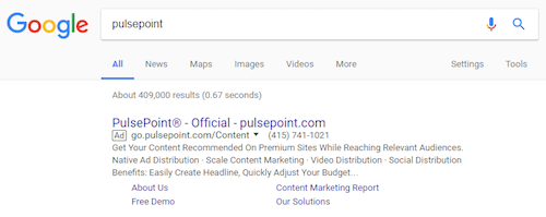
By clicking the “Free Demo” ad extension below, you get to the PulsePoint demo:
What the page does well:
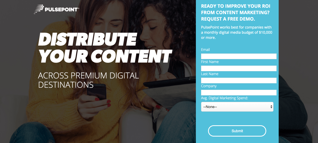
- The form headline is specific, personalized, and benefit-oriented.
- The Z-Pattern layout provides an easy path for visitors’ eyes to follow.
- The form encapsulation, makes it difficult for visitors to miss.
- Bulleted copy makes it easy for prospects to learn about the key features and benefits of PulsePoint without having to read too much.
- The platform image gives visitors a preview of what the platform is like and what they’ll see more of in the demo. However, it’s a bit small and should be larger to give a better representation of the software.
- Social proof — the customer testimonial and customer badges — adds more credibility to PulsePoint and the demo, which helps make prospects feel more comfortable working with the company.
What could be A/B tested:
- Removing the hyperlink from PulsePoint’s logo would eliminate the only unnecessary exit link on the page. If they do this, the only exit link would be converting on the CTA button.
- The CTA button doesn’t stand out because it’s the same color as the form. Designing it in red, for example, would help the button jump off the page.
- The “Submit” CTA button copy is as boring as it gets. Writing conversion-worthy copy such as, “Show Me the PulsePoint Software” or “Schedule My Free Demo” is more inspiring and would entice more prospects to convert.
- Including Jim Sestito’s headshot would be a nice final touch to the testimonial because visitors could put a face to the name.
- The 2015 copyright is out of date and reduces the credibility of PulsePoint, which can make prospects think, “Is this offer even still effective?”
Which demo landing page inspired you?
Demos are one of the best ways to give prospects a sneak peek into your product or service because it gets your brand in front of them as they’re close to a purchase decision. It’s one thing to offer a free product demo, but can be challenging to persuade visitors act. A demo post-click landing page is the best tool to convince them to act.
What stood out to you in these examples? Which page would persuade you to convert? Start creating your own personalized demo post-click landing page with Instapage. Sign up for an Instapage Enterprise demo today.

See the Instapage Enterprise Plan in Action.
Demo includes AdMap™, Personalization, AMP,
Global Blocks, heatmaps & more.
