In about the time it takes to blink, online search users form a first impression about your brand. That means, 0.05 seconds is all people need — and you can’t afford to be on the wrong end.
Knowing this, it’s easy to understand why making an extraordinary first impression is crucial.
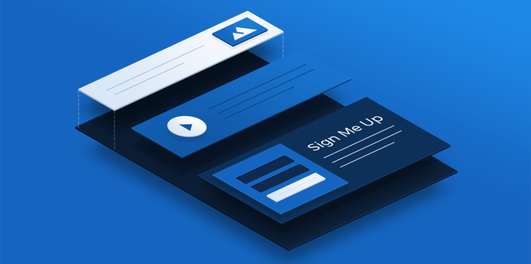
So what’s the best way to accomplish this? A marketing post-click landing page.
What are marketing post-click landing pages?
A marketing post-click landing page is a standalone web page created by digital marketers that uses a combination of persuasive elements like testimonials, benefit-oriented copy, and engaging media to convince its visitors to take action on an offer. The offer could be a newsletter subscription, sign up for an account, download a white paper, purchase a product, and more.
Marketing post-click landing pages aren’t just effective for making impactful first impressions, though. These pages can be used throughout each stage of your marketing funnel and the buyer’s journey to increase engagement and leave a positive, lasting impression on your prospects.
Breaking down the marketing funnel
A marketing funnel is a customer acquisition model of the journey that your clients take with you — from their very first impression of your brand to the time they convert into a customer. Marketing funnels have many parts, but the three main stages are awareness, consideration, and decision.
Awareness stage
The awareness stage is the top of your funnel, before prospects even know who you are. They’re aware they have a problem that needs solving, and what type of product or service they’re looking for, but they don’t yet know your company can solve it.
Consideration stage
The second level of the funnel is the consideration stage. Here, prospects have identified your company as a potential solution, and they’re trying to get to know you better. As they evaluate you and your competition, their goal is to discover your level of knowledge, authority, and trustworthiness to narrow down their options.
Decision stage
At the bottom of the funnel is the decision stage, where your lead makes his or her decision. Prospects know they have a problem to solve, have evaluated their options, and it’s now time to make their decision. Will your company be the chosen one?
Throughout each of these funnel stages, a post-click landing page makes it more likely that prospects stay engaged with your brand and move closer to purchase. Meaning, you increase your chances of turning prospects into leads and leads into customers. (For more information how to use post-click landing pages at the top of the marking funnel, check out this guide.)
How are brands using marketing post-click landing pages?
Since marketing post-click landing pages are effective for driving brand awareness, traffic, and sales; companies often use them throughout their entire marketing funnel.
Let’s take a look at how some brands do this.
(For shorter pages, we’ve shown the entire page. However, for longer pages, we only displayed above the fold. You may need to click through to each page to see some of the points we discuss. Also, keep in mind that some brands may be A/B testing their page with an alternate version than is displayed below.)
Offers in the awareness stage
Marketing post-click landing pages used in the awareness stage are great for making killer first impressions. Pages in this stage are typically used to provide people with initial information about your company, increase blog subscriptions, and generate downloads of tip lists, ebooks, and white papers.
Here are two examples in the awareness stage:
Health Coach Institute
Health Coach Institute created this post-click landing page to provide prospects with more information on becoming a Life and Health Coach:

What the page does well:
- The Health Coach Institute’s logo is not hyperlinked. This helps keep visitors on the page, instead of providing an easy exit route.
- The image above the fold is warm and welcoming. The smiling face likely evokes emotion from prospects, which could increase their desire to request more information.
- The lead capture form uses bright, contrasting colors which really makes it “pop” off the page.
- The short form is quick and easy to fill out, likely resulting in many leads for this company. This early in the marketing funnel, there’s no need for a lot of information.
- The arrows (on the CTA buttons, directly beneath the fold, in the “More Inspiration” section, etc.) act as visual cues, directing visitors’ attention to various parts of the page.
- Video testimonials allow visitors to hear from real students how effective the program is.
- The “As Featured In” section shows prospects what publications have featured the Health Coach Institute.
What could be changed or A/B tested:
- The amount of copy could be overwhelming for some people. For a post-click landing page that is simply offering more information, there is a lot of information to process. The amount of copy on this introductory type of page is more appropriate for a sales page.
- Competing CTAs (“Connect With Us” and “Continue”) have different goals. Connect With Us allows visitors to speak with a coach whereas Continue will presumably send program information via email.
- The CTA button copy is as general as it gets. “Continue” could be improved to persuade more visitors to click. Something more informative and exciting such as, “Send Me Program Information” might convert more prospects.
- Lack of white space makes the page seem overwhelming and cluttered. As soon as visitors scroll below the fold, they are bombarded with lots of text. Adding white space in between the various sections would draw attention to the most important elements and make the page easier to comprehend.
- Multiple exit links in the footer could distract prospects and take them away from the page before they’ve had a chance to convert.
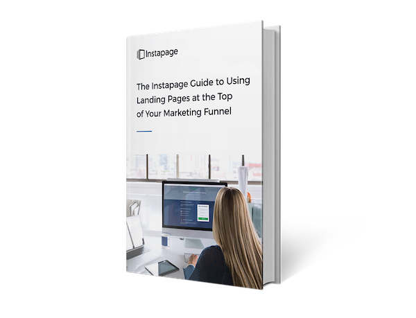
WorkCast
WorkCast uses this post-click landing page in the awareness phase of their marketing funnel to generate free eBook downloads:
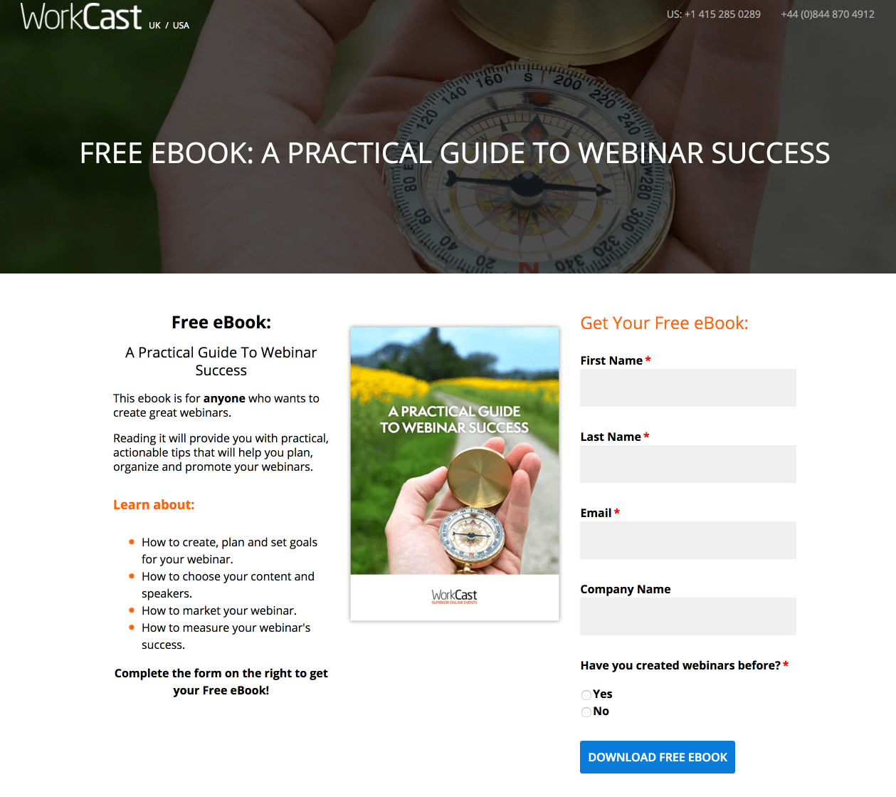
What the page does well:
- The click-to-call phone number makes it easy for prospects to contact the company without leaving the page. It also adds a level of trust to the brand because they are making themselves openly available to prospects.
- The headline tells visitors exactly what’s available on this page.
- The ebook’s cover page shows visitors what they can expect to receive after completing the form.
- The phrase “free ebook” is used multiple times and since people love free, this will likely persuade visitors to convert.
- The short form does not request too much personal information. After all, this is only an ebook. If the offer being promoted was a product demo or price quote, WorkCast could request more detailed information.
- Minimal copy that includes bullet points won’t overwhelm visitors because it provides the most important information and the main takeaways of the ebook.
- The blue CTA button stands out against the white background, which helps it stand out as the most important element on the page.
What could be changed or A/B tested:
- The hyperlinked logo (and UK/USA) act as exit links and may take visitors away from the page before they’ve had a chance to convert.
- The header image is nearly the same as the ebook cover page.
- A lack of social proof (e.g. testimonials or # of downloads) could be just what visitors need to be convinced this ebook is worth claiming.
- No trust signals — not even a privacy policy — to ensure prospects that their information will be kept safe.
- The CTA copy could be improved slightly. “Download My Free Ebook” could generate more clicks.
Offers in the consideration stage
In the consideration stage, your prospect knows who you are and is now evaluating you to see if your company is the best solution to their problem.
The most common offers in this stage are webinar registrations, case study and report downloads, and free samples — all assets that will give prospects a deeper look into what you can offer them.
Notice that in the two examples below, the forms are a bit longer than previous examples in the awareness stage. This is because the further down the funnel the prospect moves, typically the more qualified they are, meaning marketers can request more information from them.
GM Nameplate
GM Nameplate offers the webinar below for visitors who likely know what display integration is and are in the process of evaluating their options:

What the page does well:
- Webinar details are very specific, letting visitors know when it will take in two different timezones.
- Bullet points draw attention and provide the main takeaways of the webinar.
- The form is longer in this example, asking for more personal information now that the marketing client is the in consideration stage of the funnel.
- The arrow on the CTA button serves as a directional cue, implying that prospects should keep moving forward with the signup process.
- The ability to receive a recording likely generates more registrations because GM Nameplate promises to send the webinar recording to all people who register.
- Webinar speakers are shown — complete with their headshots, titles, and short biographies. Doing this adds credibility because prospects can learn why each speaker is qualified to present.
What could be changed or A/B tested:
- The company logos in the header are hyperlinked and have the potential to decrease conversions because they act as exit links.
- The “Register Now” CTA copy could be more descriptive. Instead, something like, “Save My Webinar Spot” may entice more prospects to convert.
- Adding a countdown timer would create urgency because prospects would know how much time is left before registration closes.
- Including testimonials of GM Nameplate customers or previous webinar attendees could speak to the company’s value or the quality of the webinar content.
- The LinkedIn button could be removed from the post-click landing page and added to a thank you page instead. As it is now, the button provides an easy way off the page, especially because it says “share this content.”
Business-Software.com
Business-Software.com designed this optimized post-click landing page for the consideration stage of their marketing funnel. It’s part of the consideration stage because they’re offering a free report that compares different marketing automation software vendors:

What the page does well:
- The logo in the top left is not hyperlinked, so visitors can’t be enticed to click and leave this page.
- Minimal copy with bullet points also draw attention, informing prospects of the three main takeaways they can expect to get from the report.
- The Z-Pattern layout makes it easy for visitors to notice the most important things on the page. Visitors likely scan the page in this order: First — the headline, second — the red stamp, third — the picture of the report, and finally — the form and yellow CTA.
- “Free” is bolded and capitalized in two places to make it obvious that prospects will receive this report for free, and all they need to do is complete the form to download it.
- The image of the report provides prospects with a sample of what they can expect to receive by downloading the PDF.
- The yellow CTA button stands out because of how well it contrasts with all of the blue and white on the page.
What could be changed or A/B tested:
- The form is a bit long for a consideration stage offer. During this part of the buyer’s journey, is physical address really necessary? These fields may deter prospects from converting.
- The CTA button copy could be more personalized to the offer, such as “I Want the Report.”
- Adding some social proof could help persuade visitors to download the report. For example, a ticker that displays how many times the report has been downloaded would be a great addition.
- The company logo in the footer is hyperlinked to the homepage, giving prospects a chance to leave the page without converting.
Offers in the decision stage
Since this is the make-or-break stage where your lead could potentially become your customer or choose your competitor, it’s critical that your post-click landing pages are fully optimized.
During the decision stage of the buyer’s journey, the most common offers are for free trials, consultations, demos, quotes, and coupons. Here are two examples of how a marketing post-click landing page can help to get the job done in the decision stage:
Domo
This is an Google search ad from Domo that appears for the search term, “data analytics:”

The marketing post-click landing page I was brought to when I clicked the ad offers a video demo:

What the page does well:
- The form is the appropriate length for a demo video. That’s because your client is moving even further down the funnel, and it makes sense to ask for information such as company, title, and department. This information will help qualify the lead for the sales team and convert the lead into a customer.
- The “Customize your demo” checkbox allows prospects to tailor the presentation to what they need.
- The orange CTA button contrasts well with the form and the rest of the page, making it “pop out” at visitors.
- Minimal copy with bullet points makes it easy for visitors to scan the page and get the main highlights.
- The rotating gif image helps prospects visualize how the Domo service can benefit companies.
What could be changed or A/B tested:
- The logo is hyperlinked to the homepage. This acts as an exit link and gives potential customers a way off the page, perhaps before seeing the rest of the page.
- The CTA button could be bigger to attract even more attention, especially since the orange contrasts with the form and the page.
- The CTA copy could be more relevant to the offer. “Watch demo” may not evoke as much action or excitement from prospects. Something more engaging like, “See what YOU can do with Domo,” may convert at a higher rate.
- Customer badges are meant to help make prospects feel more comfortable and secure in their decision to work with Domo, but MasterCard and eBay’s logos are not the actual company logos. This could make prospects hesitate to convert, thinking, “Does Domo really work these big-name companies?”
Moving Storage Services
Moving Storage Services created this post-click landing page to offer free moving quotes to prospects who may be on the fence about hiring them as their moving company:

What the page does well:
- No exit links help prospects stay focused on the page and completing the form for a free moving quote.
- Encapsulation of the lead capture form helps to draw attention to it. The only way to improve this is to outline the form or design it in a more contrasting color.
- The bright CTA button is attention-grabbing since it contrasts well with the dark blue background.
- The use of iconography to display the benefits of working with this company helps to direct focus to the list. If this section used more white space, these icons wouldn’t look as bunched together.
- Customer testimonials with names, headshots, and locations act as social proof, likely instilling a sense of comfort and trust in prospects.
What could be changed or A/B tested:
- No company logo makes it difficult to know who is providing this free moving quote.
- Unsubstantiated claims about being the best moving company and winning awards have no proof. Listing the customer service awards would help add trust and credibility to this post-click landing page.
- Improper grammar and spelling mistakes make the company look unprofessional. The top of the page reads, “For A Free Moving Quotes!” and above the form reads, “Get A Professional FREE Moving Quotes!” In both statements, “quotes” should be singular. Furthermore, “San Francisco” is misspelled in Susan Bone’s testimonial.
- The CTA button copy, “Get Free Quote!” could be more personalized to the offer. Something more unique like, “Send my free moving quote now!” may result in more conversions.
- No privacy policy takes away some of the trust value of the brand. How are people to know that their personal information is safe?
How will you use marketing post-click landing pages in your funnel?
What offers do you promote with post-click landing pages, and in what stages of your funnel?
No matter what offer you promote, create a lasting impression and continue to engage prospects at all stages of the marketing funnel. To do that, create a professional post-click landing page with Instapage. Sign up for an Instapage Enterprise demo today.

See the Instapage Enterprise Plan in Action.
Demo includes AdMap™, Personalization, AMP,
Global Blocks, heatmaps & more.
