Credit cards can be found in about 70% of Americans’ wallets today. Since the U.S. Census Bureau’s population clock reports over 326 million people in the United States, that means about 228 million Americans are credit card holders.
Knowing just how many people possess these valuable pieces of plastic — and being aware of the outstanding number of credit card providers out there — it’s clear that you, as a marketer, must make your credit card offer stand out above all the rest.
The most effective way to do this is to deliver hyper-individualized customer experiences with advertising personalization through techniques like promoting dedicated and targeted credit card landing pages.
What is a landing page?
A landing page is a standalone web page, created with persuasive elements such as a compelling headline, social proof, visual cues, and a contrasting CTA button to convince visitors to convert on a specific offer. Landing page offers can include account signups, live demos, free trials, webinar registrations, ebook downloads, and — as this article will demonstrate — credit card offers.
10 credit card landing page examples
(Keep in mind for shorter landing pages, we’ve shown the entire page, but for longer pages, we only displayed above the fold. You may need to click through to the page to see some of the points we discuss. Also note that some pages may be undergoing A/B testing with an alternate version than is displayed below.)
1. American Express
This American Express display ad was shown on a blog about financial advice:

Upon clicking the ad, prospects are directed to this credit card post-click landing page:
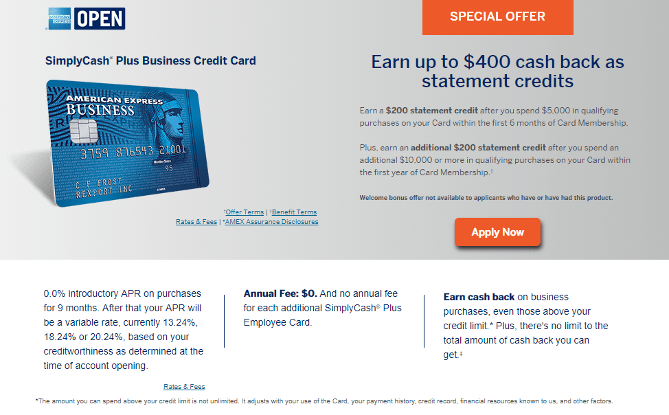
What the page does well:
- Message match through the logo, headline, image, and “special offer” helps reassure the visitor that they are in the correct place after clicking the ad, and will keep them more engaged with the offer.
- “Special offer” provides a sense of urgency, letting prospects know that this deal won’t last forever.
- The orange CTA button is attention-grabbing and is likely to encourage more visitors to click.
- The CTA button is constantly visible at the top of the page as prospects scroll, which also increases their chances of clicking.
- Different categories in the “Card Membership Benefits” section reduces some of the page copy, which is a good idea since there’s already a large amount of copy on the page.
- A click-through design means there’s no lead capture form on this landing page, removing some of the intimidation visitors may feel if they were to see a form right away.
- The multi-step form on the following page also helps to decrease intimidation, breaking up the long form into smaller steps.
What could be changed or A/B tested:
- Many exit links throughout the page and in the footer navigation make it easy for visitors to leave the page without converting.
- The CTA button copy is vague, and should be improved to something more enticing like, “Start earning cash back now!”
- The large text box in the “Card Membership Benefits” section could intimidate visitors. Moving this information to a different page, or making it expandable/collapsible, would remove some friction.
- An abundance of copy throughout the rest of the page is likely to overwhelm prospects and could deter them from converting.
2. Capital One
Searching for “Capital one credit cards” and you’ll likely see this Google ad:

When prospects click the result headline (or the ad extension “Find the Right Card” subheadline), they’re brought to this Capital One landing page:
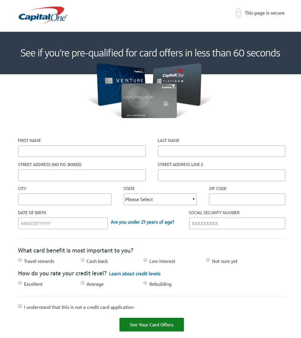
What the page does well:
- “This page is secure” serves as a trust signal, immediately showing visitors that their personal information can be trusted with Capital One.
- The headline is specific, personalized, and lets prospects know how long the process will take.
- The image shows visitors some of their options for Capital One credit cards.
- The two questions underneath the form provide prospects an opportunity to personalize their credit card offers.
- The green CTA button stands out because there’s no other green on the page.
- The CTA button copy is specific and uses personalized language to persuade prospects to click.
What could be changed or A/B tested:
- Exit links in the Capital One logo, navigation, and footer serve as distractions for visitors and take them away from the page prematurely.
- Increasing the CTA button size would help it stand out even more.
3. Discover
Here’s an email ad that Discover uses to promote their cash back credit cards, and the credit card landing page that it sends prospects to:
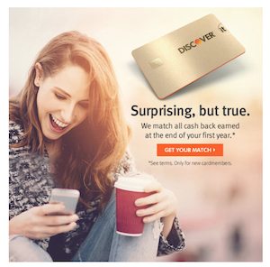
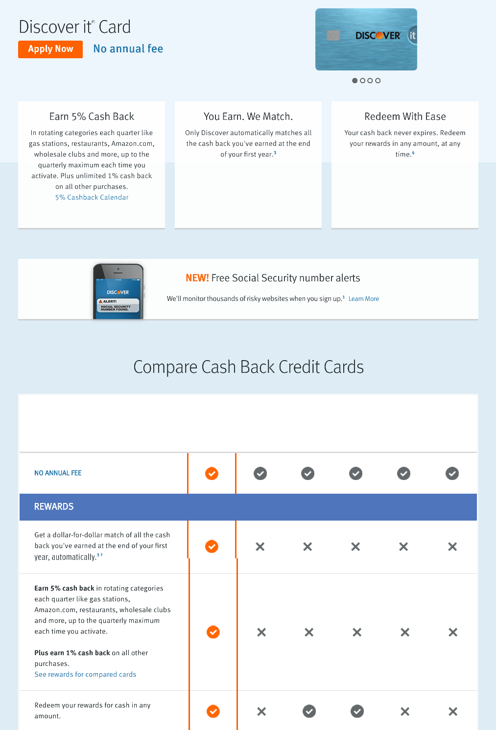
What the page does well:
- The image in the top-right provides visitors with a visual of what some of their credit card options are.
- The benefits of obtaining a Discover it credit card are displayed toward the top of the page, which helps persuade prospects to apply.
- The Compare Cash Back Credit Cards section helps prospects decide which credit card offer is best for them. Having the opportunity to choose one that best suits them likely increases their chances of applying.
- First-person copy throughout the page makes the offer more personalized and helps prospects feel more connected.
What could be changed or A/B tested:
- Lack of message match might confuse visitors when they land on this page, because it’s not very similar to the email ad.
- No UVP-oriented headline makes it difficult for prospects to quickly learn why they should choose a Discover credit card over any other credit card.
- The orange CTA button doesn’t stand out as much as it could because orange is used elsewhere on the page. Enlarging it would also make it more attention-grabbing.
- The CTA button copy should be improved to something more specific and personalized, like “I Want Cash Back!”
- Multiple exit links throughout the page could be distracting, and lead visitors away from the page without converting.
4. Chase
This credit card landing page was found after clicking a CTA button at the bottom of a blog post that was promoted on Chase’s Facebook page:
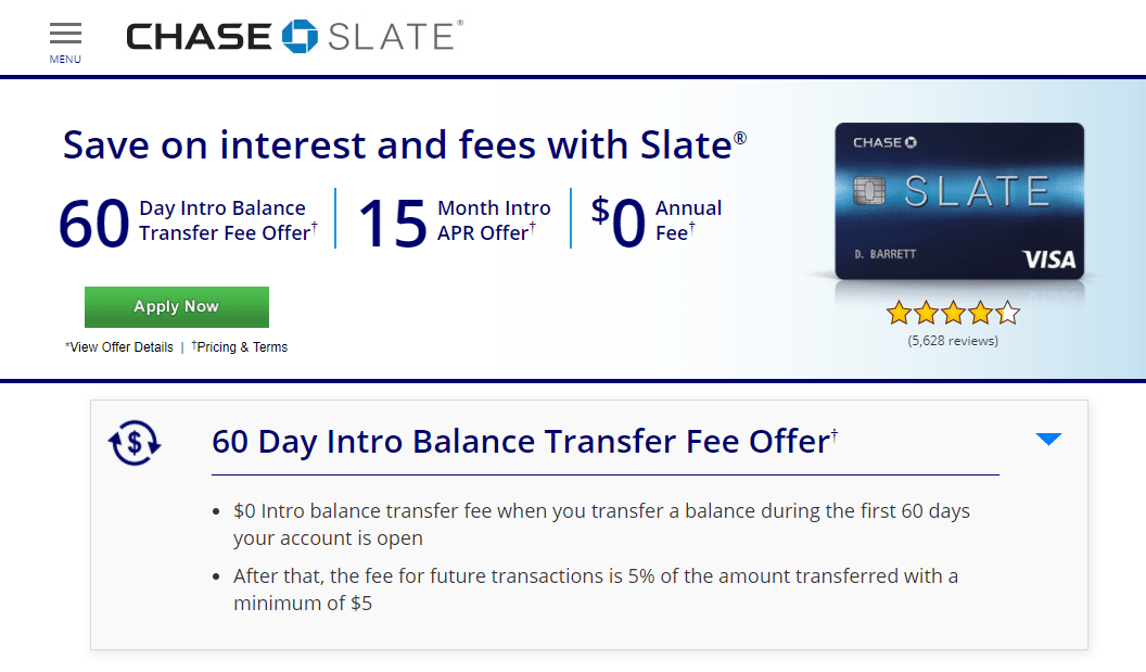
What the page does well:
- The menu button in the top-left corner opens a menu on the left side of the page, with multiple anchor links taking visitors to specific sections of this landing page.
- The headline offers a compelling UVP, stating that Slate card holders will save on interest and fees.
- The green CTA button is likely to grab prospects attention because there’s no other green on the page.
- The click-through design allows visitors to learn about the credit card offer without being immediately faced with a lead capture form. The multi-step form on the next page helps reduce friction and likely produces a better conversion rate.
- Large section headers with bulleted copy make it quick and easy for visitors to scan the page to find what they’re looking for without having to read through an abundance of copy.
- The tablet image provides prospects with a preview of one of the features they can expect if they open a Chase Slate credit card: a personalized credit dashboard with their monthly FICO score.
- Incorporating videos is a landing page design best practice because it’s a way to provide additional useful information without filling the page with overwhelming copy.
What could be changed or A/B tested:
- Multiple exit links — the Chase Slate logo, “Pricing & Terms”, the star review, and footer links — could easily distract visitors and push them away from the page without applying for a Slate credit card.
- Adding more white space around key elements, like the headline, CTA buttons, and credit card images, would draw more attention to these areas and likely increase conversions.
- The “Apply Now” CTA copy isn’t very persuasive. Testing more compelling copy, such as “Start saving now!” might generate better results.
5. United Chase
Chase partnered with United to create this display ad and corresponding post-click landing page:


What the page does well:
- The attention-grabbing headline is likely to capture visitors attention immediately because it’s the largest element on the page, highlighted by the New Offer banner.
- “View other United Chase cards” in the top-right is an anchor tag that automatically transports users to the bottom of the page.
- The yellow CTA button stands out and follows visitors at the top of the screen as they scroll.
- A click-through design allows prospects to learn about the offer first, then click-through to the next page where they must submit their information.
- The award badge from Global Traveler Magazine serves as social proof to build trust and credibility.
- The expandable/collapsible sections provide a better user experience because of the wealth of information on the page.
What could be changed or A/B tested:
- Multiple exit links provide visitors a chance to escape the page before converting.
- The CTA button copy is vague and overused in this industry. Changing it to something more unique, such as “Sign Me Up!” might encourage more people to click.
- The overwhelming amount of copy could intimidate prospects and increase the bounce rate.
- More white space (especially around the CTA buttons) would increase focus on these areas and likely make more people click.
6. Citibank
A Bing search for “Citibank” generated this paid search ad:
After clicking the “Student Credit Card” extension, users land on the following page:

What the page does well:
- Multiple green CTA buttons “pop” off the page, enticing visitors to click.
- A click-through conversion process means prospects can learn about the offer without the intimidation of a lead capture form in front of them. Also, the multi-step form on the next page helps reduce friction and likely results in more conversions.
- The “See pricing…” link is an anchor tag that conveniently directs users to the fine print at the bottom of the page.
- Section headers, bold font, and iconography help draw attention to the benefits and features of this Citi credit card without extensive copy.
What could be changed or A/B tested:
- Highlighting the card is for college students would likely attract more qualified leads. Currently, it’s only written in small font at the top of the page, and once more at the bottom of the page. Specifying the offer by enlarging the text and adding more focus on college students throughout the descriptive copy would help qualify prospects more.
- “Apply Now” is vague and should be changed to more enticing and personalized copy.
- A large amount of fine print could be intimidating and detering for visitors.
- Exit links throughout the fine print and in the footer could lead people away from the page without redeeming the offer.
- Adding social proof, such as a customer testimonial from another student, would help convince prospects to apply for their own Citi credit card.
7. Credit One
At the bottom of a Credit One blog post, this advertisement and CTA were displayed:
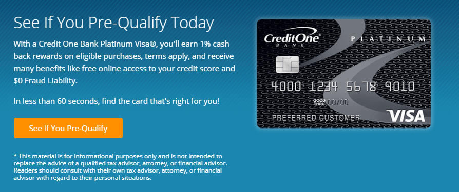
Here’s the credit card landing page it drives traffic to:
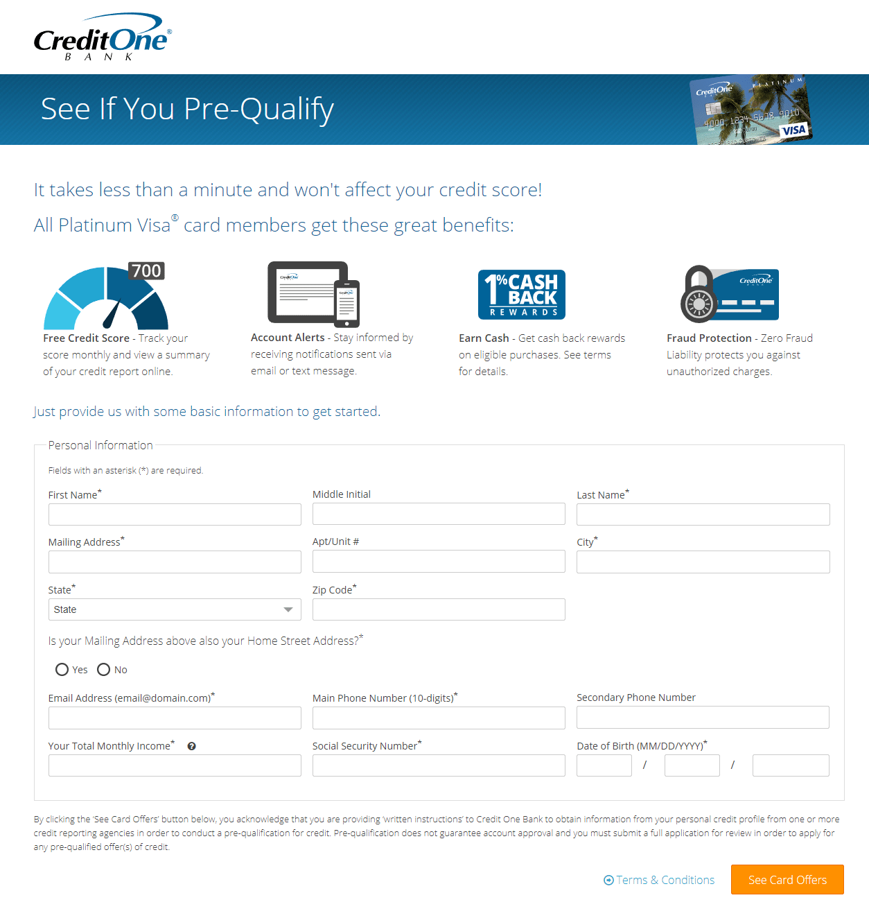
What the page does well:
- The landing page headline and subheadline are enticing, convincing, and support each other well.
- Iconography and bold font helps draw attention to the main benefits of having a Credit One credit card.
- The blue arrow that appears in the bottom-right corner when users scroll is an anchor tag that transports them back to the top of the page.
- Encapsulating the form with a box acts as a visual cue, helping draw attention to it.
- The orange CTA button stands out because it contrasts well with the rest of the page colors.
What could be changed or A/B tested:
- The company logo and footer links could distract visitors and remove them from the page without converting.
- The credit card image would be more effective if it was bigger, and matched the credit card in the blog post ad.
- Adding white space between the various sections would make the page more aesthetically pleasing and navigable.
- Including social proof would help prospects feel more comfortable with the idea of submitting their personal information to see if they qualify for a Credit One credit card.
- Personalizing the CTA button copy (“See Your Card Offers”) would make prospects feel more connected and encourage them to click.
8. Bank of America
Bank of America created a Facebook post to drive traffic to their cash rewards credit card post-click landing page:


What the page does well:
- Smiling faces in the background image add human element to the page, which is likely to build stronger connections with prospects.
- The woman’s eye gaze is a directional cue, encouraging visitors to look at the CTA button.
- Click-through landing pages like this one are ideal because prospects aren’t faced with a lead capture form right from the start.
- Encapsulating the benefits and features with color contrast helps them stand out.
What could be changed or A/B tested:
- No message match (aside from the credit card image) between the Facebook post and the landing page, which could confuse visitors.
- The CTA button color should be tested in another contrasting color because the company logo, the Travel Rewards credit card image, and the hyperlinked copy are also blue.
- The CTA button copy would likely produce better results if it was more specific and personalized.
- Adding social proof and/or trust signals would make prospects feel more comfortable, safe, and compelled to convert on the credit card offer.
9. Wells Fargo
Here’s another Bing ad that was displayed with a search for “Wells Fargo”:

When searchers click the “Platinum Visa Card” link, they’re brought to this landing page:
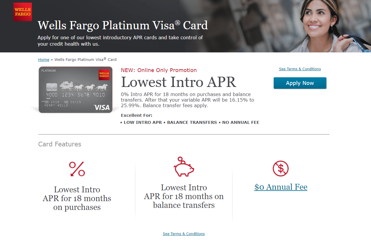
What the page does well:
- The headline tells visitors exactly what this offer is for, and the subheadline describes the offer in further detail.
- “Online Only Promotion” provides a sense of scarcity and urgency, and likely compels prospects to take advantage of the offer now.
- The CTA button appears at the bottom of the window when visitors begin scrolling, so it becomes “sticky” and stays in their sight as they navigate the page.
- Iconography with minimal copy helps draw attention to the card features and makes them easy to digest.
What could be changed or A/B tested:
- Redirecting the woman’s eye gaze to point across to the headline, or down to the CTA button, would likely generate more conversions because visitors would subconsciously look there too.
- Many exit links make it easy for prospects to leave the page without completing the conversion goal (“Apply Now”).
- The CTA button isn’t as attention-grabbing or persuasive as it could be. The turquoise doesn’t contrast well with the rest of the colors on the page, and “Apply Now” is not very inspiring.
- A large amount of fine print could deter prospects from converting on the credit card offer.
- Lack of consistency and hierarchy when it comes to the font/copy makes the page look unprofessional and more difficult to navigate.
- Including social proof, like a testimonial from a current card holder, complete with headshot and quote, would likely encourage prospects to apply for the Platinum Visa credit card.
10. HSBC
Lastly, here’s another Google Ads campaign, this time from HSBC, that directs traffic to a Gold MasterCard credit card offer:

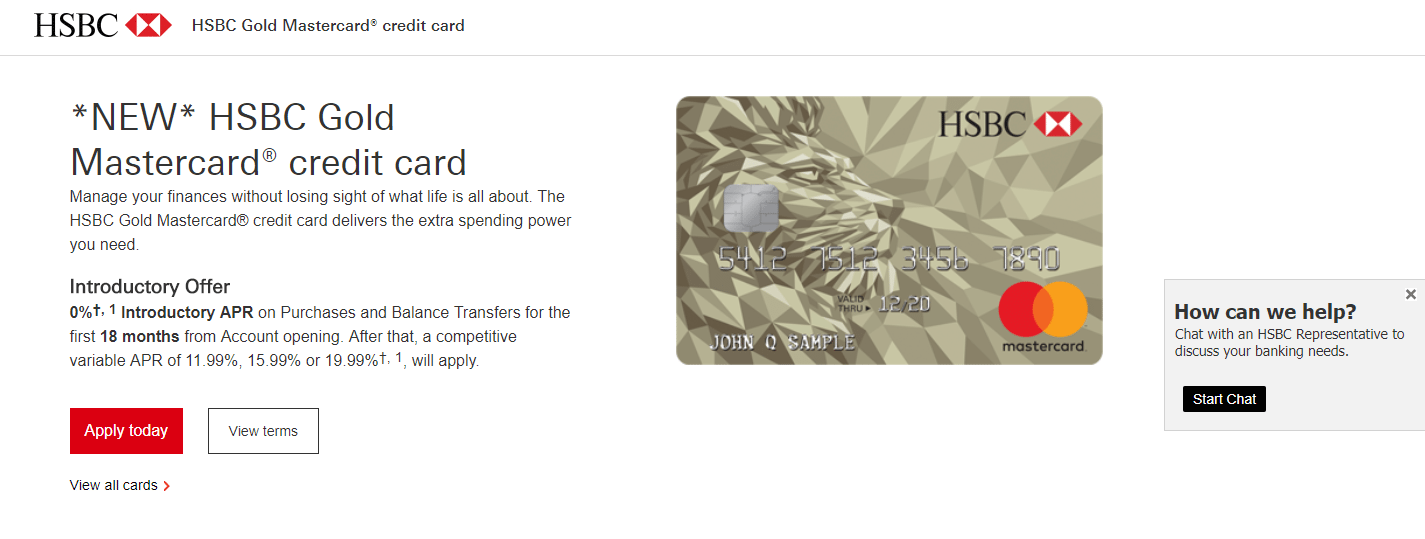
What the page does well:
- The landing page headline is very specific to the offer, telling visitors exactly what the promotion is.
- The credit card image is large and clear, giving prospects a great visual of what their HSBC card would look like.
- The live chat feature allows HSBC to connect with prospects faster and in real-time, to answer questions and persuade them to convert.
- The red CTA button “pops” off the page. It’s also helpful that it remains at the top of the window as users scroll.
- The “View terms” button is an anchor tag that takes users further down the page to view the Summary of Terms section.
What could be changed or A/B tested:
- Several exit links make it possible for visitors to escape the page without completely learning about the offer and converting.
- Extensive fine print may cause prospects to second-guess their decision to apply for an HSBC credit card.
- Including social proof would add an element of trust to the page and would likely persuade more prospects to convert.
Rise above the competition with credit card landing pages
In all areas of the financial industry, advertising personalization is essential. When it comes to credit card offers in particular, credit card landing pages are what makes all the difference. Leveraging these tools allow you to deliver effective, hyper-individualized messages to each of your target customers.
Turn ad clicks into conversions, create dedicated, fast-loading pages for every offer. See how you can provide audiences with unique landing pages by signing up for an Instapage 14-day free trial today.

Try the world's most advanced landing page platform with a risk-free trial.
