Like a rose is a rose is a rose, your brand is your brand is your brand.
Think of it like this. Your brand is like a delicate flower. It is something you’ve cared for, cultivated, and grown into an entity that represents everything you, your team, and company wishes to share with the world.
That’s why you’re proud of your brand, and why it’s upsetting when it goes unnoticed.
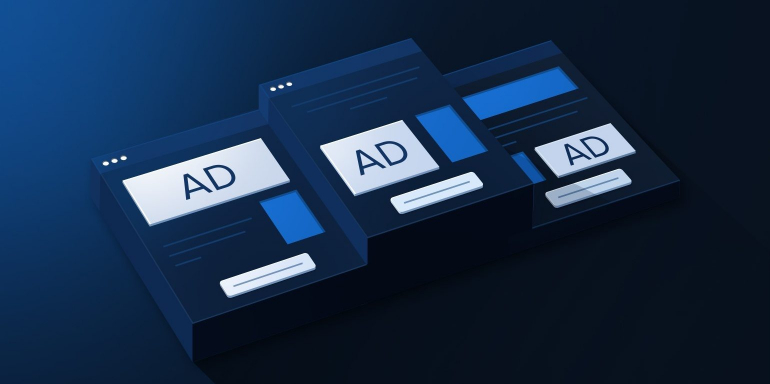
There are many ways to draw attention to your brand and one of the best is to utilize post-click landing pages.
post-click landing pages make a lasting first impression and are ideally suited to creating powerful, personalized ads that fully convey all the awesomeness that is your brand.
An advertising post-click landing page politely ushers your potential customers the duration of the customer journey, so it’s crucial to recognize that every promotion or ad needs its own post-click landing page. In this post, we’re going to examine how good advertising post-click landing pages move potential customers through each step of the buying cycle and help your brand get the attention you know it deserves.
What is an advertising post-click landing page?
An advertising post-click landing page is a standalone web page that visitors are brought to from various forms of advertising channels. Advertising post-click landing pages are designed to convince visitors to convert on a specific offer (to buy a product, download an ebook, register for a webinar, etc.) by using persuasive elements like compelling headlines, benefit-oriented copy, engaging media, and customer testimonials.
Advertising post-click landing pages can, and should, be utilized throughout the marketing funnel to make the buyer’s journey meaningful and effective.
How are brands using advertising post-click landing pages at each stage of the buyer’s journey?
Brands are using advertising post-click landing pages at each stage of the marketing funnel to optimize the buyer’s journey. This practice provides brands with the ability to raise brand awareness, drive traffic, and increase sales.
Take a look below at how content fits into the buyer’s journey at each stage. These are not exclusive to their respective stage, but are often bucketed this way:
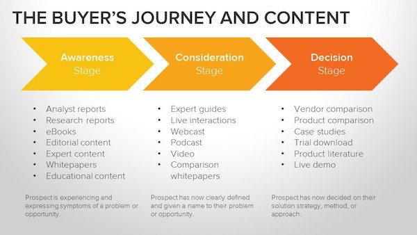
Let’s briefly review each stage of the marketing funnel, and examine how brands are using advertising post-click landing pages to achieve success throughout the buyer’s journey. We’ll also discuss elements that should be A/B tested in order to potentially achieve better results.
(Keep in mind, for shorter pages, we’ve shown the entire page. However, for longer pages, we only displayed above the fold. You may need to click through to each page to see some of the points we discuss. Also, some brands may be A/B tested their page with an alternate version than is displayed below.)
In the awareness stage
The awareness stage is the beginning of the buyer’s journey; before someone knows anything about your brand. The prospect knows that they have an issue, and that the issue needs a solution but they don’t have any idea how they’re going to solve the issue.
In the awareness stage, post-click landing page advertising is typically for educational, editorial, and expert content, analyst and research reports, tip lists, ebooks, white papers, and blog subscriptions.
Bold360
Bold360 is one brand that uses an advertising post-click landing page in the awareness stage of the buyer’s journey. The following Google ad and post-click landing page was found by searching the term “improve user experience” and is used to generate playbook downloads:

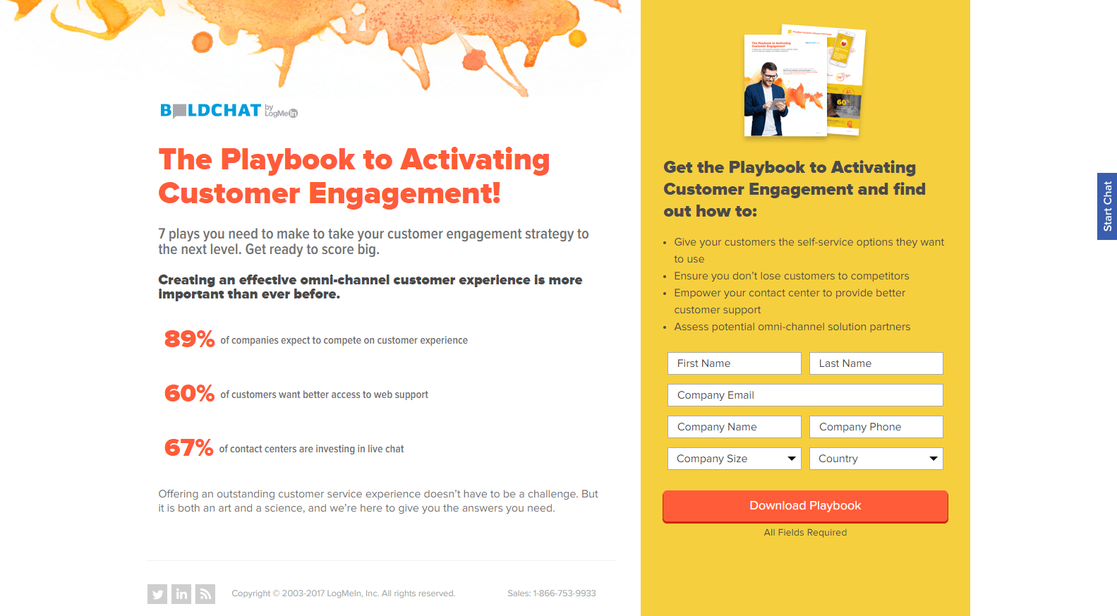
What the page does well:
- The headline is attention-grabbing, both aesthetically and with the compelling copy.
- Numerical statistics about customer experience help persuade prospects to download the playbook to learn more about how they can improve their own customer engagement.
- The image gives prospects a preview of what they’ll receive by downloading the playbook.
- Bullet points with personalized copy let prospects know what they’ll learn from the playbook and how it will benefit them.
- The “Start chat” button on the right side of the page allows prospects to contact the customer service team without exiting the page.
What could be changed or A/B tested:
-
- Exit links (the company logo and social links) could reduce conversion rates by providing prospects with a way off the page before downloading the playbook.
- 7 form fields is a bit high for a post-click landing page in the awareness stage of the buyer’s journey. At this stage of the game, the company shouldn’t need so much information.
- The CTA button copy is vague and unpersuasive. Something more exciting and benefit-oriented like, “Get Engaged!” would likely persuade more prospects to convert.
- Adding white space around the most important elements, like the headline, form, and CTA button, would make them more attention-grabbing, and make the page look more organized.
- Analogous colors (red, orange, and yellow) make it so that no one color stands out too much. Changing the color of, say, the CTA button would make it “pop” off the page more.
Too much variation in font style, size, and color makes the page look messy and difficult to comprehend.
Akamai
Akamai uses this paid search ad and post-click landing page (found by searching the phrase “page speed issues”) in the awareness stage of the buyer’s journey to generate free report downloads:


What the page does well:
- Using “Free” in the headline is smart since people are more likely to redeem free offers than paid offers.
- The click-to-play video is informative, and is only 1-minute long, so it won’t bore prospects or prevent them from watching due to lengthiness.
- The encapsulated form serves as an implicit visual cue, drawing attention to the form so that prospects are more likely to complete it.
- Bullet points tell prospects what their report will contain, adding an element of persuasion to the offer.
What could be changed or A/B tested:
- Too many form fields may deter prospects from completing the form. All of the requested information isn’t necessary in the awareness stage of the buyer’s journey.
- The CTA button copy could be improved. There is nothing engaging or convincing about “Submit.” Something more personal and descriptive like, “Send my report now!” may result in more leads.
- The CTA button color could be changed to a more contrasting color in order to make it stand out on the page.
- Exit links (company logo, navigation in the footer, etc.) give prospects a chance to leave the page before converting on the offer.
- The video advertises other videos at the end of it, which also increases the chance that prospects will leave before submitting their request for the report.
- Adding testimonials from customers who have already received the report would likely help to persuade others to convert on the offer as well.
(For more information how to use post-click landing pages at the top of the marketing funnel, check out our guide.)
In the consideration stage
The consideration stage is where the prospect begins to research all of his or her available solutions in the marketplace, and they have identified your company as a possible solution to their problem. As the prospect’s research becomes more in depth, he or she learns more about your knowledge, professionalism, authority, and trustworthiness and they are able to narrow down their list of potential choices.
Advertising post-click landing pages in the consideration stage offer content like webinars, free samples, guides, webcasts, and podcasts.
Here is a LinkedIn PPC ad discovered by searching “marketing software guide”:

Upon clicking the ad, I was brought to this post-click landing page that LinkedIn uses in their consideration stage to persuade prospects to download their B2B Marketing Guide:

What the page does well:
- Message matching is used with the ad and the post-click landing page, as both advertise $50 in ad credits.
- Bullet points with bold font make it easy for prospects to find out what they’ll be getting and learning about with the guide.
- The auto fill feature on the form makes it faster and easier for prospects to complete it, increasing the chances that they will. Although having two of the same button seems like a mistake.
What could be changed or A/B tested:
- The CTA button copy, “Download Now,” is vague. Something more engaging and enticing like, “Get the guide and $50 now!” may produce more leads.
- The CTA button color could be changed to a more attention-grabbing color (one that’s not used elsewhere on the page).
- Iconography with links to other post-click landing pages is unnecessary and potentially decreases the conversion rate on this page. Instead of including the links on this page, each offer should have its own ad campaign and its own post-click landing page.
- Exit links (company logo, header and footer navigations, social links) provide prospects a way off the page before downloading the guide.
- Adding customer testimonials from those who have already downloaded the guide and had success with it would likely convince others to download it as well.
ReadyTalk
Upon conducting a Google search for the phrase “content marketing webinar,” I came across this search ad and landing page from ReadyTalk, encouraging prospects to sign up for their webinar:


What the page does well:
- The image of the man adds a human element to the page, making the offer more relatable and enticing for prospects.
- Minimal copy is good, but adding personalized wording like “you” and “my” would be even better.
- The arrow above the form acts as a directional cue, telling prospects that there’s more to see beyond this post-click landing page.
- The one-field form is fast and easy for prospects to complete, increasing their chances of doing so.
- No exit links (aside from the second CTA button mentioned below) means more prospects will stay on the page long enough to convert on the offer.
What could be changed or A/B tested:
- “Webinars for the Customer Journey” at the very top of the page is the exact same phrase as the headline, making it distracting and unnecessary.
- The CTA button copy is as vague as it gets. “Submit” doesn’t say anything about the offer and likely doesn’t entice many visitors to convert.
- The CTA button color doesn’t stand out as much as it could, because green is used elsewhere on the page. Changing it to a more contrasting color like orange would likely draw more attention and result in more leads.
- The second CTA button at the bottom of the page should be removed. Since this is a completely different offer, it should have its own post-click landing page.
- Adding trust signals and/or social proof (customer testimonials, company badges, etc.) would make prospects more comfortable and compelled to watch the webinar.
In the decision stage
The decision stage is what it all boils down to; where customers are made or prospects are lost. Up until this point of the buyer’s journey, your lead has been creating a list of potential brands to use as the solution to their problem – and now it’s time for them to make their decision based on what they’ve learned about you so far.
During this make-or-break stage, advertising post-click landing page offers include trials, demos, consultations, quotes, coupons, and vendor/product comparisons.
Falcon
Google isn’t the only advertising channel used to send prospects to post-click landing pages. Here is a Sponsored Post on Facebook that Falcon uses to drive traffic to their post-click landing page offering a demo:


What the page does well:
- Cooperative CTA buttons all the way down the page give prospects ample chances to convert on the offer. When visitors click any of the buttons, they are brought to the bottom of the page to complete the form.
- Social proof throughout the page (company logos and customer testimonials) likely convinces others to request the demo, leading them to believe that if everyone else finds so much success with this company, then they will too.
- Bullet points and images to describe the main components of the software makes the page more engaging and easier for prospects to comprehend.
What could be changed or A/B tested:
- The hyperlinked company logo may serve as a distraction, taking visitors off the page before getting the chance to convert.
- The CTA buttons don’t catch your eye or make visitors want to click. Most of them are the same color as their background, and even the blue ones don’t contrast as well as they could.
- “Free” demo is not mentioned until the very end of the page. Highlighting that the demo is free at the top will result in more customers because prospects will spend more time browsing the page and seeing the product benefits.
- The page is aesthetically pleasing. It appears professional and branded, it’s well-organized, includes sufficient white space, and follows the Z-Pattern layout all the way down.
Missouri Table & Chair
This is a Promoted Post on LinkedIn from Missouri Table & Chair:

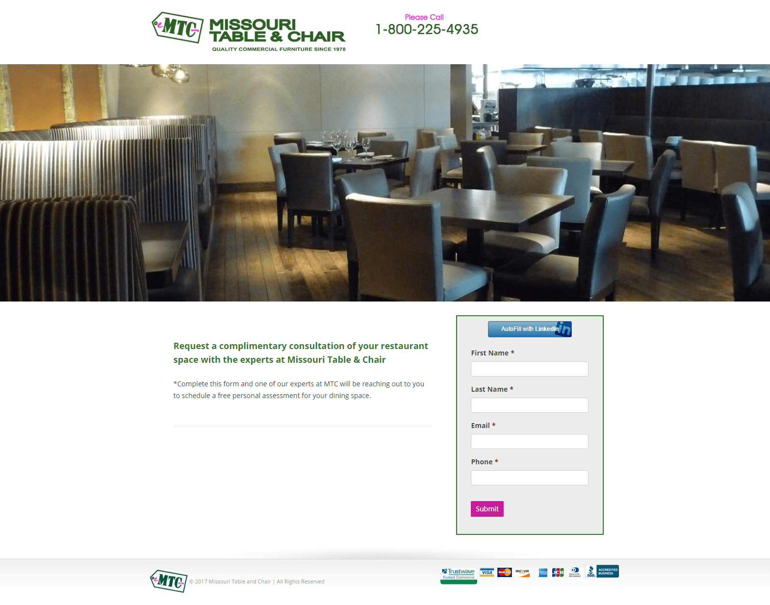
When prospects click on the Promoted Post, they are directed to this advertising post-click landing page that the company uses in the decision stage of the buyer’s journey to encourage visitors to sign up for a free consultation:
What the page does well:
- Trust seals directly beneath the form make it likely that prospects will feel comfortable converting on the offer. This is important since the company did not include a privacy policy link.
- The frame around the lead capture form helps to draw attention to it.
- The autofill function likely increases conversion rates, because it makes it easier and faster for prospects to complete the form.
What could be changed or A/B tested:
- The company logo is hyperlinked, giving visitors an immediate way off the page before converting.
- Lack of copy likely leaves prospects wondering why they should convert on this offer.
- The CTA button copy is bland. Making it more benefit-centered and exciting, such as, “Schedule my free consult now!” would likely result in more customers.
- No privacy policy could deter prospects from giving their personal information because they don’t know where it could end up.
How will you use advertising post-click landing pages?
Which of these brands’ post-click landing pages inspired you? How will you be using post-click landing page advertising? No matter what your offers are for, it’s time to begin using advertising post-click landing pages during all stages of your buyer’s journey.
By creating those post-click landing pages with Instapage, you’ll have access to our fully customizable templates and designer-friendly software. Sign up for an Instapage Enterprise demo today.

See the Instapage Enterprise Plan in Action.
Demo includes AdMap™, Personalization, AMP,
Global Blocks, heatmaps & more.
