
Marketers are continually thinking, hearing, and speaking about the demographics of their target audience — categorizing prospects by factors like age, gender, ethnicity, income, marital status, and geographical location. This information helps us understand the similarities and differences between consumers.
There’s no doubt that demographic targeting is critical to the success of your marketing efforts. To substantially enhance your marketing strategy, it’s additionally imperative that you fully understand and implement psychographic targeting and marketing as well.
What is psychographic marketing?
Psychographic marketing refers to understanding the motivations behind why your customers buy, what their values are, and how can you use that to your advantage?
That means taking into account the less tangible characteristics of your target market, such as their activities, personalities, attitudes, opinions, values, lifestyles, beliefs, goals, desires, and struggles.
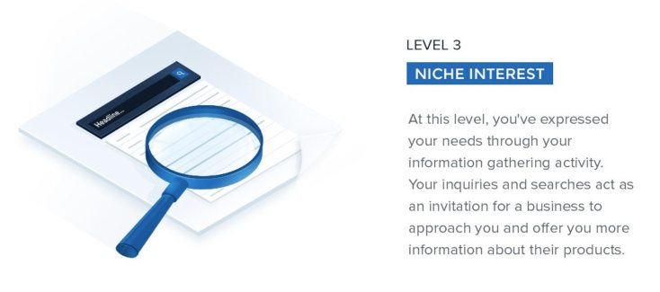
Although psychographic data is less objective and quantitative than demographic data, it’s equally as important. Using psychographic research when it comes to advertising means more solid user personas, increased advertising personalization, (Level 3 of our Advertising Personalization Classification System), and an overall more powerful and efficient marketing strategy.
Part of this process includes creating your post-click landing pages using marketing psychology to understand better what compels visitors to act.
The result?
Incredibly personalized, targeted marketing to reach specific audiences who appreciate your offers and need your product or service. This, in turn, leads to increased conversion rates.
Let’s take a look at four brands that truly understand just how important post-click landing page psychology and psychographic marketing are.
Four post-click landing pages that use psychographic marketing
(Keep in mind, for shorter pages, we’ve displayed the entire page. For longer pages, we’ve only shown above the fold, so you’ll need to click through to the page to see some of the points we discuss. Also, some of these pages may be undergoing A/B testing with an alternate version than is displayed below.)
1. HelloFresh
HelloFresh created this post-click landing page to convince visitors to sign up for one of their meal kit subscriptions.
Notice how they implement psychographic marketing to target and appeal to the countless people who don’t enjoy going to the grocery store and/or planning meals. As a solution, HelloFresh offers easy-to-make meals, complete with step-by-step directions, delivered straight to their customers’ doorstep.

What the page does well:
- No exit links make it nearly impossible to leave the page without clicking on the X in the web browser or converting on the offer.
- The green arrow pointing down the page acts as a directional cue, indicating that there’s more valuable information to see below the fold.
- The rule of reciprocity is used: HelloFresh provides directions and ingredients (and, of course, convenience) in exchange for customers’ money and contact information.
- The images of the food are realistic and vibrant, making the meals look very appetizing.
- The image of the phone shows visitors that they can manage their plan right from their mobile device.
- “No commitment necessary” is reassuring for prospects who may be concerned about being locked into a contract.
- Customer testimonials, complete with a full name and headshot, serve as social proof to build trust with prospects.
- The CTA button copy is personalized and action-oriented, which helps compel visitors to click.
- A sense of urgency is conveyed at the bottom of the page (“Don’t miss out! This special offer expires soon.”) letting visitors know that they must act quickly if they want to redeem this offer.
What could be A/B tested:
- Adding white space would help the page look less cluttered and make it easier to navigate.
- The green CTA button blends in with the rest of the green on the page. Changing it to a more contrasting color like orange would make it more attention-grabbing.
2. Orangetheory Fitness
This Orangetheory Fitness post-click landing page is meant to speak to those parents (or any adults, really) who are trying to get back into a fall routine. Whether their kids are going “back to school,” or they’re headed “back to work,” Orangetheory Fitness can help them get “back into shape” as well.
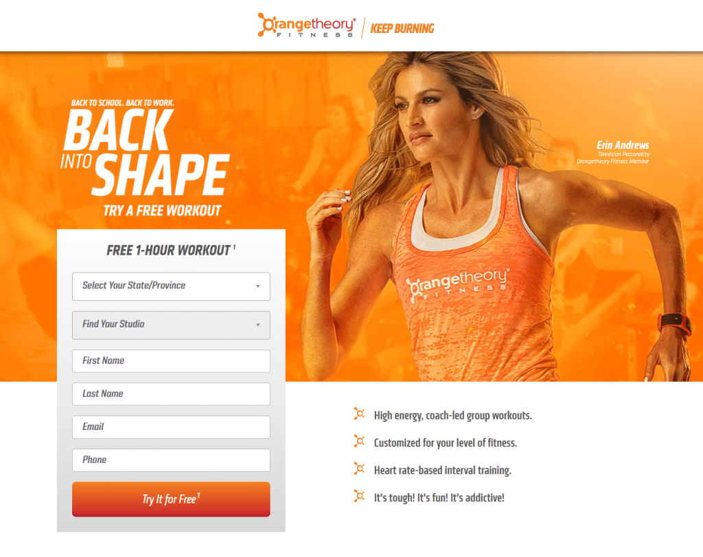
What the page does well:
- Authority — another marketing psychology principle — is demonstrated here with the image of Erin Andrews (TV personality) working out in an Orangetheory fitness shirt.
- Erin Andrews’ eye gaze is aimed directly at the headline, subconsciously encouraging visitors to look there as well.
- “Free” is used multiple times throughout the page, which is great because it’s difficult to refuse a free offer.
- Encapsulating the form helps it stand out and likely encourages more conversions.
- The 6-field form is appropriate for an offer in the decision stage of the buyer’s journey.
- Bulleted copy highlights the benefits of signing up for a free trial without overwhelming visitors with unnecessary text.
- The short Keep Burning video is a good inclusion because it delivers additional information without filling the page with more copy.
- The CTA button at the bottom of the page is an anchor tag that takes prospects up to complete the form.
What could be A/B tested:
- The hyperlinked company logos (and the website link itself) at the top and bottom of the page act as exit links and could take visitors away from the page before seeing the whole offer.
- The “My All Out” section also contains multiple exit links that could distract visitors. Including the woman’s success story on this post-click landing page would help convince prospects to convert without taking them away from this page.
- The orange CTA buttons don’t stand out as much as they could if they were a color used less on the page, like purple.
- The 2016 copyright date diminishes some of the page’s credibility and might make visitors wonder if this offer is still relevant.
3. Outskirts Press
This post-click landing page was designed specifically for authors looking to get their work published. Outskirts Press makes it clear that they understand the struggle to find a fair, suitable publisher, and they express that the best way to overcome this struggle is to self-publish (with the help of Outskirts Press.)

What the page does well:
- The headline is very benefit-oriented and compelling.
- The video is a perfect example of empathizing with a visitor’s struggle and then providing a solution to that struggle.
- Bullet points provide visitors with important details without cluttering the page with too much copy
- “Instantly”/“Instant” (above the form in all three sections) appeals to visitors’ need for getting quick results.
- Only two form fields make it quick and easy for prospects to convert on the offer.
- “Free” on the CTA buttons is an effective tactic because everyone loves free.
- Well-known brand logos are persuasive — Who wouldn’t want to sell their book to companies like Amazon or Barnes & Noble?
- The ebook images give prospects a preview of what they’ll be receiving should they choose to convert on the offer.
- The red arrows are explicit visual cues, showing visitors where to direct their attention.
- The audio testimonials are a nice inclusion because prospects can learn about others’ publishing experiences in an interactive way without having to read.
- The social media logos at the bottom of the page show visitors where they can find Outskirts Press on social media without automatically redirecting them there.
What could be A/B tested:
- The Outskirts Press logo at the top of the page is linked to the company’s homepage, which could immediately remove visitors from this post-click landing page.
- Three different offers are presented here when actually, they should each have their dedicated post-click landing page.
- The written testimonials in the ebook section refer to self-publishing in general — not necessarily self-publishing with Outskirts Press.
- Adding a privacy policy to let prospects know that their information will be safe and secure would likely increase conversions.
4. Ashford University
Ashford University implements psychographic marketing on this post-click landing page to target parents who want to earn a degree, but may not be able to attend school because of other responsibilities (like children). This is evident primarily through the page’s main image and headline.

What the page does well:
- Eye gaze draws attention to some of the most important page elements: the child’s to the headline, and the adult’s to the form.
- The headline is personalized and benefit-oriented, which makes it likely to persuade visitors to convert.
- Encapsulating the form with color contrast helps it stand out.
- Multiple orange CTA buttons “pop” to grab visitors’ attention. Also, the arrow on the first button serves as a directional cue.
- The bulleted list — complete with iconography and bold print — makes it quick and easy for prospects to scan the page to find the most important information.
- Multiple anchor tags (“Fill out the form…” and the second orange CTA button) take prospects directly to the form to complete it, enhancing the user experience.
What could be A/B tested:
- 7 form fields may intimidate people who are simply looking for more information in the consideration stage of the marketing funnel.
- The fine print on and below the form might cause visitors to question the company’s motives.
- The CTA button copy is vague. Specifying what exactly prospects are getting started with might generate better results.
- Too much white space at the bottom makes this page longer than it has to be.
- Footer links provide visitors with an escape route from this page.
- Adding social proof, such as a customer testimonial, would help encourage prospects to convert.
Boost sales with psychographic marketing
Whether you’re looking to generate more guide downloads, or hoping to increase product sales, your goals can be better achieved with psychographic marketing. While using demographics is useful, pairing demographics with psychographics is necessary.
Start building your post-click landing pages with psychographic targeting like the brands above did. With Instapage, you’ll have access to 100+ fully customizable templates and a robust set of features. Sign up for an Instapage Enterprise demo today.

See the Instapage Enterprise Plan in Action.
Demo includes AdMap™, Personalization, AMP,
Global Blocks, heatmaps & more.