What happens when you drop an anchor into the water?
The anchor holds the boat in place, right? You still have the freedom to move a certain distance from the anchor point in any direction, but no matter which way you go, you’re restricted to a specific radius.
That’s similar to how anchor tags function on a web page. They allow visitors to jump to various locations on the page, but it keeps them on the page.
Marketers love this web design technique because it enables them to highlight specific points of interest, especially with landing pages where the goal is to inspire action. To accomplish this, you’ll need to design a persuasive landing page with the right optimized elements. Our new ebook, The Ultimate Guide to Building a Persuasive landing page goes into more detail on that:
But in today’s post we’ll demonstrate how marketers use anchor tags to draw attention to specific page elements, and ultimately convert on the page.
What is an anchor tag?
An anchor tag, or anchor link, is a web page element that links to another location on the same page. They are typically used for long or text-heavy pages so that visitors can jump to a specific part of the page without having to scroll as much.
Since clicking on an anchor link takes visitors where they want to go without much effort, they improve the overall user experience, which aids in the conversion process. Not only do they make it fast and easy for visitors to navigate your page, but they can serve as visual cues, pointing people toward elements that are integral to your conversion goal.
It’s worth mentioning that they can be static or animated. When animated, anchor tags have the potential to attract more attention because it’s likely the only thing moving on the page. And when you combine animation with white space, you get a powerful combination that draws people’s attention where you want it.
In the anchor tag examples below, you’ll notice this design technique can be used in a variety of ways.
What can anchor tags highlight on landing pages?
Important copy
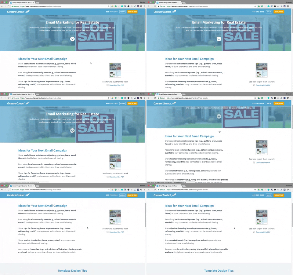
Since your product or service’s benefits are conveyed through copy, using an anchor link to specific copy is ideal. Constant Contact does this on their landing page midway down the page. Once a visitor clicks the down arrow, the page scrolls for them:
SocialMediaCompanies.com is another brand with an anchor link that directs visitors below the fold. In this example, they want visitors to notice the key areas that the company rates and reviews:
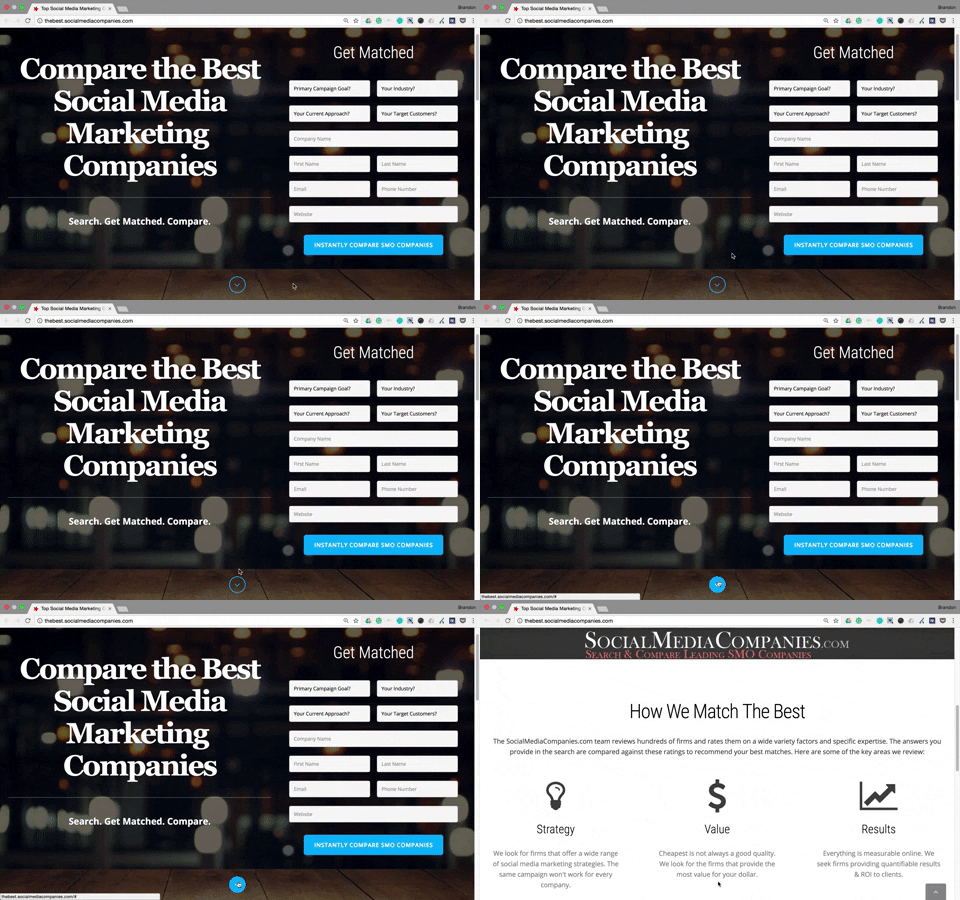
Each example shows that by highlighting the benefits or important details about your offer with an anchor tag target, it’s more likely that visitors will read (skim) the copy.
Customer success stories
Featuring customer success stories and testimonials is a great way to provide visitors with compelling social proof. They build trust and confidence in your product or service and helps guide them toward converting.
To ensure their customer success stories don’t get overlooked, Dynamic Yield features a bouncing anchor tag arrow to draw attention and guide visitors in the right direction. When prospects click the arrow, they bypass the brand logos and are taken straight to the success story videos:
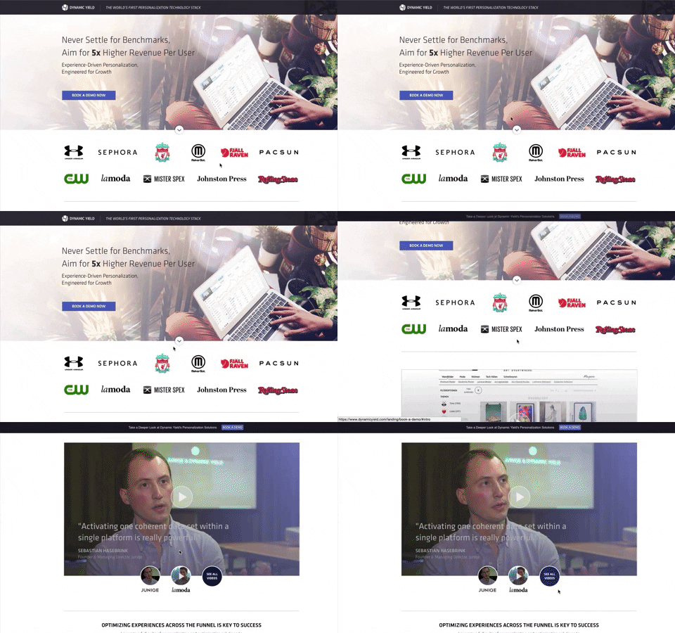
Since this kind of customer review can often sell your product more effectively than anything else on the page, why risk your prospects skipping over them?
Use cases
Boardvantage does something a little different than the previous examples. Here they identify the target, “Explore Use Cases” next to the arrow anchor tag. Notice how it is surrounded by sufficient white space to make it stand out, too. Once clicked, visitors are sent to the section below the fold where the company highlights the major features and benefits of MeetX with minimal copy, short videos, and screenshots:
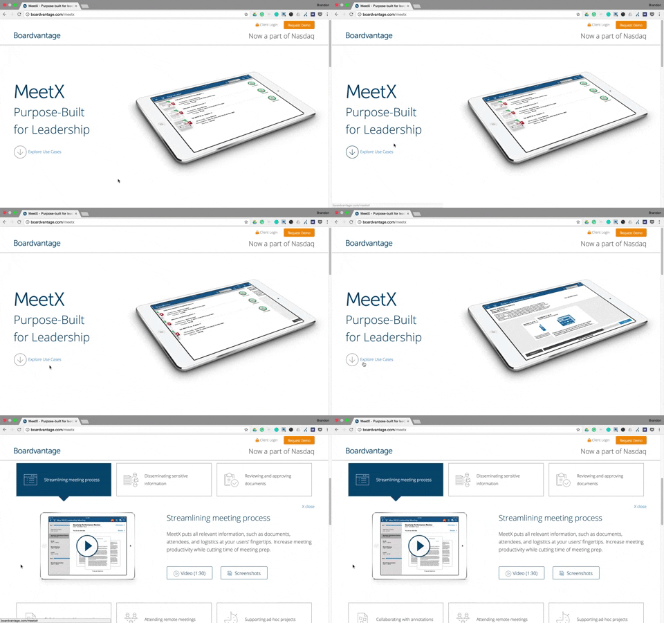
This particular section contains the main product selling points, so they wanted to make sure visitors saw it. Smart move by Boardvantage.
Product add-ons
On this Lyft landing page, the menu navigation links are all anchor tags, leading visitors to various places on the page. When they click the “Get Yours” link, the page scrolls near the middle where they can learn more details how to get their own Amp:
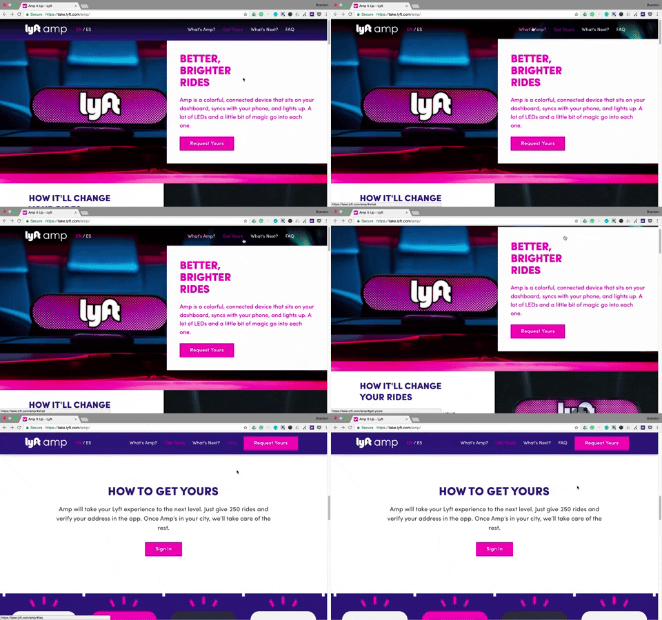
If the user had clicked the FAQ navigation link, they would be sent to the “everything you need to know” section near the bottom of the page. Compared to other elements mentioned in this article, FAQ sections aren’t very common on landing pages. But they still serve an important purpose, especially if a company is attempting to sell something specific to their brand.
Lead capture form
This Salesgenie landing page is filled with anchor tags, each aimed at getting visitors to engage with the page more. Each down arrow sends people further down the page while each orange CTA button will direct people back up to the top to complete the form:
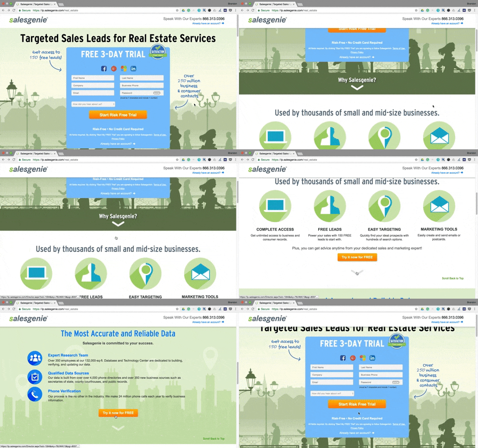
Notice the CTA button again. Its bright orange color is attention-grabbing and uses compelling copy (“free”), which likely results in more clicks. When visitors click it (or any of the cooperative CTA buttons), they are sent back up to the top of the page to start a Salesgenie free trial.
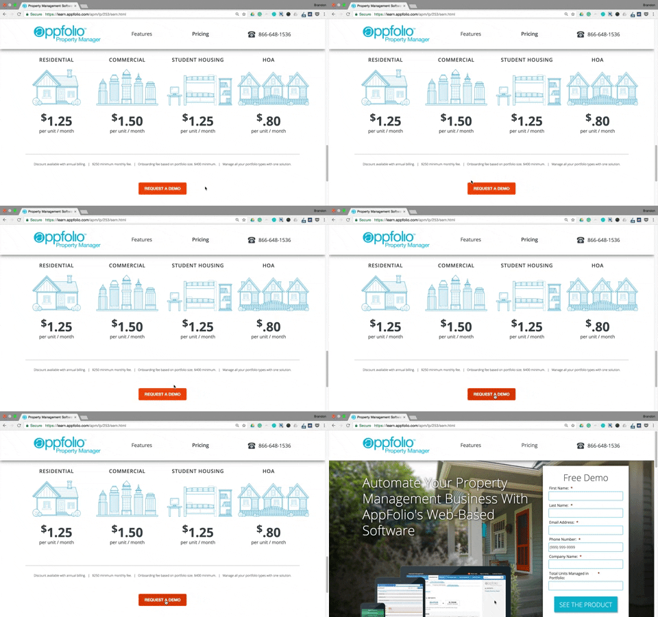
AppFolio also uses a CTA button to redirect prospects to their lead capture form. Once visitors have scrolled through the entire page, they see this orange CTA button. The button is an anchor link that redirects to the form at the top of the page:
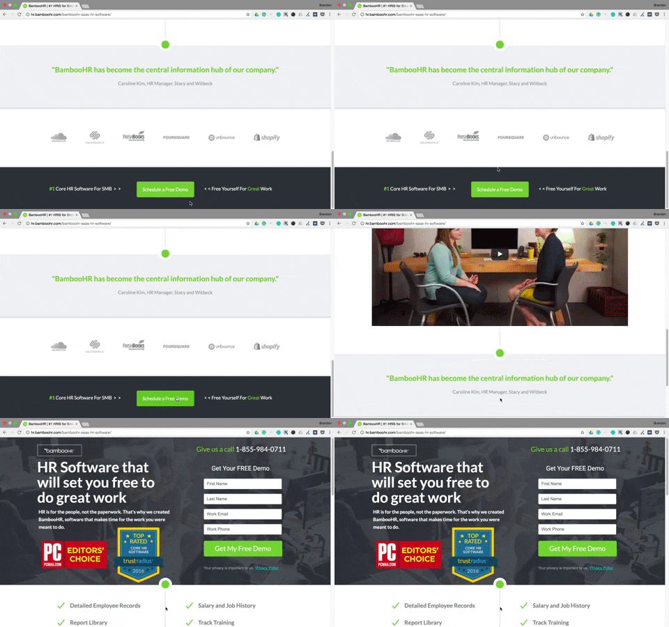
 In our third CTA button example, BambooHR highlights their CTA button with a contrasting color, the copy specifies that the demo is free, and there are even arrow directional cues pointing to it on both sides:
The lead capture form is one of the most important elements on your landing page because without it, you have no way of obtaining your prospects’ information. Without an easily accessible form, prospects have a harder time converting, so anchor tags are a great design technique to nudge them toward the form and convert.
CTA button
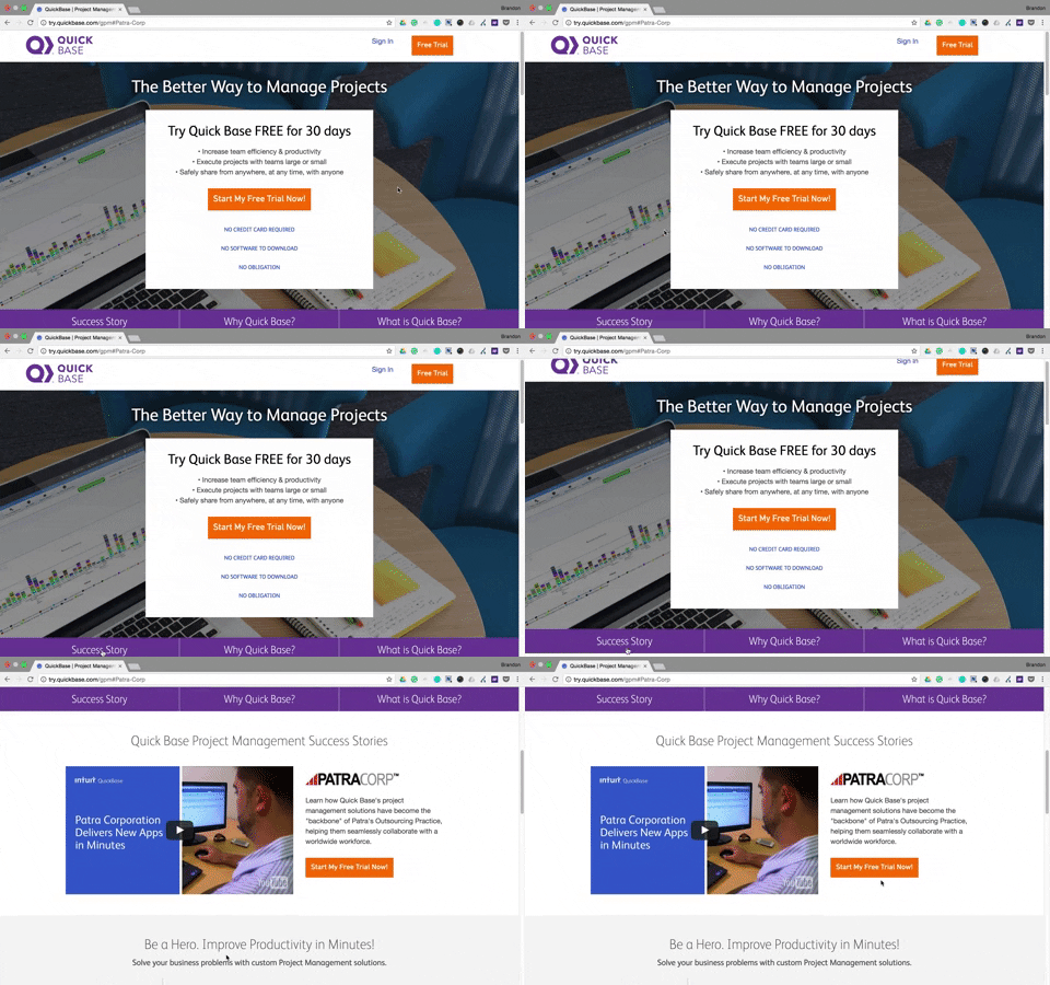
There are many ways to optimize your CTA button, but you can also create anchor links that direct visitors right to them. In the QuickBase example below, the company created a landing page navigation (the three sections at the bottom of the image), in which all three links are anchor tags. When prospects click “Success Story” and “What is QuickBase,” they are redirected to two different sections further down the page, both of which feature a CTA button:
Obviously, your CTA is crucial. It’s literally how people convert. Make it stand out, be persuasive with the copy, and make it as accessible as possible by creating anchor tags that lead right to it.
How do you use anchor tags?
The examples above are not a comprehensive list, but they give you a good idea how anchor tags assist with conversions and highlight different landing page elements. Whether you’re linking specific landing page elements or setting up an entire link menu, you can’t go wrong with anchor tags on your landing pages. They provide an enjoyable user experience, which in turn, increases your chances of conversion.
Start using anchor tags today by adding custom code to your landing pages. Sign up for an Instapage 14-day free trial today.
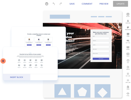
Try the world's most advanced landing page platform with a risk-free trial.
